A multidisciplinary designer passionate about visual identity and interactive design, exploring how to craft playful, meaningful experiences across diverse mediums.
B.F.A. DesignB.S. Arts & Entertainment Technologies
The University of Texas @ Austin
UX/UI & Game Design
A collection of my game design and UX/UI work, from a disco typing game to a magical personality quiz.
›
3D & Product Design
A collection of industrial design projects, from product concepts to prototypes.
›
Motion Graphics & Videography
A variety of videos I have produced from hype videos to fan edits.
›
2D & Graphic Design
A variety of my graphic design work, from layout design to livery design.
Currently a Design & Marketing Intern at JanMar Agency and Culture Clash Magazine, where I work across web design, UX/UI design, merch design, and web listings, alongside creating social media content, digital campaigns, branded materials, and promotional graphics.
Web DesignUX/UI DesignMerch DesignBrand ImplementationDigital Campaigns
August 2025 – Present
Public Relations Officer & Solar Public Relations Lead
Serving as Public Relations Officer for Longhorn Racing's Solar, Electric, and Combustion teams, leading overall branding, outreach, and communications across the organization. Also serve as the Public Relations Lead for the Solar vehicle team, directing visual storytelling through graphics, photography, videography, merchandise, and digital content.
Shaped Hook 'em Bhangra's creative vision by developing concepts, producing dance mixes, and defining the team's brand and aesthetic through cohesive branding and promotional design. Led the design and production of team merchandise to maintain a consistent visual identity across all materials.
Concept DevelopmentBrand IdentityPromotional DesignDance Mix Production
October 2025 – Present
Graphic Designer
The Pyrography Project, College of Fine Arts
+
Graphic designer for The Pyrography Project, where I developed the branding and logo. Awarded the Artistic Citizenship Collaborative Creative Grant from UT Austin's College of Fine Arts as part of an interdisciplinary team, contributing to a community-engaged, experience-based project exploring Artistic Citizenship.
Logo & Brand DesignCommunity-Engaged DesignGrant AwardeeInterdisciplinary Collaboration
2D & Graphic Design
A variety of my graphic design work, from layout design to livery design. Click on a project card to get full details!
← All work
Typography analysis, zine design, book production, game design aesthetics
Typography in Persona 5Fall 2025
Vehicle livery, solar racing, heat map gradient, collaborative design
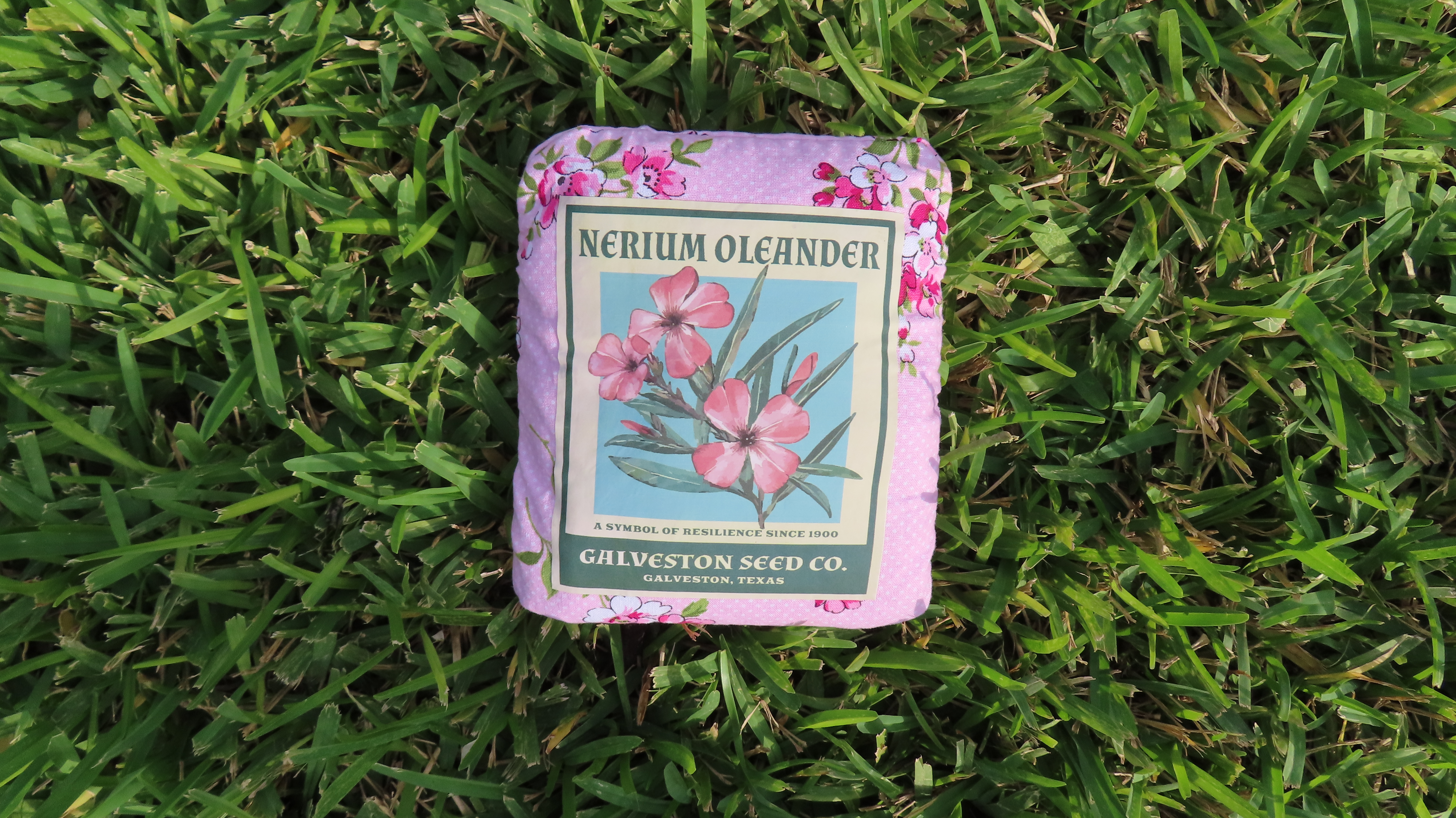
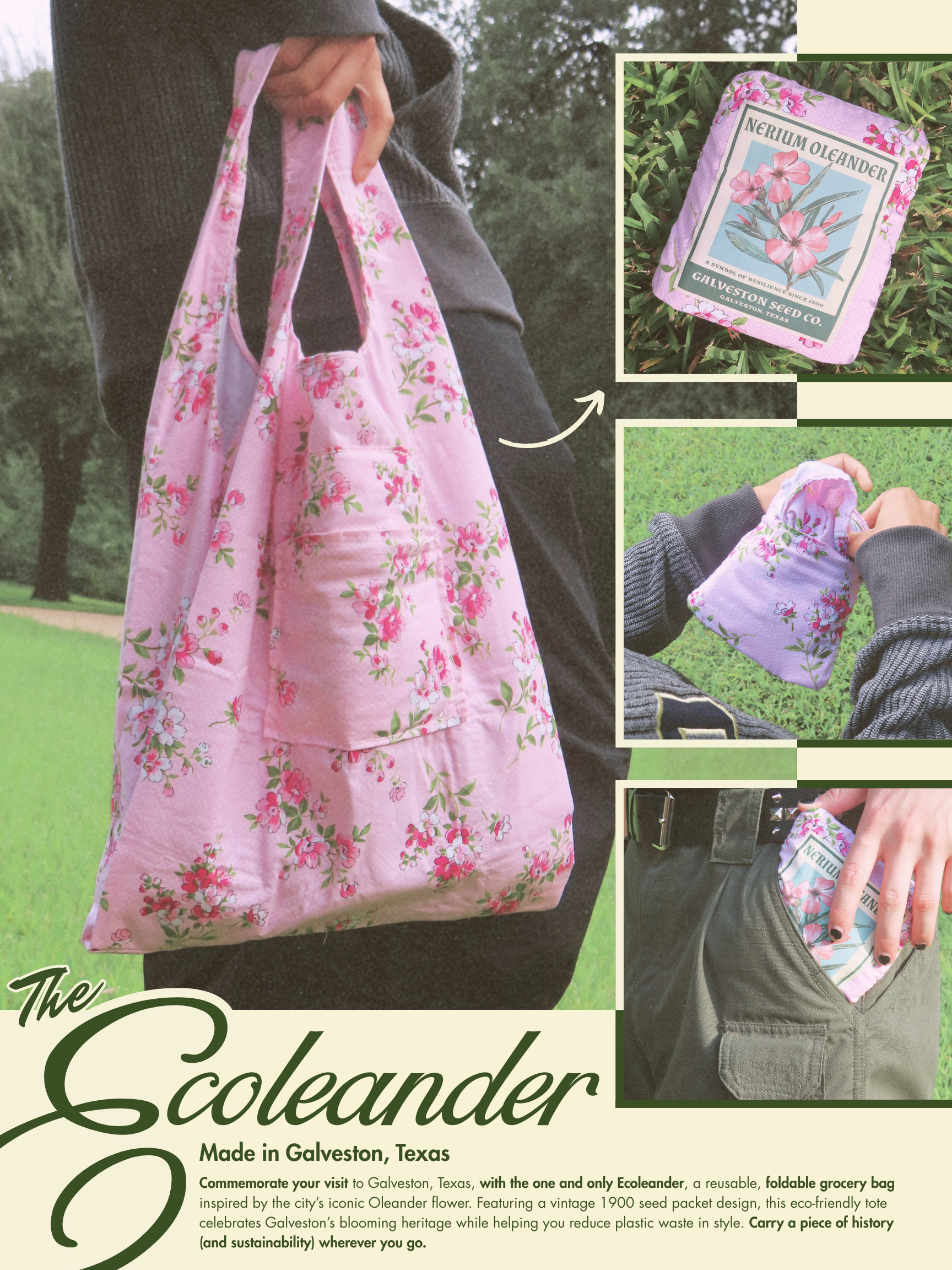
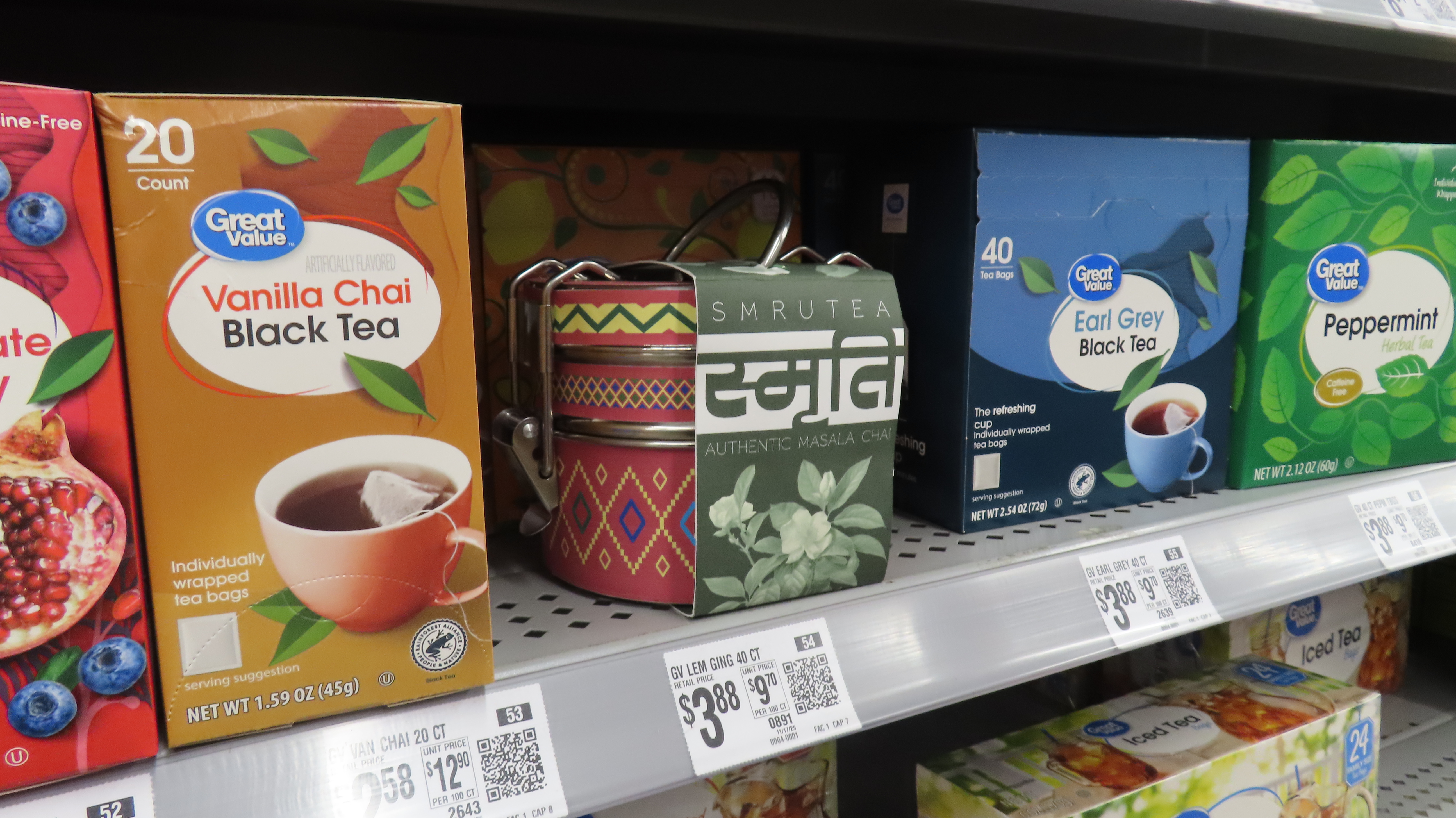
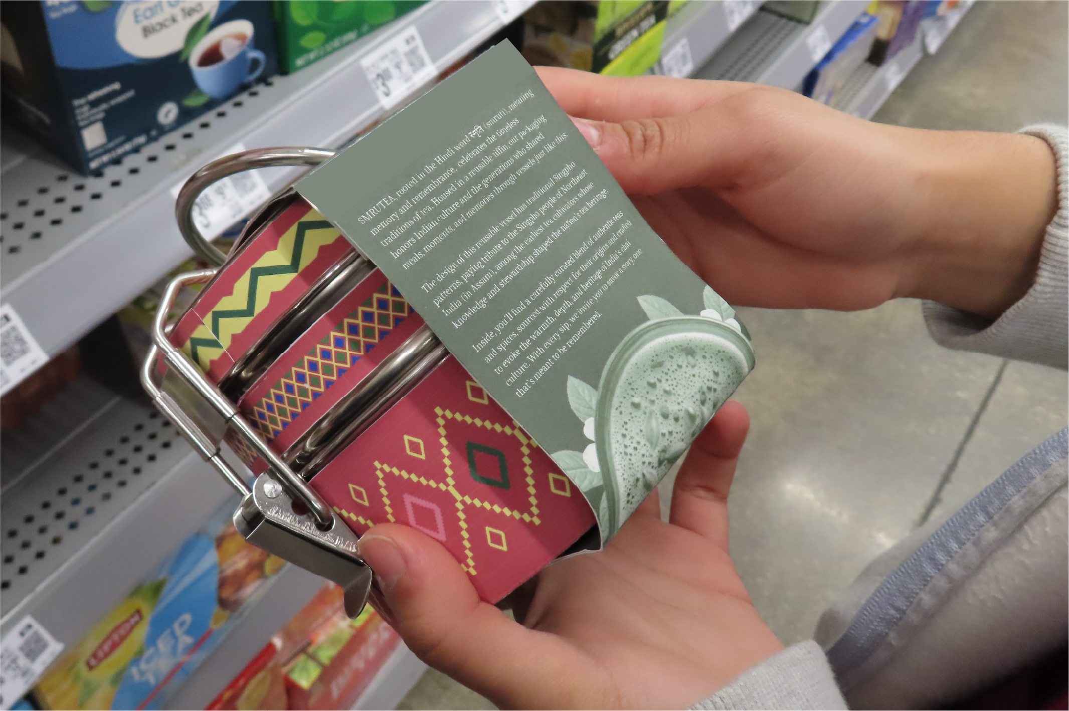
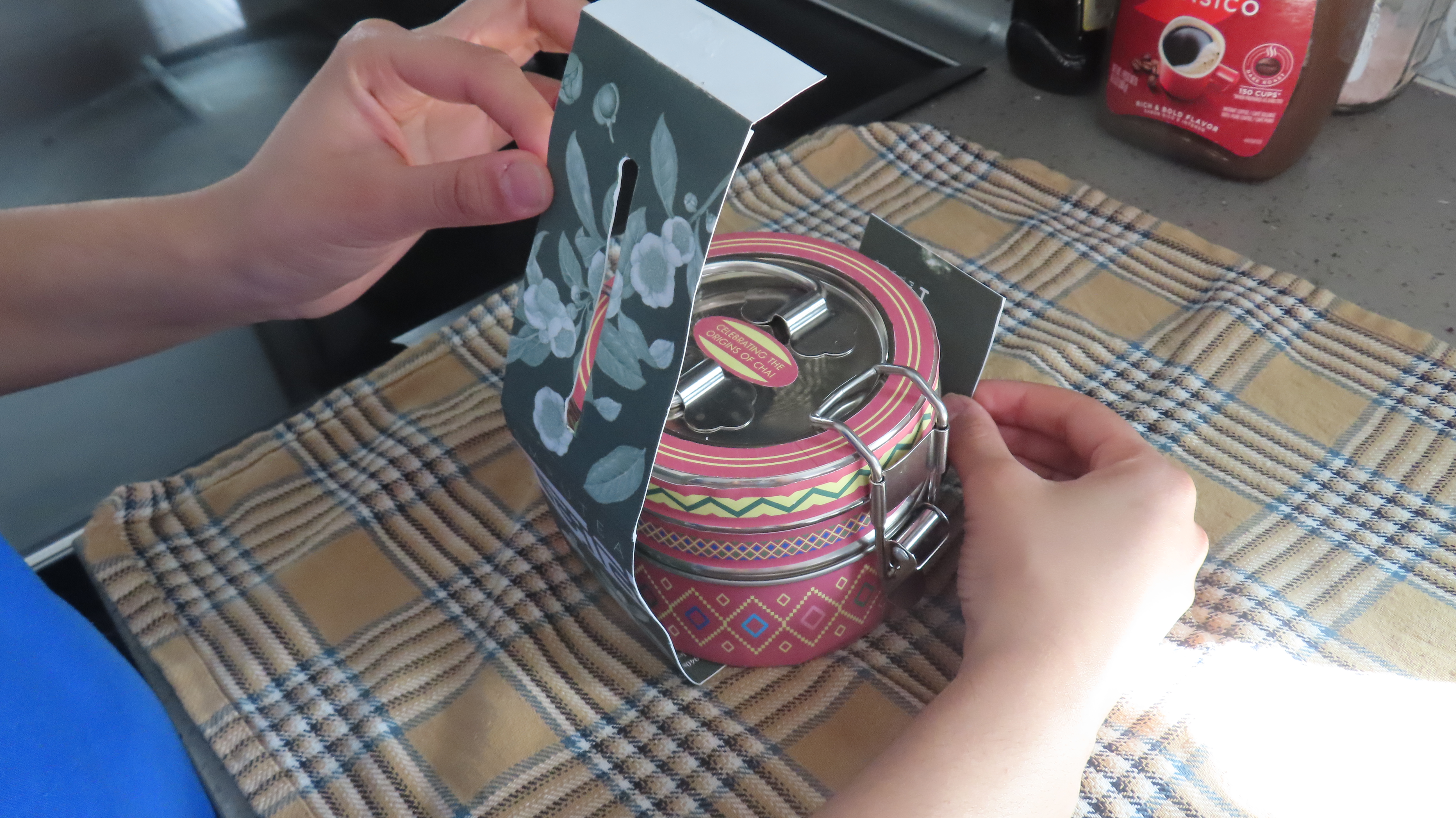
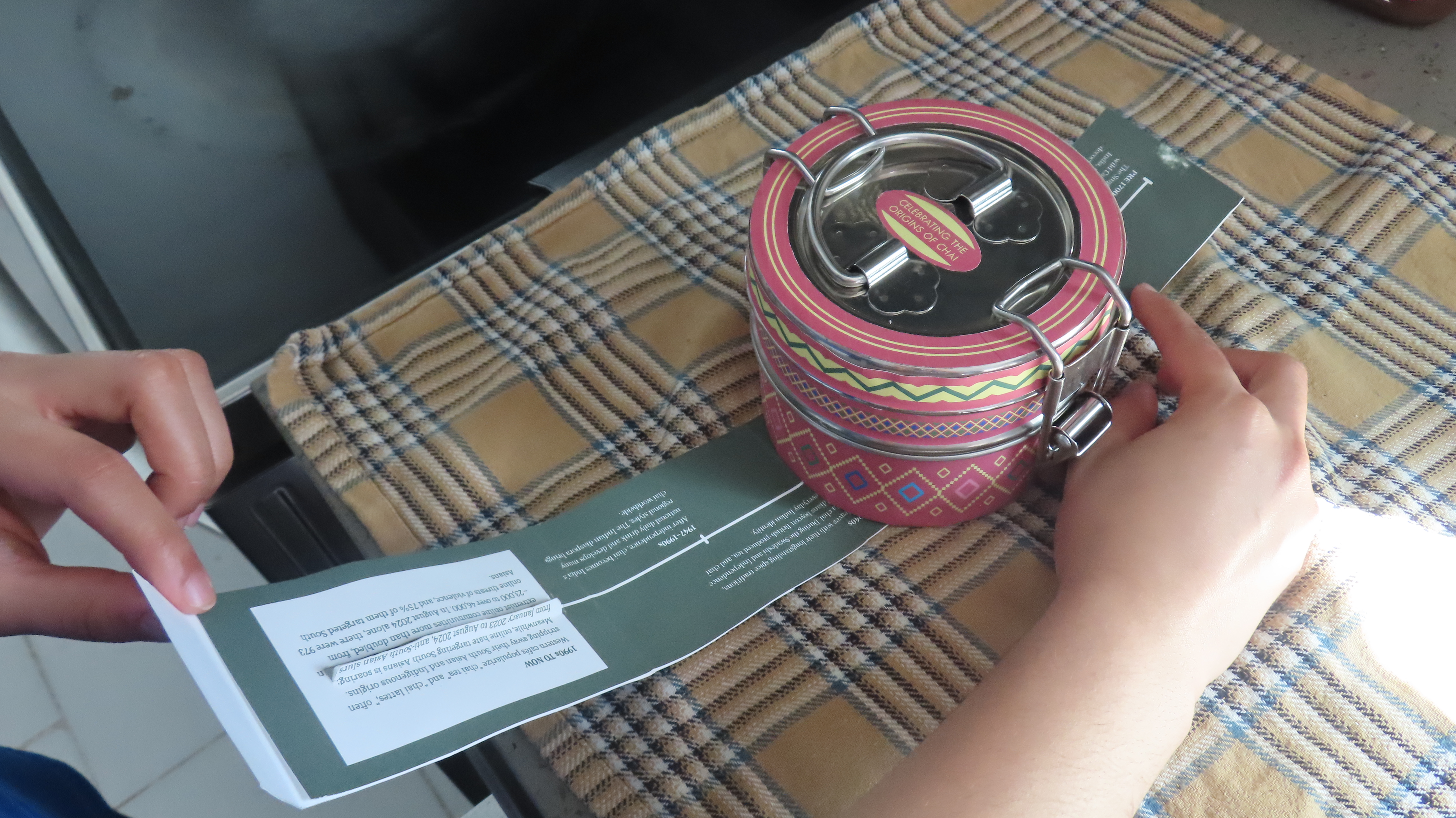
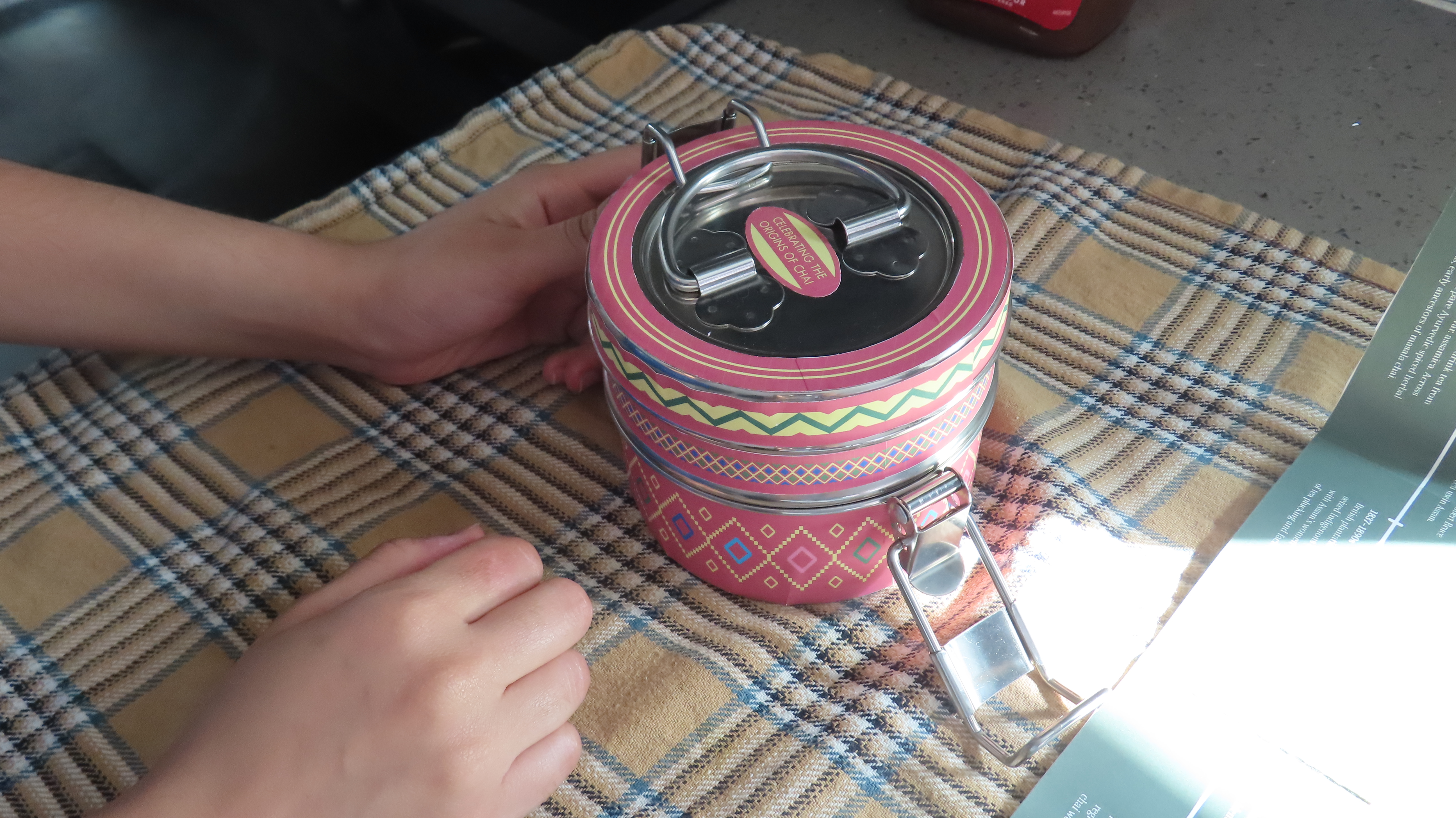
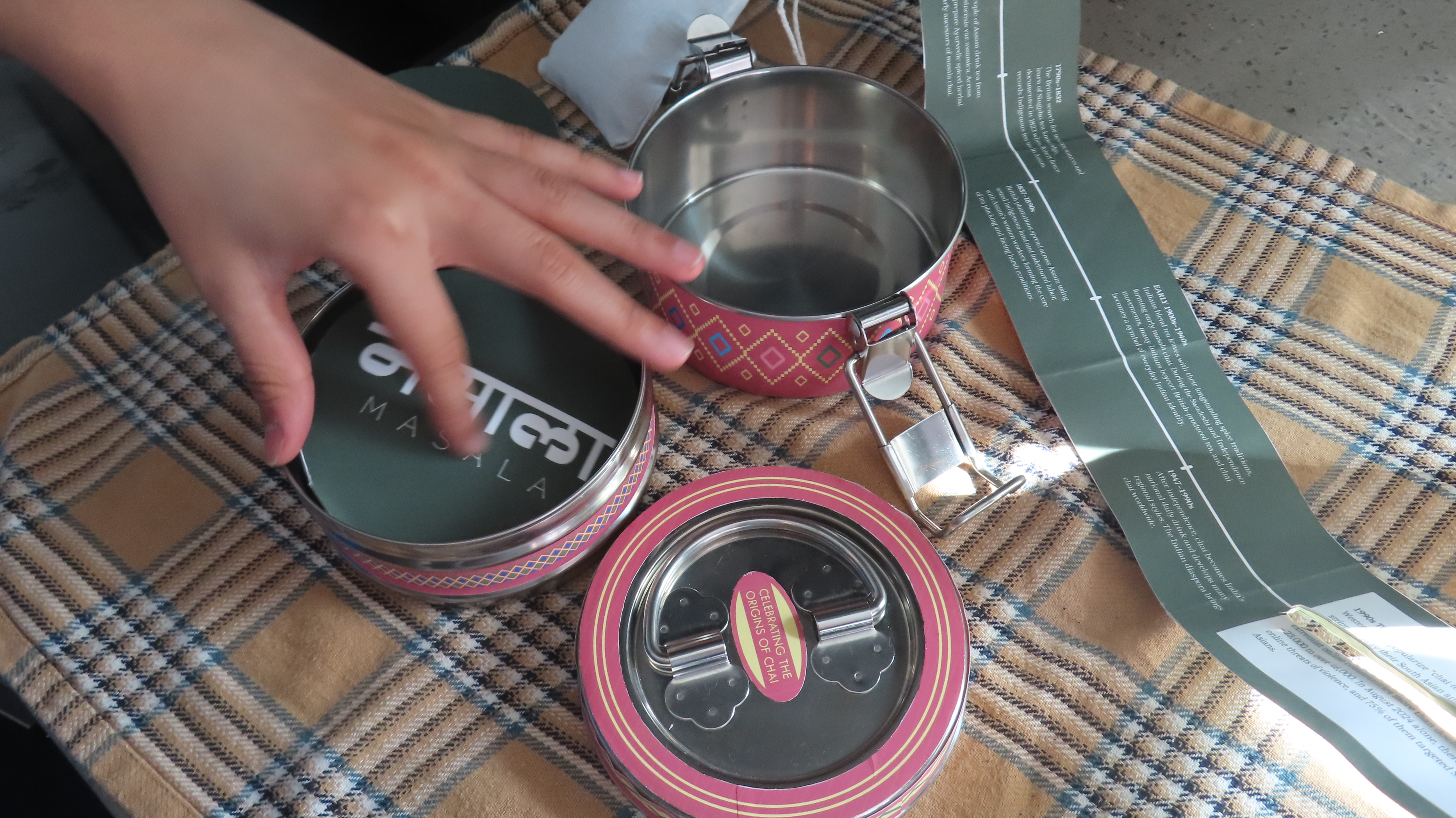
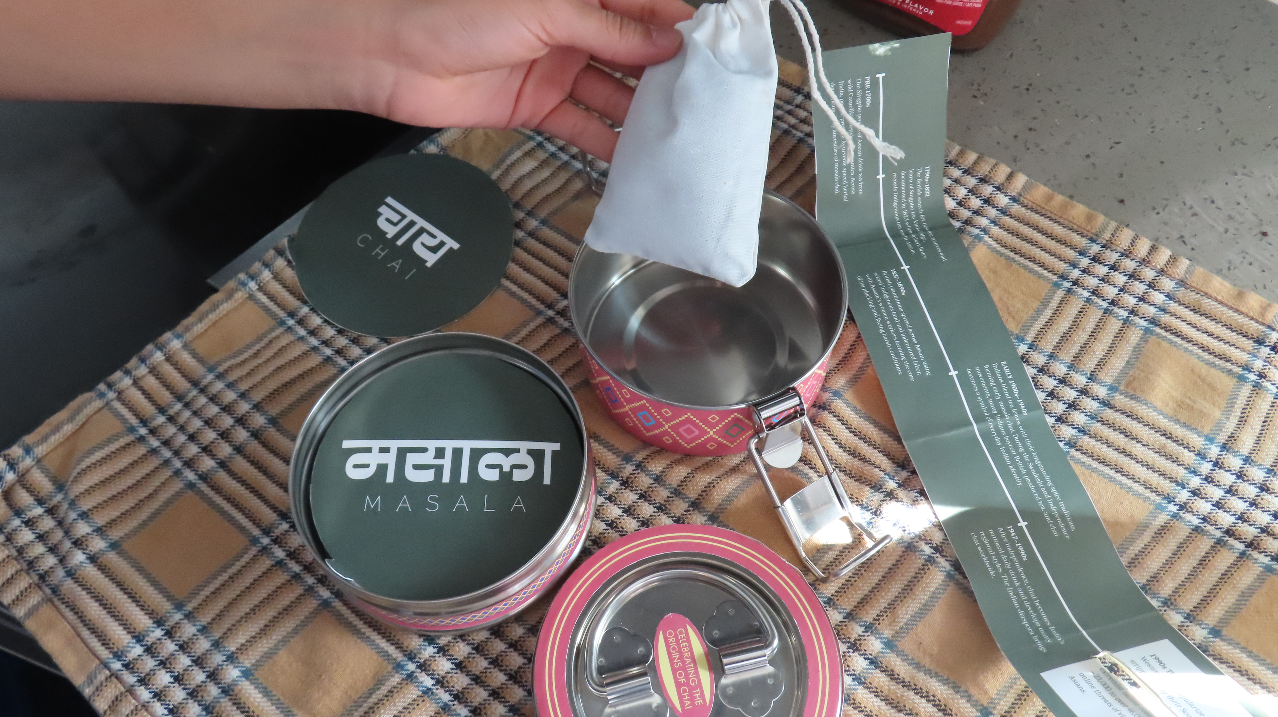
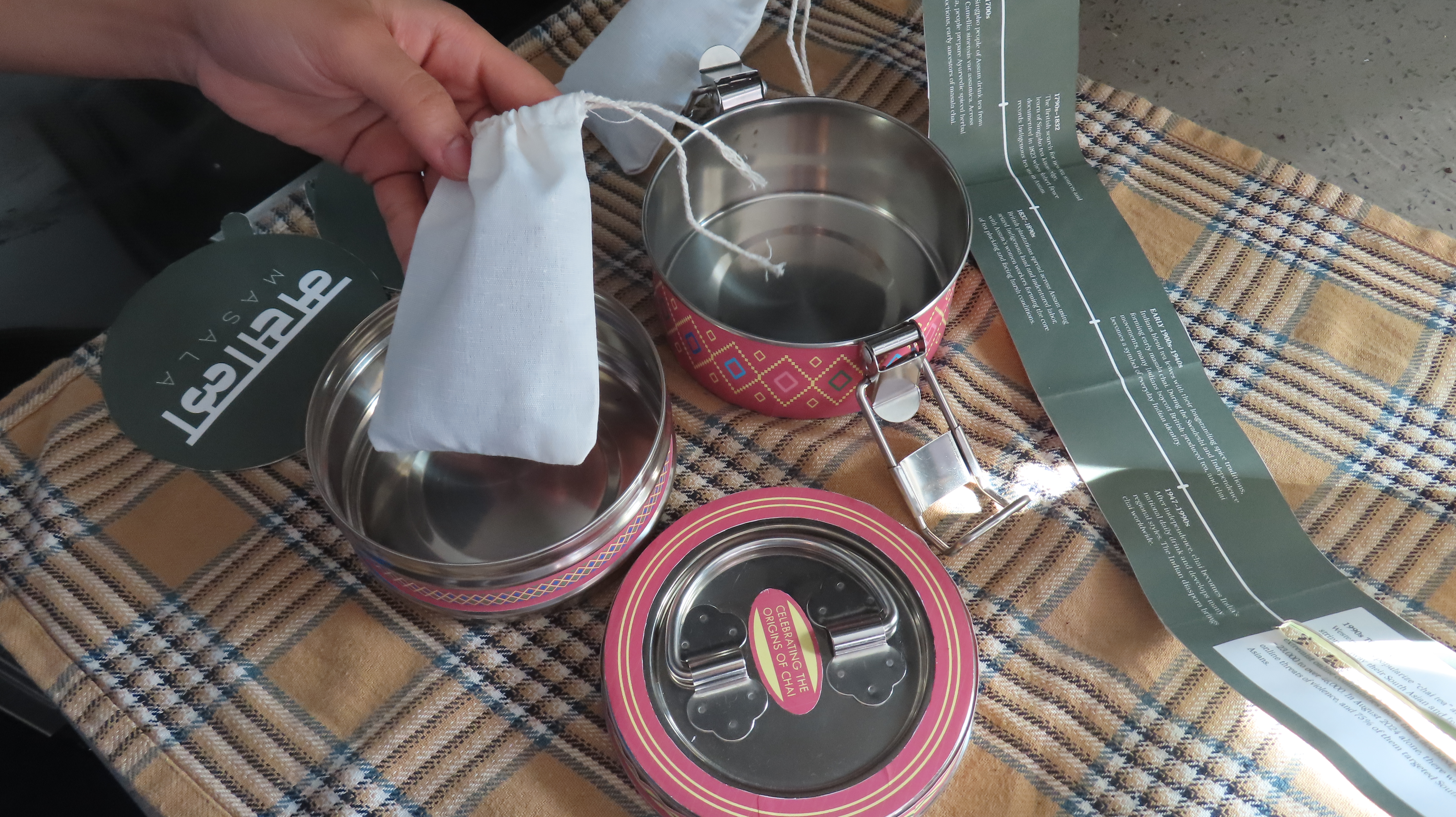
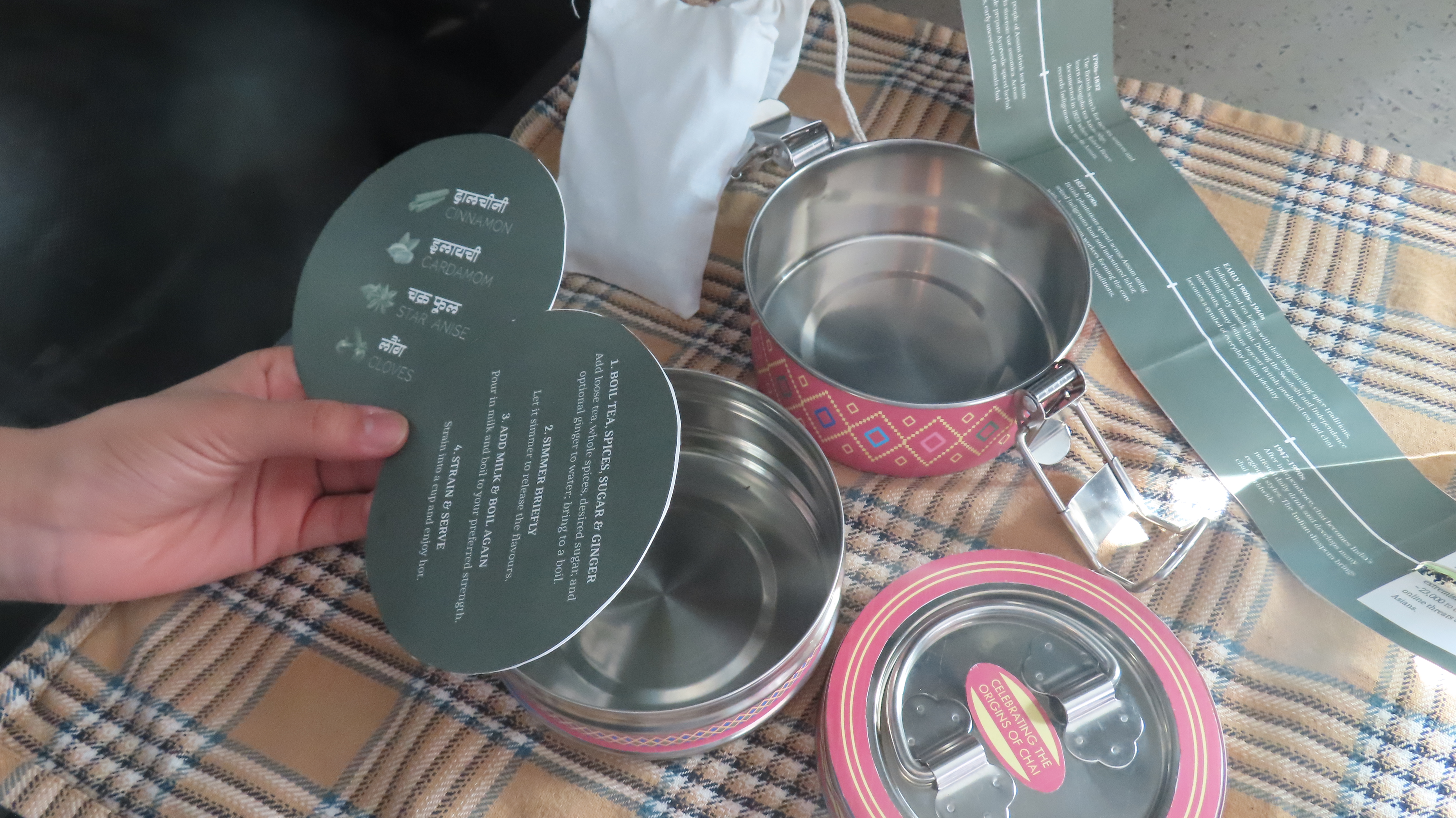
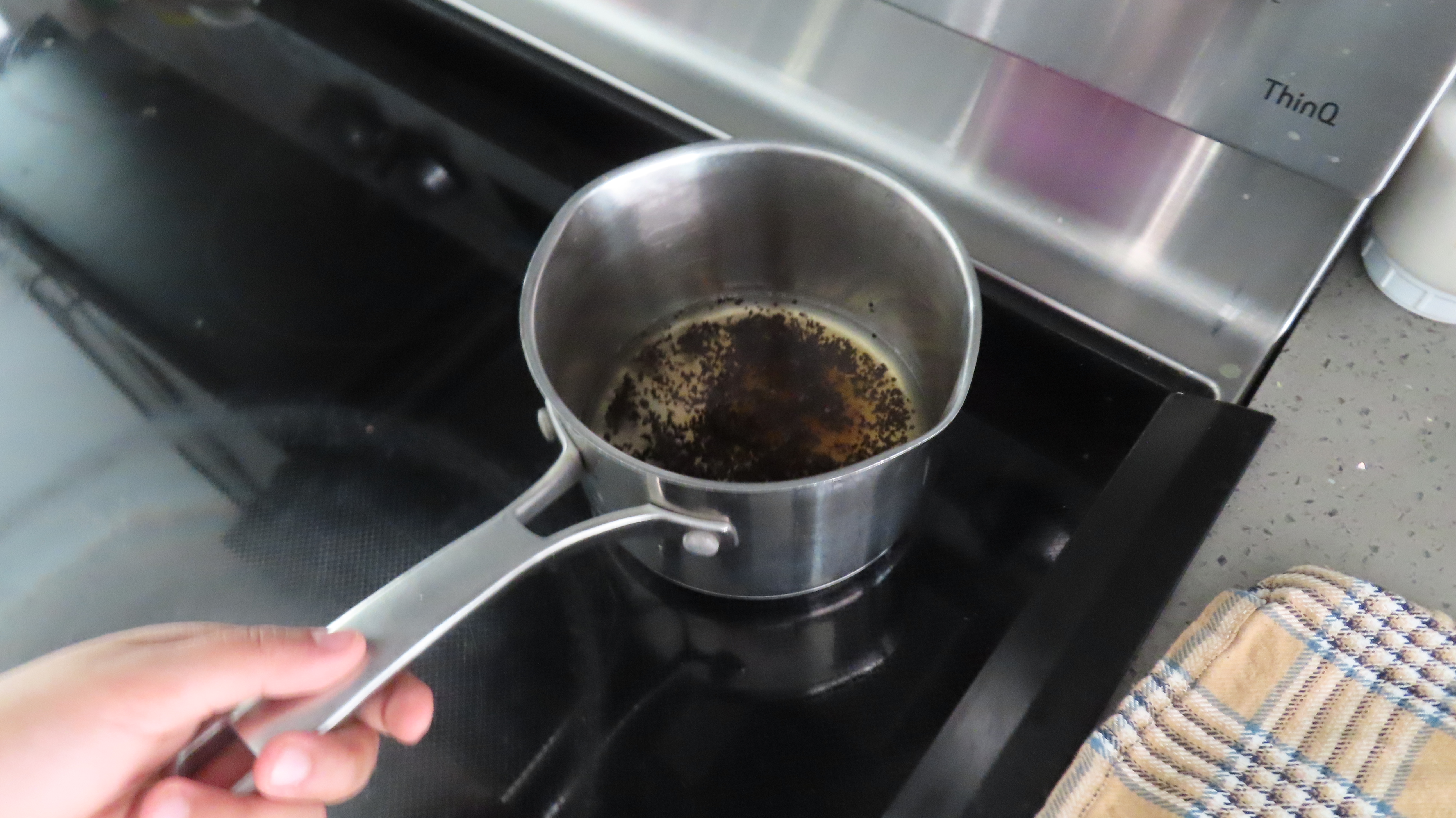
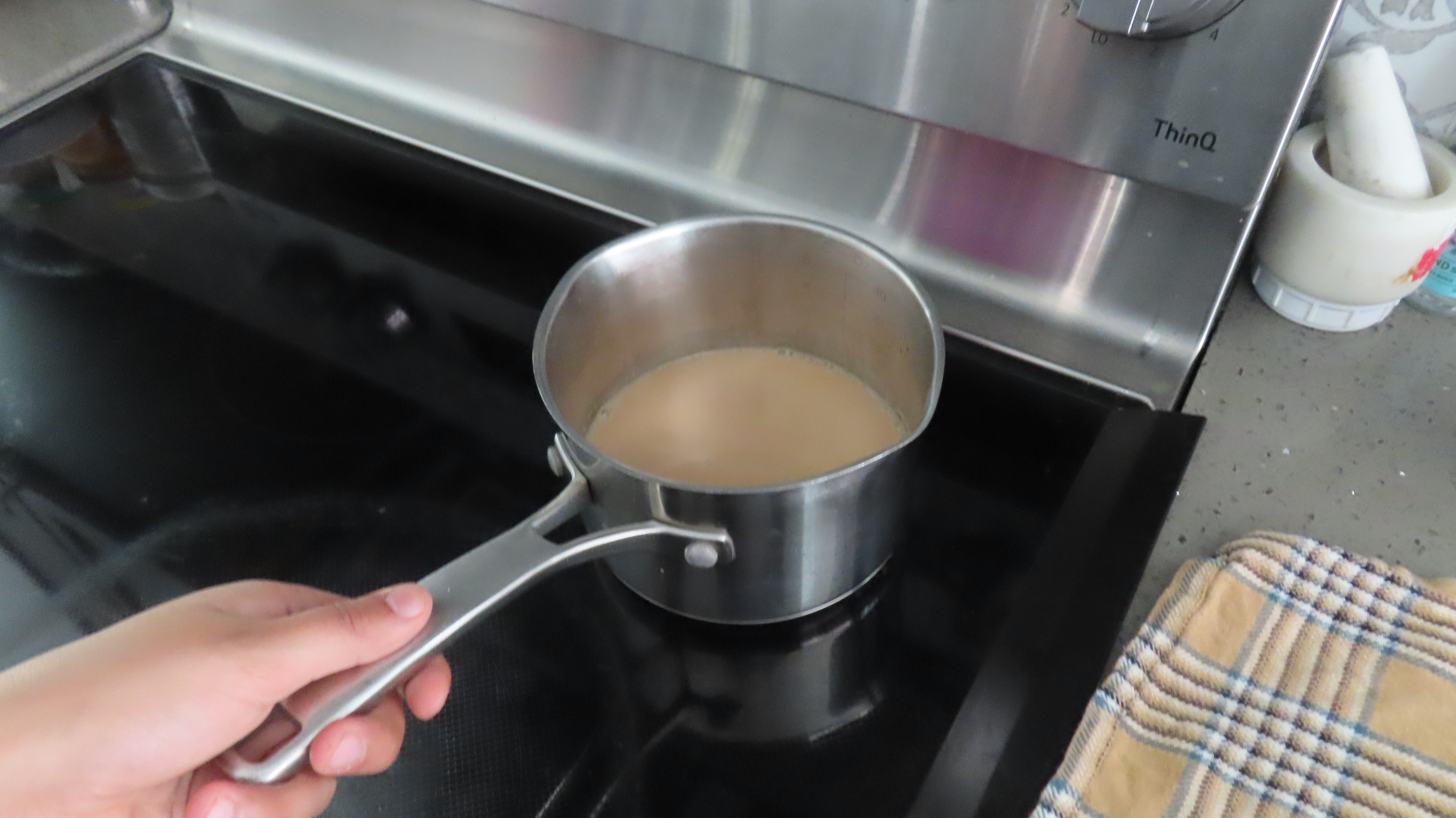
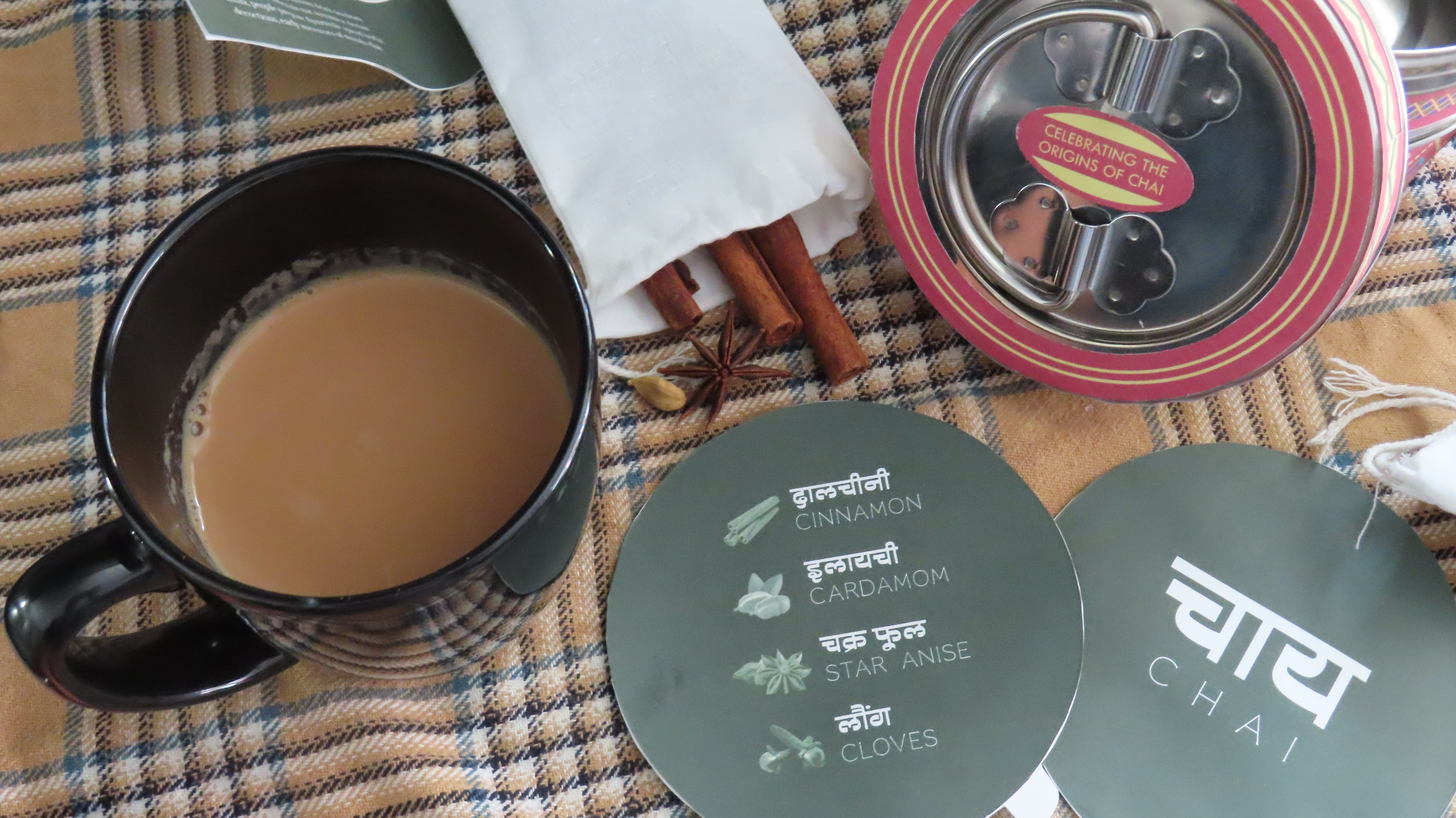
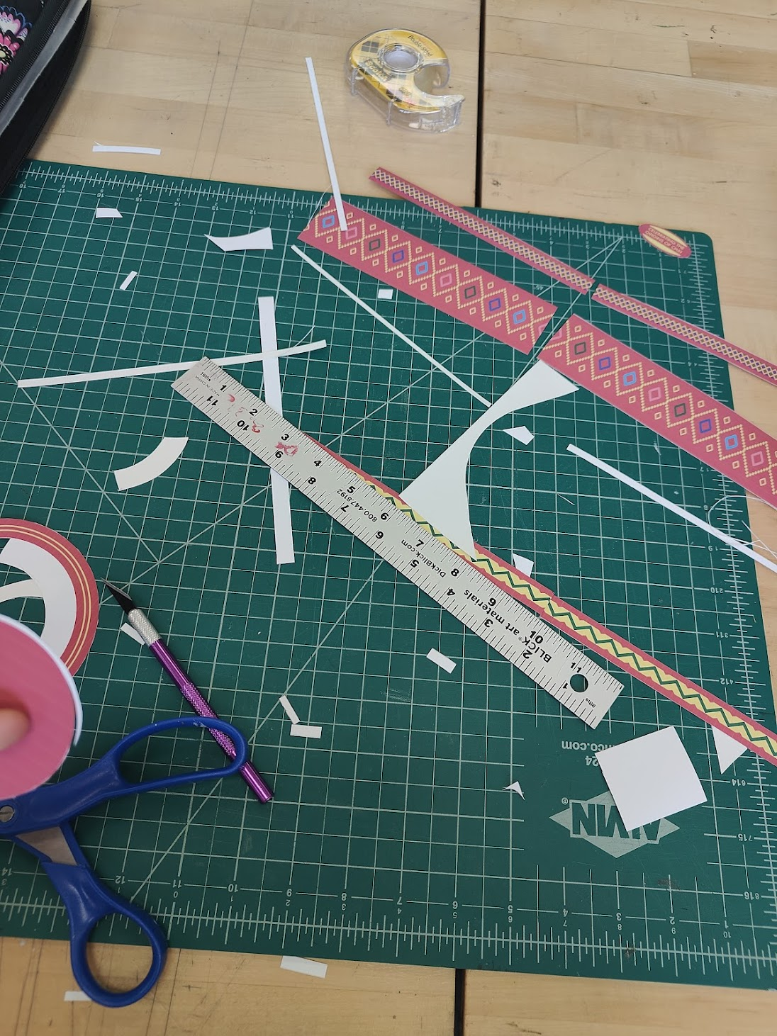
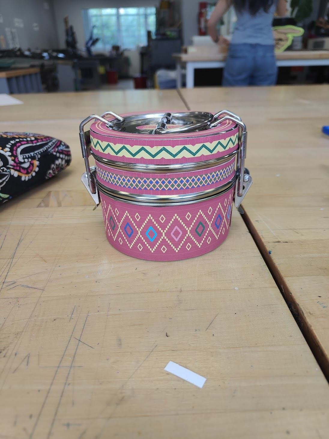
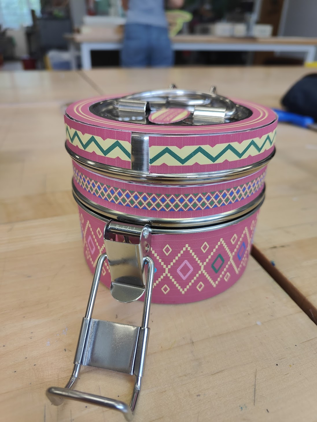
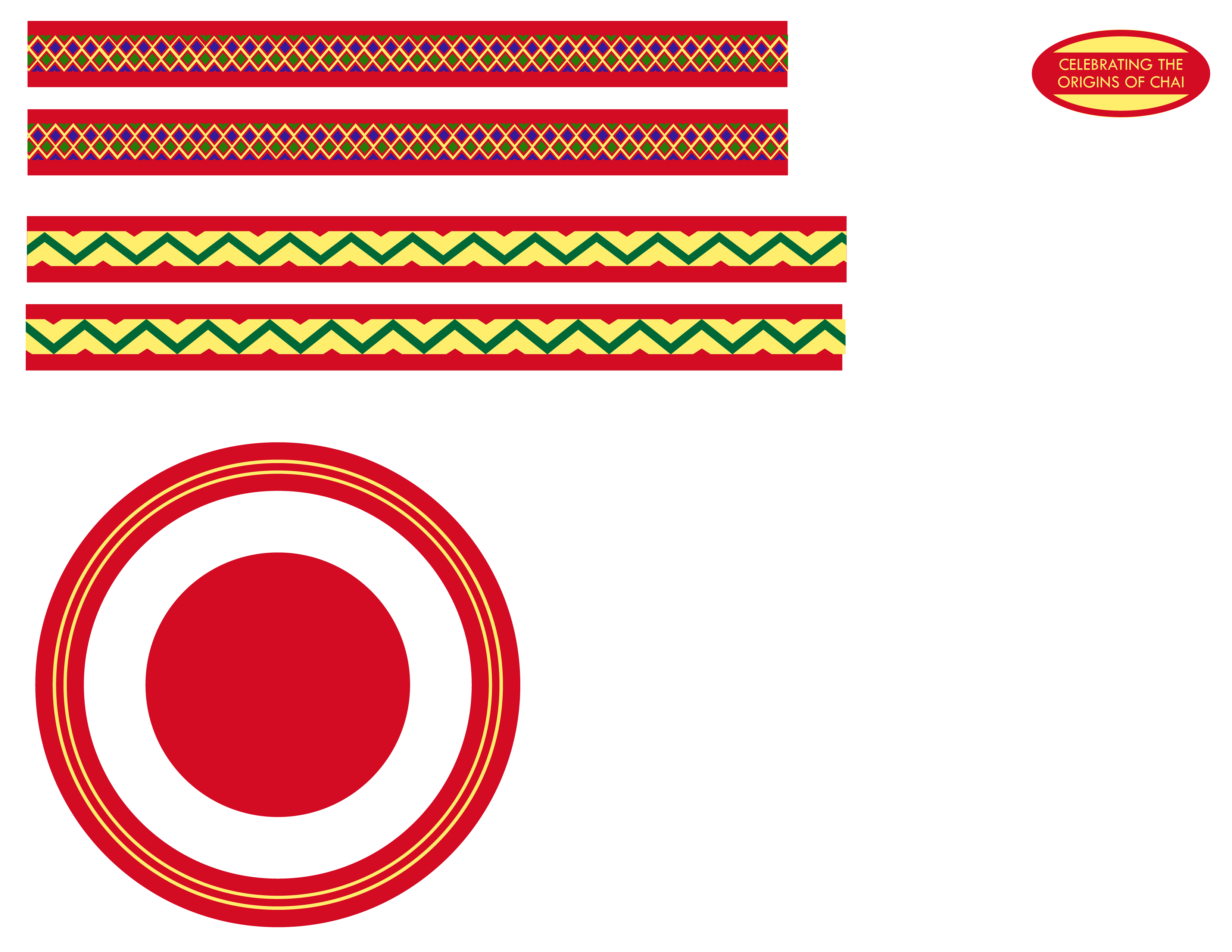
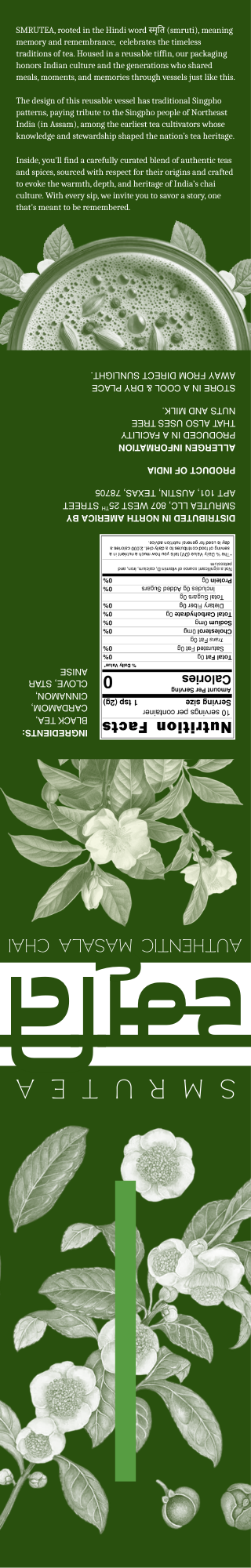
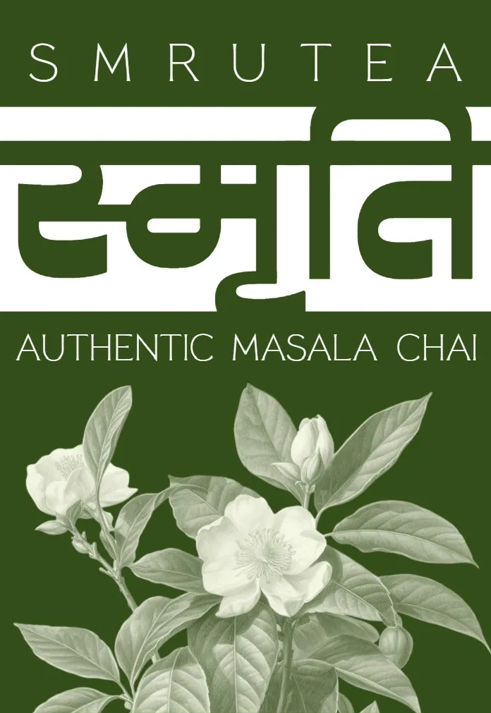
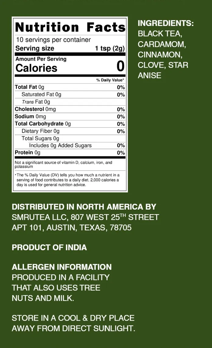
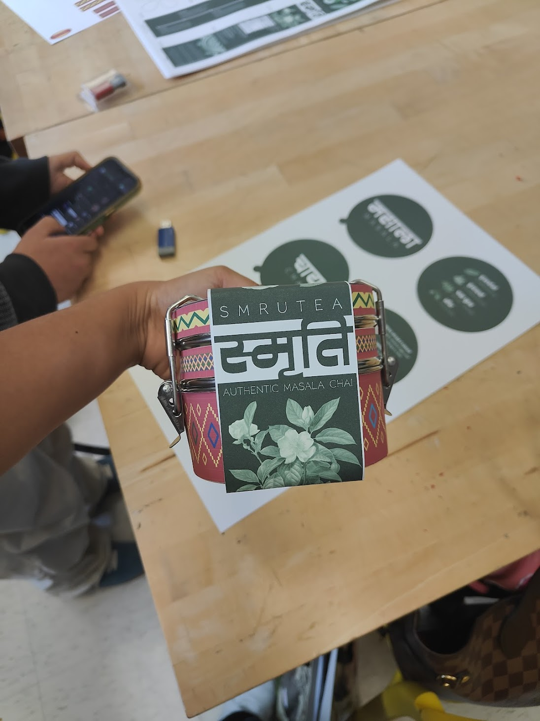
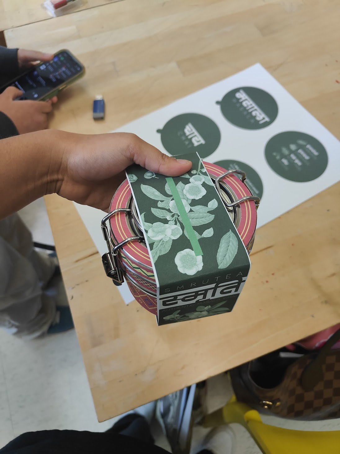
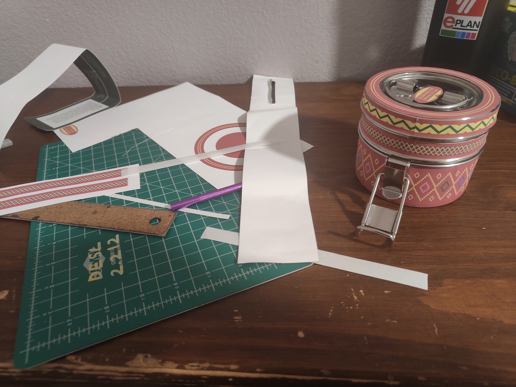
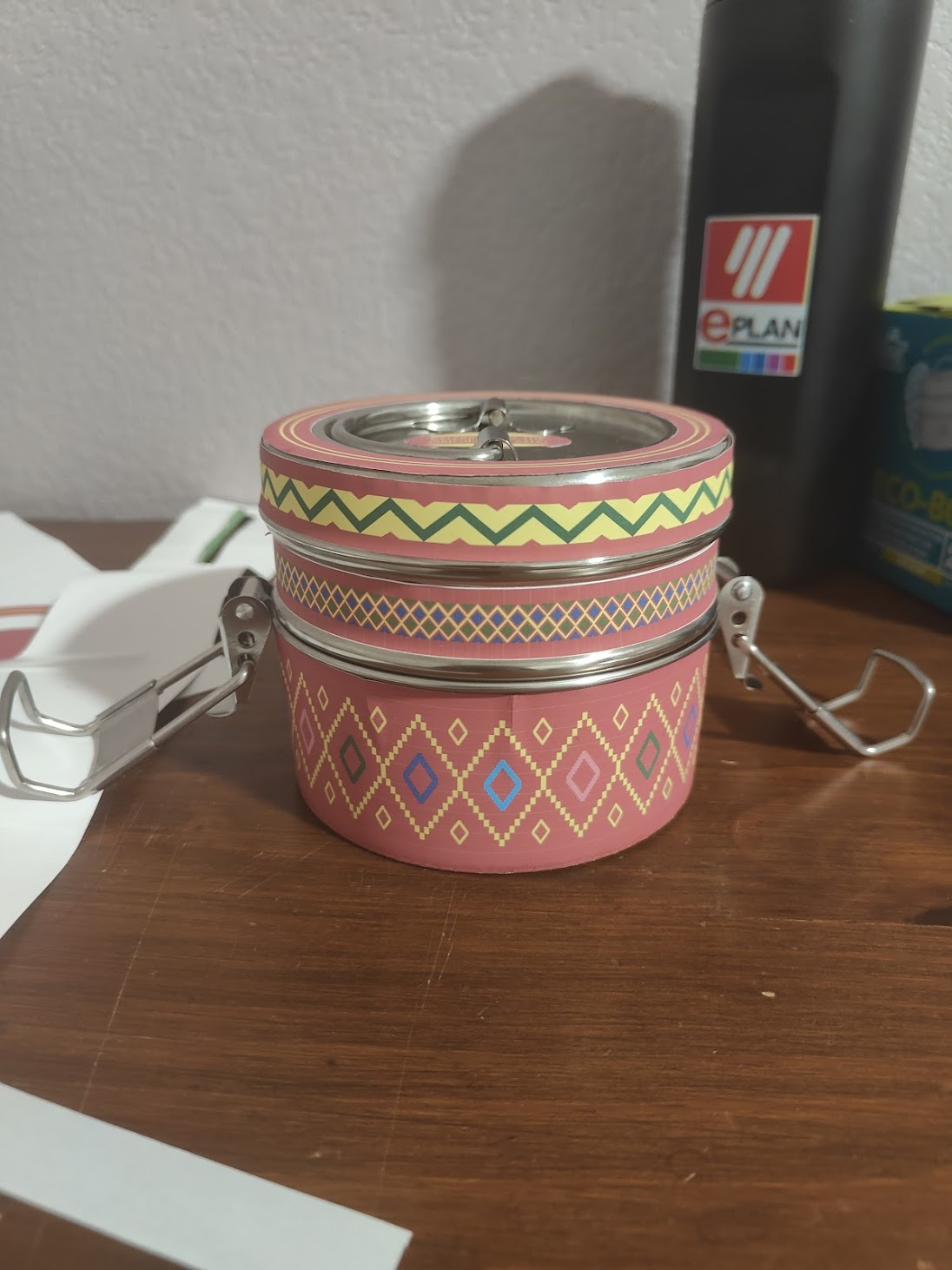
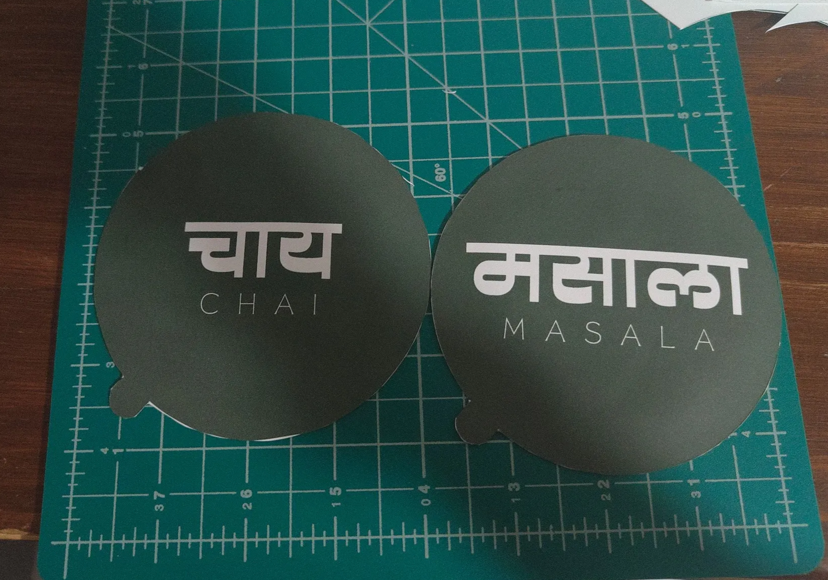
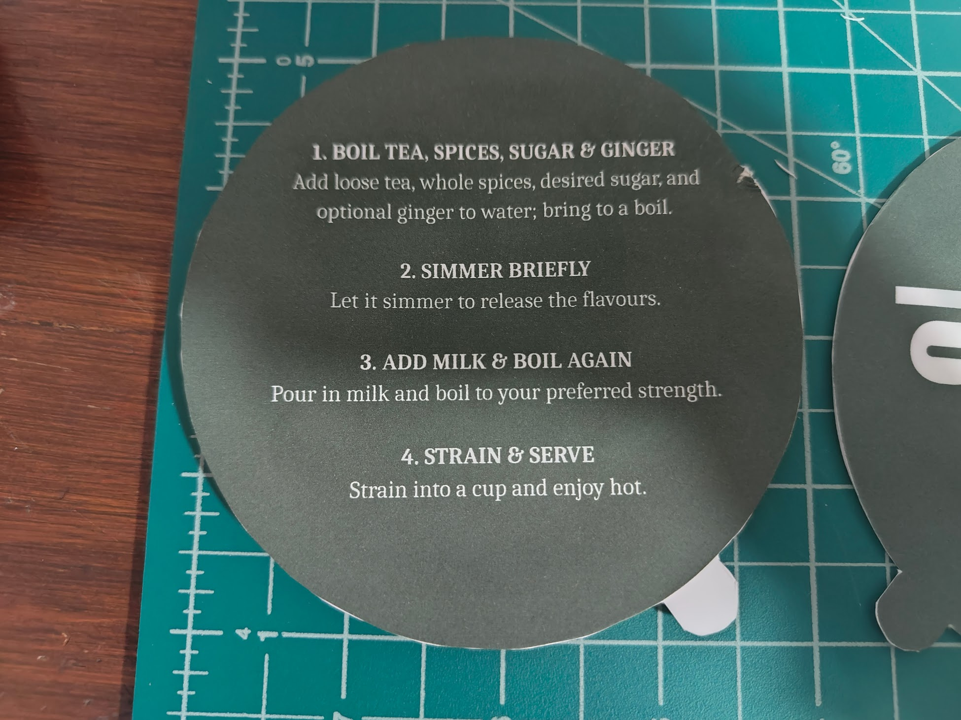
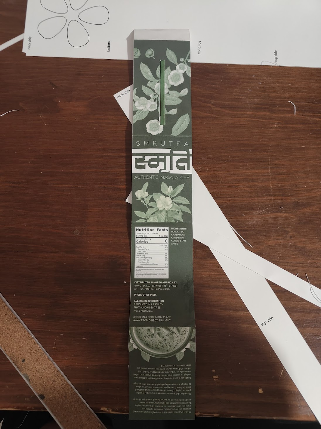
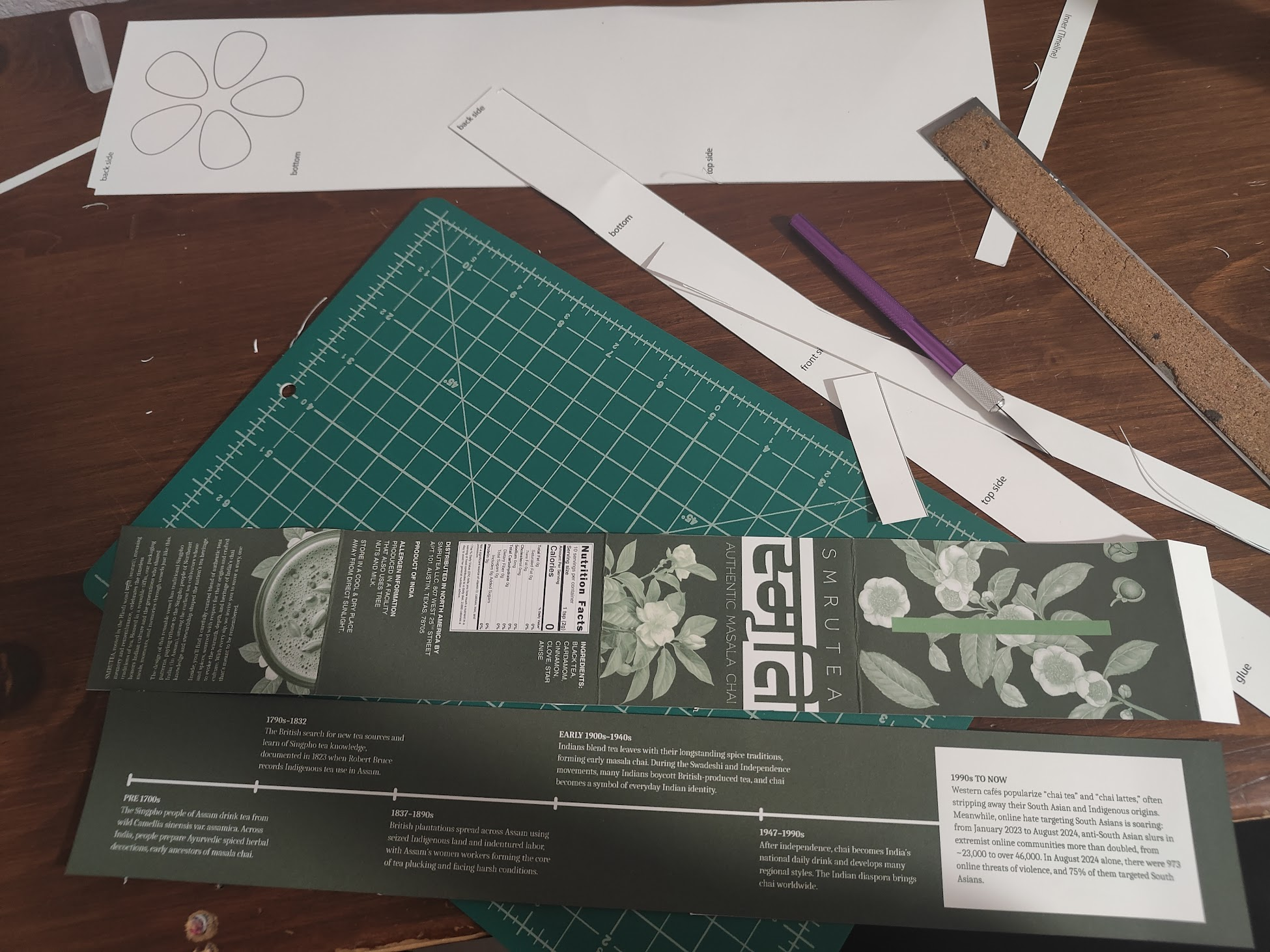
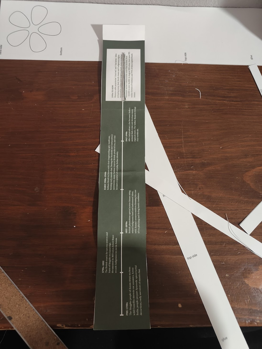
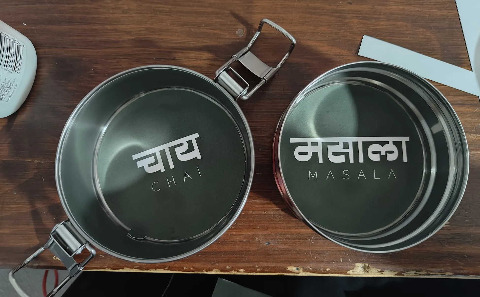
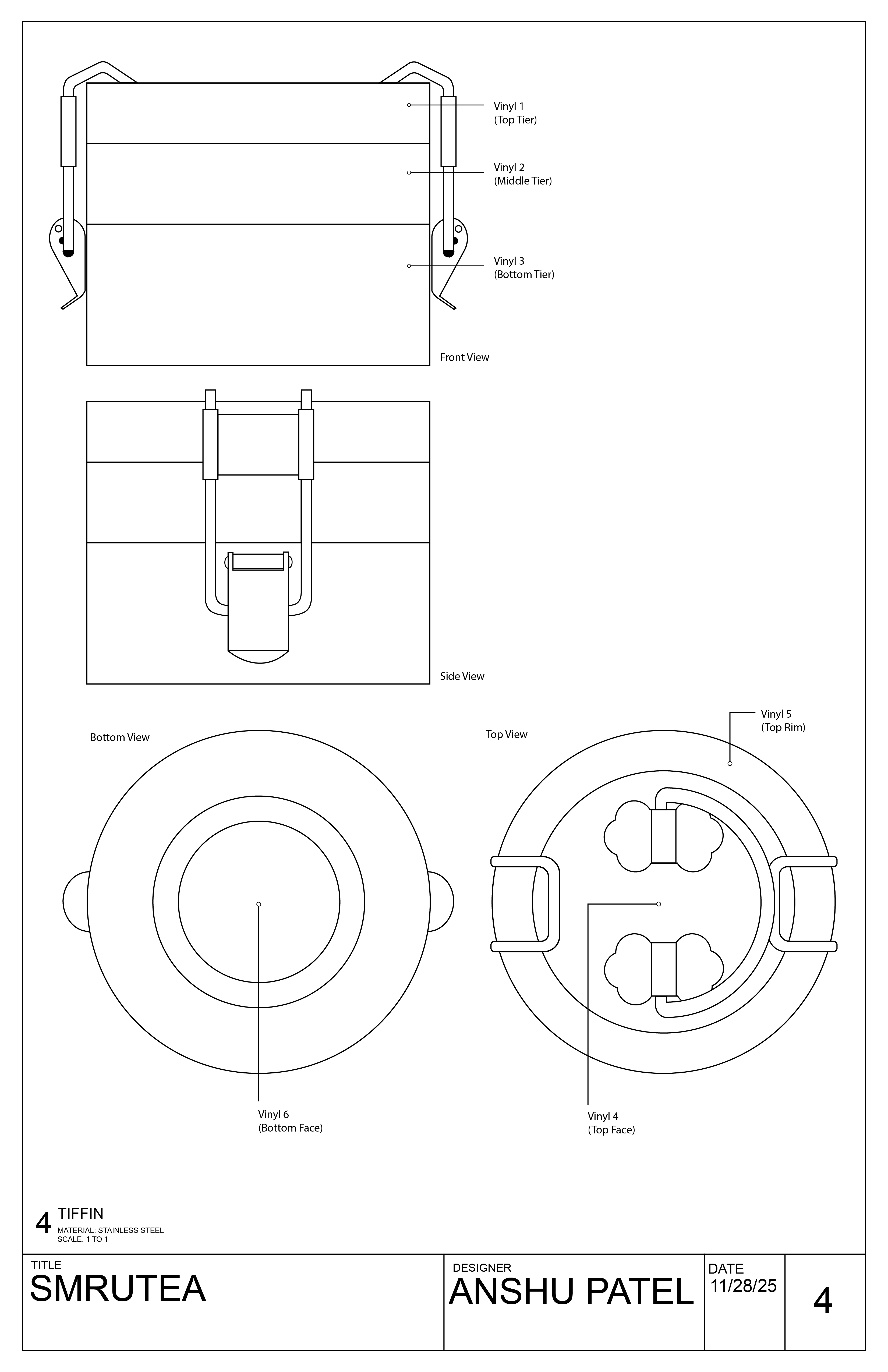
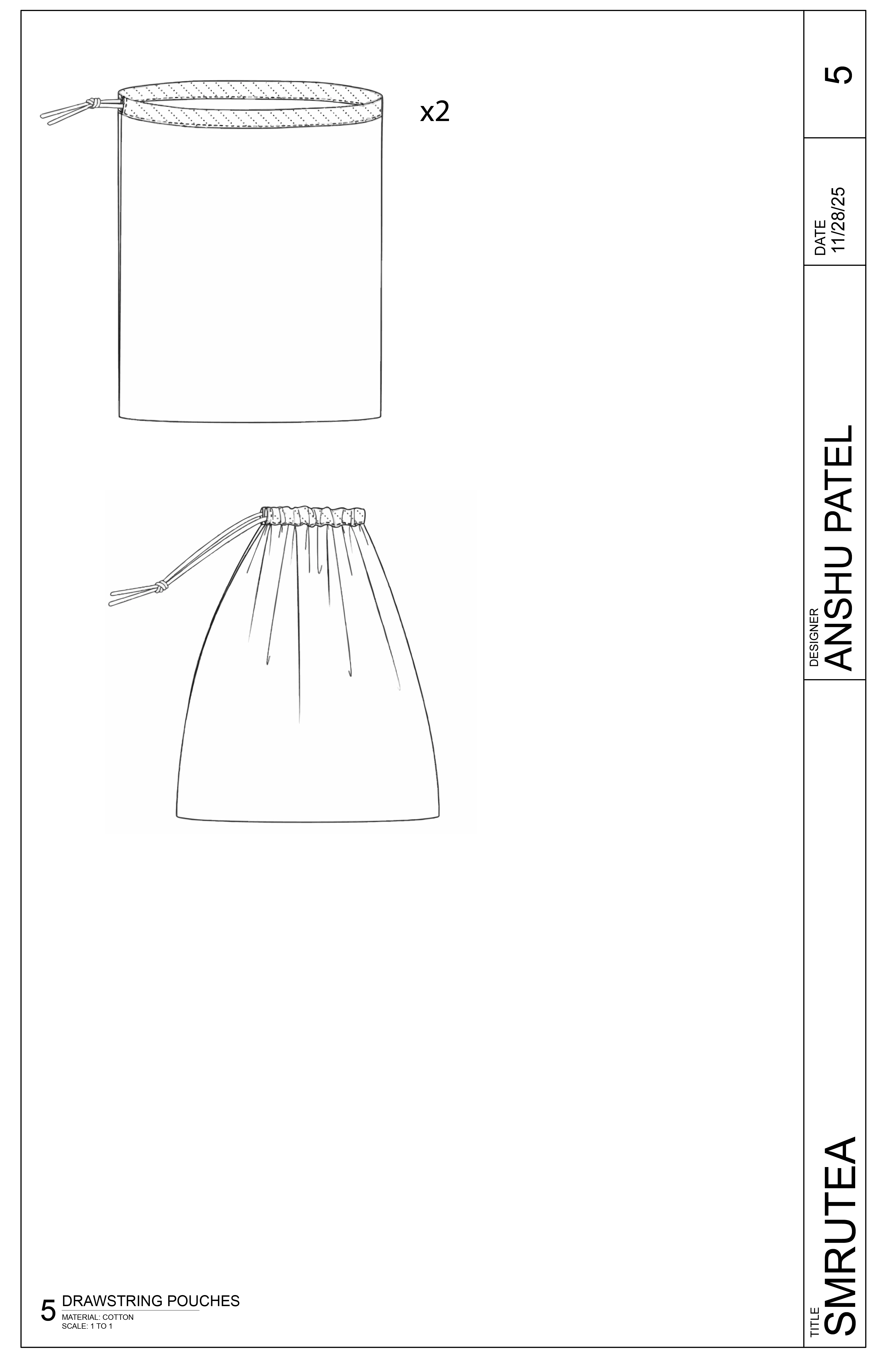
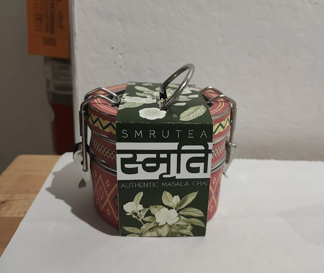
Packaging design, discursive design, cultural research, illustration, print production
SmruteaFall 2025
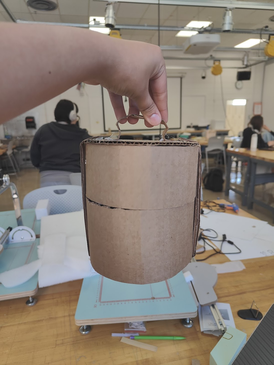
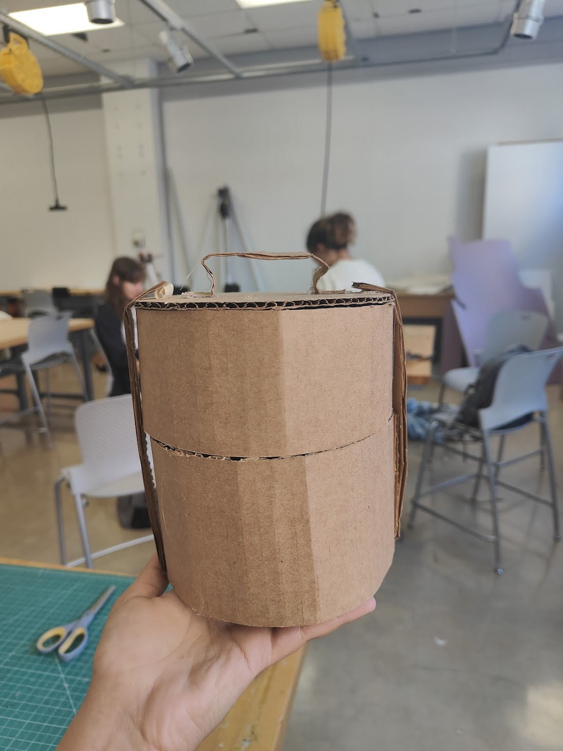
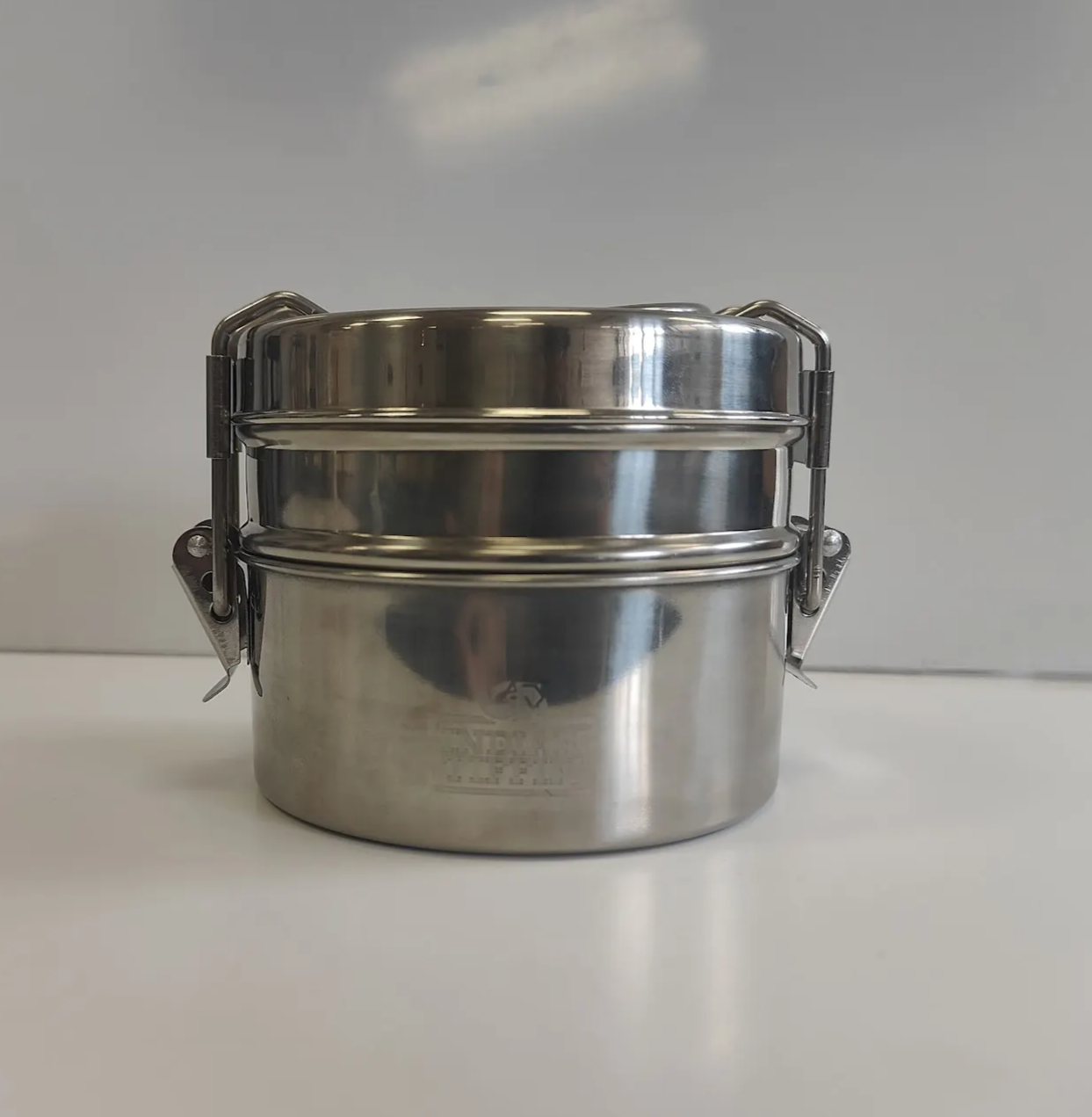
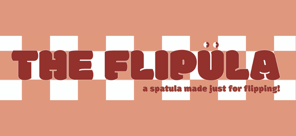
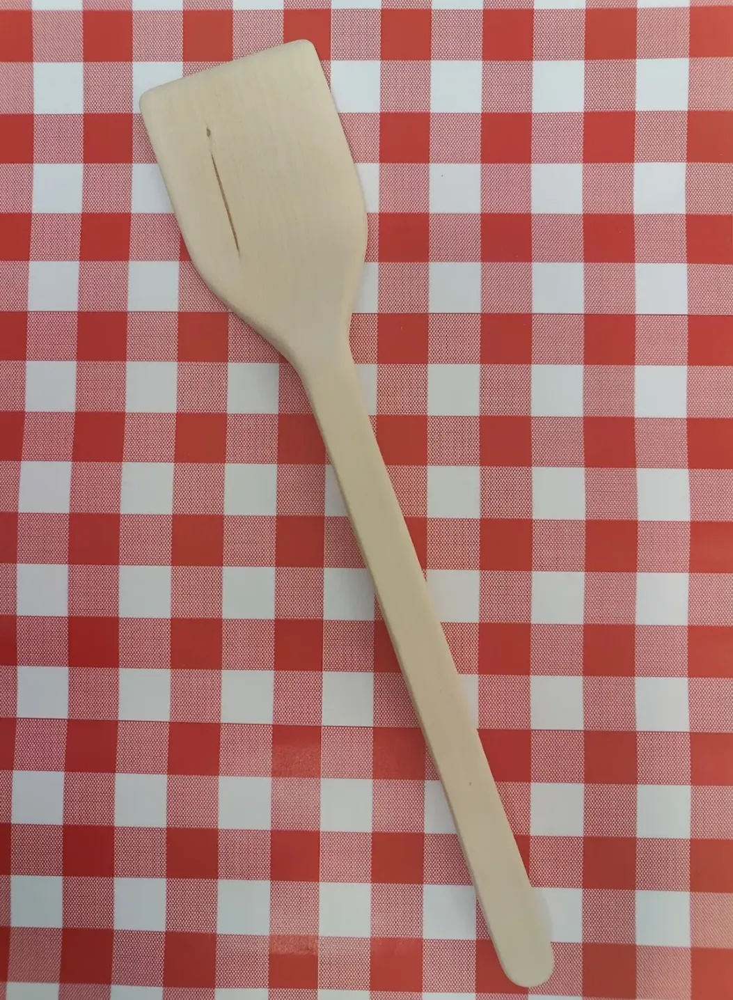
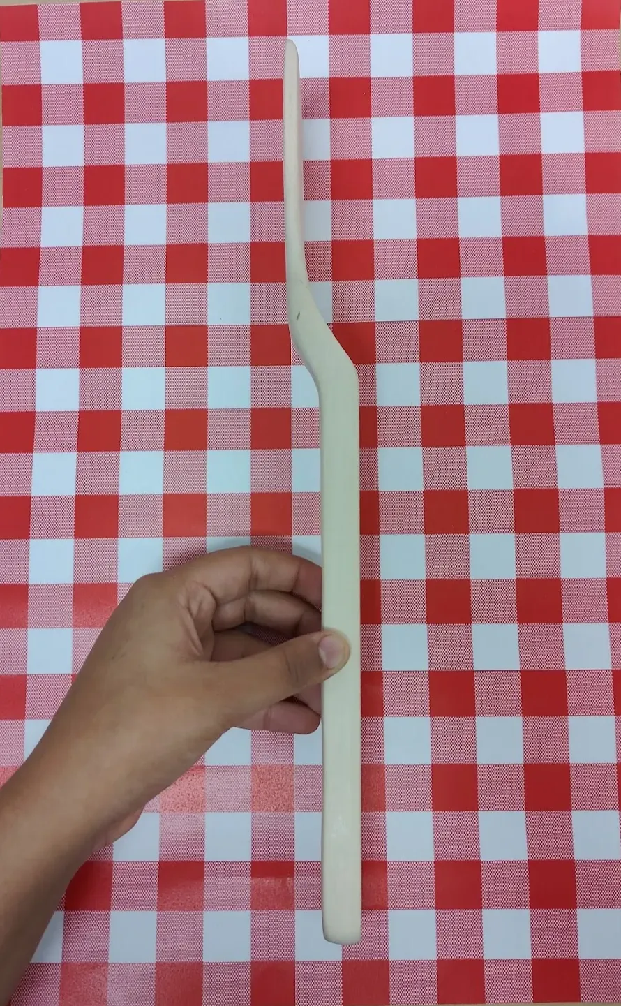
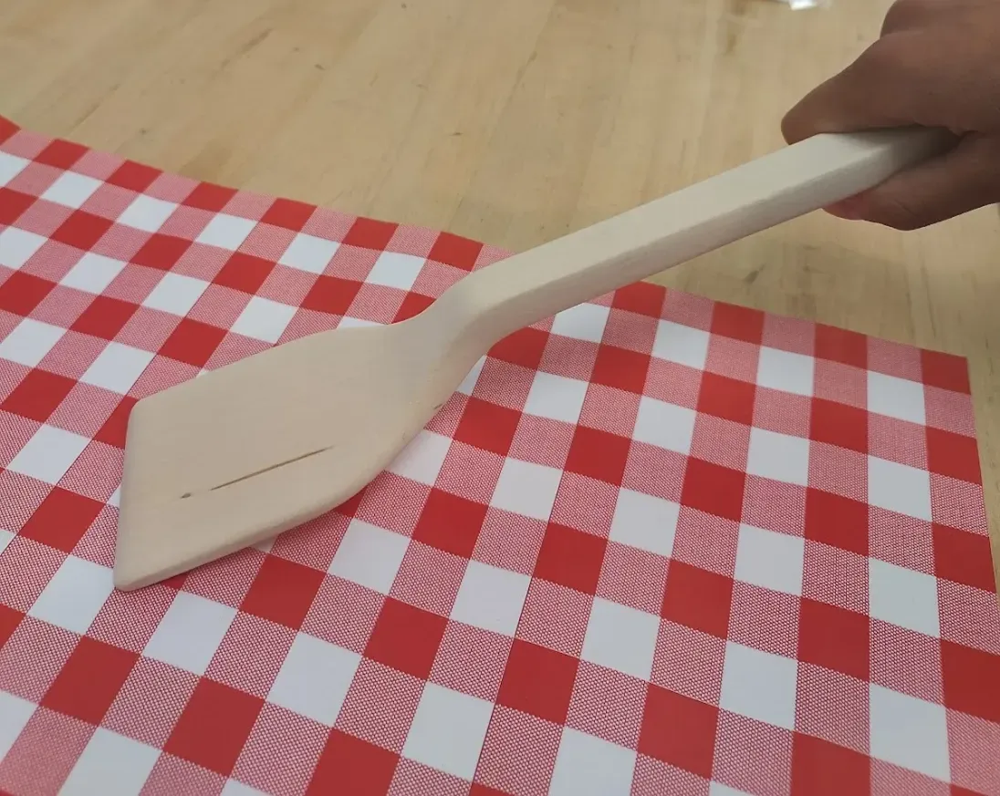
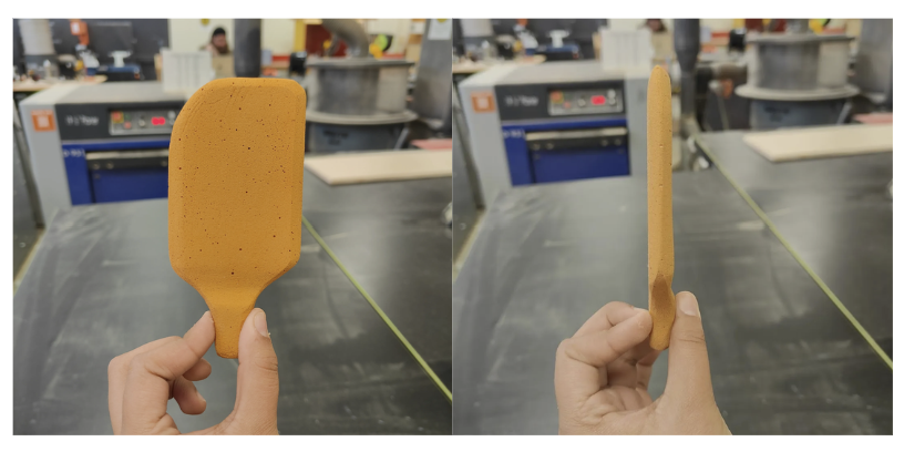
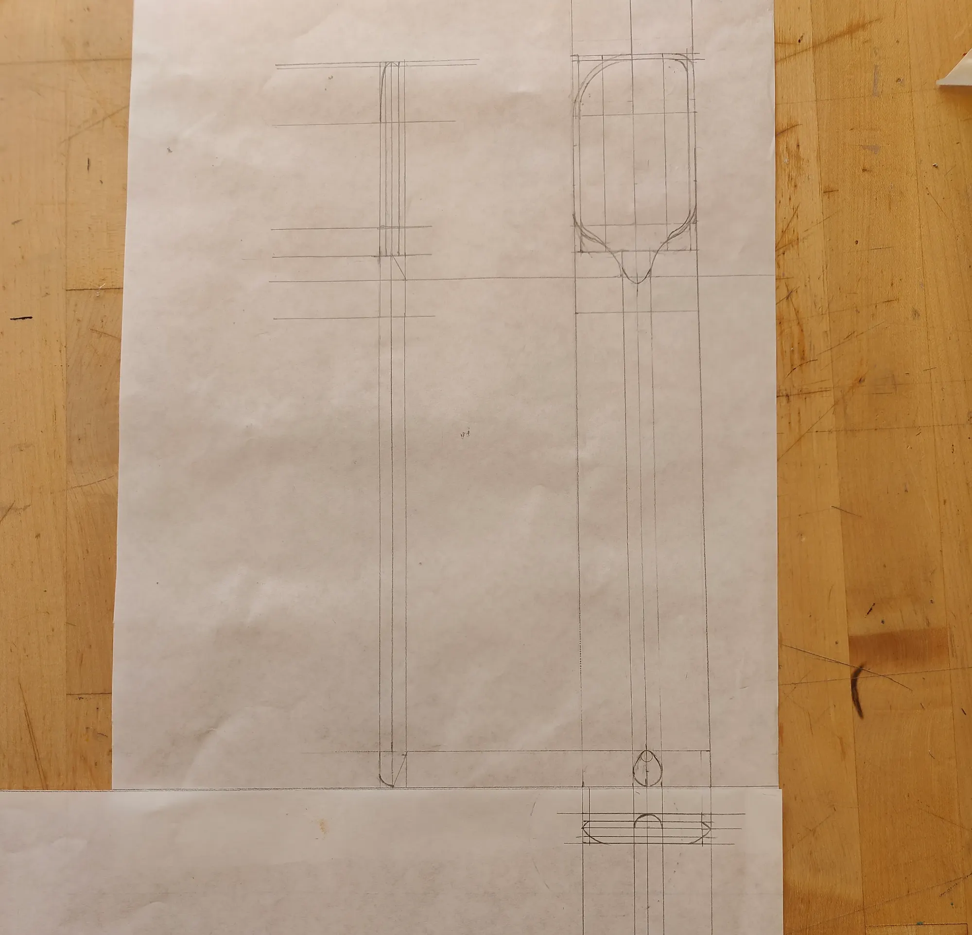
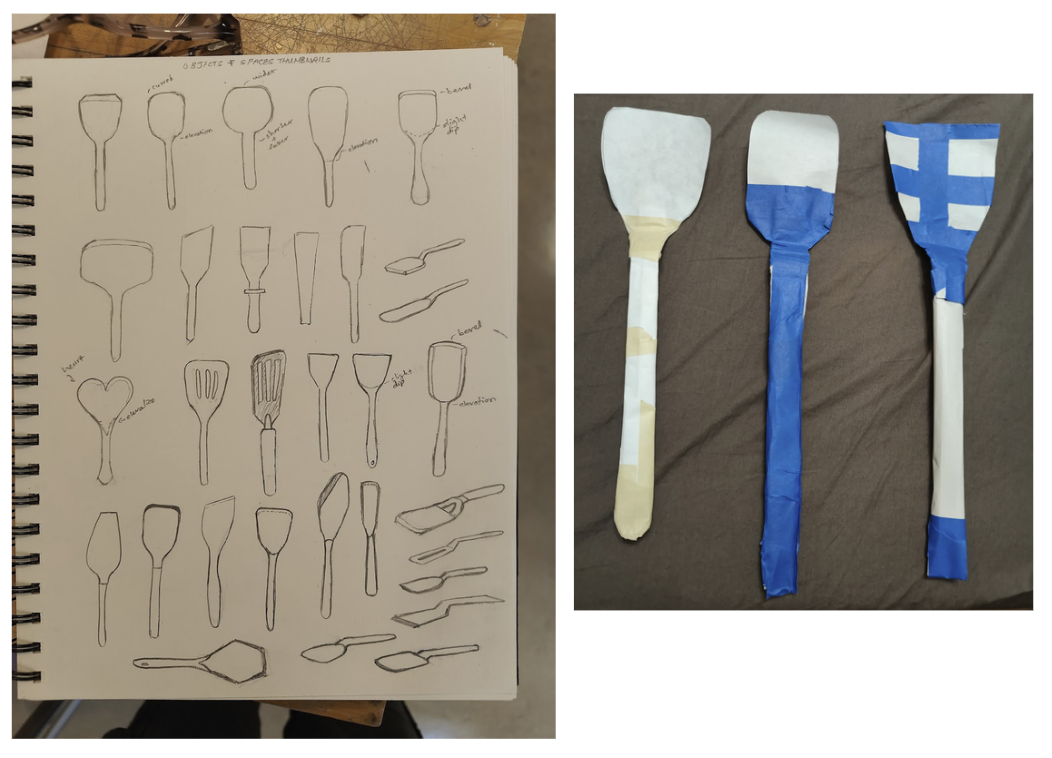
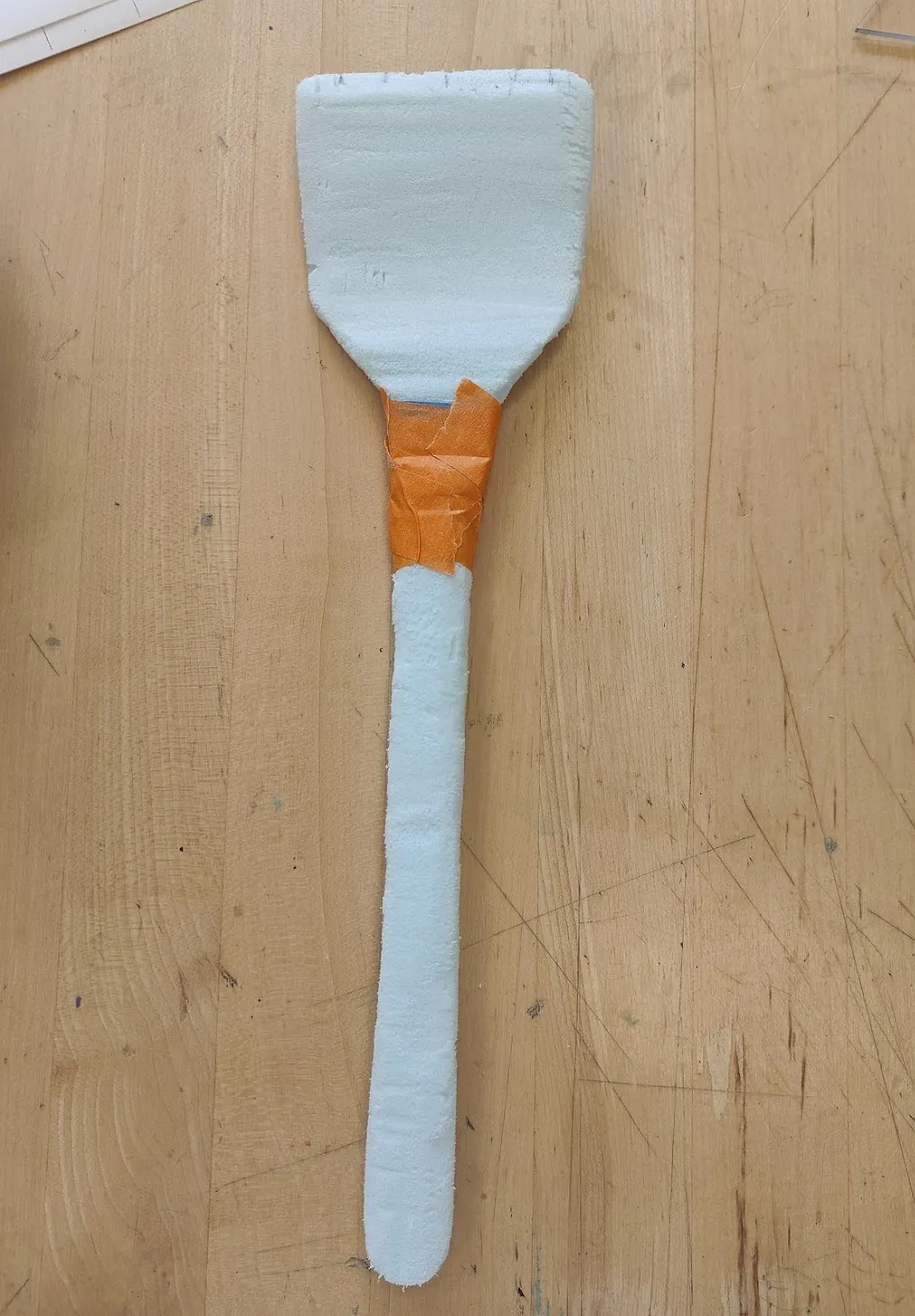
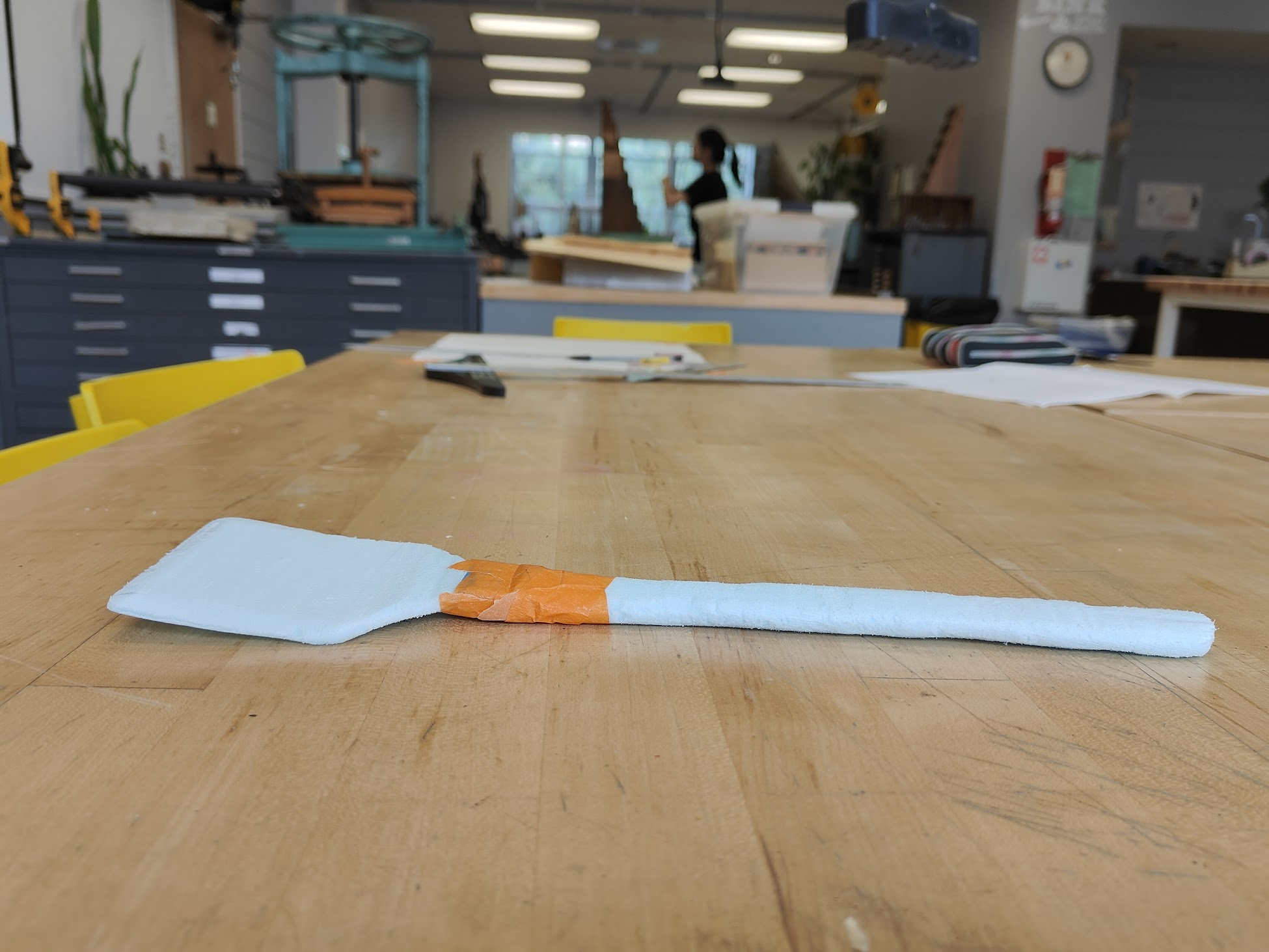
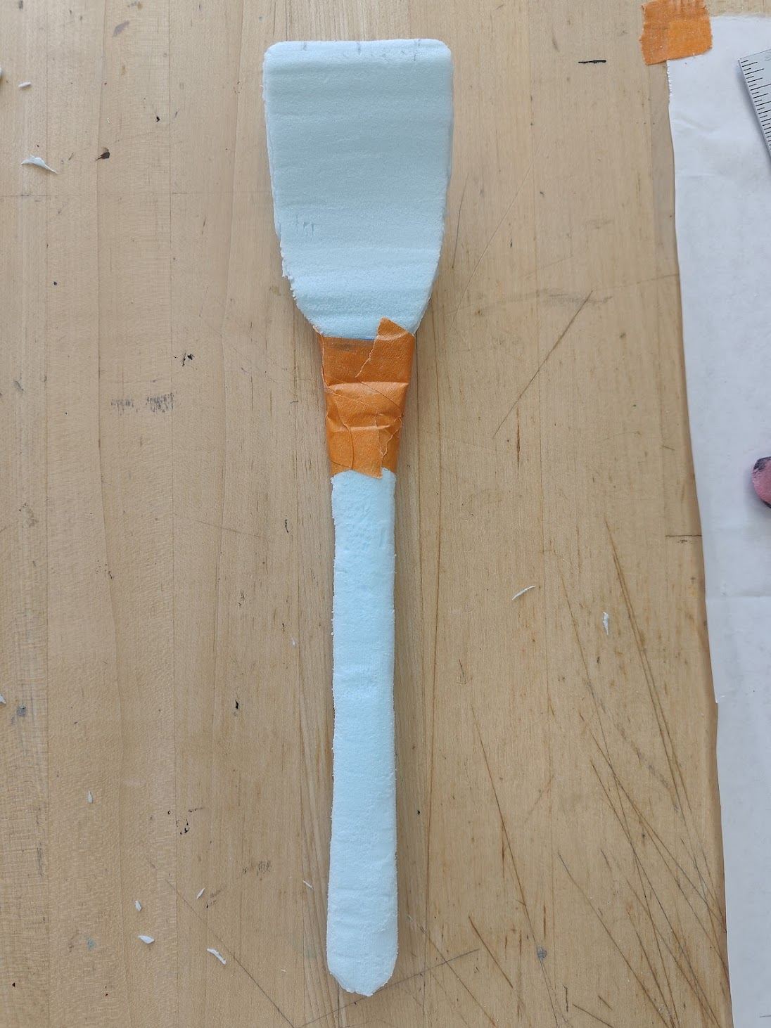
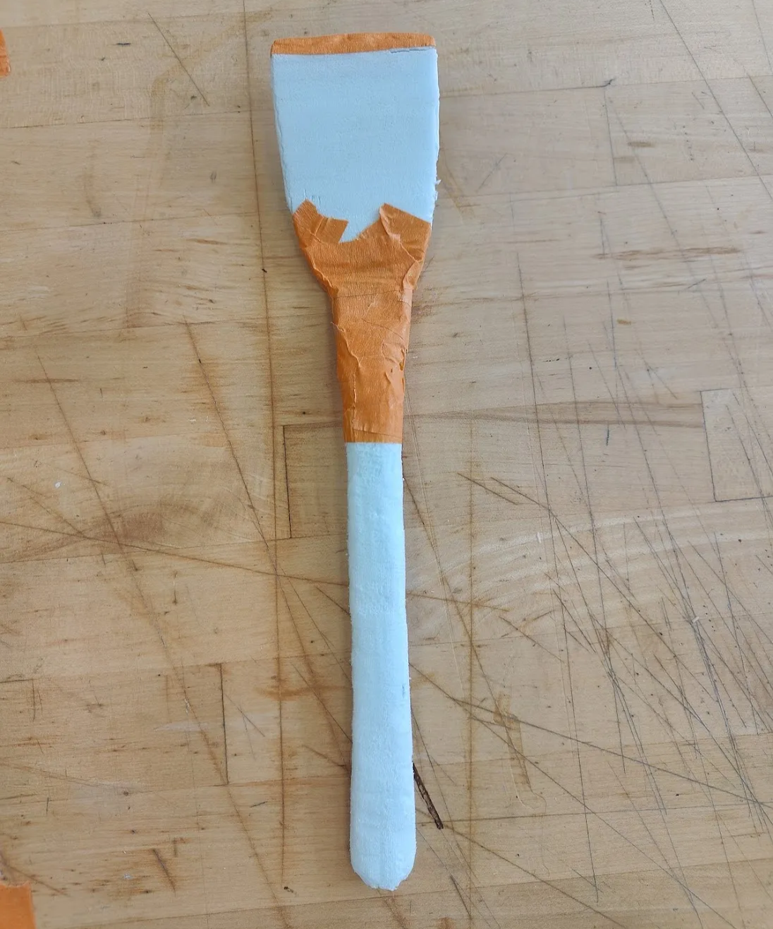
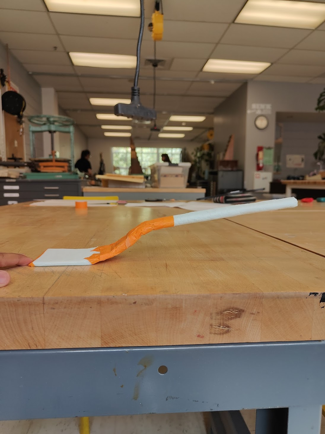
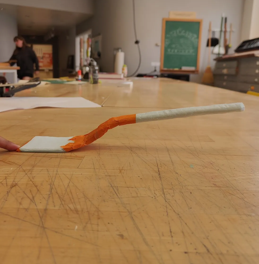
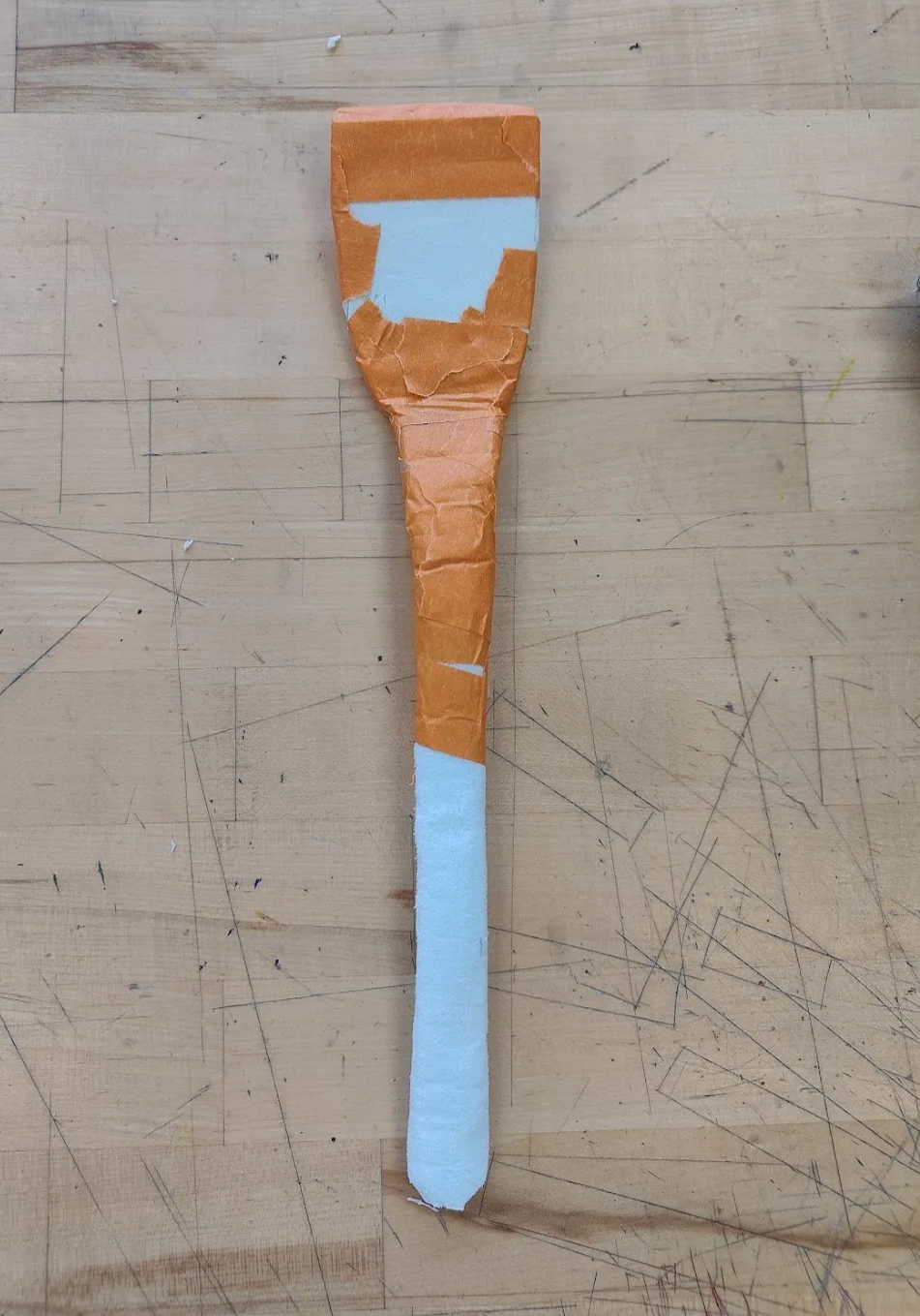
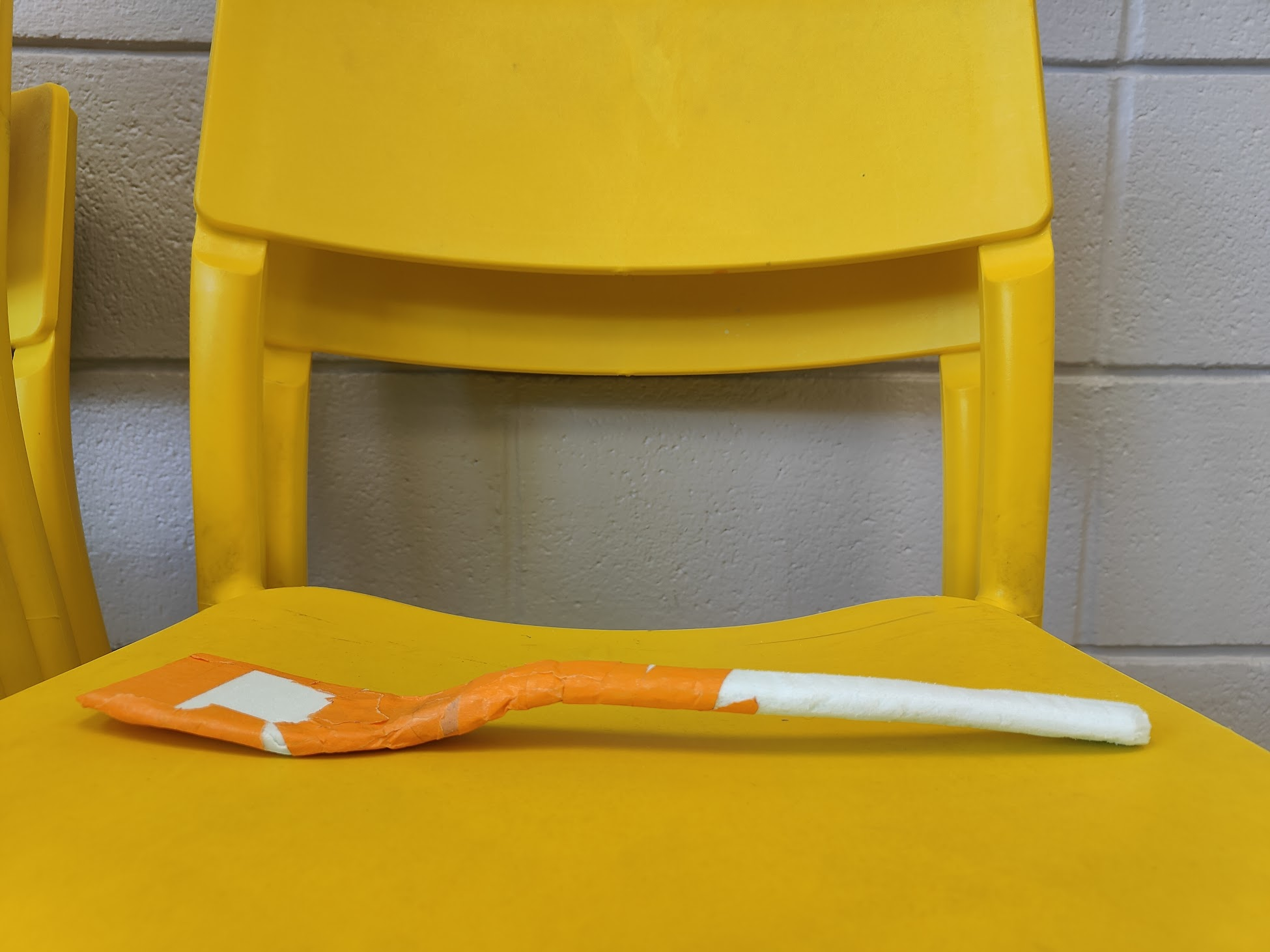
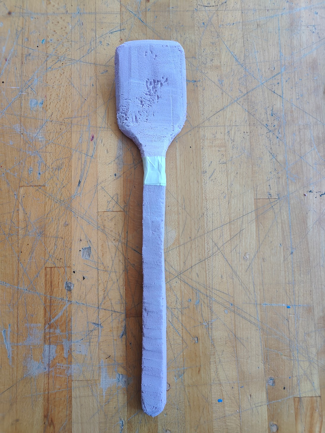
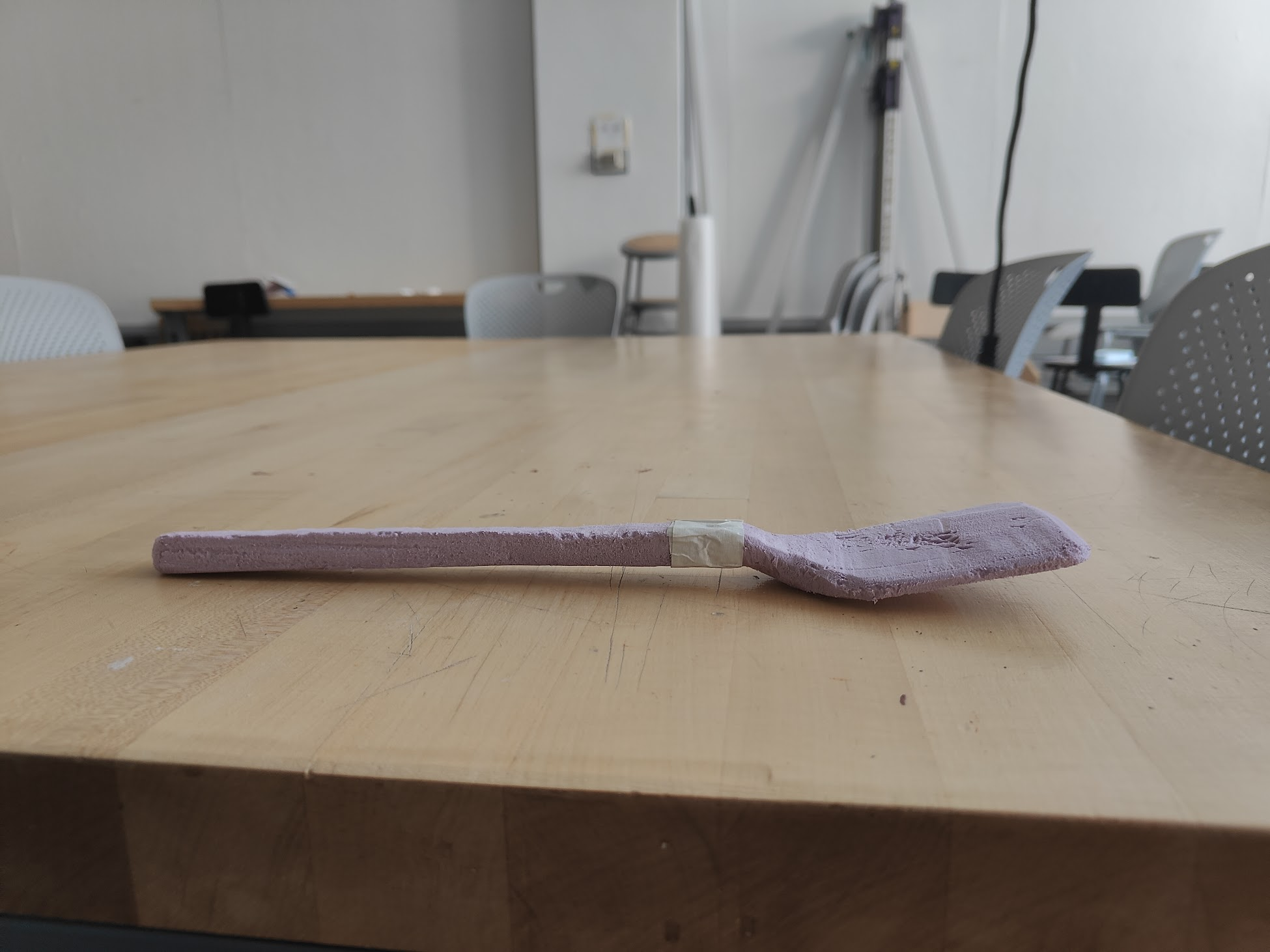
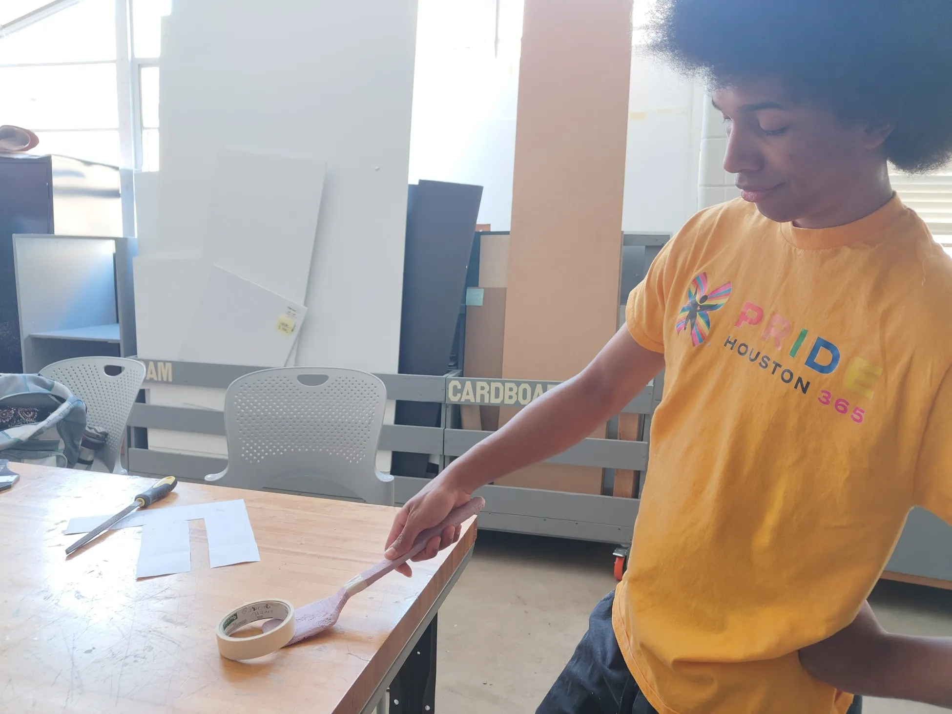
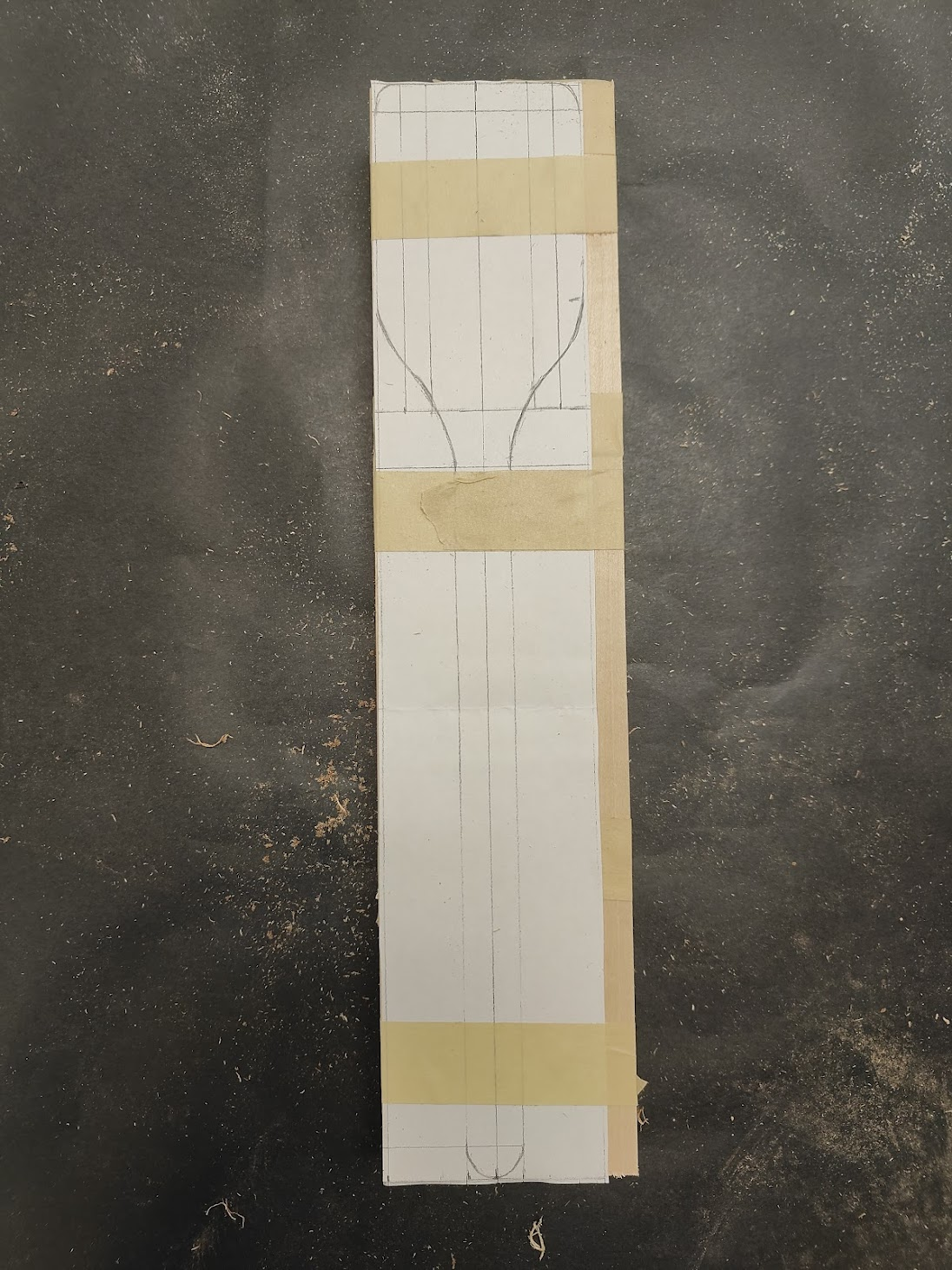
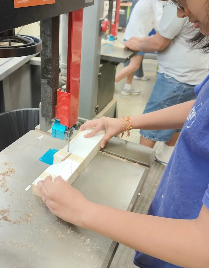
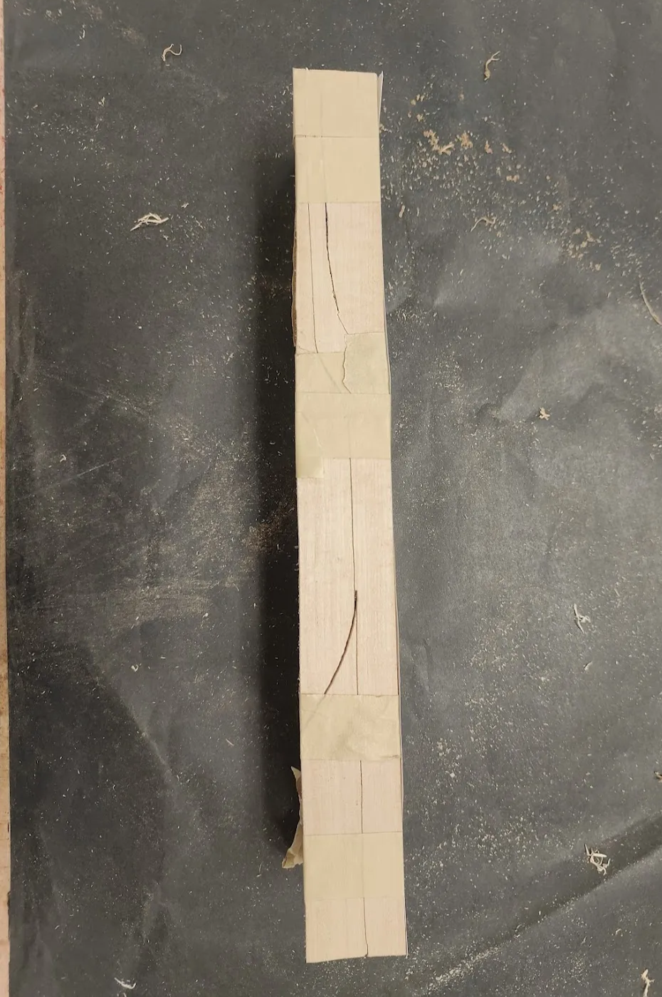
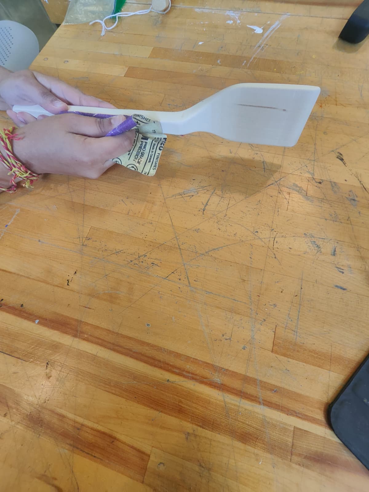
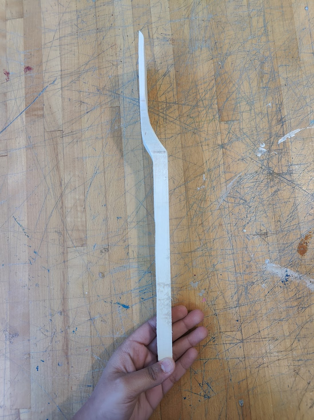
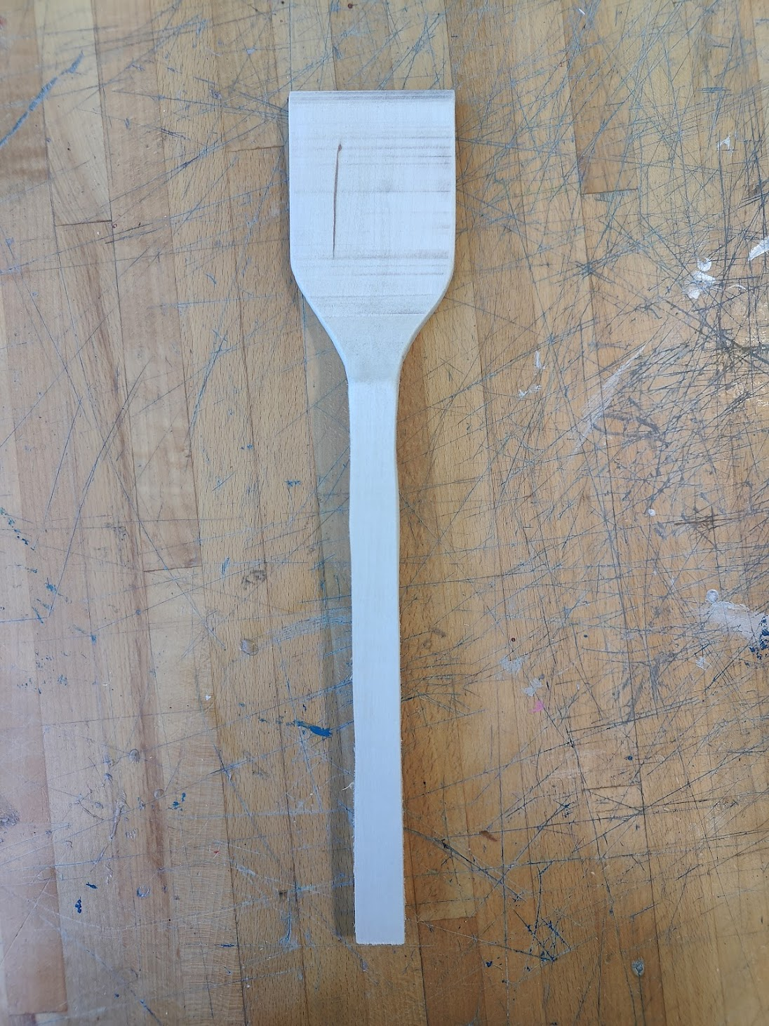
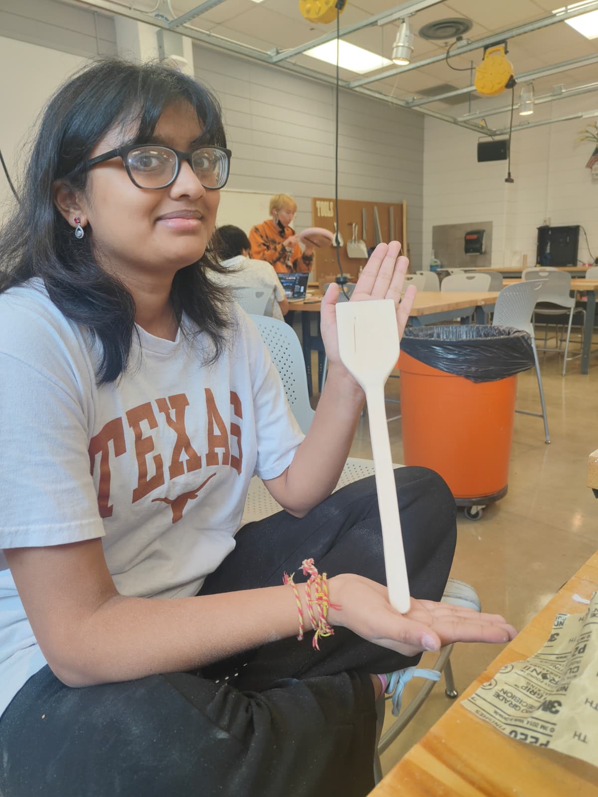
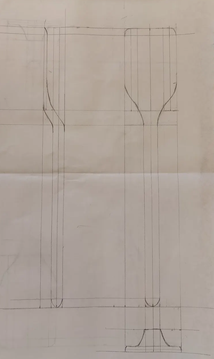
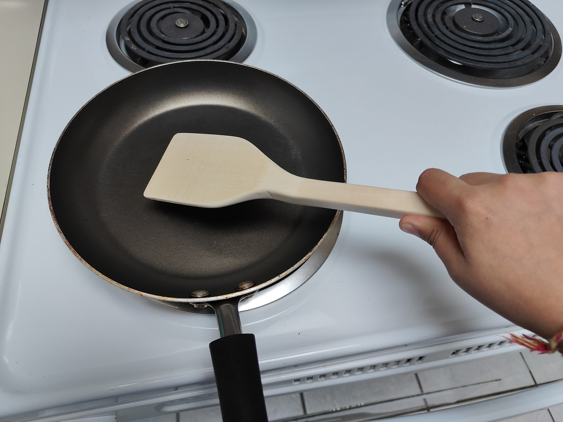
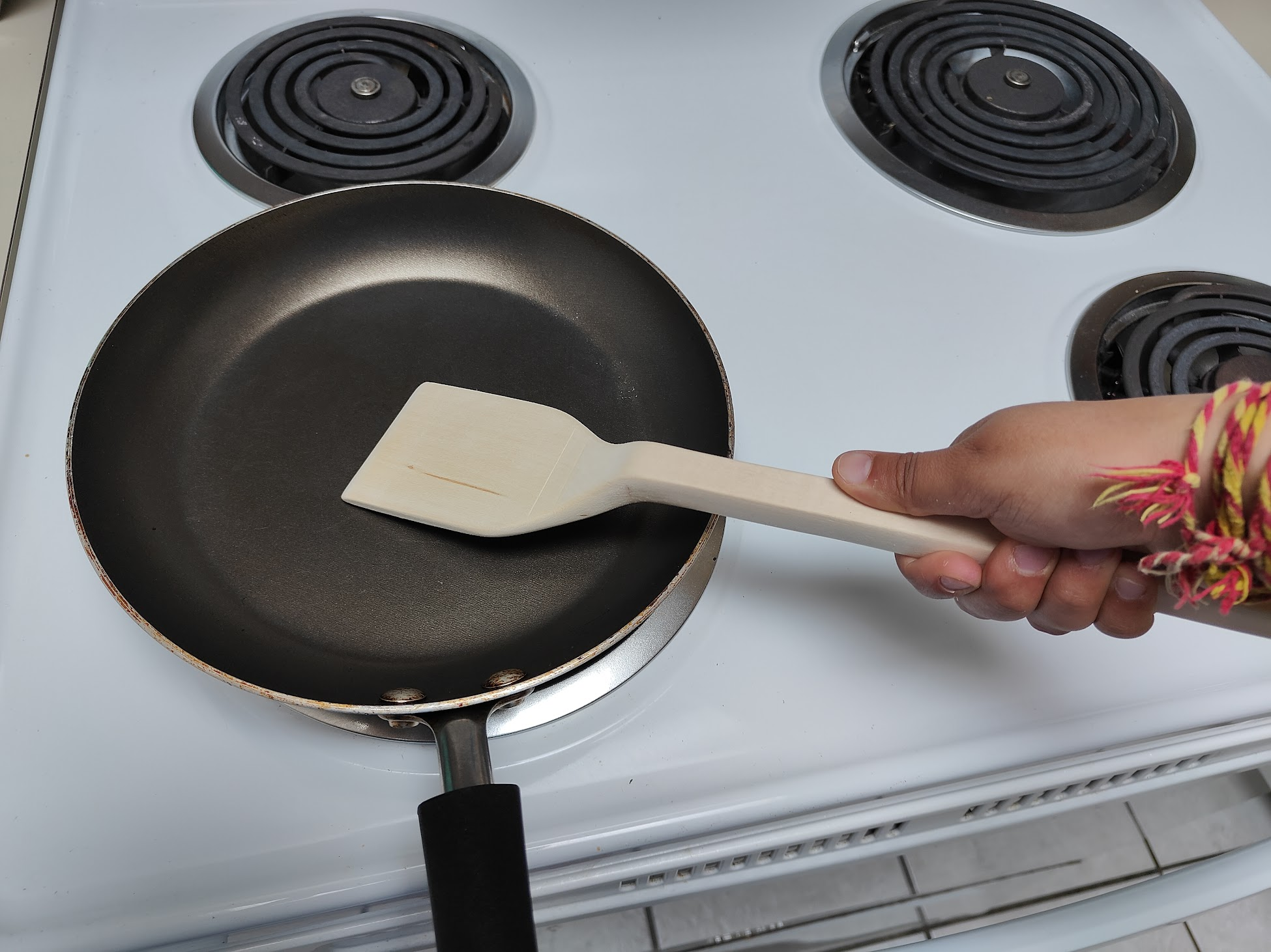
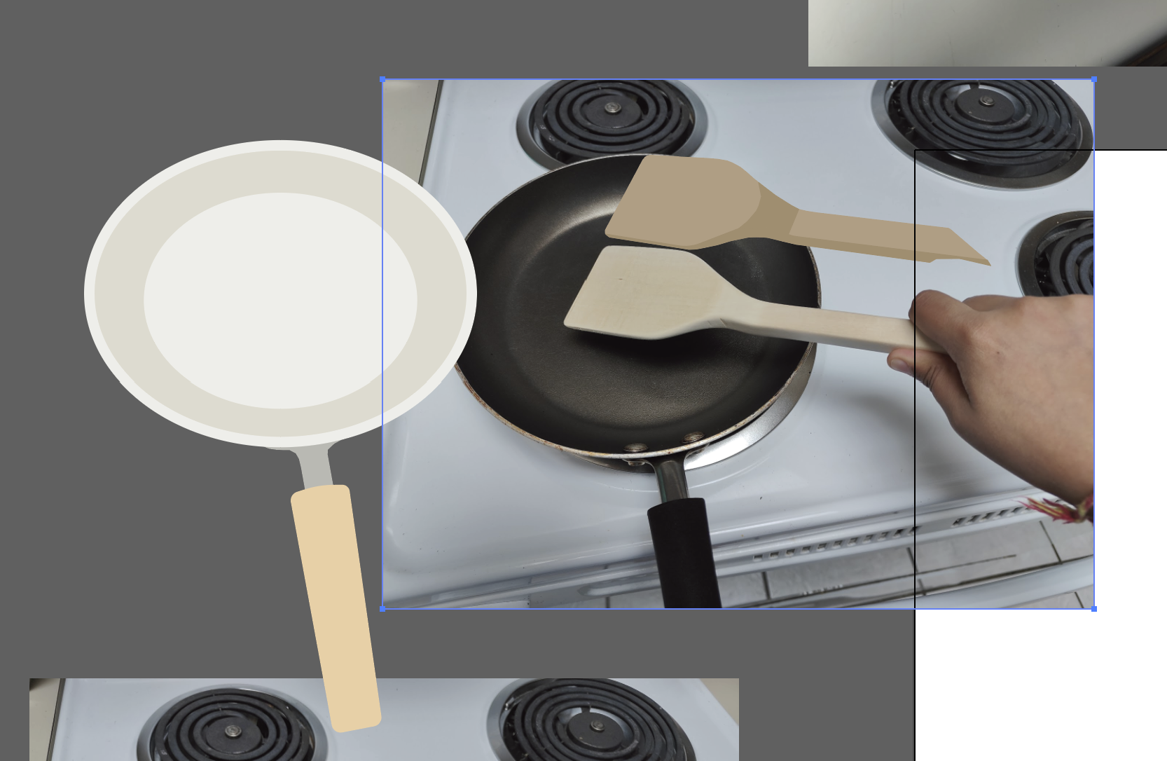
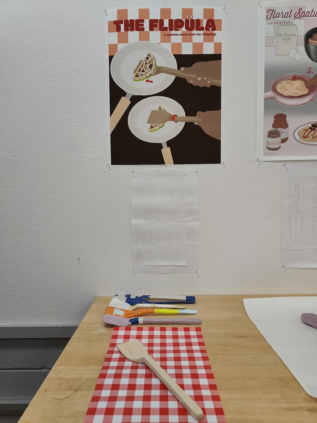
Carpentry, product design, Adobe Illustrator
The FlipulaFall 2025
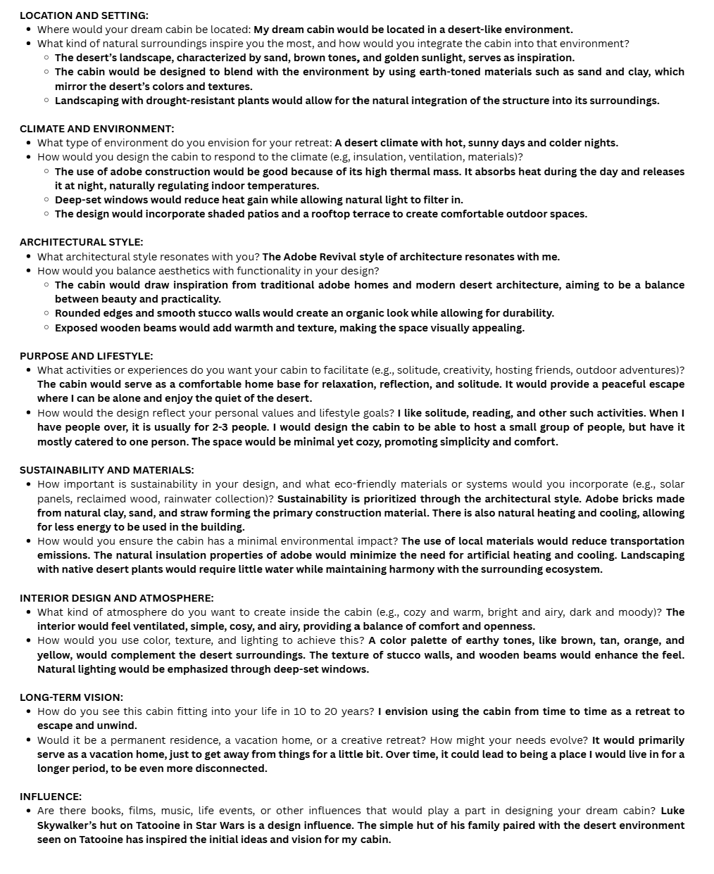
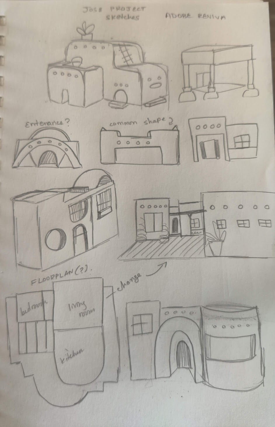
Architectural design, Rhinoceros, Twinmotion
Dream Cabin: Adobe RevivalSpring 2025
Motion Graphics & Videography
A variety of videos I have produced from hype videos to fan edits. Happy watching!
← All work
Produced for Longhorn Racing's Unveiling event and presented prior to the reveal of the 2026 vehicle, High Noon. I filmed all footage and handled both video and audio editing.
My second most-viewed edit to date, reaching 135,000+ views and 30,000+ likes.
Fun Fact: This is the most viral video on my anonymous editing account! At the time of writing, it has accumulated over 320,000 views and nearly 50,000 likes.
A designer and aeccentric gamercat lovercookie cake decoratorfangirlcomics enthusiastdancerfontphileawesome little sister >:)DIY barberfigurine collectorkeychain hoarder
I'm a multidisciplinary designer currently pursuing a B.F.A. in Design and a B.S. in Arts & Entertainment Technologies at the University of Texas at Austin. I am the first student (of two) to ever pursue this combination of degrees simultaneously!
During my time at UT, I've had the opportunity to work across branding, UI/UX, motion graphics, product design, and game development, and so much more! I love exploring different areas of design, but what always draws me in is creating experiences that people can interact with, learn from, and connect to.
I'm also currently the Public Relations Officer for Longhorn Racing, the largest engineering organization at UT and one of the most accomplished student organizations on campus. I manage branding, graphic design, and communications across all three vehicle teams while also serving as the Public Relations Lead for the Solar Vehicle Team. Getting to work alongside hundreds of incredibly talented students who spend countless hours designing, building, and racing vehicles has been one of the coolest parts of my college experience.
I'm especially interested in interactive design, visual identity, game development, and storytelling. I love thinking about the little details that make someone pause, explore, or see something differently, and I'm always looking for ways to weave narrative and a distinct visual voice into the experiences I create.
Because my work has taken me across so many different disciplines, I've become comfortable jumping into unfamiliar territory, learning new tools, and adapting to whatever a project needs. Whether that's designing an interface, building a brand, prototyping a game mechanic, or something completely unexpected, I'm always excited to figure it out!
When I'm not creating, you can usually find me playing video games, getting lost in books and comics, or making ridiculously specific Spotify playlists.
For this project, I created a zine that examines the typography choices and fonts used in the video game Persona 5, focusing on how type contributes to the game's visual identity and storytelling. I chose this project because there is limited academic and design-focused analysis on the artistic decisions behind video games, particularly typography. As a double major in Arts & Entertainment Technologies and Design, it felt meaningful to create a project that bridges academic research and design practice around a game that helped shape my career interests.
Self-authoring this book gave me a unique kind of research paper, one that let me write, design, and publish a book on one of my major interests while doing proper research into the typography, visual design, and UX/UI of video games, a field I intend to pursue.
The Brief
Create a Typographic Study in Book Form
The project was to design a book that uses text and type as image to explore a typography through a chosen area of interest, with a clearly defined audience. The reader should come away with a deeper understanding of both the topic and the role typography plays within it. While self-authoring was optional, I chose to write all of the content myself, making this a fully original research-driven publication on top of a design project.
"This project combines text and type as image to create a book about typography and an area of interest of your choosing. The audience for this book will be selected by you. The reader should come away with a deeper understanding of the area of interest (topic) as well as the role of typography as it relates to that topic. It should demonstrate typographic controls explored throughout the semester."
The origin of this project began with the design brief itself. When we were asked to create a book that studied typography through an area of interest, I was immediately excited, having looked forward to this assignment since Professor Gray first introduced it. The initial challenge, however, was deciding what subject to focus on.
It quickly became clear that I wanted to study the typography of a video game. As a student in the Game Design concentration within my Arts & Entertainment Technologies degree, and someone with a deep appreciation for video games, it felt natural to explore typography within an interactive medium I care deeply about.
Choosing a single game proved more difficult. I considered several favorite titles, from The Legend of Zelda, potentially as a broader typographic history, to The Last of Us, comparing its in-game typography with its television adaptation. After weighing these ideas, Persona 5 emerged as the strongest choice.
My first figurine ever was of the protagonist of Persona 5! I have had this since 2017.
I even decorated it with an accompanying sticker I got at a convention that I spent my limited allowance on.
I first discovered Persona 5 in middle school, shortly after its global release. Seeing its menu screens, UI, and overall aesthetic for the first time left a lasting impression on me, as its bold typographic style demonstrated how typography could shape mood, identity, and user experience, ultimately catalyzing the direction of this project.
How can I design a visually engaging zine that explores and explains the typography of Persona 5?
Research
Exploring the Metaverse: Gathering Information
I dove into websites, articles, books, online forums, and emailed professionals to gather research and insights to support the creation and content of my book.
Compiling a Miro Board
One of the first things I knew about this book is that I would self-author it. To do that successfully, I had to gather a wealth of resources. So to the internet I went!
I created a Miro board to compile websites that could guide my research, as well as sources for font specimens. When gathering materials, I didn't limit myself to typography alone. It was also important to collect research from related fields, such as game psychology, UX/UI design, and more, as these insights would help supplement my work. I also explored Reddit forums, where the community is very active, to see if others had similar questions or inquiries.
Explore my Miro board above, click to interact.
Key Takeaways
Collected research beyond typography, including psychology and UX/UI.
Organized sources and font specimens on a Miro board.
Checked Reddit forums for community insights and similar questions.
Library and Archive Research
I also set up a meeting with Tina Tran, the Liaison Librarian for Visual Arts at the University of Texas at Austin, to get her help finding resources for my project.
Me flipping through Arcade Game Typography by Toshi Omagari to view structure as well as content.
During the meeting, we both discovered, though I had somewhat expected, that there is no specific research on typography in Persona 5 and that information on typography in games in general is scarce. What we did find together was the book Arcade Game Typography by Toshi Omagari, which I later went to check out at the Fine Arts Library.
Key Takeaways
Academic research on typography in games is limited.
Studying similar research, such as Arcade Game Typography by Toshi Omagari, can be useful not only for content but also for structure.
Emailing Charlotte Couderc
While compiling my sources, I came across a fantastic website called Game Font Library. This platform is dedicated to showcasing and sharing the official interface fonts used in video games.
Created by Charlotte Couderc, a Lead UI Artist for AAA games and typography enthusiast, the site collects typefaces that define the visual identity of games, whether from user interfaces, logos, or other graphic elements. All fonts featured are official fonts provided by developers themselves, with no recreations or approximations. Charlotte personally reaches out to UI artists worldwide to ensure accuracy, preserving the true typographic heritage of the industry.
While exploring the site, I noticed that it only had fonts for Persona 3 Reload. On the About page, I saw that the website was run by Charlotte Couderc, and I decided to email her explaining my project and asking for guidance in sourcing the fonts used in Persona 5. I wasn't expecting a response, assuming she might be busy as a UX/UI Designer on The Witcher 4.
To my delight, a few days later she replied, not only responding, but also sharing that she already had the fonts compiled and would upload them early so I could use them right away. I am deeply grateful for her help, as her knowledge and database have been invaluable to my research.
The email exchange between me and Charlotte. Click any image to expand.
Key Takeaways
Don't be afraid to reach out to professionals,most are happy to offer guidance and support.
I now have a complete understanding of the key fonts and typefaces used in the game, without needing to guess or do excessive research.
Key Design Implications
Create a book that is not only visually appealing but also thoroughly researched, accurately covering the fonts and typography used in the game and their purpose.
Design the book to reflect and build upon the aesthetics present in the game itself.
Use Game Font Library and Charlotte's guidance to construct the section on the specific typefaces used in the game.
Provide context alongside the typographic information so readers gain a comprehensive understanding of the game, its visual style, and its typography.
Presentation
Presenting the Content of My Book
As part of the project requirements, I was asked to compile information and present my ideas to the class, explaining the topic I was covering, why I chose it, and how I planned to structure the information.
Here you can go through the presentation I curated for class. It is important to note that a lot of the information was verbally communicated by me, supported by the animations and images in the presentation.
Click through the slides above to explore the full presentation.
The presentation proved to be immensely helpful for me, as it made a rough outline of what I would include and how I could talk about it. It also helped me develop ideas on how I could have visual graphics interact with the text and content within the book itself. Professor Kelcey's feedback was to talk a bit slower next time, and that she enjoyed the slide layout and animations, as well as the sources I was utilizing to help me make this book.
Developing Content
Making an Infiltration Guide
With all my research compiled and under my belt, I begin to consider form and the content that will go inside my book.
Making a Staple-Bound Book Dummy
In class, Professor Gray showed us how to make a simple staple-bound book dummy and gave a lecture on the process, after which we created one ourselves in class.
Book dummy prototypes made in class to test dimensions and stapling.
In this class, I learned about the staple binding method, what a signature is, and that if I want to create a staple-bound book, the total page count (including the cover) needs to be divisible by 4, since a signature consists of folded pages. With this knowledge, I went to the design lab and made my own book dummies with a few pages to test dimensions and stapling.
Making a Plan for Content
During class, Professor Gray also showed us examples of past student work. I explored these examples to help determine dimensions and binding methods.
One book that particularly caught my eye was by a past student, Kenny, who explored Japanese localization in Dragalia Lost. I ended up using his formatting, a landscape staple-bound book, as inspiration for my own project.
With a rough idea of how I wanted to produce my work, I turned my focus to the content for each spread and page. To help organize my ideas and structure the content, I created a Notion page where I bulleted everything I needed to remember when designing my spreads. This served as the foundation for the content of my book.
A screenshot of my working document where I wrote everything for the book.
Over the course of making my book, I also made sure to write the content I wanted to include. I needed to balance writing enough while still covering all the key points I wanted.
Although it was challenging, I found it rewarding to know that the book I was producing was also written by me. I knew I would be more satisfied with the final result by self-authoring it.
For guidance, I referenced my previously mentioned Notion page to help structure my writing. This ensured I stayed on track and didn't forget what to include. The end result was a satisfactory amount of content that I could use as I moved forward with the layout design.
Design
Making the Calling Card: Designing the Actual Book
With all my content developed, I spend many hours designing my spreads in Adobe InDesign.
Designing the Book
Before and during Thanksgiving Break, I spent many days working on the spreads of my book. One challenge I faced was figuring out how to approach the book in general. After some trial and error, I settled on a method. I decided to use in-game assets to help build the aesthetics and layout. I would also use a simple color palette and include screenshots, images, and captions to help the reader understand the information I was presenting without making it boring.
Screenshots of my working document with the visible grid.
Much of my design process involved applying what Professor Kelcey had taught us in class, including pacing, font size, ragging, typesetting, and more. I was able to tackle much of the book thanks to her step-by-step teaching and my ability to implement what I had learned.
Because I had done extensive preparation in terms of content and outlining my plan, designing the book was not as difficult as it could have been if I hadn't completed that work ahead of time.
On the left, a spread designed to inform the reader about the visual language that defines much of Persona 5, using captions and imagery to support the written content.
Additionally, as part of the project requirements, I included a diagram, which I found especially useful for explaining hierarchy and UX/UI, and showing how typography contributes to these elements in the game.
Some photos I took while working on the spreads in InDesign.
A screenshot I took of my Discord logging the hours I spent on InDesign on one of the days I was working on the project, which I found as amusing as I found painful.
Once I was satisfied with my writing and the text flowed in, I adjusted my spreads accordingly and typeset all my text, as I learned to do so in class. It took a lot of time and effort, but eventually I had the spreads completed. The full digital PDF is viewable in the flipbook below the hero image at the top of this page.
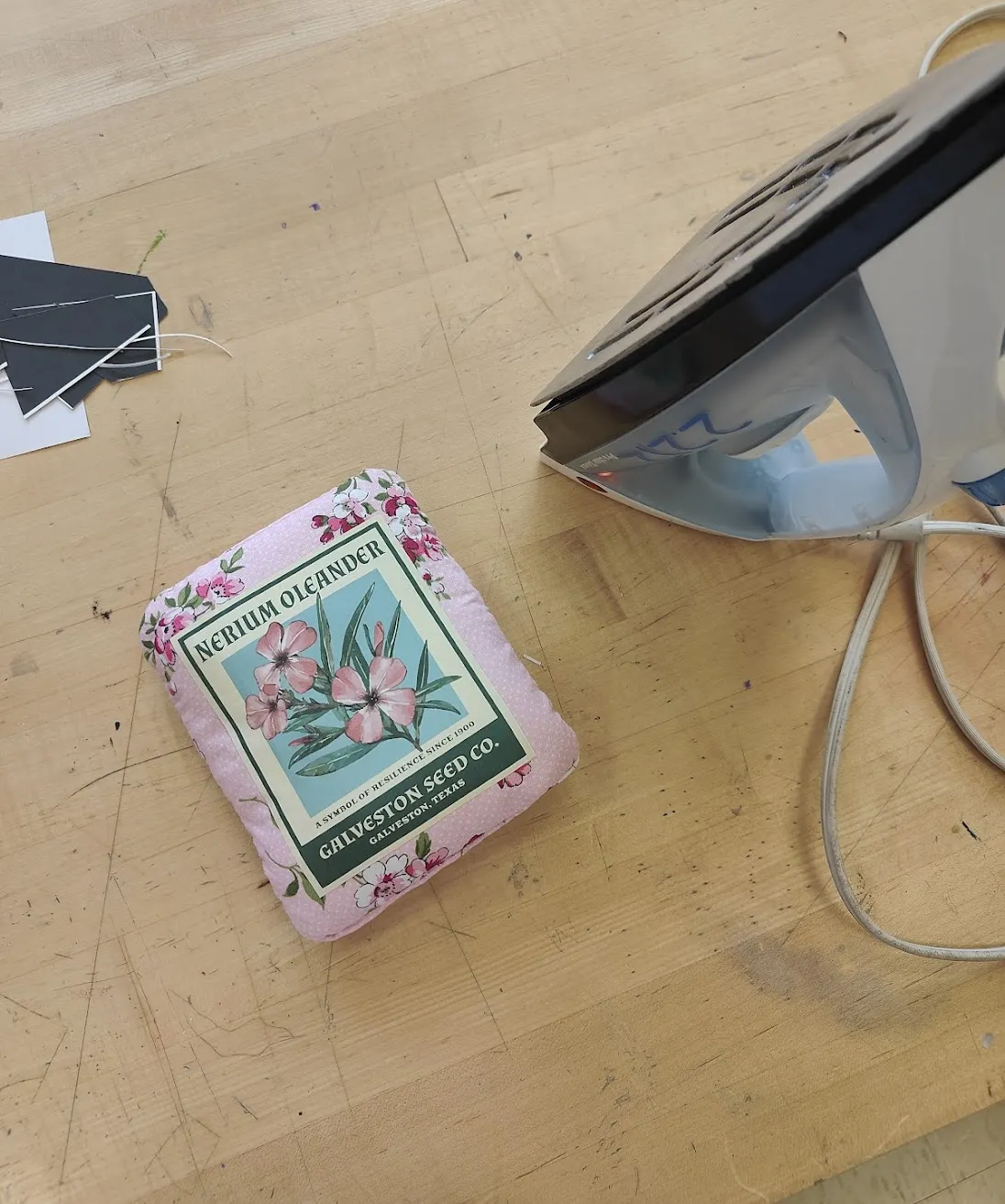
Designing the Book Sleeve
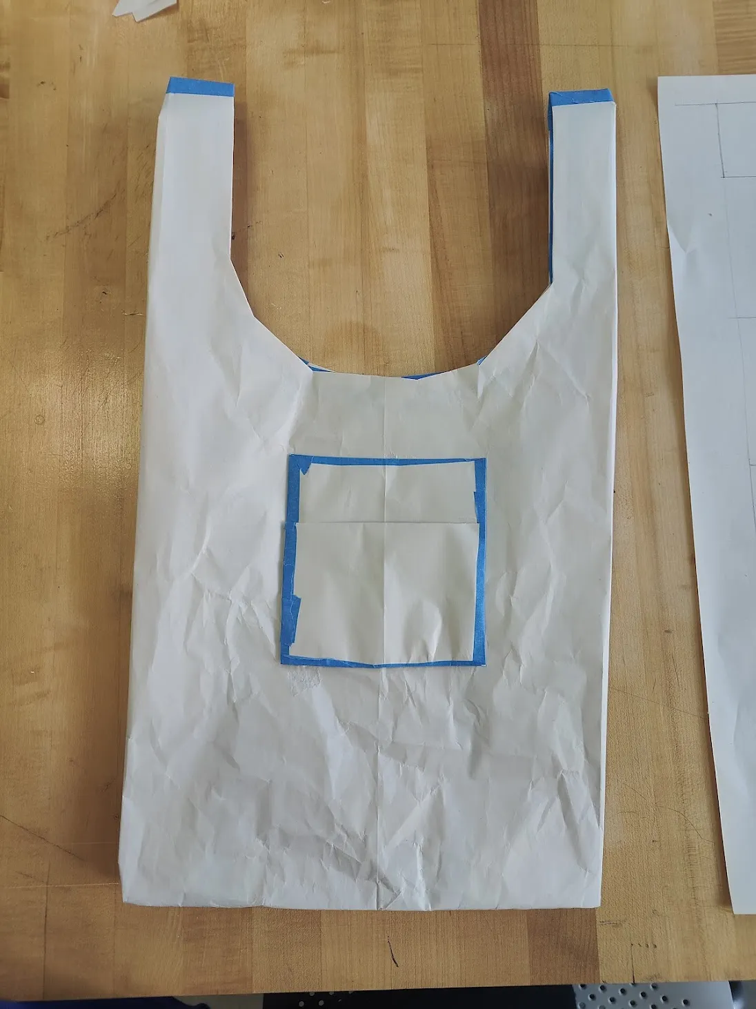
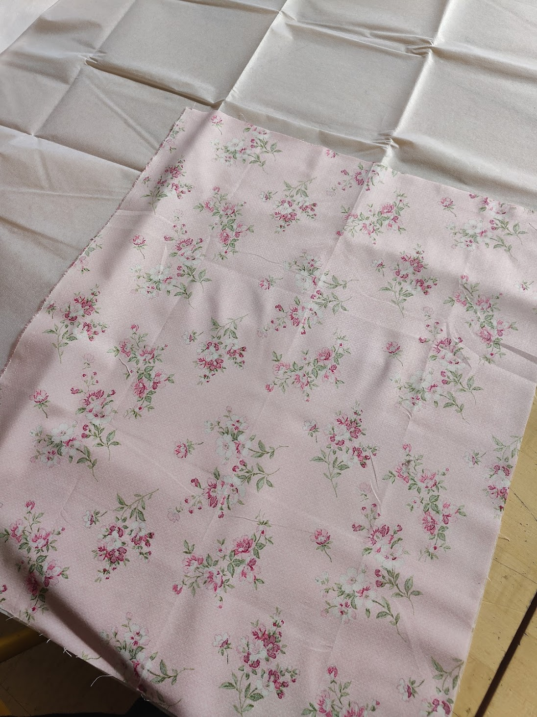
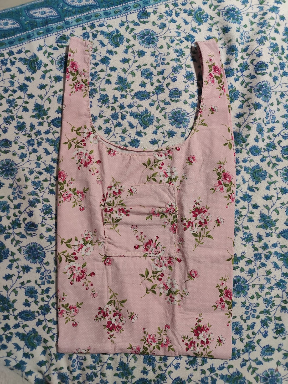
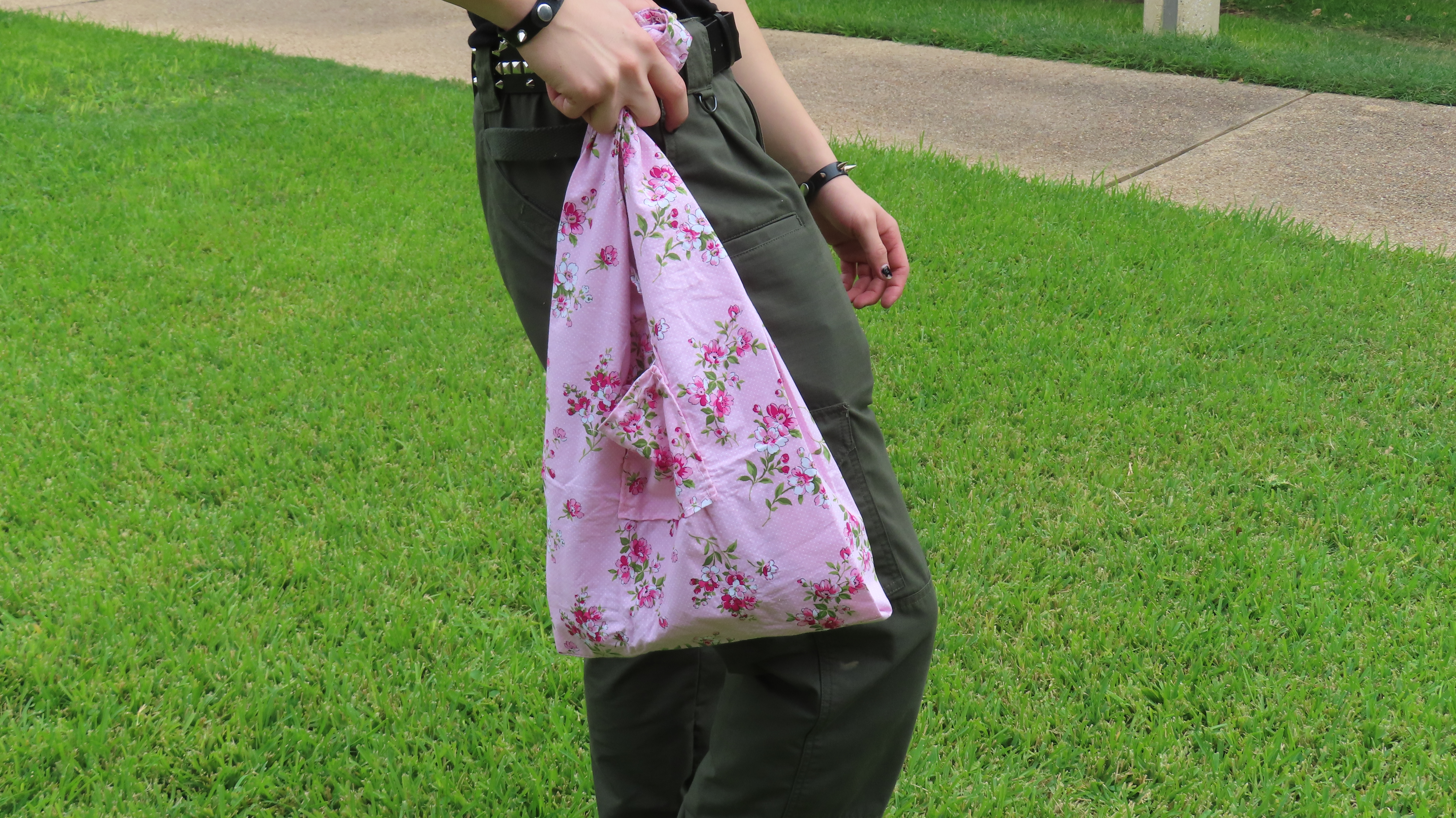
A reference of the bag I would be making for the book sleeve.
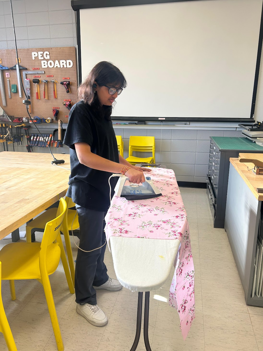
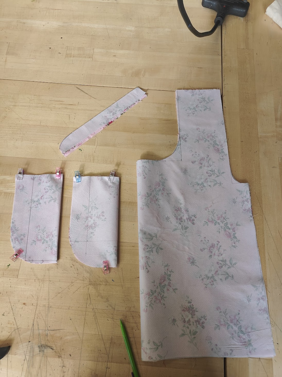
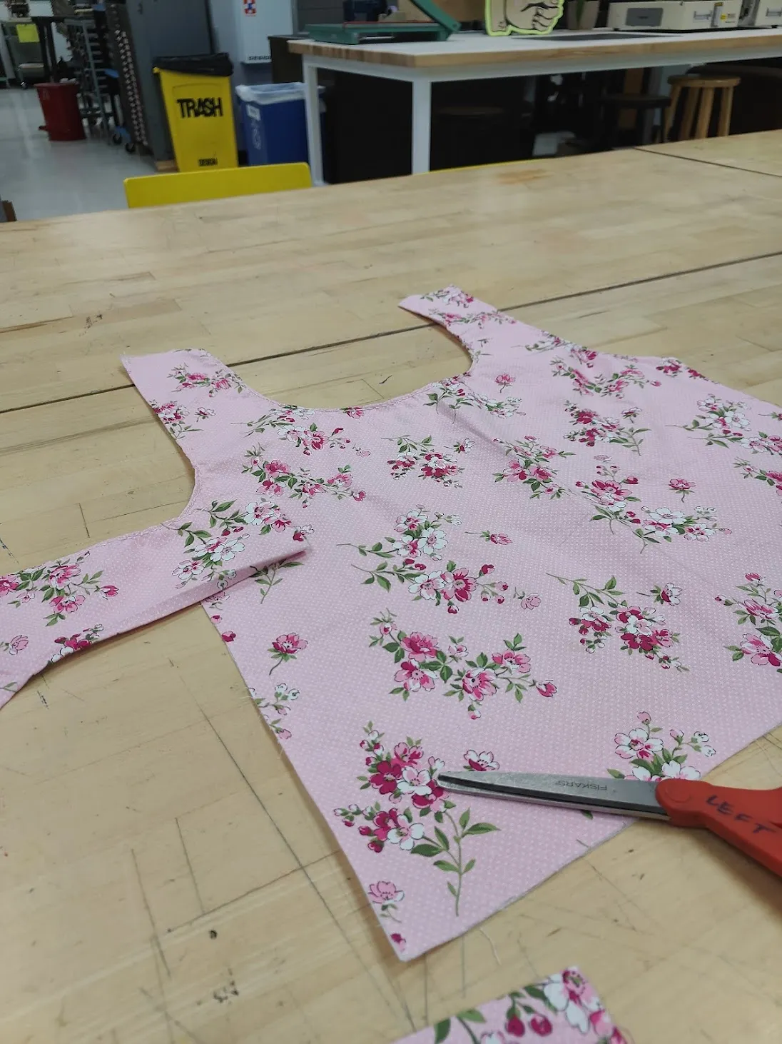
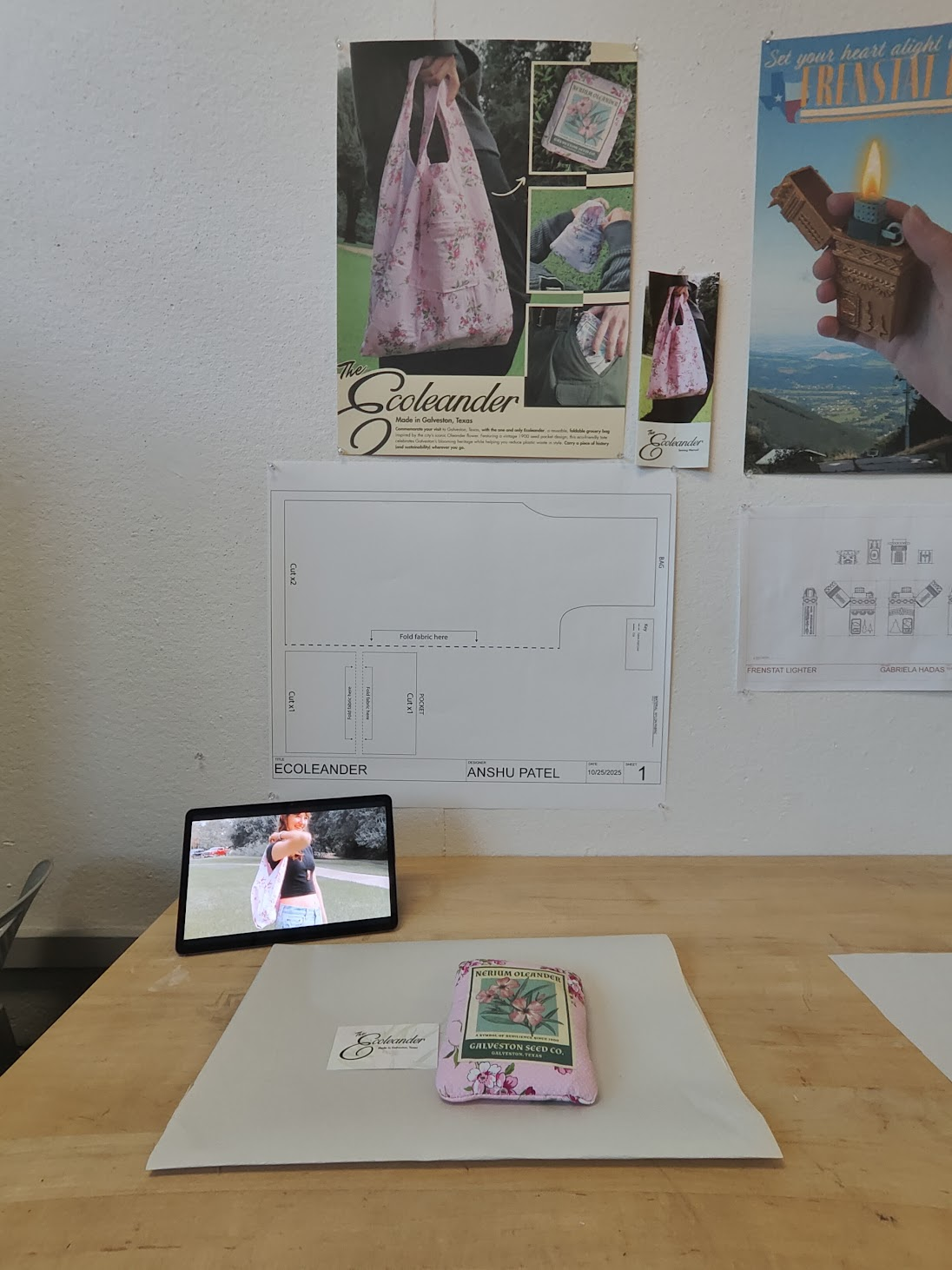
I also made the pattern that I would use to make the book sleeve I wanted to make. I wanted the book sleeve to look like the protagonist's school bag, and make the experience feel like you found a calling card (the book) in his school bag. Below is a PDF of that pattern that I printed and used once I returned to campus.
Securing the Treasure: Producing the Book and Book Sleeve
With my spreads and cover being print-ready, I begin physically producing my book.
My prototype print!
Now that I was back on campus, I immediately started my production process. The first step was to run a test print on regular copy paper and build a prototype of my book. I did this during class.
While cutting the pages at home, I had a horrible accident with the Xacto knife and ended up cutting my finger badly. After doing first aid on my finger, I finished my prototype, which I was satisfied with despite the injury.
After completing the prototype, I began printing the body copies of my book. I planned to produce four copies: one for testing production and parameters (you can never be too careful), one for myself (sophomore review), one to submit to Kelcey (as required), and one for my friend, who was genuinely interested in my book (an honor to share it with them).
Since I was sharing paper purchased with my friend and classmate Katie Shih, we printed the body copies together on the Ricoh printer in Anna Hiss Gymnasium. I also printed the cover and book sleeve, both on the thicker paper provided by the design lab.
While cutting my first body copy, I noticed a small graphical mistake on one of the pages. I had to manually collate the affected signature and reprint that page. It was stressful, but since I was on schedule, I reminded myself that everything was okay and successfully reprinted the page.
With all body copies corrected, I began full production. At Anna Hiss Gymnasium, I cut every page of my body copies, followed by their covers and book sleeves. I used a bone folder to score and fold each page. Once everything was cut, I started binding and compiling the books. I documented the process with photos to capture each step.
Cutting and assembling the books.
This was a completely new experience for me. While the process was daunting, I was satisfied with both my effort and the copies I produced.
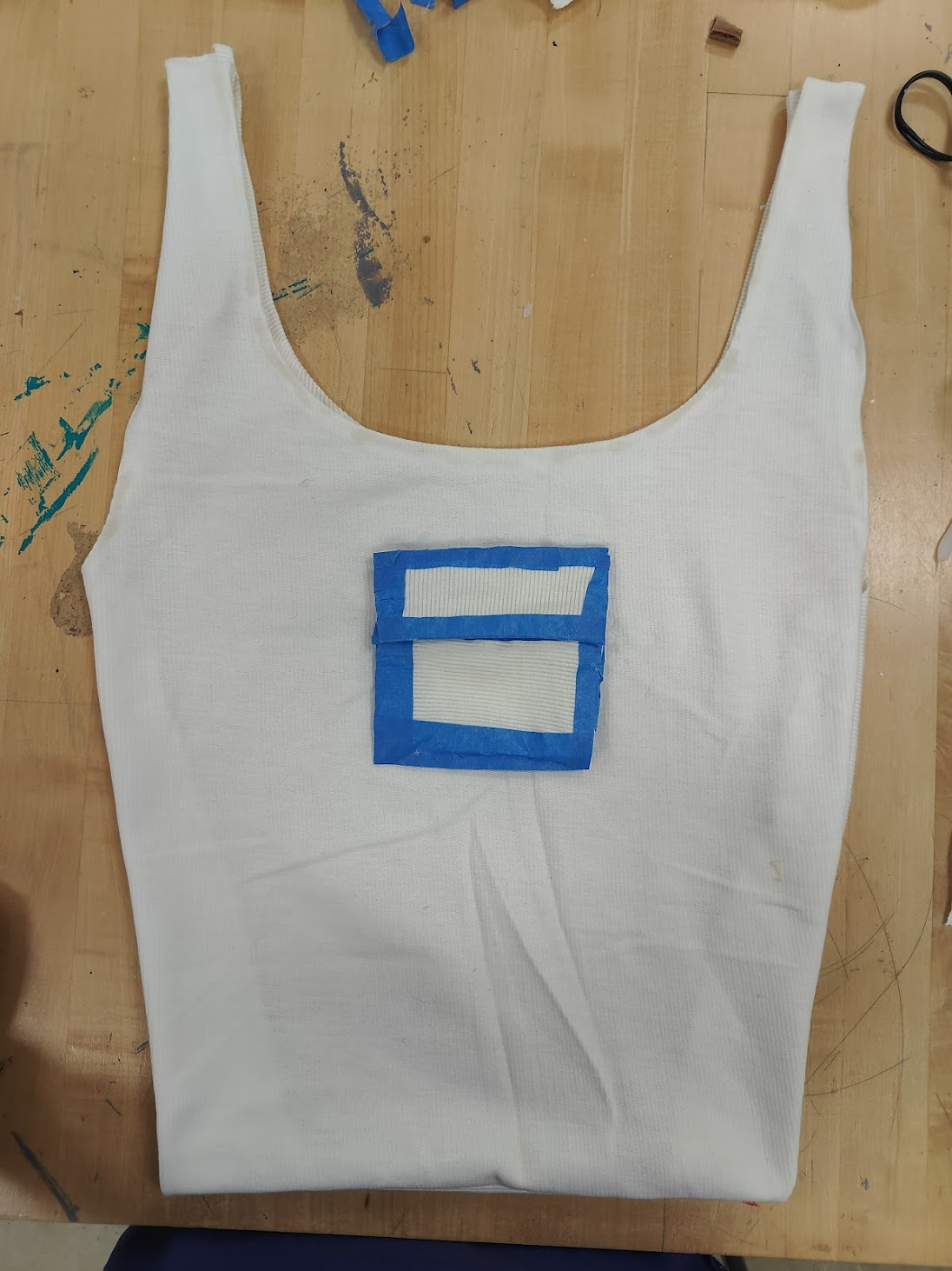
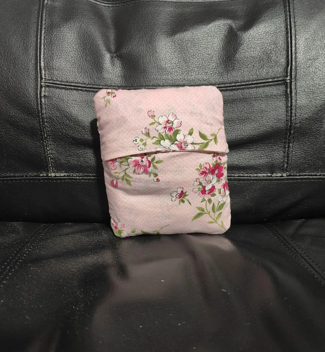
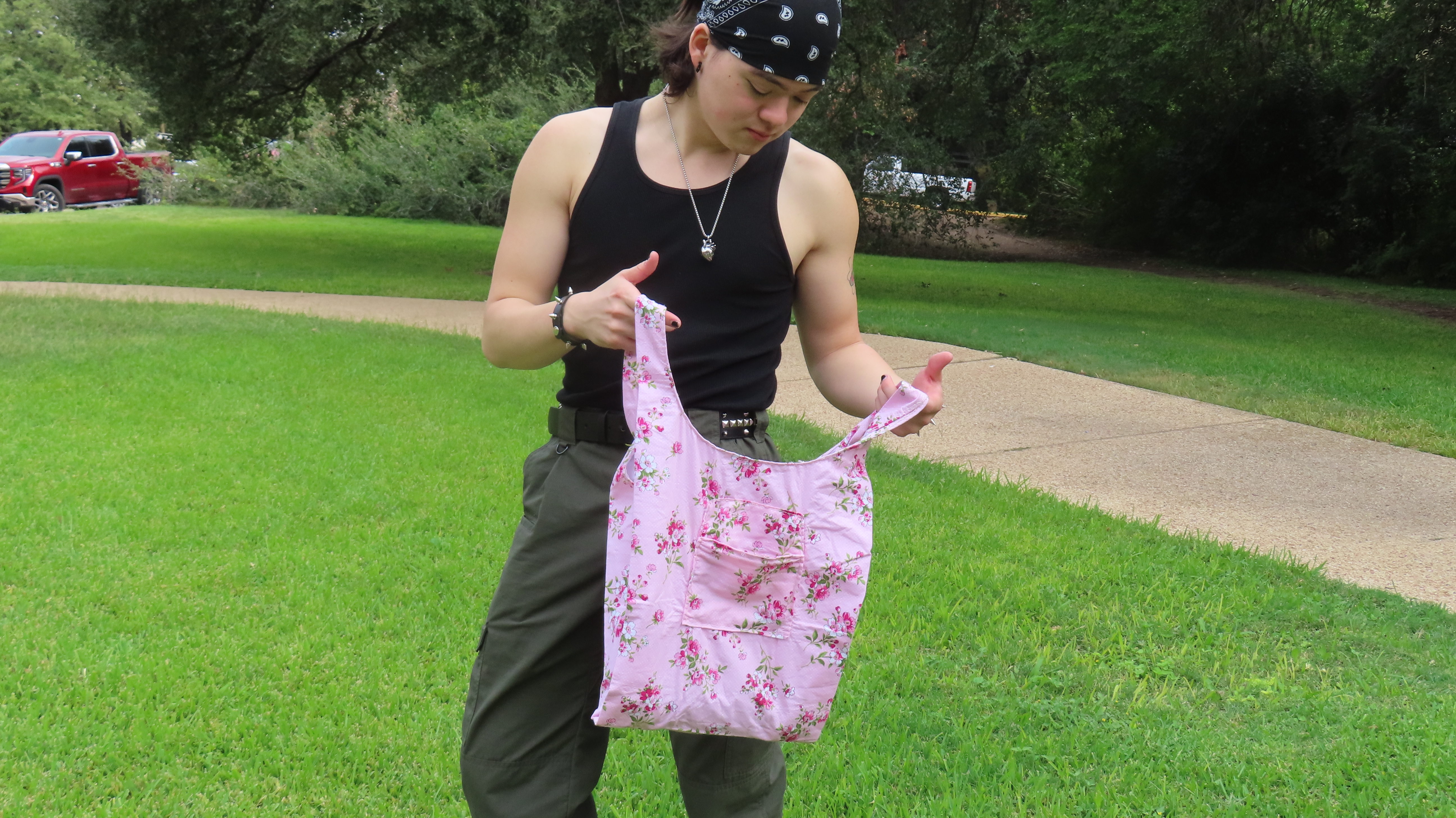
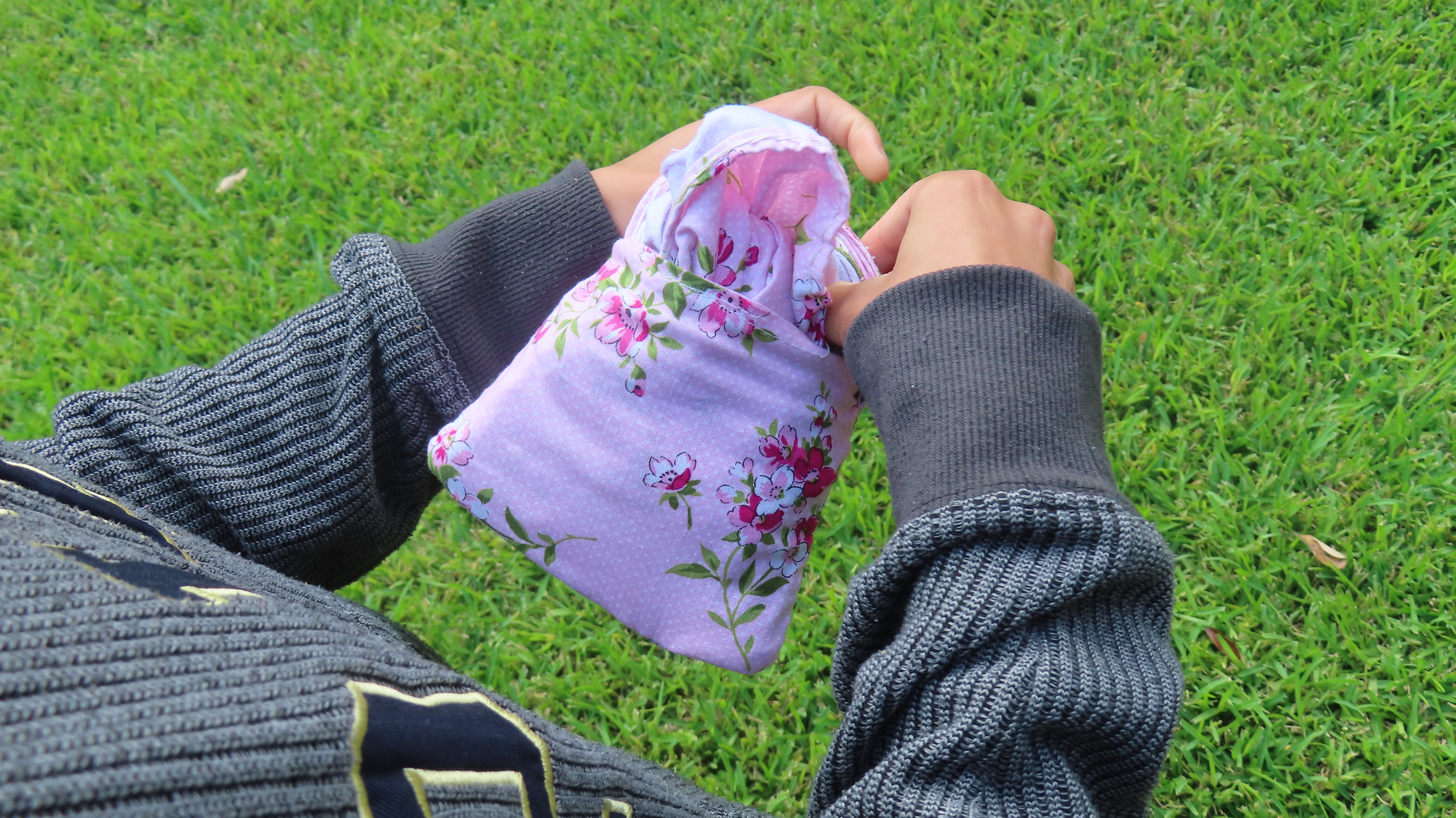
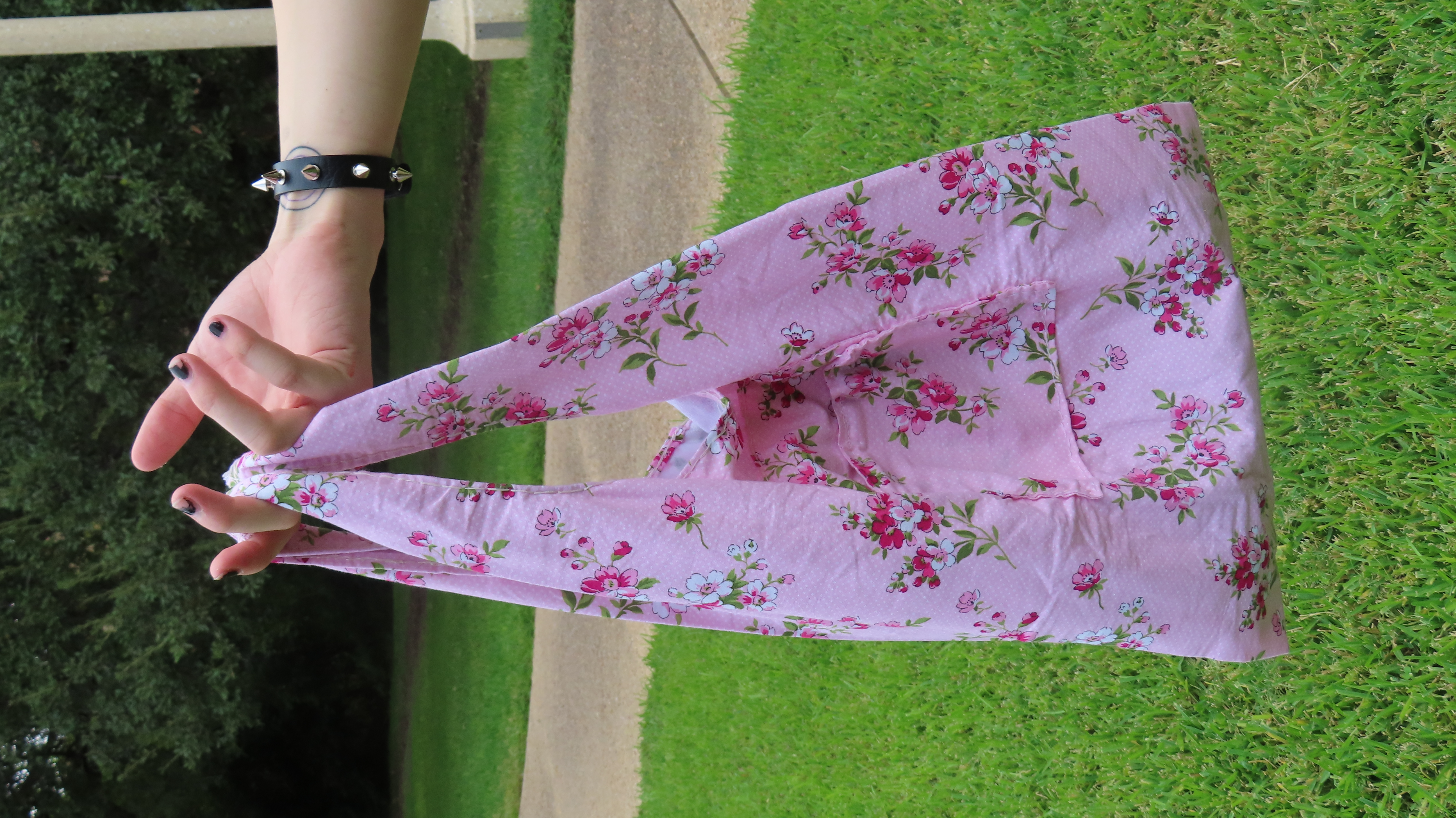
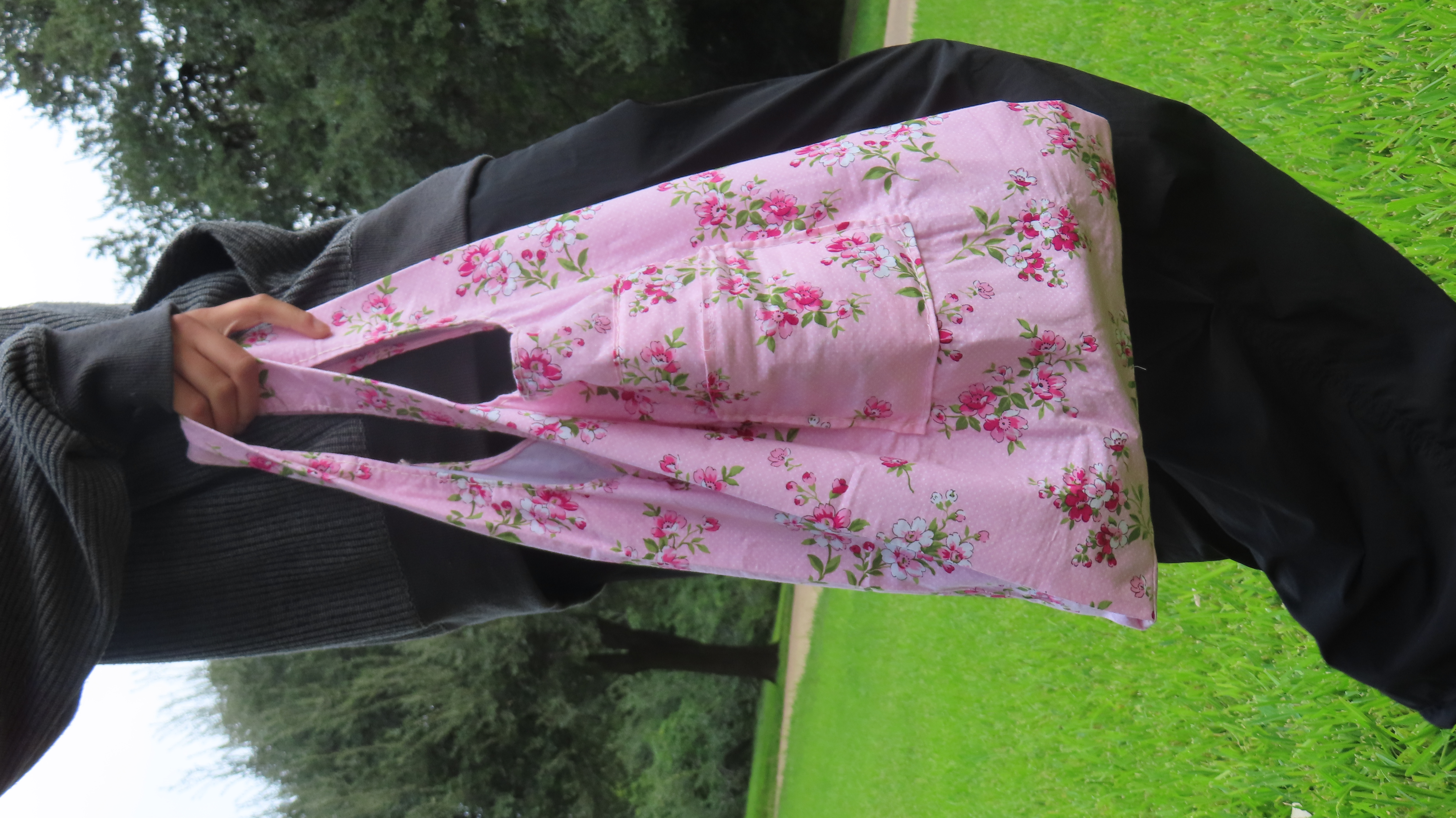
Production of the book sleeves!
The book sleeve presented its own challenge. I knew that black ink could crack along fold lines, but I had to move forward. I minimized damage by scoring extensively before folding, but the results were still not perfect. I then used glue to secure the sleeve, as tape (used in the prototype) would not have held the structure properly and would have been too obvious. After a lot of trial and effort, I successfully created four book sleeves, including one for testing. While the quality wasn't exactly what I had hoped for, I had to make concessions due to time constraints and move forward.
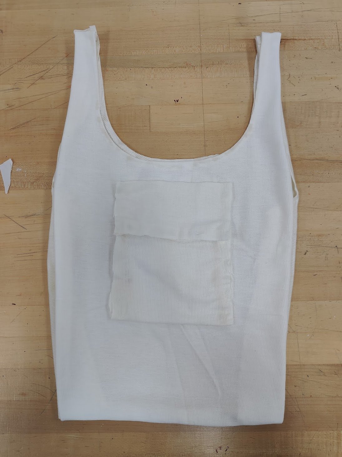
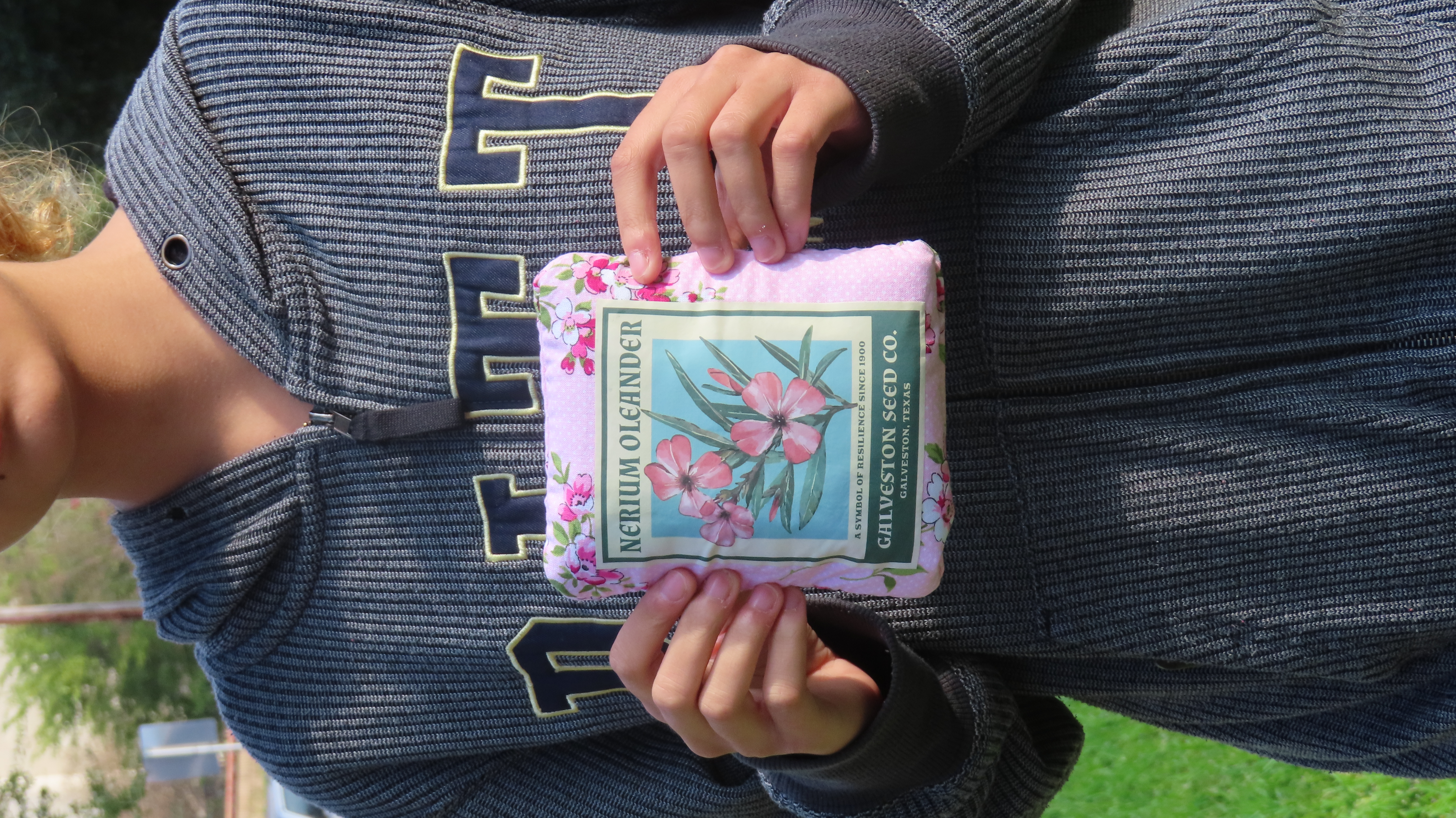
The finished book sleeve.
All four copies in all their glory!
Spread by Spread: The Physical Book
Below, you will find photographs of each spread in real life that I took.
Front cover
Back Cover
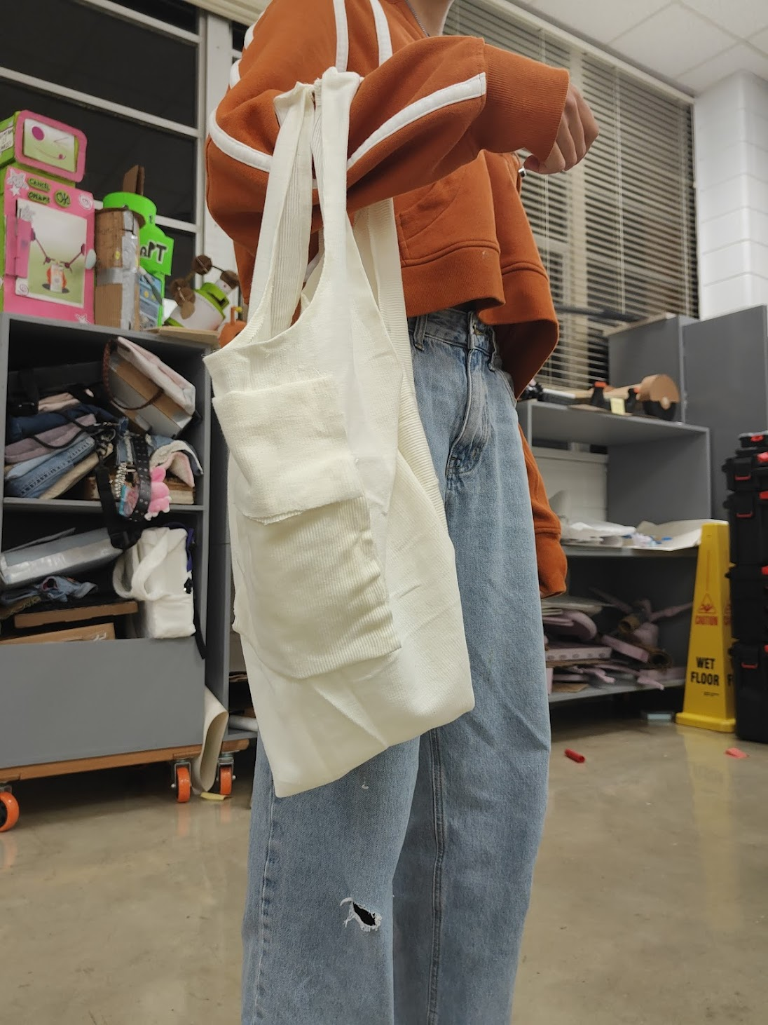
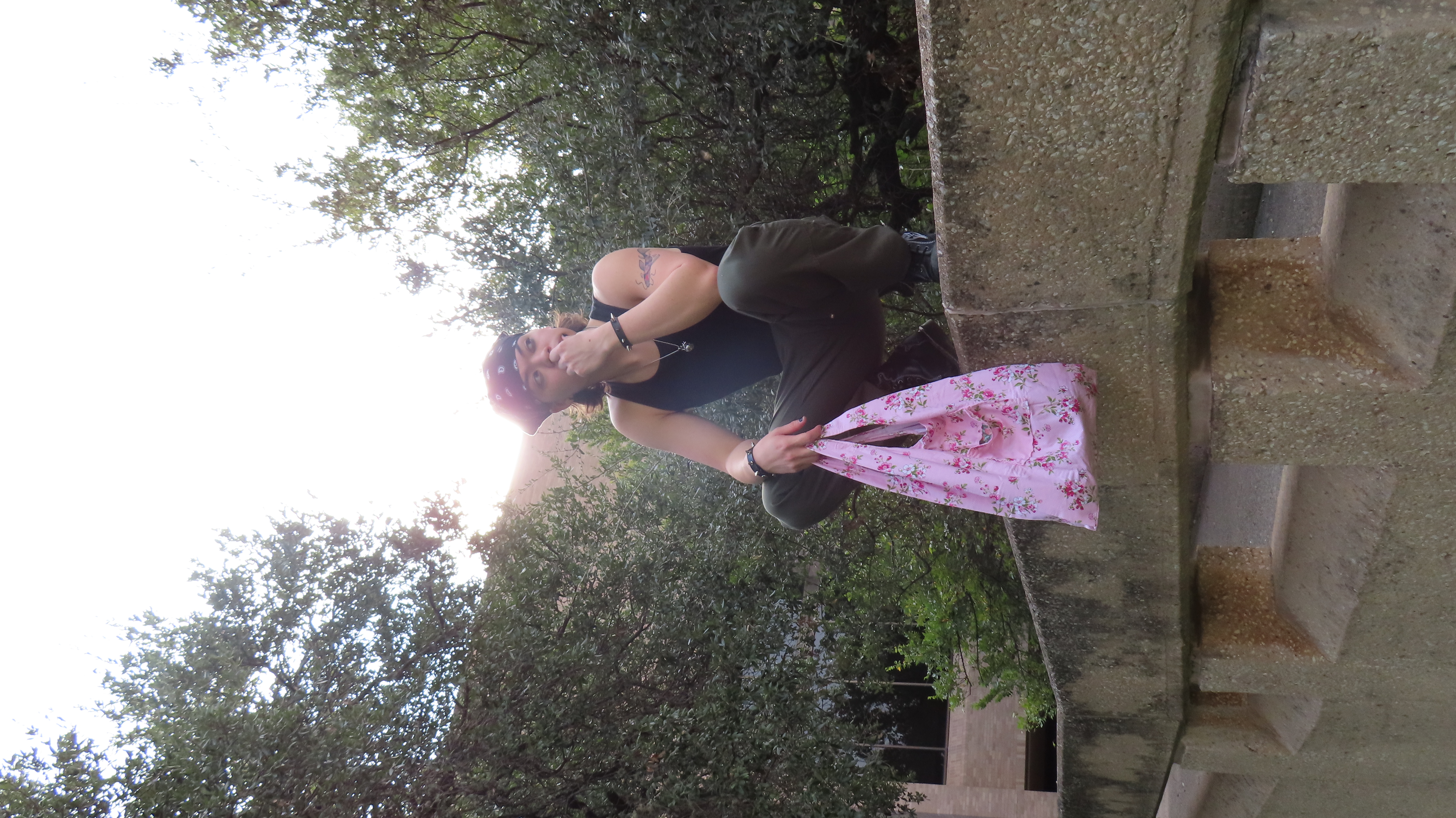
Two copies together. Book in book sleeve.
Critique
Battle Report: In-Class Critique
With the book ready to turn in, I received in-class critique from a peer.
With all my books made, it was time to go into class and submit my best copy to Professor Kelcey, who would keep it in her archive forever. In class, we did a simple critique, where we got assigned a person and wrote on a sheet of paper what we thought of the book and responded to the guided questions.
The person who critiqued my book was Jessica Zhu. To the left is a photo I took of her critique sheet that I got to read. She said she overall enjoyed the experience of the book itself and its layouts, but the craftsmanship of the book sleeve could be improved. I agree with a lot of her points, especially the ones regarding the book sleeve. I appreciate her kind words as well!
With the critique over, I had to say bye to my most heralded copy of the book. I hope Professor Kelcey enjoys flipping through it!
Reflection
Lessons, Opportunities, and Final Thoughts
I finish the project knowing that I finally conquered layout design and the ever-so-daunting Adobe InDesign, producing a book on a game I love and contributing to the study of type within video games.
This project allowed me to bring together everything I learned about typography over the semester into a true labor of love. From conducting research, designing spreads, to compiling and producing a physical book, every step challenged me in new ways. Never did I imagine I would be able to use InDesign to this extent, or write and produce my own book, but here we are. I am immensely grateful for the guidance I received from Professor Gray and the growth I experienced throughout this class. Going from someone who had never touched InDesign to holding a book I created in my hands feels surreal, and I still can't believe it.
Though I am proud of what I have made, I recognize that there is always room for improvement. When I produce more copies of this book, I plan to refine the book sleeve and experiment with ways to make it more polished and durable. I am eager to continue exploring layout design and producing research books in this manner. While this project required immense effort, time, and many lost hours of sleep, it has been incredibly rewarding. I am excited to continue pushing my creative boundaries and bringing more research and design projects to life in this manner, going into the future.
UX/UI & Game Design>DiscoType!
UX/UI & Game Design | Game UI Design
DiscoType!
A colorful typing game where you play as a dancer and type along to the music. Every letter moves your character frame by frame, turning your typing into smooth dance moves. DiscoType! features an original logotype, a custom hand-crafted typeface, and a fully connected Unity prototype published live on Itch.io.
This is a high-fidelity prototype built for Typography in Games. The Unity build demonstrates the full UI prototype with a functional gameplay mechanic, not a finished commercial game.
The project brief was to invent a brand new game, design a logo and custom font for it, build a full suite of game screens in Unity (title, main menu, and at least two additional screens including a gameplay screen with a functional mechanic), wire all the scenes together, and publish a live WebGL build on Itch.io. We also designed a tutorial and delivered a final slide deck with full documentation.
The Team
The Phrog Girls
Our class started with a mixer activity that the whole class joked about sounding like speed dating. Since the class is split between AET and Design students, and I am double-majoring in both, I made an effort to meet everyone. After the session, I was genuinely honored to be approached separately by two AET students, Carly Mills and Miranda Cruz, who both asked if I wanted to team up. We checked in with Professors Jessie Contour and Kelcey Gray, who gave us the green light (and laughed at how excited we were), and the "phrog girls" team was born.
All our communication happened over Discord and in person, and everyone stayed on top of things throughout. Miro became our best friend for the creative process. We compiled almost all of our ideation and prototypes there to keep everything in one place.
Miranda CruzAnimator (wireframing, character design, animation)
Game Concept
DiscoType!
Our first task after the mixer was to each brainstorm three game concepts with mood boards and research. After we shared our ideas with each other, Carly and Miranda both voted to move forward with mine. I was so touched by that, and honestly still am.
The three of us brought a variety of creative ideas to the table, but we all felt Anshu's initial concept had the best balance of scope, aesthetic specificity, and mechanics. Anshu's disco dance floor inspired typing game won the vote.
DiscoType! is a colorful typing game where you play as a dancer of your choice and type along to the music. Every letter you press moves your character frame by frame, turning your typing into smooth dance moves and nonstop rhythm. Before the song ends, type as fast as you can to raise your WPM and keep the performance going. With bright colors, lively visuals, and fun dancing characters, DiscoType! transforms typing practice into an exciting challenge full of energy and style.
The aesthetic was inspired by 70s and 80s disco culture, which gave us a rich visual reference library to draw from and a very clear direction for the whole project.
All three brainstormed game ideas on Miro
Paper Prototyping
Dance Floor, IRL
Paper prototyping a typing game was genuinely confusing at first. We were unsure how to approach it, so we brought our concerns to Professors Jessie Contour and Kelcey Gray. They suggested we use an existing typing game to simulate our mechanics in real life, so that's exactly what we did.
Fortunately, my best friends were visiting for a sleepover around that time. I voluntold them to help, and they were more than happy. We ran the prototype using Nitrotype: one person called out how the player was performing while another person physically danced to represent the dancer's response to that performance. The results were pretty interesting.
Players responded positively to seeing their typing speed reflected in the dancer's movements, and they quickly understood the connection between performance and visual feedback. The dancer was occasionally distracting, but we attributed that mostly to having a real person in the room rather than an on-screen character. We logged it as something a digital implementation would naturally solve.
We also landed on an important design decision: we initially planned a competitive two-dancer setup with one acting as a bot opponent, but simplified to a single dancer on the dance floor. It made the concept cleaner and helped us hit all our goals without overcomplicating the prototype.
Paper prototyping documentation
Color & Aesthetic
Vibey, Groovy, Disco Futuristic
We settled on a color palette that captures the energy of the whole game: bold, vibrant, and unmistakably disco. Every design decision from the logo to the screens was rooted in this direction.
The DiscoType! color palette
Early Unity Prototype
While I was working on the visual identity, Carly got started in Unity. She used a robot GIF as a placeholder for the player character during early development. That robot ended up becoming a hidden easter egg in the final game.
Carly prototyping the game with a robot GIF as a placeholder, who later became an easter egg character
Early Wireframes
Miranda's early UX wireframes
Logo
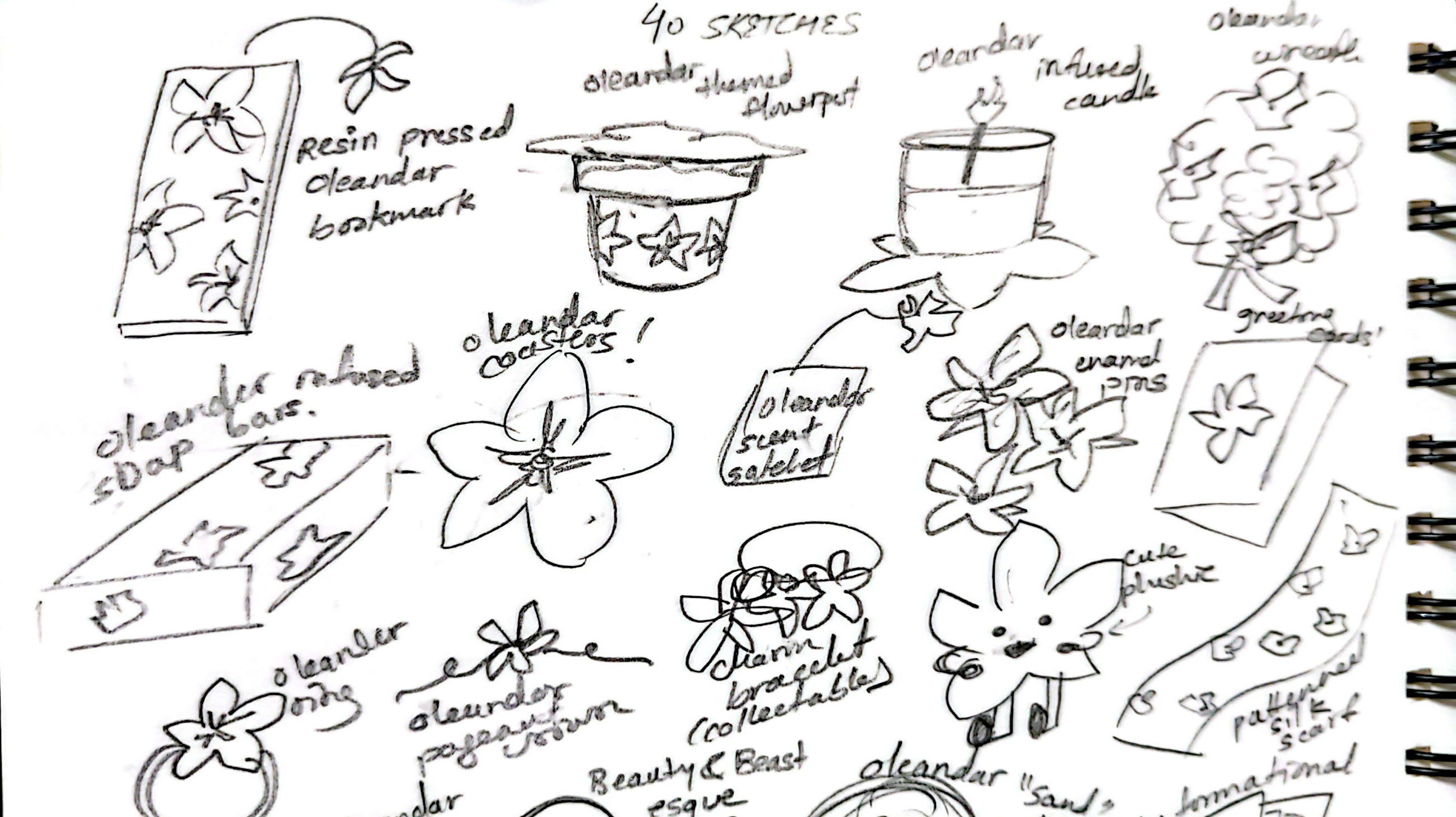
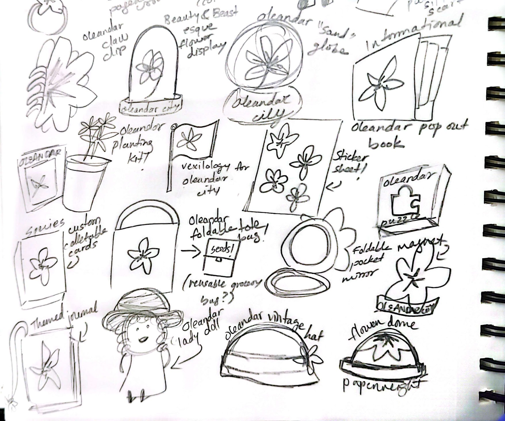
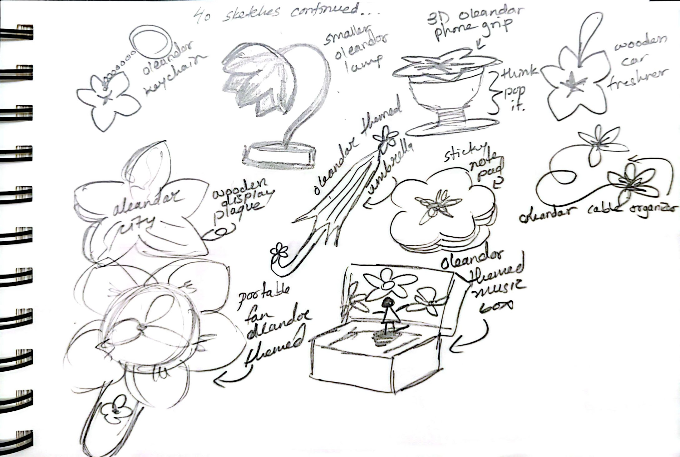
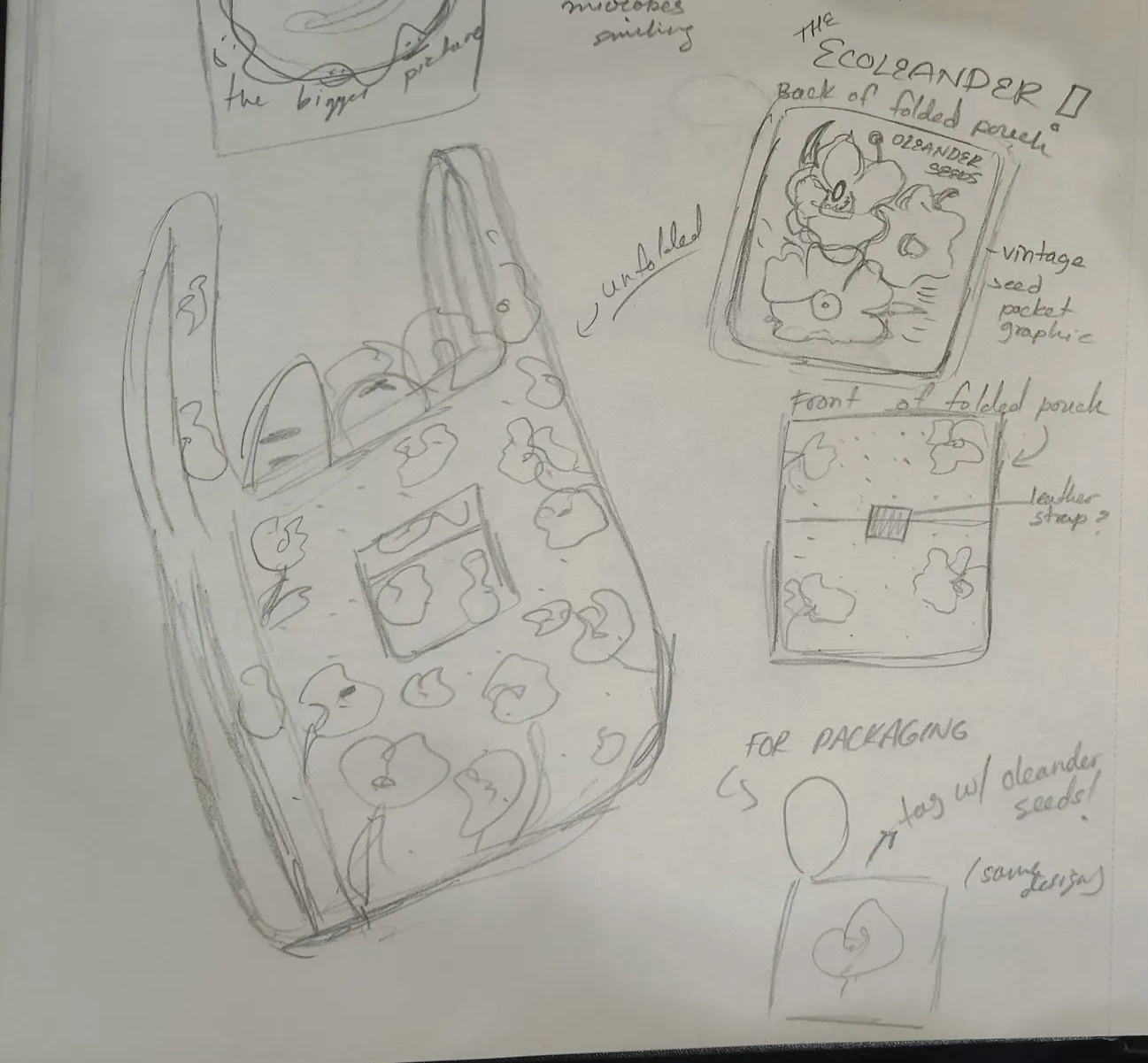
30 Sketches, One Winner
I produced 30 unique logo sketches based on a variety of aesthetic references, then had Carly and Miranda circle their favorites. We moved forward with sketch number 3.
30 logo sketches. Sketch 3 selected for development.
Final Logotype
Final logotype
Logotype in Context
Logotype in context
DiscoType Font
The Font
I began font creation by producing a range of Homra sketches. We reviewed them together and landed on a display typeface inspired by groovy, retro aesthetics. I sent the in-progress font to Professor Kelcey for feedback during development and implemented her suggestions into the final version.
I named the font DiscoType because it was made specifically for the game, and it just fit perfectly. We paired it with Futura throughout for the typing text, since Futura matched the retro aesthetic while staying clean and legible at any size.
Homra sketches exploring the font direction
Font inspiration (left) and feedback from Professor Kelcey (right)
To provide encouraging, real-time feedback to players during gameplay, I designed custom callouts using the DiscoType font and refined them in Adobe Illustrator. They are styled in the game's theme pink to feel vibrant and on-brand.
All callouts used in the game
Characters & Animation
The Characters
Carly and Miranda worked together on character designs, coloring, and animation. Since I am a dancer, I contributed by sending Miranda reference videos to support her animation work. Watching our characters come to life from sketches to final sprite sheets was genuinely one of the most exciting parts of the project.
Character ideation and concept art
Alien girl final character art
Character sprite sheets
Animation Process
Animation workflow loop
Final Animations
Final character animations
Screens
All the Screens
Once the visual identity was established, we built out all the game screens and connected them in Unity. Every screen transitions to the next using buttons or keypresses. The screen flow diagram shows how they all link together.
A colorful disco typing game. Choose your dancer, pick a song, and type along to the music. Every letter you press moves your character. See how high you can push your WPM before the song ends.
Reflection
Looking Back
Making DiscoType! was an incredibly fun and rewarding experience. Each of us had the opportunity to contribute to the parts we were most passionate about, and collaborating as a team made the whole process even more fulfilling. We are especially proud to see our original vision and aesthetic come to life in the final product.
While there were moments when managing so many moving parts became challenging, we worked through them and maintained strong communication throughout. This is what allowed us to stay on track and bring DiscoType! together as something cohesive. Given more time, we would love to add more songs (ideally ones we produce ourselves), new characters, and more animations to expand the experience. Overall, we are really proud of this prototype and excited to keep creating.
Instructor Feedback
Professors Contour and Gray
Both professors praised the clarity of the game description and how immediately fun the core mechanic is: type fast, perform better. Kelcey called out the clear shared visual direction and loved that the game has live stats. Jessie said the pitch sentence "futuristic disco meets Club Penguin dancing rhythm game" was tight and polished.
On the visual side, Kelcey praised the logo sketches and strong consistency of the final font. Jessie complimented the polish of the font and how well the aesthetic carried across every element of the project.
On the presentation, Kelcey noted that the team dynamic was genuinely evident and gave a final note: "Successful collaborations and shared passion yield great games." Jessie found the presentation organized, loved the sound effects and stats, and was able to get right into the demo.
Sound effects sourced from Pixabay (user 9jackjack8)
Claude AI was used for coding assistance
All music and copyrighted material belongs to the respective artists and was used for educational and prototyping purposes only
UX/UI & Game Design>Oracle
UX/UI & Game Design | Interactive Web Design
Oracle
The Oracle tells your future in a lighthearted, personalized way, pairing your result with a recommended genre and media to explore. A magical personality quiz built as an interactive web experience with original illustration and animation.
I began my ideation process using sticky notes on Miro to explore a wide range of possibilities. I wrote down a plethora of ideas before narrowing them down to the concept I ultimately pursued: Oracle. I consume a lot of content and have a strong affinity for magical and whimsical themes, so I wanted to merge those interests into a playful, interactive website. The Oracle allows users to have their "future told" in a lighthearted way while also receiving a recommended genre and accompanying media, creating an engaging experience.
Miro sticky note ideation
Color, Typography & Grid
Purples, Greens, and Pixel Magic
I explored various color palettes on Coolors before settling on one that felt right. From the beginning, I knew I wanted to work with purples and greens since those colors immediately come to mind when I think of an oracle concept (likely influenced by Percy Jackson). For the logo and title typography, I used TAN Grandeur, which I customized by adding star emblems. Its wispy, magical, and whimsical qualities perfectly capture the oracle theme. I paired this with VT323, a pixel-style font, to create a connection between video games and the interactive nature of the website. The overall design was meant to feel playful while still supporting the project's core themes. I also applied the grid systems introduced in class to guide the placement of elements throughout the layout.
I started by making a really barebones website to test out my layout, mechanics, and color palette to see if I could even bring my concept to life. I did extensive self-teaching and reviewed code I had learned my freshman year in an intro UX/UI class, and used AI when necessary to build a general wireframe for my website. I needed some assistance with code formatting, flexbox, and similar concepts, but I successfully created a functioning, animated website that I understand. After establishing the core functionality, I was able to focus on the design aspects, drawing and implementing all of the graphic elements as SVGs/PNGs. I'm glad I established the core functionality first.
Process: Making Assets
The Oracle, the Background, and the Logo
The main assets I developed were the image of the Oracle, the background, and the logo. I created the Oracle herself using Illustrator and vector tools. The background was originally sourced from Amit Ginni Patpatia on ArtStation and then recolored to match my color palette. The logo was designed in Canva using TAN Grandeur, and I added my own embellishments to make it feel more distinctive and logo-like. Bringing all of these elements together made the project feel complete and especially satisfying.
Asset development in Illustrator
Oracle illustration, logo, and background
Interaction Design & Animation
Motion as Communication
Motion and glow are used throughout to guide user interaction and attention. Pulsing elements signal the system is waiting for input, floating animations make the interface feel alive, and scaling and glow effects on hover clearly communicate interactivity. They were also the most fun to experiment with. Made it all magical.
Homepage Entry
When the user hovers, the element slightly grows and shows a soft green glow. This signals it is clickable and meant to be interacted with. The glow draws attention to it as an important entry point, and the quick transition makes the interaction feel responsive and smooth.
Oracle Image & Speech Bubble
The oracle image stays still at first. When hovered, it slightly grows and gains a glowing shadow. When clicked, it briefly shrinks to show it has been pressed. These small movements help users understand the image is interactive and give physical-like feedback, similar to pressing a real button.
The speech bubble gently floats up and down at all times. It is not clickable, but the movement makes it feel alive, like the oracle is actively speaking. This keeps the viewer's attention and supports the storytelling aspect of the experience.
Answer Buttons & Results
When the answer buttons are not being hovered, they continuously pulse with a shifting glow to highlight their importance and signal the experience is waiting for input. When hovered, the buttons become slightly larger and begin to jitter. The scale increase clearly communicates interactivity, while the jitter adds a sense of energy and urgency, almost like the button is reacting to the user's presence. On the results page, media images slightly grow and gain a layered glow on hover, while the image inside also scales up to create a sense of depth. The restart button behaves exactly like the start button, creating familiar, consistent behavior.
Usability Testing
Three Testers, Great Feedback
My three users were so helpful. Some highlights from their feedback:
"Maybe try to have it where on each new page it goes back to the top, so it is more responsive."
"The hover animations are so cute and engaging."
"The illustration of the Oracle is very nice and cute."
"The buttons are so interesting and engaging."
"The website is very poetic in the answer choices."
"Maybe put a 'let's discover...' since it was unclear when it would end."
This is my first time developing something and it was so fun! It was really daunting at first and I really thought I bit off more than I could chew, but researching resources and just figuring it out as I went really helped. Professor Parks loved it!
Instructor Feedback
Professor Parks
"Documentation is thorough: concept, color, Figma, interaction, and iteration all there. One of the only students to include a short video on the interaction/animation page. The oracle illustration is stunning and carries the whole visual identity. The purple/magenta with glowing outline creates real atmosphere. The answer options are poetic and personal enough that anyone can find meaning in them. Font choice is perfect: clean, readable, great contrast. The glowing outline, button jitter, and speech bubble animations all make the oracle feel alive. The animation feedback for affordance design works well."
Update: I have implemented the scroll and question transition improvements!
UX/UI & Game Design>Featherform
UX/UI & Game Design | Game UI Design
Featherform
A cozy sci-fi farming game prototype featuring an original logotype, a custom hand-crafted typeface, and Unity-built UI screens published live on Itch.io. FEATHERFORM is a fictional single-player farming RPG set on a Martian colony where you play as a space pigeon restoring the planet.
This is a prototype built for a game design course. The game is fictional and the Unity build demonstrates the UI prototype, not a full playable game.
The project brief was to invent a fictional digital game and build a prototype for it from scratch. That meant coming up with the concept, designing a logo, creating a whole custom font, and designing a start screen and a gameplay screen. Then we built both screens in Unity, wired up the button interactions, and published the final WebGL build live on Itch.io.
Game Concept
FEATHERFORM
FEATHERFORM is a single-player farming RPG (with optional multiplayer) set on a cozy sci-fi Mars farm, rated Everyone 10+. You play as a space pigeon who farms, terraforms land, grows alien crops, and cares for little Martian animals while restoring the planet. It's relaxed and exploration-based, with crafting, farm upgrades, and simple story objectives. Light, comedic, and cozy.
Inspiration
The concept pulled from four places.
The Martian: farming on Mars, just cozier.
Stardew Valley: the slow farming rhythm and caring about your little piece of land.
The Pigeon Children's Books: the pigeon protagonist and the humor.
Red Rising: Mars and rebuilding a world from scratch.
Logo
30 Sketches, One Winner
I sketched thirty logos to explore different directions. Sketch 25 was my favorite, and it turned out to be Professor Kelcey's favorite too!
Thirty logo sketches. Sketch 25 selected for development.
Final Logo
Final logotype
Logo on Title Screen
Logo on the title screen
Featherfont
A Custom Sci-Fi Typeface
I did five rounds of uppercase and lowercase sketches to figure out the direction for the font. I wanted something sci-fi but still playful, so I went with hard vector lines with rounded caps. I used Calligraphr to actually build the font from my hand-drawn letterforms. Professor Kelcey pointed out her favorites as marked in the sketches.
Uppercase and lowercase sketches with Professor Kelcey's feedback marked
Featherfont in Context
Hard vector lines, rounded caps. Sci-fi but still playful. Below are the font slides.
I designed both screens and then rebuilt them in Unity using Canvas and UI elements. The start screen has the logo and a button menu. The gameplay screen shows the relevant UI with scores and items, and key presses trigger updates live.
Start screen
Gameplay screen
Assets & Process
Vector Illustrations & Reference
I used vector illustrations online as reference and image traced some of them to speed things up. All sources are cited below.
A fictional cozy sci-fi farming game. Play as a space pigeon farming on Mars. Click Start on the title screen, then press the keys listed on the page to interact with the gameplay UI.
Reflection
A Completely New Experience
This was also a completely new and exciting experience for me! Being able to bring a concept to life, even as a prototype, was incredibly rewarding. Designing a logo and creating an entire font from scratch was such a cool challenge and a valuable skill to develop. Overall, the whole process was super exciting and gave me the opportunity to learn so much. If I had more time, I would definitely refine the graphics and illustrations further, but I am really proud of what I was able to accomplish.
Instructor Feedback
Professors Contour and Gray
Both professors praised the strength of the visual development process: the variety of inspiration, thorough logo exploration, and strong iteration. The logo was felt to successfully communicate the retrofuturistic sci-fi space pigeon concept, and the research clearly informed the final design. The custom font received especially positive feedback for its consistency and how well it complemented the overall identity. One note for improvement was refining some vector curves for a more polished finish. Overall, they commended the execution, presentation, and thoughtful process behind the project.
UX/UI & Game Design>Stellar Exploration
UX/UI & Game Design | Data Visualization
Stellar Exploration: The Scale of Our Universe
An interactive, cinematic star map built from real data, showing the stars closest to our Sun and telling the story of just how small we are and how vast space truly is.
Create an interactive experience driven by data. Gather a dataset that interests you, understand the story it tells, and communicate that narrative visually. Limit the amount of text. Communicate through icons, visuals, and interaction. Two weeks.
The project could be a data visualization, a data-driven artwork, an interactive narrative, or a game-like interface. The brief was intentionally open-ended, which made choosing the right concept and scoping it carefully especially important.
Concept & Ideation
A Map of Our Neighbors
I started brainstorming on Miro with sticky notes, exploring a wide range of possibilities before landing on space. I knew early on that I wanted to create something cinematic and exploratory, so I looked for datasets about the stars nearest to our Sun.
My concept became a distance-based star map built from real data, showing every star closest to us. The story I wanted to tell is about scale: how tiny our world and solar system are in the bigger picture, and how vast and open space truly is. Not overwhelming, just something that makes you stop and feel it.
Miro ideation board
Full process board on Miro, drag to explore
Dataset
Cleaning the Data
I found a stars dataset on Kaggle in CSV format and converted it to JSON so I could use it in the visualization. Once I started working with the data I found a lot of duplicate entries, so I went through it carefully and removed the less accurate ones. I also researched and manually added data for our own Sun, since I wanted it to be the anchor of the whole map.
Original CSV converted to JSON, duplicates cleaned, and Sun data added manually.
Sketches
Scoping It Out
With only two weeks on the clock I had to nail down scope early and commit to a direction before building anything. These sketches show me thinking through potential pathways and ideas.
Early concept sketches
Process & Iteration
Building It Up
I started with an extremely barebones version built straight from my sketches: minimal animations, basically click-and-draw functionality. I used it to experiment with placement, test out ideas, and figure out exactly what I wanted to showcase before committing to any real polish.
Early iteration
I was also a bit concerned about using too much text in the project, so I reached out to our class TA, Helena. She was super helpful throughout the whole process, especially during usability testing.
Reaching out to TA Helena for feedback
Usability Testing
The usability test was really helpful. People enjoyed what they saw so far, but Helena's feedback made it clear the project had a lot more potential. She told me to make it more cinematic and to think less about presenting data and more about the story I wanted to tell. What did I want people to feel? What did I want them to experience? That advice completely sparked the grind to maximize the project and bring it to life the way I originally envisioned.
Usability testing
Design Decisions
Title Screen
Our Sun, colored according to its spectral class, greets the user on the title screen. I used a serif font for the main title to give it a cinematic feel, paired with a smaller UI font for descriptions to keep the text clean and readable. Subtle animations throughout set the tone and make the whole experience feel more like a film than a chart.
Title screen
Title screen animation
Main Screen
The main screen features a spectral color key, with every star colored by its spectral class. Faint rings show light year distances. An animated zoom bar shows how far in or out you are. A button lets explorers return to the center. When you hover a star, its data is revealed with animations that clearly signal which one is selected.
Main screen
Main screen interaction
Animation Close-ups
The zoom-out animation when entering the main screen makes the experience feel dramatic and sets up a sense of exploration right away. The zoom scale bar shows how deep in you are. Hover animations and a cursor change help signal which star is selected.
Zoom animation (left) and hover interaction (right)
All additional resources included on the Miro board
Looking Back
Reflection
I love space so I had so much fun with this one. If we had more time, I would have drawn a distinct personality for each star and included the educational timeline idea I had initially in my sketches. This project got really nice feedback and responses and everyone really liked it, which was awesome.
Professor Feedback
"This is one of the best documentations from this project; it feels like a story. Lovely writing that feels personalized but professional. The intro animation is perfect for a project about scale. Negative space and circle size communicate the concept beautifully. Overall design is clean and aesthetically stunning. The greatest strength is that cinematic feel, something to carry into all your future work. You found data that seems straightforward, but created an interface that turned it into an experience that provoked curiosity and emotion. Wonderfully done."
UX/UI & Game Design>Silent Spellcraft
UX/UI & Game Design | Unconventional Interaction
Silent Spellcraft
An interactive browser-based game that uses real-time ASL hand gesture recognition to cast spells. Your hands are the controller.
Course
AET 330T Exploring User Interaction
Instructor
Sydney Parks
Semester
Spring 2026
Timeline
2 weeks
Tools
HTML, CSS, JavaScript, MediaPipe
Type
Unconventional Interaction
UX/UI & Game Design | Unconventional Interaction
Silent Spellcraft
Play it yourself! ↗
Note: Silent Spellcraft is a working prototype actively in development. The hand tracking system is being refined and gesture recognition accuracy can vary depending on lighting conditions.
Design and build an interactive experience using an unconventional interaction as the primary input. Mouse clicks and keyboard presses don't count. Explore embodiment, gesture-based control, and spatial design. Two weeks.
Tools included anything that could support the idea: ml5.js, Python, TouchDesigner, Unity, Arduino, VR. The concept and execution were fully open, which made scoping the project carefully one of the most important early decisions.
Open in a desktop browser with camera access enabled. Show your hand and fingerspell to cast spells.
Concept
After researching the scope of the project and my current technical limits, I decided to focus on ASL fingerspelling (the alphabet) rather than full sign language vocabulary. Fingerspelling is a core part of American Sign Language, used for names, places, and words without their own sign, and it was a realistic scope to implement within two weeks.
The experience is an interactive learning game where the player takes on the role of a fairy defending themselves from approaching magical creatures. Each creature represents a letter of the alphabet, and the player must perform the correct ASL hand sign to defeat it. My research included exploring tools like fingerspelling.xyz, which helped me understand how repetition and visual prompts support memorization of the ASL alphabet. This project applies those ideas in a game format to make practicing fingerspelling more engaging.
Early ideation
Unconventional Interaction
Your Hand is the Controller
Silent Spellcraft uses a camera-based hand gesture recognition system instead of traditional keyboard or mouse input. It's powered by MediaPipe Hands, running directly in the browser using WebAssembly and WebGL. The user's webcam captures their hand, and the system detects 21 hand landmark points in real time. Those landmarks are analyzed using a custom geometry-based classifier that compares finger positions, distances, and joint angles to recognize ASL fingerspelling letters.
When the detected letter matches the on-screen prompt, a hold-progress bar fills to represent spell charging. Once complete, the fairy casts a spell to defeat the approaching creature. This method was chosen because it lets players practice real ASL hand shapes through physical movement rather than button presses, keeps all processing local in the browser without needing a server, and turns the user's own hand into the primary controller.
Real-time hand tracking in action
Affordance Design
Communicating Without Words
The affordance design in Silent Spellcraft is built to guide the user through visual cues, spatial layout, and minimal text. The landing page explains the goal in structured steps so players know what to expect before they jump in.
On the main interface, each dark creature carries a letter, signaling which ASL handshape to form. The charge bar above the detected sign gives real-time visual feedback. Spatially, the player's hand appears in a dedicated camera box, target letters are positioned directly in front of the character, and prompts sit right below the feed, keeping the user's attention in one focused area. Progression is gradual: Level 1 introduces only a few letters to avoid cognitive overload, and the alphabet chart gives players a reference to compare handshapes.
The affordance design also borrows from familiar platformer conventions, making it immediately recognizable. The fairy reacts dynamically to spell casts, providing visual feedback that reinforces the game's mechanics. By blending those familiar conventions with clear visual cues and interactive guidance, the game communicates what to do without feeling overwhelming.
Main game interface
Affordance design in action
Design Decisions
Color, Characters, and Type
The game leans into pinks and softer, traditionally "feminine" tones. This was a deliberate personal choice and a pushback against the tendency to avoid these aesthetics in game design. The palette maintains enough contrast for clarity and readability, showing that a playful, cute aesthetic can coexist with strong visual communication.
The fairy companion is designed with brown skin, both for representation I want to see in games and for visual contrast within the environment. It helps the character stand out while reflecting a genuine commitment to diversity in character design.
For type, Crimson Pro is used throughout to support a clear visual hierarchy. It's highly legible for instructions and interactive elements while still carrying an elegant, stylized quality that fits the aesthetic.
Color palette and typography
Process & Iterations
Building It Out
I started by integrating an existing ASL fingerspelling library to get a working proof of concept, then layered my own designs and assets on top. The gesture recognition system is still being dialed in. The library I'm using has inconsistencies that I'm actively working through, and performance can be affected by lighting conditions. Debugging this while also building out the visual side of the game has been the main challenge of the project.
This project was built using JavaScript with MediaPipe Hands. AI coding tools helped me navigate the technical complexity of the gesture recognition system, especially in areas where the documentation was sparse. Using whatever tools are available to ship something real is part of the process.
Early prototype and code
Assets
During spring break I collected and created the visual assets for Silent Spellcraft. I selected and adjusted many of them to match the color palette, keeping the visuals consistent and cohesive across the interface. Characters, environments, and UI elements were all brought into alignment so the game feels like a unified visual world.
Open in a desktop browser with camera access enabled. Show your hand and fingerspell to cast spells.
Looking Back
Reflection
This was definitely a challenge for me. I yet again attempted to do something I had never done before and it was a journey. Since this is still a prototype, once I get more time I really want to make it more developed and more designed in the way I actually envision it, refining everything from mechanics to layout with a lot more playtesting. But for a prototype I was quite satisfied. And Professor Parks told me this is the most developed project anyone has submitted for this assignment yet, which meant a lot.
Professor Feedback
"Great reasoning for the interaction; it has a clear relationship with the concept. Fun and engaging way to teach sign language, and the fairy casting spells makes the player feel like they are genuinely casting with their hand. Great eye for design. The depth from blurred backgrounds and drop shadows was a nice touch, and the characters are very cute. Feels like a distinct personal style. The documentation was thorough and the amount of thought put into every decision came across clearly."
UX/UI & Game Design>Choco Knight
UX/UI & Game Design | Game Design
Choco Knight
A 2D pixel platformer. Embark on a sweet adventure as a cake-loving knight on a quest to reunite with her one true love... cake! Explore a colorful pastry world, overcome tasty obstacles, and conquer sugary challenges to reach your ultimate dessert destiny.
This game was created as part of my Games and Interactivity class at the University of Texas at Austin. I built it using an instructor-developed game kit. I recolored and implemented the visual assets, and designed the levels and overall gameplay experience.
A 2D pixel platformer. Embark on a sweet adventure as a cake-loving knight on a quest to reunite with her one true love... cake! Explore a colorful pastry world, overcome tasty obstacles, and conquer sugary challenges to reach your ultimate dessert destiny.
Process Slides
Full Documentation
This project was fully documented in a slide format according to the course requirements. Go through each slide below.
A cake-loving knight on a quest for dessert. A 2D pixel platformer built in Games and Interactivity at UT Austin.
UX/UI & Game Design>Spotify: Designing a New Microinteraction
UX/UI & Game Design | Micro-interaction Design
Spotify: Designing a New Microinteraction
How might we create meaningful and mind-opening music discovery experiences for university students so that they are able to connect more to their surroundings and others?
My assigned persona is "University Student Omicron," who is seeking mind-opening experiences and meaningful connections. Their motivations are based on wanting to foster a sense of kinship and becoming more attuned to their environment and the people around them. The problem statement emphasizes the need to "help in opening space for meaningful attention."
I relate to Omicron as a university student. Many students (including me) want to make friends, develop long-lasting bonds, break out of routine, and connect to their environment on a deeper level. My personal experiences of being a Spotify warrior (I listen to music whenever I am doing quite literally anything) and always seeking to find new music and share music tastes informed my design. A Spotify task flow with an emphasis on finding something new to listen to aligns quite well with the persona's need for connection and meaningful experiences.
Existing Task Flow
How I Already Discover Music
Open the app (neutral, just ready to listen). Scroll to "Made For Anshu Patel" (mild excitement). Click Discover Weekly (subtle anticipation; it's built from data Spotify has on what I actually listen to). Scroll through songs (curious). Click on one and play (curious and excited to hear something fresh, especially with my habit of replaying the same songs on loop).
The interface alters my umwelt by framing music discovery as effortless and personal. But with the algorithm, Spotify also narrows my world by predicting what I want to hear, which can limit exposure to diverse or unfamiliar songs.
Interface Analysis
"Made For You" and What It Limits
The central design pattern I analyzed was the "Made For [Username]" categorization on Spotify's home screen. It makes a vast music catalog feel curated, personal, and approachable. But it also frames discovery as something that happens to you, not something you participate in.
Low-fi wireframes and analysis sketches
The Laban Movement Analysis captures the feel of using the app well: direct focus (single-task scrolling), light weight (no physical effort), sustained time (user sets the pace), free flow (no enforced path). Scrolling through Spotify is leisurely and unconstrained.
The Mechanisms & Conditions Framework showed something more pointed: the app encourages passive exploration while actively discouraging active search. The Search tab is tiny at the bottom of the screen. The home screen suggestions are displayed prominently and brightly. The design is making a choice about what kind of discovery it wants you to do.
Design Opportunities
Three Directions
The analysis surfaced three design opportunities, all pointing at the same gap: Spotify's social and environmental discovery is underdeveloped.
01
Geographical Music Suggestions
Let users discover music recommended by people in their area. Ties music to place, fosters community, and helps students feel attuned to their environment, which is exactly what Omicron wants.
02
Social Discovery
Enable sharing and exploring Discover Weekly playlists with friends. People find music through social connections all the time, but Spotify doesn't let that integrate back into the algorithm.
03
Event-Based Recommendations
Music suggestions tied to specific campus spaces and events. A study lounge playlist, a football game's shared listening queue. Context-aware music that connects students to their immediate environment.
I moved forward with the first one. It felt the most grounded and the most Spotify-native.
The Concept
Local Eye
The "Local Eye" is an eye icon added to Spotify's now-playing screen. Tapping it opens two options: recommend the song you're currently hearing to people in your area, or open a playlist of what locals around you are recommending. Think of it like a rotating Top 100 that refreshes as people listen more and suggest new things, inspired by how Spotify's Blend playlists show who added each song.
Concept sketch
The eye icon reinforces the concept of attentiveness and engagement. The interaction plays with contemplation and community-driven interest. You contemplate what you want to recommend and what others around you are suggesting, and you have to be genuinely interested in contributing to (and drawing from) your community's listening habits to keep using it.
It addresses Max-Neef human needs directly:
Participation: engaging with your local community and demographic through music
Affection: fostering social bonds by sharing music taste
Understanding: discovering new songs and understanding the people around you
Leisure: making music discovery feel like a social hobby, like pinning something on Pinterest or liking something on Instagram
Identity: expressing yourself through what you choose to recommend
Per feedback from classmate Maya Ramani, I removed the original blinking animation from the eye icon, since it wouldn't be seen at that scale and added unnecessary complexity. Users simply tap the eye and get prompted with their two choices.
Process
Ideation to Prototype
Ideation map
Userflow and wireframe sketches
Sketching the userflow was where the idea really solidified. I realized the interaction is simpler than I initially thought, and that's a good thing. I also added handling for duplicate suggestions mid-sketch, drawing from how Spotify's Blend playlists attribute songs to specific people.
Wireframing in Figma went faster than expected. I made two versions. The first was polished enough that version two only needed small adjustments (tweaking opacity on the pop-up tint, adding a drop shadow to the "add away!" button). Spending more time on fidelity than necessary in medium-fi was a lesson learned, but it paid off when moving to the prototype.
Both participants naturally knew what to do. Yay script! Figma screwed things over a couple times with click registration, but it worked out. Both seemed to enjoy the multiple options and how simple the interaction was. I liked how they were acting out what they were doing, which was fun and helpful to watch.
The interface is intuitive and easy to navigate according to my testers, following Spotify's familiar design. Users can easily recognize symbols and interact without memorization, and the design encourages exploration and engagement with local users. Minimal errors occur due to the simple and clear structure.
What I need to address based on feedback: clarify the definition of "local music" so users understand its purpose, make the icon more prominent while maintaining Spotify's clean design language, and create more ways to access the feature beyond just the now-playing screen.
Iteration
What I'd Change with Full Build Capabilities
These changes are listed with the idea that I would have the full capabilities to implement them just as well as Spotify (not limited by what Figma allows me to do).
I would add a small animation when a song is added so it's more noticeable.
I would include an "Undo" option to make it easier to exit Local Music.
I would add a quick tooltip to explain the eye icon on first use, implemented only when the feature is first discovered, not every time.
I would adjust the eye icon slightly so it stands out without being distracting. I wanted to emulate Spotify's simplicity, but I think I'd want something more playful moving forward.
I would clarify how "local" is defined and maybe add an option to expand beyond the immediate area. This needs a limit, since at some point "local" just shifts into a global top 100.
I would add a feature where you can click the profiles of people who suggested a song.
I would add the ability to actually scroll through the songs, but that's more of a refining-the-prototype thing.
Reflection
Music as Belonging
My microinteraction changes how university students like Omicron experience and share music, making them feel more connected to the people around them and fostering more attunement to their environment. It creates a world where music isn't just personal, streamlined, and generalized, but a shared, local experience -- shaping how they discover new music and artists. Instead of just relying on algorithms, they help curate music for the community around them, reviving a ritual of collective music discovery. It's supposed to sort of emulate how mixtapes or early radio shaped social listening.
The interface changes their umwelt by making them see music as something that can belong to a place, not just a personal playlist. "Local" stops being just about geography and starts feeling more like a cultural identity. As a medium, the interface shifts music discovery from isolated and passive to social and intentional -- which fits with McLuhan's idea that the medium shapes how we experience the message. If we are bound to experience music through a platform like Spotify, it should be more social and community-oriented than what it is now.
P.S. I just like to think about if this interface was actually adopted. Imagine the social media discourse: "The people in Austin know what real music is, because why are the Local Music suggestions in Huntsville genuinely horrendous." It's so curious to think about what kind of discourse something like this would generate.
2D & Graphic Design>High Noon Livery
2D & Graphic Design | Vehicle Livery
High Noon Livery
Our team designed the livery for Longhorn Racing's solar vehicle High Noon. We wanted to make something that didn't look like any other solar car out there.
Our team was selected to design and oversee the creation of the Longhorn Racing Solar vehicle High Noon livery. From the start, we approached the project with a different vision. Rather than creating another solar car livery that followed conventions commonly seen in solar vehicle competitions, we asked ourselves a broader question: how could we push the category forward?
We wanted to create something new, distinctive, and immediately recognizable. A livery that felt unlike anything that had come before it. The team was originally Maya, Saahil, and myself. Evan joined later in the process and became an important part of the project's development.
As part of early ideation, Maya asked each of us to develop and present our own livery concepts. These presentations served as a starting point for discussion and helped establish the creative direction that would eventually shape the final livery.
Process Board
Everything on Miro
The full design process, from initial concept presentations to reference boards, sketch reviews, and iteration rounds, was documented and discussed on Miro. The board shows the evolution of the livery from first ideas to the final direction.
Full process board: reference gathering, concept presentations, sketches, and iterations all in one place.
Ideation
Individual Concept Presentations
Each team member developed their own slide presentation exploring different visual directions and uploaded them to Miro, where we could review, discuss, and build upon each other's ideas. The concepts I brought to the table were largely exploratory. I was interested in testing bold forms, distinctive patterns, and graphic systems that could give High Noon a unique visual identity and help it stand out both on the road and in competition settings.
Slides from my concept presentation, exploring bold forms and graphic systems for the livery.
Direction
The Heat Map Idea
Upon seeing Saahil's and Maya's broader range of inspiration, a new direction started to take shape. I began adding references of heat map gradients to our Miro board, inspired by the idea of visually representing heat and energy. At our next meeting, I brought up the concept of a heat map inspired gradient theme, and the team discussed how it could connect directly to the vehicle's solar-powered nature.
The idea felt especially fitting because it translated an aspect of the car's function into a visual language. Rather than relying on graphics commonly seen in solar racing, the heat map gradient offered a way to communicate solar energy through color, movement, and form.
Heat map gradient references I added to the Miro board. These references shaped the visual language that became the foundation of the livery.
Sketch Exploration & Critique
What Was Working, What Wasn't
The next phase focused on sketching and critique. We each developed concepts and then came together to discuss what was working, what should be explored further, and what ideas were less successful. These reviews helped us identify the strongest elements from each direction and refine the overall vision for the livery.
Throughout this process, we also had to work within the requirements of the competition. Visibility regulations, sponsor placement, and other technical constraints all influenced our decisions. Every concept had to balance creative ambition with practicality, ensuring our vision could be executed while remaining compliant with competition guidelines.
Sketch exploration across the team, with each person developing concepts independently before coming together to critique.
Second Iterations
Low-Fi Illustrator Renderings
After the sketch phase, we moved into low fidelity Illustrator renderings, which we referred to as our second iterations. Using feedback from critiques, we translated the strongest concepts into more developed digital proposals. These designs were created on two scaled vehicle outlines extracted from a UV unwrap of the car. Working directly on the vehicle's geometry allowed us to evaluate how graphics would flow across the body, test color placement, and better understand how each concept would read at full scale.
This is one of my first ever iterations. I explored versions that used larger, more solid graphic shapes. As I developed them further, I realized they would not work well with many of the project's requirements, including sponsor placement, visibility considerations, and the overall form of the vehicle. While these concepts were ultimately set aside, they helped clarify the constraints we needed to design within and informed later iterations.
My early iteration using larger, more solid graphic shapes. A direction that was ultimately set aside, but it helped clarify constraints.
Presenting the Direction
Getting the Heat Map Approved
We then met in person with the livery team and upper management to present our direction. After several long discussions, we were able to gain support for the heat map concept and move forward with developing it further.
Because of the limited available space on the vehicle, we needed a simple way to identify the car as being from UT Austin. Inspired by a concept Evan created, we decided to use a cutout of the Longhorn silhouette rather than the full logo. We liked how this approach maintained a clear connection to the university while working within branding and copyright considerations.
Third Iterations
Incorporating Sponsors
With the overall direction approved, we moved into our third iterations and began incorporating sponsor logos into the designs. This stage was challenging. Everyone on the team was balancing a heavy workload, and finding logo locations that satisfied sponsor requirements while preserving the integrity of the design took a lot of trial and error. Over time, we refined the layouts and found solutions that worked for both the sponsors and the overall livery.
One of my concepts posted to the Miro board during the third iteration phase.
The full spread of third-iteration concepts from across the team.
Synthesis
Taking the Best from Everyone
We then had a long meeting where we broke down each design and decided on the specific elements to carry forward. My gradient direction and Maya's gradient styling were both retained, along with the typography style I had developed. Saahil's deeper, richer color choices were incorporated into the final palette, and Evan's logo placement approach was selected as the foundation for how branding would be handled. From there, we created a detailed list of what to keep and what to remove, refining the direction into a clear, unified system.
In parallel, I compiled a range of potential fonts for the "80" numbering and shared them with Maya. She then used her laptop to consolidate all of these inputs and begin assembling the final livery direction.
Font options I compiled for the "80" race number, shared with Maya for the final assembly.
In the following days, Maya and I met frequently to work directly on the design together. We would switch between laptops and build the livery side by side, iterating in real time. My role during this stage focused on refining sponsor logo placement, positioning the required driver and team lead names, and generally acting as a second set of eyes for Maya as she consolidated the final composition.
The livery in progress. A constant back-and-forth of real-time adjustments for clarity and competition compliance.
Final Livery
High Noon
The final livery for High Noon. A heat map gradient wrapping a solar racing vehicle, with a Longhorn silhouette cutout and carefully placed sponsor branding. Seen in person, it stopped people to look. The reactions it got made the whole thing feel worth it.
Reflection
What I Took Away
This was an amazing opportunity. My team was really proactive, and everyone genuinely cared about making something thoughtful and well executed. I had never designed a car livery before, so this was one of the most fun and honestly unexpected projects I've worked on. I learned a lot from my teammates, especially Maya, who showed me effects and techniques throughout the process that I had never used before.
I really enjoyed collaborating with everyone, and seeing the final car in real life was a surreal moment. The reactions it got, especially people stopping to look at it with curiosity and excitement, made the whole thing feel worth it. Having a design that felt a bit whimsical but still intentional was really rewarding.
A big takeaway for me was learning how much constraints actually shape good design. Working within competition rules, sponsor requirements, and visibility limitations forced us to be more creative, not less.
I also learned that most of the progress comes from iteration and conversation. The design only really came together because we kept talking things through, testing ideas, and refining them as a group rather than sticking to our first instincts. On a personal level, I got a much better feel for how collaborative design actually works in practice. Working closely with Maya and the team, switching between feedback, edits, and real-time decisions, taught me how important communication and flexibility are when you're building something complex together.
2D & Graphic Design>Watermarks: Hajra Waheed's Asylum in the Sea
2D & Graphic Design | Editorial Spreads
Watermarks: Hajra Waheed's Asylum in the Sea
Exhibition spread design responding to Hajra Waheed's work. Two different approaches, each working with the formal qualities of her work in a distinct way, developed across multiple rounds of critique.
This project asked me to design exhibition spreads for Hajra Waheed's Asylum in the Sea. The goal was to create layouts that could sit alongside her work in a real exhibition context, giving viewers information about the piece while still letting the artwork do what it needs to do.
I ended up developing two pretty different approaches: one experimental, where the spread's design directly responds to the formal qualities of the artwork, and one more traditional, where clean structure and photography carry the layout. Both had something going for them, and the critique process helped me figure out which direction was worth pushing.
Sketching
Figuring It Out on Paper
The first step, as always, was to create sketches. I'm not very familiar with exhibition design or sketching for that kind of layout, but I tried my best. I used simple boxes and lines and let myself experiment freely while coming up with ideas. I kept thinking about different ways to place the information while still respecting and highlighting the artwork.
Early sketches exploring layout ideas for the exhibition spreads.
During critique, people responded well to my idea of getting creative with the title. I also got the suggestion to create a spread directly inspired by the formal qualities of the work itself, which felt like a genuinely interesting direction to take.
Design
Letting the Artwork Lead
Once I started laying out the spreads in InDesign, I found myself paying closer attention to the artwork and using its details to guide my design decisions. I chose an eggshell off-white background because it reflects the main color in the piece and creates a calm, clean look. I also made a wooden frame around the image to echo the way Hajra Waheed frames her work in real life, which helped the spread feel more connected to the original artwork.
As I zoomed in on the piece, I noticed smaller visual elements that inspired more choices. I added red text to highlight important information, just as Waheed does in her work, and drew lines that connect the images to the text so the layout mirrors her style of guiding the viewer's eye. I liked stepping away from more traditional layout conventions and letting the artwork's formal qualities shape the design. It made the spread feel more intentional and let the artwork influence both the structure and the overall mood.
My next spreads ended up being much more traditional. I really liked the photos taken of the work, so I used them to help guide how I aligned the text. I made sure the straight edges in the images lined up cleanly with the edges of the page to create a more organized look. I also enjoyed experimenting with the placement of the images and the quotes to find a balance that felt right.
Critique
What the Room Responded To
During the critique, everyone enjoyed looking at both designs, but Professor Kevin was especially enthusiastic about my experimental approach. He said he really liked how I committed to a concept and pushed for something unconventional that aligned with the subject matter, rather than relying on the typical structure of an exhibition spread. Although he felt my second design was well executed, he encouraged me to break out of the mold and continue iterating on the first concept.
As for feedback, the group suggested introducing more variety in the initial spreads. Having them look so similar made them feel repetitive, so even though the concept was strong, I needed to think further about how to make each spread more engaging and distinct while still staying true to my overall vision.
The spreads brought into critique.
Revisions
Zooming In
For the changes, I focused primarily on revising the first spread. My friend Julie mentioned that the layout almost feels like you're zooming in on the piece as you move from one spread to the next. Building on her observation, I decided to highlight the artwork in the first spread and then make the second spread feel like you've tapped in to zoom closer and see more detail in Hajra Waheed's piece. To achieve this, I extended the rectangle the piece sits on so that it breaks the frame, removed the lines I previously had, and emphasized the artwork within the image itself.
During the critique, Professor Kevin again responded positively to my concept and creativity. He pointed out that the background behind the column and piece could be distracting, and suggested removing it so viewers can more clearly see the connection I'm trying to establish through the design and concept. Overall, the revision was well received, and he appreciated how I stepped outside the typical mold to execute a layout that responds directly to the artwork.
Final
The Submitted Work
After the final critique, I applied the slight changes Kevin suggested. I liked his reasoning and the direction it pushed the work, so I committed to it.
Reflection
Breaking Out of the Norm
I really enjoyed experimenting with these spreads. I liked thinking about how they might exist in a hypothetical space alongside the artwork, and how a visitor would experience them, making connections between the layout, the information, and the piece in front of them. I'm satisfied with the result, and I'm glad I pushed myself to break out of the norm with this project. Moving forward, I hope to continue experimenting and creating work in a similar vein when designing spreads.
2D & Graphic Design>Logos & Branding
2D & Graphic Design | Brand Identity
Logos & Branding
Logos, brand systems, and identity work for student organizations and class projects across UT Austin.
I created a comprehensive Brand Book for the organization, centered on accessibility, branding consistency, and knowledge transfer. Before this initiative, we lacked a centralized resource like this, and members often struggled to understand and apply the organization's brand identity effectively.
Prior to my election as Public Relations Officer, I received frequent feedback that branding resources were scattered across numerous files, difficult to locate, outdated, or simply unusable. One of my first priorities after being elected was to make these resources more accessible and practical for everyone.
To address this, I developed an accessible Notion-based Public Relations Hub for LHR. Its most notable feature is an interactive Brand Book and set of branding guidelines that make it easy for members to find, understand, and apply our visual identity standards. Beyond the Brand Book itself, this PR Hub serves as a centralized knowledge base providing resources and training materials on graphic design, media production, branding, and other communications-related skills. It was designed not only to improve brand consistency but also to support the long-term development and onboarding of future members.
Includes color palette, typography standards, logo usage rules, tone of voice, photography guidelines, and templates. Accessible to all LHR members through the PR Hub.
The full knowledge base for LHR members,resources and training materials on graphic design, media production, branding, and communications. Built for onboarding and long-term consistency.
Dragon Wars | Fall 2025 | Foundations of AET
Rapid Prototyped Card Game
Created branding for a rapid prototyping card game project with a one-day turnaround. I was in charge of branding, creative direction, layout, and narrative. Kodi Khiraoui did the dragon head art, Sophia Scott did the skill art inside the cards, and Tristan Teng did scribe work, writing and lore.
Final presentation slides for the Dragon Wars rapid prototyping project, covering the game concept, card design, rules, and team contributions.
Hook 'em Bhangra | Fall 2025
2025-2026 Season Logo
This is the logo I designed for Hook 'em Bhangra's 2025-2026 season. Prior to developing the logo, I had drafted multiple concepts, and my fellow executive team members and I decided on a street-style, graffiti-inspired theme. This logo reflects that vision, using our team colors of orange, black, and white and transforming our emblem into a graffiti-style design to capture the energy of the season.
Click here to see the merchandise created with this design.
The Pyrography Project | Spring 2026
Logo & Brand Identity
The Pyrography Project was born at the University of Texas at Austin College of Fine Arts as a student-led collaboration rooted in artistic citizenship. Supported by a $2,000 Artistic Citizenship Collaborative Creative Grant, the project brings together students from different disciplines who believe art can strengthen communities and encourage care for place.
I was asked by my friend Clark White to join him in applying for the grant. Once we received it, I took on the role of graphic designer and brand developer for the project. I created the color palette, designed the logo, built a simple Canva website, and managed the project's Instagram account and visual identity.
We are actually taking this initiative beyond its original one-year requirement and plan to continue growing it throughout our junior year. The project has become something we are committed to developing long-term, and I am excited to continue contributing to its growth and impact.
Two shirts and a hoodie for UT Austin's solar car racing division. I designed the graphics and oversaw production end-to-end. We wanted to draw on Solar's more illustrative aesthetics, have at least one design reference the current branding and color palette, showcase the Longhorn Racing Solar identity, and create merchandise the engineers were proud to wear and represent (and wear and rep they have!)
Hook 'em Bhangra | Fall 2025
Dance team apparel
The constraint was tight: two colors only, for print cost, and no direct use of "Hook 'Em" due to copyright. The goal was to capture the team's energy and the culture of bhangra in a single graphic.
Inspired by tear-away posters, each "tab" in the layout includes a barcode that scans to read "Hook 'Em Bhangra." The design leads with our team motto, Big. Bad. Bold., and features a bhangra dancer silhouette in the background. "We Are Gold" ties back to the motto and the season's chosen palette, while graffiti-inspired textures push the energy forward.
Final graphic
2D & Graphic Design>Posters
2D & Graphic Design | Poster Design
Posters
A collection of posters from Images in Communication (DES 321) and Typography 1 (DES 325). Each one went through rounds of sketching, critique, and iteration. Click "Process" on any poster to see how it got made.
Typographic Follies I
Typographic Follies II
Typographic Follies III
Nerds
Doomsday
Artist Book
Sketching
The first step was to create a range of sketches and then narrow them down for class critique. I had a lot of initial sketches, experimenting with various treatments to see which ones translated best into a strong design. By sketching multiple options, I was able to explore different shapes, textures, and visual identities without committing too early.
In class, I presented my selected six sketches and received feedback from my peers and instructor. The consensus was that my Nerds candy concepts stood out the most. They felt that these sketches best communicated my intended idea of something "chaotic yet cohesive." Reflecting on this stage, I'm glad I began with a broad range of ideas, as it gave me confidence in choosing a direction.
Initial sketch explorations presented in class critique.
First Iterations
First iterations developed from the Nerds concept direction.
Refinement & Critique
For the iteration I brought to our last critique round, I adjusted the positioning of the letters that spelled out "Nerds" in all lowercase. I duplicated the text, changed the duplicate to blue, and overlaid it. This created a risograph-like effect where the overlapping colors blended into purple, which also references the grape flavor of the candy. I liked this effect much more because it added to the overall concept of the design.
I also refined the scale of the book page layout to make it neater and more balanced. I maintained text hierarchy consistency to ensure the design remained reflective of the original packaging's structure. During the critique, my classmates and professor suggested fixing the spacing of the secondary text and refining the overlap so it looks less like a direct duplication. Instead, they encouraged me to make the letters slightly different and imperfect, as if retraced by hand.
The version brought to the final critique round.
Final
I realized that I actually preferred my text overlaying and being on top of the secondary text. On second thought, I liked that effect better, so I updated my poster to reflect it. With these changes, I completed my final iteration of the Nerds poster, keeping the idea of "chaotic yet cohesive" as the main concept.
Reflection
This project gave me the chance to see, like I have many times before, how an idea can grow from sketches to a final design through feedback and iteration. Starting with many sketches let me try out a multitude of ideas before narrowing down to the Nerds candy concept. Critique helped guide my choices, especially with hierarchy, spacing, color, and making the letterforms feel more natural. In the end, I created a design that feels structured but still playfully chaotic.
The Brief
The project brief was Drawing from Source Material: Transforming Forms. Our professor put up several physical posters in class, and we had one hour to record as much information and detail as we could observe. After that, we would never see the posters again, so whatever we captured in that short timeframe became the foundation for our design process.
I sketched quickly, noting shapes, colors, typography choices, and compositional elements that stood out to me. These raw observations became the source material I could later reinterpret. These are the sketches I made directly from the source posters, which I later used as building blocks for my final concept.
Observational sketches made in class from the source posters.
Sketching & Direction
Then I began to play around with messaging and creating a variety of sketches. While revisiting my observational sketches, I found myself especially drawn to the use of eyes and hands in one of the posters. I was also inspired by the bold wording and text treatments found in several propaganda posters, as well as the use of negative space in the orange-colored "DDC vs. Austin" poster.
As I experimented, my messaging started to lean toward addressing the dangers of modern-day technology and its impacts on our world and privacy. I was also strongly drawn to messaging that highlights urgent issues such as pollution, global warming, and the idea that our planet is being harmed by human actions. This call-to-action theme became central to my sketches.
During the desk critique, my desk mates gave me valuable pointers. When brainstorming ways to move beyond the paper, I introduced the idea of having two different versions of the poster on one page using invisible glow-in-the-dark paint, a concept my desk mates loved. They noted that while my idea and message felt solid, I needed a clearer central direction. The conversation about glow-in-the-dark paint motivated me to keep pushing my ideas further.
Preliminary Designs
For the prelims, I aimed to convey a clear, streamlined message: "Our planet is endangered." I drew inspiration from the "DDC vs Austin" poster's use of negative space, the overall tone of propaganda posters, and a striking poster featuring two black hands prying open eyes. As you review my preliminary designs, you will notice that 2 out of 3 include the text "89 SECONDS TO MIDNIGHT," referencing the Bulletin of the Atomic Scientists' Doomsday Clock.
Preliminary design 1: two crows whose beaks form the silhouette of a white tree on fire, with "89 Seconds to Midnight." The first time I explored negative space this way.
Preliminary design 2: a stark black hand gripping a bomb shaped like the Earth, with "89 SECONDS TO MIDNIGHT" at the top. A more immediate, literal interpretation.
Preliminary design 3: hands reaching upward with a white flame silhouette, the smoke forming the shapes of Earth's continents. My weakest of the three compositionally.
Critique & Email Exchange
On the day of the critique, I printed all three posters and pinned them up. When it was my turn, I presented each design, explaining my message, the details I included, and my sources of inspiration. I also emphasized that these posters did not yet include the tertiary details I planned to add using translucent glow-in-the-dark paint.
To my surprise, the only design that generated discussion was my second poster, the one featuring the hand holding the Earth bomb. The most useful feedback I received was the recommendation to consider screen printing, to avoid doodles that could lessen the seriousness of the poster, and to limit my color palette.
After reflecting, taking notes, and sketching further, I concluded that my poster featuring the two crows offered the strongest opportunity to push my boundaries and incorporate the glow-in-the-dark elements I had envisioned. I sent Professor Kevin an email that night to discuss moving forward with a different design than the one critiqued.
The email exchange with Professor Kevin. His points were immensely helpful in allowing me to refine my design while staying true to my vision.
Refining the Design
I decided to make the fire more dynamic, limited the color palette significantly, moved the text to the top and increased its size, and adjusted the tree silhouette to be more symmetrical, balanced, and better integrated into the crows' beaks. I also shifted the entire graphic downward and added skulls within the crows' heads to further emphasize my concept. Overall, these changes made me much more confident in the design and strengthened the impact of my message.
The final iteration sent to the ARTL Lab to be printed.
I also created a mockup to show where the glow-in-the-dark details would be applied. I added geometric factory buildings at the bottom, with smoke rising from the chimneys forming an arrow-like shape, using green to reflect how the glow-in-the-dark paint would appear.
Mockup showing where the glow-in-the-dark elements would be applied.
In Class with Kevin
In class, Professor Kevin saw my poster, recalled our email exchanges, and introduced the idea of using monochrome color palettes for future iterations. Here is what we developed together in class, which I am including for reference in case I use it in a future iteration.
The monochrome color direction developed together in class.
Painting Process
Before starting the painting process, I considered screen printing but ultimately decided against it. The main issue was the viscosity of the glow-in-the-dark paint. If I had tried to screen print, I would have needed to dilute it significantly, which would likely have reduced its glow. I had already swatched the paint and found that, despite its thickness, it would still require multiple coats even without dilution. Hand painting felt like the best way to preserve both the visual impact and the glow effect I was aiming for.
On Thursday, I picked up my print and began the painting process after my classes. Initially, I had planned for the glow-in-the-dark elements to be completely invisible, but after testing it, I realized I didn't like that effect. I decided I wanted the green buildings and smoke to be both visible and glow in the dark. Using paint allowed the poster to have more texture, which aligned with my goal of introducing a physical medium. Even with multiple layers, it took several hours to get the glow right.
Between coats of paint.
Final Critique & Reflection
The final critique went well. I was the last person to present since we had to turn off the lights to see the glow effect. Unfortunately, because of the daylight and the light streaming in from the hallway, the glow didn't show up very well, but it was okay. I received feedback mainly about the color, and most of the critique focused on what I could try in the future and what materials I might use to elevate the overall composition.
This project taught me how to transform observation into something more personal. Starting from quickly recorded sketches of existing posters, I developed a design that evolved into a message about environmental destruction. Experimenting with color, negative space, and glow-in-the-dark paint pushed me to think beyond traditional mediums and consider how materials can add meaning. The feedback I received helped me think about future improvements in materials and composition, and I may revisit this piece for my sophomore review to continue refining it.
The Brief
In class, we were introduced to the Artist Book Poster and were randomly assigned our artist book, which Professor Kevin checked out from the Fine Arts Library and gave us. We were to analyze the book over the course of a week and write a one-page analysis, then develop a presentation for it the next week.
The book I got assigned was Modelling Standard by Jorge Satorre and Erick Beltrán with drawings by Jorge Aviña. We were asked to explore both the visual and conceptual aspects of the work, including the author's background, the inspiration behind the book, its intended purpose, and potential directions for composition.
We also presented our findings to the whole class to introduce everyone to the book we were studying. Afterward, we began making sketches and discussing them in groups. I created a variety of sketches, some inspired by the concepts of microhistory and others focused on the formal aspects of the book itself. For the conceptual posters, I explored ideas such as microhistory, apophenia, and connection, among others.
Sketch explorations, both conceptual and formal.
Group Critique & Preliminary Designs
We had a group critique where we shared our work and discussed the reasoning behind our approaches. My peers appreciated the variety in my sketches and provided guidance on which concepts had the strongest potential. The critique was especially valuable for helping me narrow my focus and identify a clear direction.
Four preliminary designs. The first is based on apophenia, the second on colonial microhistory, and the last two are formal designs using scanned pages from the book.
Final Iteration
During the critique, my Cyanobacteria poster received very positive feedback. Kevin especially liked the composition and the idea behind it. The main piece of critique I received was to make the text less direct and lean into the theme of people perceiving things that aren't inherently there.
The changes I made were relatively minimal but intentional. I changed the background border to black and converted both images into halftone greyscale for a more cohesive visual effect. I also introduced speech bubbles as a subtler, more indirect text element. One bubble says "How's the weather, Jim?" while the other responds with "Not great," written in Wingdings. This further develops my concept of humans forming associations and seeing faces or stories in objects that don't inherently possess those qualities. Finally, I printed the poster in the Design Lab on off-white paper, which I felt complemented the graphic more effectively.
Final poster, printed on off-white paper in the Design Lab.
Reflection
After the final critique, I was not asked to make any further changes. Kevin mentioned that the adjustments I had already made were effective and successfully conveyed my intended message. In my final reflection, I realized that this project was quite different from anything I've done before. I've never created a poster in this style, and I consider it to be rather unconventional compared to typical modern poster designs. Despite that, I believe my ideas and concepts came through effectively. I was pleased with the opportunity to experiment, take creative risks, and learn new approaches to visual communication through this project.
I got Melinda's poster for the remake. We were to take a poster made by someone else and use it as a launching point to create a new poster with a whole other concept.
Melinda's original poster (left) and the poster I made (right).
The Brief
For this project, we had to design a series of three black-and-white typographic posters that demonstrated hierarchy using only type in InDesign. The constraints were strict: we could not use imagery, shapes, color, or grayscale, and each poster had to follow specific type limitations. I chose Aglet Slab as my type family.
Each poster had its own constraint built into the brief, specifically designed to push us toward understanding hierarchy and how to communicate information clearly through type alone. One poster required a single point size, forcing hierarchy through spacing and placement only. Another allowed one weight but four point sizes, so scale had to do all the work. The third allowed up to four weights from the same family, introducing contrast through weight variation. Because the project relied entirely on typographic control, I focused on hierarchy, balance, and rhythm through adjustments in kerning, tracking, and leading. These subtle refinements helped guide the viewer's eye and emphasize key information without breaking the constraints. This process really strengthened my understanding of how spacing, scale, and alignment can create structure and visual interest even under tight limitations.
The Three Posters
Version 1: single point size. Version 2: one weight, four sizes. Version 3: up to 4 weights.
3D & Product Design>The Ecoleander
3D & Product Design | Object & Textile Design
The Ecoleander
The Ecoleander is a collapsible, reusable grocery bag designed to highlight Galveston Island's city flower, the Oleander, and its unique history. Created as a functional, one-of-a-kind souvenir, it aims to move beyond typical tourist clichés by offering something both authentically rooted in place and environmentally sustainable.
The goal was to design a souvenir that highlighted a unique aspect of my hometown that isn't typically represented or tied to local stereotypes.
The project asked me to design a small, handheld souvenir. I personally wanted to create one that was functional, useful, and environmentally conscious. While Galveston Island is almost always represented by its beaches and shores, its rich history is often overshadowed by the cheap plastic trinkets found in souvenir shops. I wanted the object to be meaningful and educational, highlighting an important aspect of my hometown while also serving a practical purpose.
How can I design a functional, one-of-a-kind souvenir that embodies my hometown (Galveston, Texas) without falling into clichés?
Research
Exploring the Island's History
Defining Our "Image of the World"
Some of the notes our class took on "The Gift".
Professor Catterall encouraged us to cultivate an "image of the world" and use Shearer's Design Thinking Framework to guide our design process. We also read The Gift by Clive Dilnot as a class, which addresses the cultural significance of gifts and giving, to help frame our thinking. This helped me connect research insights to concept development.
Key takeaways:
Design can bring people, stories, and places together meaningfully.
Considering how users interact with a design helps make it functional and engaging.
Establishing guiding questions clarifies objectives across research and design phases.
Library and Archive Research
The Miro board I compiled of my research.
I explored the Rosenberg Library archives, the Galveston and Texas History Center's digital collections, and the International Oleander Society's pages. This research helped me uncover the history, stories, and visual context of Galveston's history.
Key takeaways:
The Oleander has a deep cultural and historical presence in Galveston that I was ignorant of.
Archival research can provide visual and textual inspiration for meaningful design.
Narrowing Down Concepts
I compiled all research and references on Miro, then narrowed the focus to three potential concepts: the Galveston Trolley, the history of The Strand District, and the Oleander City. This clarified the design direction.
Key takeaways:
Narrowing research to a few core concepts makes iteration and prototyping more focused.
Combining historical, cultural, and ecological elements can make a souvenir both meaningful and educational.
Functional objects can tell a story while serving practical needs.
Key Design Implications
Focus on representing underexplored aspects of Galveston history.
Create a souvenir that is functional and environmentally conscious.
Ensure the design communicates meaning and engages users with local stories.
Use research insights to guide concept selection, iteration, and prototyping.
Ideation
Generating Ideas Through Sketching
I began by sketching a variety of small knick-knacks based on each concept, though I wasn't completely satisfied with all of them. I looked forward to the in-class discussion to get feedback and help guide my thinking further.
All the first sketches I made prior to in class discussion.
During class, we discussed our three possible directions for the hometown souvenir project in small groups. Talking with peers about their designs was incredibly helpful, and everyone gravitated toward Galveston's Oleander City concept, and I shared their enthusiasm. I developed the concept further through initial sketches and notes to capture my ideas.
All 40 of the sketches I made for my Oleander City concept. Here you can see the birth of the final concept!
I continued refining the project, creating forty sketches and thumbnails to explore the Oleander City concept. I initially considered designing a doll inspired by the Queen of the Oleander Fete to celebrate local history and Juneteenth, but after discussing originality concerns with Professor Catterall, I shifted to new directions.
One idea that stood out was a foldable tote bag, which I refined into a foldable grocery bag. This change made the concept more practical and meaningful, aligning with my goal of creating a functional, environmentally conscious, and educational souvenir.
Concept Development
The Ecoleander Becomes a Concrete Idea
The drawing I made to solidify my vision.
Before moving forward with prototyping, I wanted to establish a clear vision for my final product. I created a quick reference drawing showing how I wanted it to look and function: a collapsible grocery bag with a vintage seed graphic on the back of the folded pouch and an oleander flower pattern on the reusable bag itself. With this plan in place, I proceeded to make prototypes of the product.
Prototyping
Building and Testing the Foldable Grocery Bag
My paper prototype of the bag.
After deciding to move forward with the reusable foldable grocery bag, I researched different bag forms and sketched a rough orthographic drawing to estimate dimensions (I later quickly realized that instead of making an orthographic drawing, I should create a pattern for textile products). I realized that accurately representing a flexible bag in precise sketches required careful consideration of its shape and scale.
I created a paper and masking tape model to test the overall form, which revealed that the bag needed to be smaller than my original sketches. This allowed me to refine the proportions before moving to fabric.
For the fabric prototypes, I worked with scrap material to test the foldable pouch mechanism. The first iteration failed due to the fabric being too thick, but after adjustments and improvisation, the third iteration successfully demonstrated the pouch functionality. These early tests confirmed the concept and helped establish a clear pattern for a cleaner cotton prototype intended for the final deliverable.
The failed second iteration.
The successful third iteration.
I also documented the bag's scale relative to a person to ensure practical usability. With these prototypes, I now have a solid plan for constructing the final, functional, and eco-conscious souvenir.
Fabrication & Production
Crafting Deliverables and Bringing the Ecoleander to Life
Making the Base Prototype
Me ironing out my fabric.
Attaching the fabric interfacing.
I went to the Design Lab and began building my final prototype. I began by preparing my materials, ironing the fabric flat before cutting two identical 52 x 62 cm panels for the body of the bag. I paired these with medium-weight interfacing to give the fabric the structure and durability of a reusable grocery bag. After trimming the interfacing to match, I carefully pinned and ironed it onto the fabric, taking my time to align the edges and ensure an even, secure bond that created a sturdy foundation for the prototype.
Cutting out the fabric.
Photo I took while handsewing.
I continued working on my prototype by cutting the prepped fabric for the handles and the foldable pouch pieces. When I began sewing, I realized the industrial machine wasn't suitable for the detailed stitching I needed, the overly sensitive foot pedal made precision difficult, and I ended up removing the initial seams. I switched to hand-stitching, working in the studio and later at home to finish the seams. While the stitching wasn't as clean as I'd hoped, the experience reminded me that setbacks are part of the prototyping process. I ultimately decided to move forward, knowing I could refine the construction later with a more manageable sewing machine.
The flaps I made initially.
When I went home for the weekend to finish my stitching, I discovered that both of my family's vintage sewing machines were in poor condition, and it took my dad and me about an hour of troubleshooting late at night before one finally worked. Even then, it couldn't handle the multiple fabric layers needed for the flaps, so I hand-sewed them before moving on to constructing the rest of the bag, stitching the outline, flipping it, attaching the handles, tucking in the sides, and sewing the bottom to form the full structure.
Once assembled, I tested the bag and realized the interfacing made it too thick to fit into the original flaps, so I spent additional time removing them, making larger ones, and hand-sewing them on. After a few final adjustments, the base prototype was complete, and despite the setbacks, I finally had the actual prototype in my hands and functioning!
The new flaps working, and the base bag complete!
Making the Seed Graphic for the Pouch
Next, I had to prototype the seed graphic that I wanted to iron onto the pouch. I began designing the seed packet graphic that I planned to transfer onto the back of the folded pouch using fabric transfer paper. I went through 4-5 iterations and shared them with both my peers and Professor Catterall. They provided extensive guidance on color choices, ensuring accuracy, and making sure the design effectively captured what I wanted it to convey.
Screenshot of my Illustrator making the graphic.
My finalized graphic.
I went to the Design Lab to finalize my designs. Gabi helped me learn how to use the inkjet printer, and I created a test print before printing the design onto fabric transfer paper. I then trimmed the transfer and carefully ironed it onto the pouch, following the recommended settings.
Photographing the Prototype
I planned the photoshoot a week in advance and asked my friends to wear black or dark colors, and they were enthusiastic about participating. We went to the sunny green space behind the ART building, where I had brought items to fill the bag so it would hold its shape. We experimented with a variety of poses and compositions, and my friends were very receptive to direction and carried out everything smoothly. By the end of the session, we had taken more than 160 photos and several video clips, many of which I later used in my presentation and supplementary materials.
Creating the Presentation Poster
I spent a weekend creating the presentation poster. I took inspiration from vintage product posters and tried to emulate them without diminishing the features of the bag at hand. My friend Maya R. worked with me throughout the process, offering a fresh perspective that helped clarify what looked visually strong and coherent. I initially felt overwhelmed by the many possible directions, but choosing to reference vintage posters gave me a clear framework to build from. I focused on showing the bag's design, its foldable function, and its scale, and I feel the images I selected communicate these points effectively. For typography, I paired a cursive headline reminiscent of my inspiration pieces with Futura for secondary text. Even though the final layout isn't a direct replica of the vintage posters, drawing from them helped me create a cohesive, intentional design that presents the bag clearly and confidently.
Posters I took inspiration from.
Creating the Title Block (Sewing Pattern) and Sewing Manual
Creating the pattern was fairly straightforward. I adjusted the sizing where needed, using my earlier documentation and referencing online patterns as guides. I noted that the ideal material would be nylon and ensured the pattern was at a true 1:1 scale. Since I had never made a pattern before, I researched common conventions, noticing that most include cut and fold lines along with sewing instructions. I considered merging everything into one document, but instead chose to keep the pattern clean and create a separate sewing manual to clearly explain the construction process.
I repurposed the sewing instructions that I had personally used to assemble the bag, making adjustments where needed and incorporating images from a YouTube tutorial. I edited and recolored the visuals to better illustrate the specific steps I wanted to highlight. I then formatted the manual as a Z-fold brochure and prepared it for printing, including two of the images used in the poster as well as the "Ecoleander" title for consistency.
Supplementary Materials: Making a Tag and Video
I then designed the tag for the bag, reusing the flower graphic from the seed-packet design and lowering its opacity to create a soft background. The front features the "Ecoleander" title, while the back includes a brief history of the Oleander flower and its connection to Galveston. The tag helps tie the whole project together, making the bag feel more like a real souvenir while reinforcing the educational aspect behind the design.
Process photo of all my prints laid out.
The tag attached on to the bag.
I then printed the tag and attached it to the bag using a string. I made a small cross-shaped cut in the corner of the tag, threaded the string through it, and secured it to the folded pouch, giving the bag a polished, finished look.
Once the tag was complete, I focused on one final task: creating a promotional looping reel to play on my tablet during the critique. I wanted to ensure that all the photos and videos I had taken were showcased in a cohesive way. Since I enjoy video editing and working in After Effects, I spent time between classes compiling a simple, seamless loop that highlighted the bag and its features, creating a dynamic presentation to complement the physical prototype.
For the video, I used the instrumental of "Illegal" by PinkPantheress and synced my photos and clips to the rhythm. I took an intuitive approach to editing, experimenting with compositions and adjustments as I went, while ensuring the final title shot was included using footage Drew filmed in advance. I omitted some grocery store photos that disrupted the flow, then color-graded the clips for a dreamlike aesthetic and animated the ending text with a glitch transition. Although the process was rushed, I enjoyed creating the reel and hope to spend more time on a fully developed version in the future.
Critique
In-Class Critique and Feedback
Our final critique went really well. The main feedback was to slightly adjust and refine the poster copy text if I were to reprint it, but overall, everyone responded positively to the bag, my execution, and the supplementary materials. Professor Catterall and my fellow students enjoyed my product and told me they would purchase it if it existed within Galveston, which was an honor to hear. I was very happy that critique went that well.
Reflection
Lessons, Opportunities, and Final Thoughts
This project allowed me to build on what I have learned in this class, as well as others, and apply that knowledge to a more complex, meaningful design. The ideation process was challenging at first, but I eventually settled on a concept I was excited about and could fully develop. I gained a deeper appreciation for creating a design that is both functional and educational. The bag not only reduces plastic waste but also highlights the significance of the Oleander flower in Galveston. Using my "Image of the World" framework to guide the process helped me stay intentional and focused throughout.
I learned a great deal about managing time, materials, and aesthetic decisions, from pattern-making and sewing to typography, color, and creating the video reel. Moving from sketches to a tangible, functional prototype was incredibly rewarding, and presenting the final product gave me a sense of fulfillment and confidence in my design decisions. Paying attention to finer presentation details, such as the sewing manual, tag, and video, strengthened the cohesiveness of the overall project compared to previous work.
Looking ahead, I plan to carry the same thoughtfulness and effort into future projects, continuing to bridge the gap between concept and execution. This experience reinforced the importance of designing with both purpose and audience in mind, and it has inspired me to approach future work with the goal of creating designs that are both meaningful and engaging.
3D & Product Design>Smrutea
3D & Product Design | Packaging & Discursive Design
Smrutea
A culturally grounded chai packaging that critiques the appropriation of chai while honoring its origins, labor, and rituals. Using a traditional Indian tiffin as both container and narrative device, this project reframes tea packaging with authenticity and care, aiming to educate Western audiences on the cultural history behind chai.
The goal was to design a piece of critical packaging that goes beyond function to spark conversation and reflection.
We were asked to design packaging that was critical, thinking critically about a chosen artifact and identifying a moment of discord within its cultural, social, or commercial context. The packaging uses discursive design principles to challenge assumptions and encourage new ways of thinking about the product.
I knew almost immediately that I wanted to address the appropriation of chai. As an Indian who grew up with strong connections to my heritage and ethnicity, this issue was deeply personal to me, and this project felt like the perfect way to address it.
How can I repackage chai in a way that honors its cultural heritage and origins while critically addressing its appropriation?
Research
Researching Chai Packaging and Cultural Context
Writing a Research Paper
As a precursor to the project, the brief required an in-depth analysis of my selected artifact alongside related research. This included studying packaging conventions and analyzing three experimental and three conventional packaging examples, examining their formal qualities, associations, and connotations, culminating in a 2-3 page written paper with referenced images and a full bibliography.
Initially, I planned to package the tea strainer rather than chai itself, but as the project progressed, I shifted my focus to chai. My research paper still centered on tea packaging broadly, since strainer packaging was limited and my goal was to address chai's cultural story more directly.
Making a Miro Board + Compiling Sketches
Explore the full Miro board above.
As I often do at the start of design projects, I created a Miro board to compile my research, ideas, and preliminary sketches before settling on a final concept. This included my exploration of the tea strainer, discussions with Professor Catterall, and my temporary concept of a tea kit that later evolved to focus on chai itself.
Using the Design Thinking Framework, I expanded my research and established parameters to guide the Transform phase. I narrowed my focus to three broad conceptual directions and prepared to create 25 sketches. Around this time, I began questioning the effectiveness of focusing solely on the tea strainer and started considering including chai itself.
Eventually, I arrived at a concrete direction: adapting a stainless steel tiffin into the kit. I considered other traditional Indian vessels, such as a masala box, but the tiffin was the strongest fit due to its airlock mechanism and ability to safely store multiple components. Through further reflection, we ultimately decided the project should focus on chai itself, its appropriation, cultural origins, and how it is marketed, rather than centering the strainer.
Key Design Implications
Focus on chai itself rather than the strainer to clearly communicate the intended message.
Use a stainless steel tiffin to create a reusable container that keeps tea fresh and safe.
Highlight the origins of tea in Assam and center the design around that cultural context.
Design the packaging to educate consumers about the culture, origins, and heritage of chai in an informative and engaging way.
Prototyping
Building Prototypes of the Tiffin
The build process involved translating conceptual ideas into physical form while refining both function and narrative. I began with a crude paper prototype to hold the packaging and test my concepts physically; at this stage, I was still holding onto the strainer concept that I would later remove.
Here you can see I was still trying to imbibe a strainer in some way.
These prototypes were about testing the consumer experience, helping me identify areas for improvement around clarity of instructions, cultural storytelling, visual hierarchy, and usability. I then moved to a cleaner cardboard prototype of the tiffin to experiment with during class while reserving my actual steel tiffin for the final design.
I spoke with my classmate Maya Ramani about potential narrative directions, and I struggled with how to capture the broad, rich history of chai and its origins in India without oversimplifying. To ground my thinking, I conducted in-class research and reached out to family members who grew up experiencing chai culture in India. Their firsthand insights into how chai was distributed and consumed helped inform my design decisions.
I had envisioned using vinyl or sticker wraps around the tiers of the tiffin but was unsure what imagery would best convey the story. After much deliberation, I found a direction that felt meaningful and respectful: chai originated from the Singpho tribe of Assam, with deep cultural ties to the women of the tribe, who were primary cultivators exploited under British rule. To honor this, I decided that the vinyl wraps would feature patterns inspired by traditional women's garments from the region.
In addition to the tiffin wraps, I planned supporting packaging elements: a cardstock slip wrapped around the tiffin containing nutritional facts, contextual information, and a fold-out timeline. These elements allowed me to communicate both technical and cultural aspects of the product.
Production
Making Smrutea - Producing All Deliverables
My dad visited Austin and delivered the tiffin I would be using for this project. I took measurements and started drawing the stickers out in Illustrator immediately, based on those measurements. With an impending break and limited access to a proper color printer, I was on a time crunch to get everything printed.
Creating the Sticker Decals
The design and patterns of the decals were directly inspired by the tribal wear of the women of the Singpho tribe, the original cultivators of chai. I searched deep on the internet to reference these traditional Singpho textile designs for the packaging.
Reference images for traditional Singpho textile designs.
Initial decals intended for a full wrap around each tier.
Applying the Sticker Wraps to the Tiffin
Wanting to ensure my dimensions were correct and have time to adjust if something was wrong, I headed to the Design Lab to cut out all my vinyls. Although I accidentally cut my finger in the process, I still managed to apply the vinyls successfully. I noticed the measurements for the top rim were slightly off, so I updated my file and planned to reprint that section for a cleaner wrap.
Cutting the vinyl decals in the Design Lab.
Applying the decals to the tiffin.
The gap/misprint I noticed in the top rim.
The reprint file to ensure full surface coverage on the first tier.
Creating the Inner Timeline for the Wrap-Around Label
To design the label, I aimed for a simple, easy-to-read timeline that would be revealed when removing the cardstock slip wrapped around the tiffin. I initially created a black version before switching to green, which felt more vibrant and appropriate for the project's tone. Thanks to extensive prior research, writing and organizing the information for this timeline was straightforward.
The initial black version, switched to green for more vibrancy.
The final green timeline for the wrap-around slip.
Creating the Circle Inserts for Each Tier
I created inserts for each tier: one tier holds the masala, with the insert labeled in both English and Hindi along with images and names of each spice; the other tier is labeled "chai" in English and Hindi and includes instructions for making an authentic brew at home using the ingredients in the kit.
Making the Outer Design for the Wrap-Around Label
I finished the remaining packaging components in class, including the nutrition facts, the timeline, and other supporting details, before heading to the Design Lab to finalize the prints. I explained my packaging decisions to Professor Catterall, who was especially excited about the name of my brand. Smrutea is a wordplay on the Hindi word smruti, meaning remembrance, often associated with meaningful objects. She gave me her journal so I could write out everything I knew about the word, which was a really special moment.
Me writing the meaning of smruti in Professor Catterall's journal.
The complete wrap-around slip I designed for the packaging.
Close-up of the front title face.
The nutrition facts label, made with a real tea packaging label as reference.
Compiling Everything Together
I began compiling my final tiffin packaging using the printed materials I had prepared. I cut and glued the necessary pieces, using all my prints due to accidental rips or stains. Frustrating, but part of the process. I sourced the tea and spices from home and selected the bags for the tiffin tiers.
Cutting new vinyls to replace the ones I was dissatisfied with.
The tiffin with the updated decal application.
Cutting and glueing the inserts.
Close-up of the instructions insert.
Preparing the wrap-around slip at home.
Back side with the timeline.
Trimming and preparing the slip.
The inserts living inside their designated tiers.
The slip applied with the tiffin handle poking out as intended.
Made two versions; one failed with a rip.
Securing it with tape while I awaited the reprint.
Bottom view with all the technical parts of the label.
Preparing for Critique - Final Details
Back on campus, I finalized and reprinted my packaging slip and inserts. I worked on finishing the title block details, extended the green area on the slip to prevent the white peeking that happened earlier, adjusted all graphics accordingly, and increased the font size on the back face of the tiffin. Once everything was ready, I printed multiple copies and recut everything for a clean final assembly.
Reprinted slip, more vibrant colors and neater double-sided construction.
New slip on tiffin. Looks so much better!
Photography
Collecting Storyboard Materials
I used the packaging to photograph my storyboard images. I went to Walmart, placed my product on the tea shelf, and took photos of it as well as shots of my sister interacting with it. I also set up my kitchen as a home environment and took a large number of photos of the product in use, including making tea with it.
Storyboard images mounted on foam core for critique.
Title Blocks
Creating the Title Block Posters
I created all of my title blocks for the critique presentation. For the tiffin title block, Professor Catterall and I had difficulty finding a suitable reference, so I ended up drawing it myself, using my own tiffin as the reference and measuring each part to create the final technical drawings.
Critique
In-Class Critique and Feedback
My classmates and professor were very receptive to what I created. They appreciated the layers of meaning in the project and the amount of thought and intention behind each decision. I received critique on my storyboard, particularly around layout, structure, and how I could improve it using more consistent grids and clearer visual organization, which I agreed with and had already planned to address.
People responded especially well to the commentary I incorporated, including the way I addressed the appropriation of chai and Indian culture. It was encouraging to see that the message landed the way I hoped. Overall, it was a very positive critique, and I left feeling genuinely proud of what I accomplished. Although the project required an enormous amount of time, labor, and focus, the final result felt rewarding and worth the effort.
Reflection
Lessons, Opportunities, and Final Thoughts
What a project to end the semester on. This final project almost felt like the "final boss" of everything I've learned so far. Having such an encouraging, supportive, and wise professor like Professor Catterall has allowed me to grow in 3D design in ways I never expected. I truly did not realize I was capable of this level of work at the start of the semester.
What made this final project especially meaningful was the cultural element. I am so glad I was able to create something that speaks to my culture and share that message in a thoughtful and intentional way. It felt empowering to address the appropriation of chai and Indian culture in a format that combined design, storytelling, and personal identity. Seeing classmates and my professor respond so positively made all the long hours and late nights feel worth it.
There were so many moments where I felt exhausted or unsure, especially when things didn't turn out perfectly on the first try. But being able to hold something in my hands that I am genuinely satisfied with is priceless. This project tested my patience, discipline, and creativity, and in doing so, it showed me exactly how much I've grown.
I'm leaving this class feeling proud, inspired, and excited for what comes next. This was the kind of learning experience that stays with you, and I'm grateful I got to end the semester with something that represents who I am both as a designer and as a person.
3D & Product Design>The Flipula
3D & Product Design | Object Design & Carpentry
The Flipula
The Flipula is a redesigned spatula made to improve comfort and ease when flipping food, specifically quesadillas. This project focused on testing different shapes and angles to make a simple tool work better. It also helped me learn how small design changes can make a big difference in everyday use.
The goal was to design and build a spatula prototype that felt good to use and worked well for real cooking and addressed problems we faced personally.
I wanted to take something common and make it more functional through testing and iteration. I started by looking at the flat wooden spatula I use at home to make quesadillas. It works okay, but I noticed that the whole thing is not that ergonomic and it being completely flat makes it less functional. This inspired me to design a spatula that feels more ergonomic and is better suited for cooking something like quesadillas.
How can small design changes make an everyday tool easier to use?
Research
Exploring Function By Studying Existing Examples
I explored how the shape, angle, and proportions of a spatula influence its comfort, control, and overall performance during use.
Observing and Using Everyday Tools
To help tackle my design inquiry, I began by observing and using my own spatula at home that my sister and I use to help us cook quesadillas. I paid close attention to how it performed during real cooking tasks, how it flipped food, the angle of the handle, and the overall comfort in my hand. This helped me identify the practical strengths and weaknesses in an already existing spatula design.
Lowering the head angle helps the spatula slide under food more easily.
The handle shape and thickness affect how comfortable it feels to grip.
The effectiveness for flipping can be either enhanced or hindered by the width of its head and its surface area.
Recreating an Existing Spatula Head
We also recreated an existing Crate and Barrel spatula head while learning how to make accurate orthographic sketches to guide the process. Orthographic sketching helped me better understand the relationship between design and form. Using these sketches as templates, I carefully shaped my foam model with precision and patience. During class, Professor Catterall demonstrated how to carve a spatula head on the bandsaw, providing valuable insight into translating drawings into three-dimensional prototypes.
Orthographic sketches helped visualize proportions and curves before carving.
Translating 2D drawings into 3D foam both helped guide the prototyping and process, and brought ideas to life to test form and function.
Key Takeaways
Lowering the spatula head will most likely improve control and flipping ease.
Having testing orthographic sketches expedites the prototyping process and ensures high-quality, precise results.
Simpler forms often look cleaner and are easier to manufacture.
Small changes in the surface area or bevels of a spatula head can significantly affect its effectiveness and overall function.
Ideation
Experimenting with Different Spatula Forms and Their Effectiveness
I explored different forms and proportions through sketches and prototypes to find what felt right.
I created numerous sketches and discussed my ideas with my classmates (Maya, Drew, and Gabi). After receiving feedback and talking through my design problem and approach, I began experimenting through rough prototyping. I produced a variety of small paper and foam models to test how different shapes felt in my hand. The foam models were especially useful for evaluating which forms not only looked appealing but also functioned effectively when moved like a real spatula. They also allowed me to test the preliminary orthographic sketches I had developed and see how well they translated into three-dimensional form.
Early versions were too flat and stiff. After adjusting the angle between the handle and head, the motion felt smoother and more natural. By the end, I found a design that was both simple and functional, keeping the same spirit as my original quesadilla spatula but improving how it worked.
Iteration 1 Front View
Iteration 1 Side View
Iteration 2 Front View
Iteration 2, Back View (just as flat as iteration 1)
In between iterations, me experimenting with handle elevation.
In between iterations, me experimenting with handle elevation.
Iteration 3
Iteration 3 Side View
This first version turned out quite flat, with the head measuring about 3 inches wide at its widest point and the handle about 1 inch wide. It felt oversized, rigid, and didn't capture the structure I had imagined from my paper prototypes.
To refine it, I trimmed the head down to 2.5 inches and the handle to 0.75 inches, creating my second iteration. While this version was slimmer, I felt it needed more flexibility and different elevations between the head and handle, like I mentioned, to allow for an actual flipping motion.
I then created a third iteration, introducing a bend between the head and the handle. This gave the spatula a more functional angle, lowering the head below the handle. I later used this version to inform my shop sketches, though I ultimately decided I wanted a straighter handle and head rather than the uneven, bendy form of the third prototype. After observing this iteration, I revised and finished my sketches, and I left for my next classes.
Shop sketch test - Iteration 4
Iteration 4 Side view
Joshua testing out my Iteration 4 foam model.
I created another prototype using purple scrap foam to test how well my shop sketches translated into a physical model. Although the material was difficult to work with, the process confirmed the accuracy of my design and provided valuable feedback from my peers.
Fabrication
Flipula: A Simple Tool Redesigned
The Flipula is designed to allow for ease of flipping when cooking foods like quesadillas with a familiar and comfortable feel.
After completing the rough prototyping, I moved on to creating the final wooden prototype. The design features a slightly lowered head and a smooth, rounded handle, making it easier to slide under quesadillas and other foods while flipping without awkward wrist movement. The shape is minimal yet intentional, designed to blend into any kitchen while improving functionality compared to a standard spatula.
The build process taught me patience and accuracy while working with materials.
I used the bandsaw to cut the final spatula shape out of wood, then sanded it to create soft edges and smooth curves. Moving from foam to wood was scary, and it required precision and focus to get the right form. I refined small details, like the transition between the handle and head, to make it look clean and feel comfortable to hold.
Each stage helped me understand how to shape materials more carefully. Even small sanding mistakes showed me how sensitive the design was to proportion and balance.
Overall, the build process went smoothly and was very successful.
A picture of my top view prepped for cutting.
An action shot of me cutting my spatula on the bandsaw.
A picture I got of my side view post cutting and taping back together.
Me roughly sanding out a very slight bump I had found in the handle.
What my spatula looked like unwrapped from all the tape and after the cuts - side view.
What my spatula looked like unwrapped from all the tape and after the cuts - top view.
Me dramatically regaling my spatula.
The shop sketch I used.
Production
Making a Presentation Poster
Creating a presentation poster helped me learn how to effectively communicate the purpose and functionality of the tool I crafted.
I went into my kitchen and took photos using my actual spatula, then began illustrating in Illustrator while keeping my messaging in mind. Throughout the process, I checked in with friends to see if they understood the subject of the poster and the ideas I was trying to communicate. Their feedback led to numerous adjustments and minor iterations.
A screenshot of my making my poster.
Final Result
The Finished Flipula
Testing & Feedback
Testing and Feedback
Feedback helped me refine the proportions and improve overall presentation.
Critique setup.
During critiques, classmates liked the clean shape and smooth surface of my final model. Some suggested improving the grip and head during my earlier prototyping phase. Professor Caterrall also gave helpful notes on my presentation poster, like adding depth and scale to my Illustrator renderings. This feedback helped me communicate the design more clearly.
Reflection
Lessons and Opportunities
The Flipula taught me how to create clean wooden prototypes and clearly present the ideas and purpose behind my designs, showing that simple, thoughtful designs can be highly effective for their intended use.
Working from sketches to foam and then wood showed me the patience and attention to detail needed for clean prototypes, while small adjustments (like lowering the spatula head) taught me how minor changes can greatly improve function. Tying the project to a personal experience, like flipping quesadillas with my sister, made testing and refining my designs more meaningful. I also learned how presentation and aesthetics, such as naming the spatula and designing a poster, shape how others perceive a product. In the future, I'd like to explore new materials, like food safe wood or heat-resistant composites, and continue refining how I convey both the purpose and thought behind my designs
3D & Product Design>Dream Cabin: Adobe Revival
3D & Product Design | Architectural & Interior Design
Dream Cabin: Adobe Revival
A personal cabin retreat inspired by Adobe Revival architecture, designed to reflect personality and lifestyle while blending with its natural surroundings. Functional, sustainable, and modeled in Rhinoceros with final renders produced in Twinmotion.
The goal was to design a personal cabin retreat that reflects personality and lifestyle while blending with its natural surroundings.
The cabin needed to be functional, sustainable, and inspiring, incorporating essential living spaces alongside optional creative features. Eco-friendly solutions were prioritized throughout, and the final design had to balance practicality with visual appeal.
How can I design a cabin that feels personal and rooted in place while remaining sustainable and functional?
Planning
Guided by Questions
Before jumping into modeling, we worked through a big set of guided questions to help figure out where we wanted our design to go. Things like lifestyle preferences, aesthetic sensibilities, site conditions, and sustainability goals. It was a good exercise for translating personal values into actual design decisions.
The guided questions and answers that shaped the initial design direction.
Research
Reference & Inspiration
I put together a Miro board of reference images and did some research to guide my design process. Looking into Adobe Revival architecture, with its earthy walls, flat roofs, and deep-set openings, gave me a solid visual and material language to pull from. Having it all in one place was really helpful to stay inspired throughout the project.
Miro board of reference images and research compiled to guide the design.
Sketching
Quick Sketches as a Guide
We were tasked with brainstorming through quick, rough sketches to create a guide before starting our modeling in Rhino. Nothing polished, just a way to get ideas on paper and think through the space before committing to anything.
Early ideation sketches exploring massing and spatial layout.
Modeling & Rendering
From Rhino to Twinmotion
After pulling together my research and sketches, I started modeling in Rhinoceros. Once I was happy with the model, I exported 2D line drawings for the poster and brought the base model into Twinmotion. From there I added textures, furniture, people, and adjusted the environment to bring the scene to life. Everything was then compiled into the final poster shown at the top of this page.
Reflection
First Time in Rhino and Twinmotion
This was my first time using Rhino for a project and 3D rendering something in Twinmotion. I'm pretty satisfied with how it ended up, and got some positive reactions during critique. Seeing everyone else's cabins was really inspirational, and I can't wait to apply these skills in future projects.

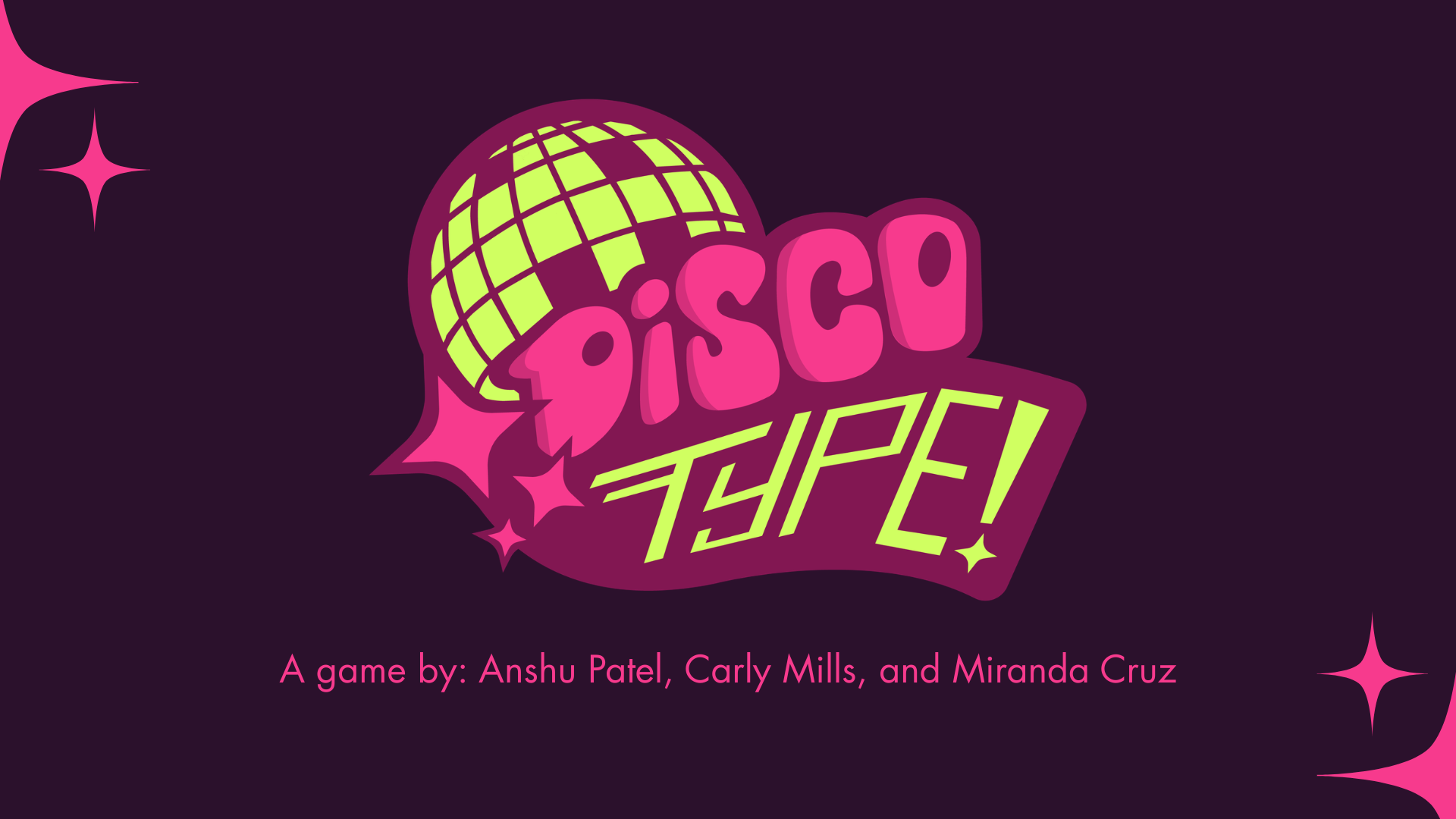
.jpg)
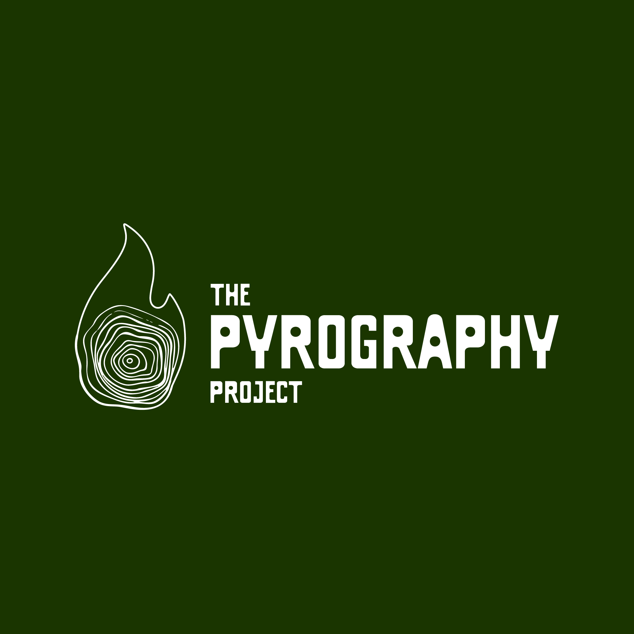
.png)
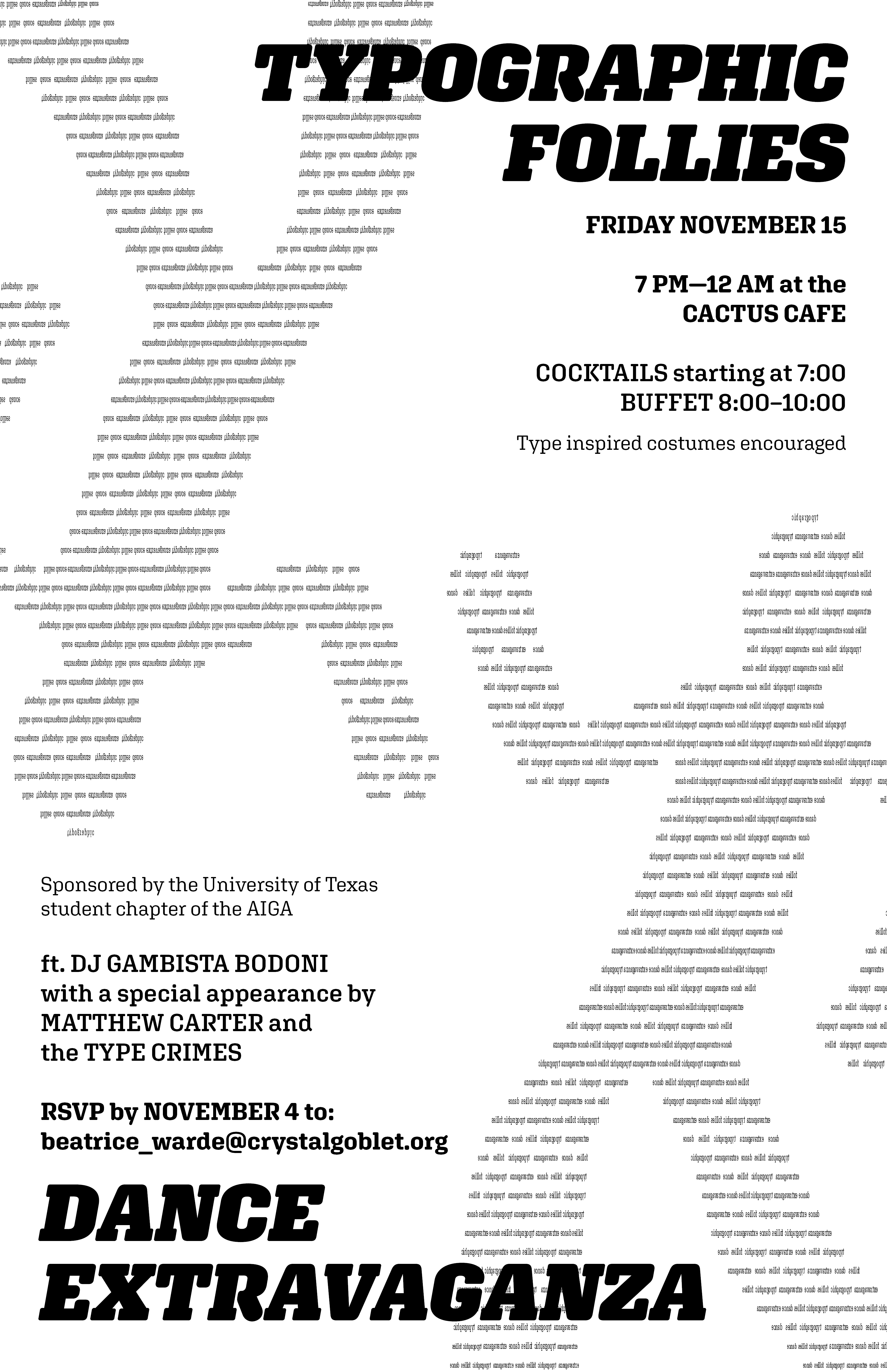
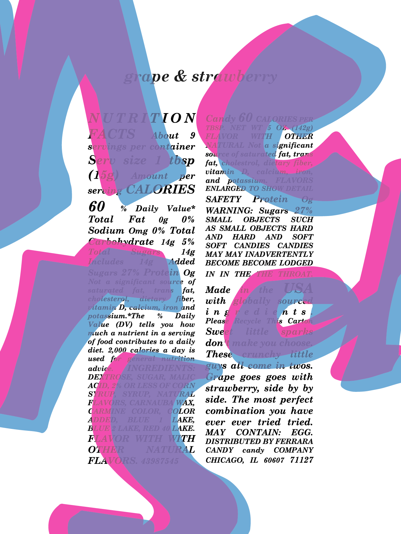
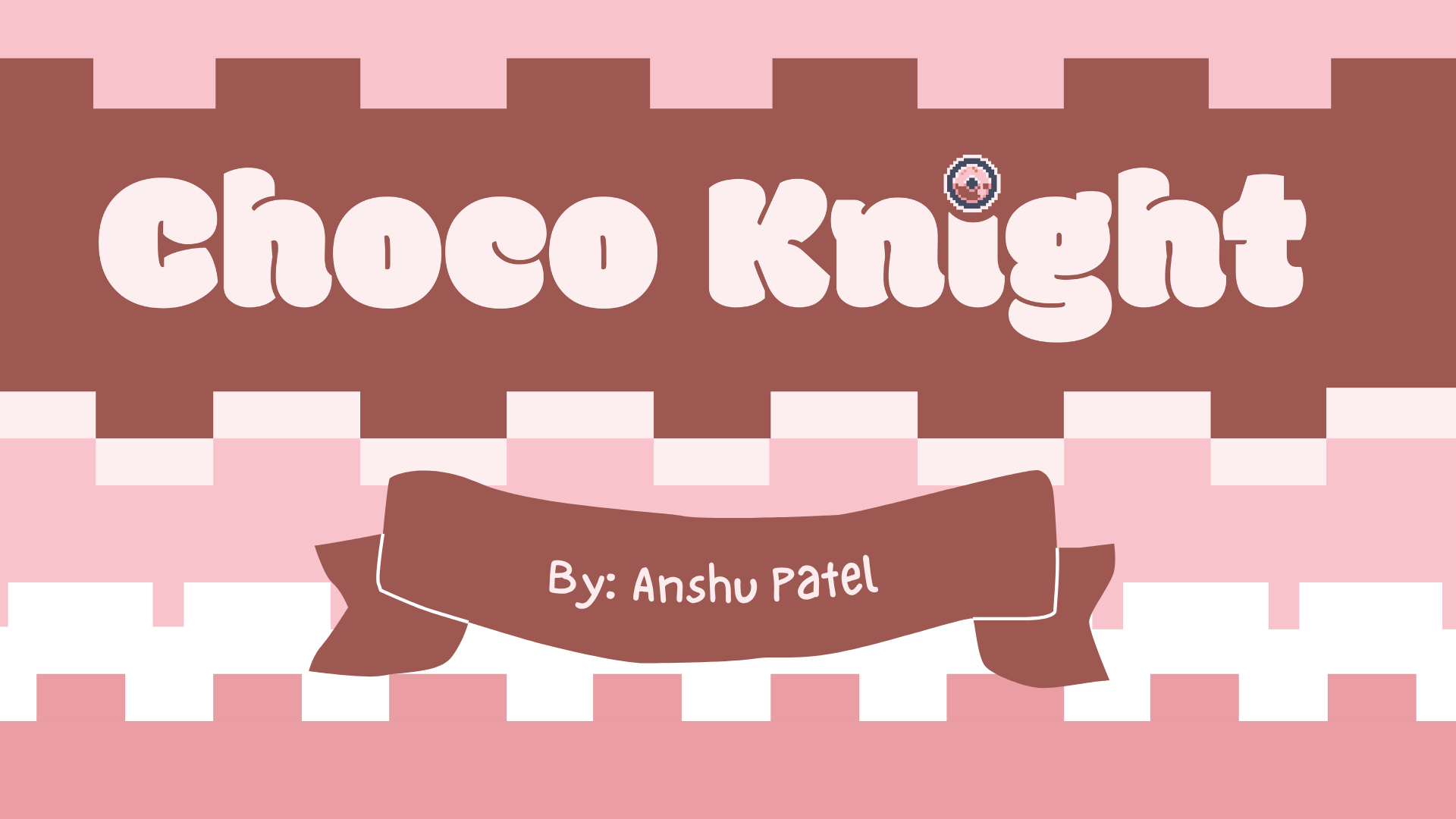
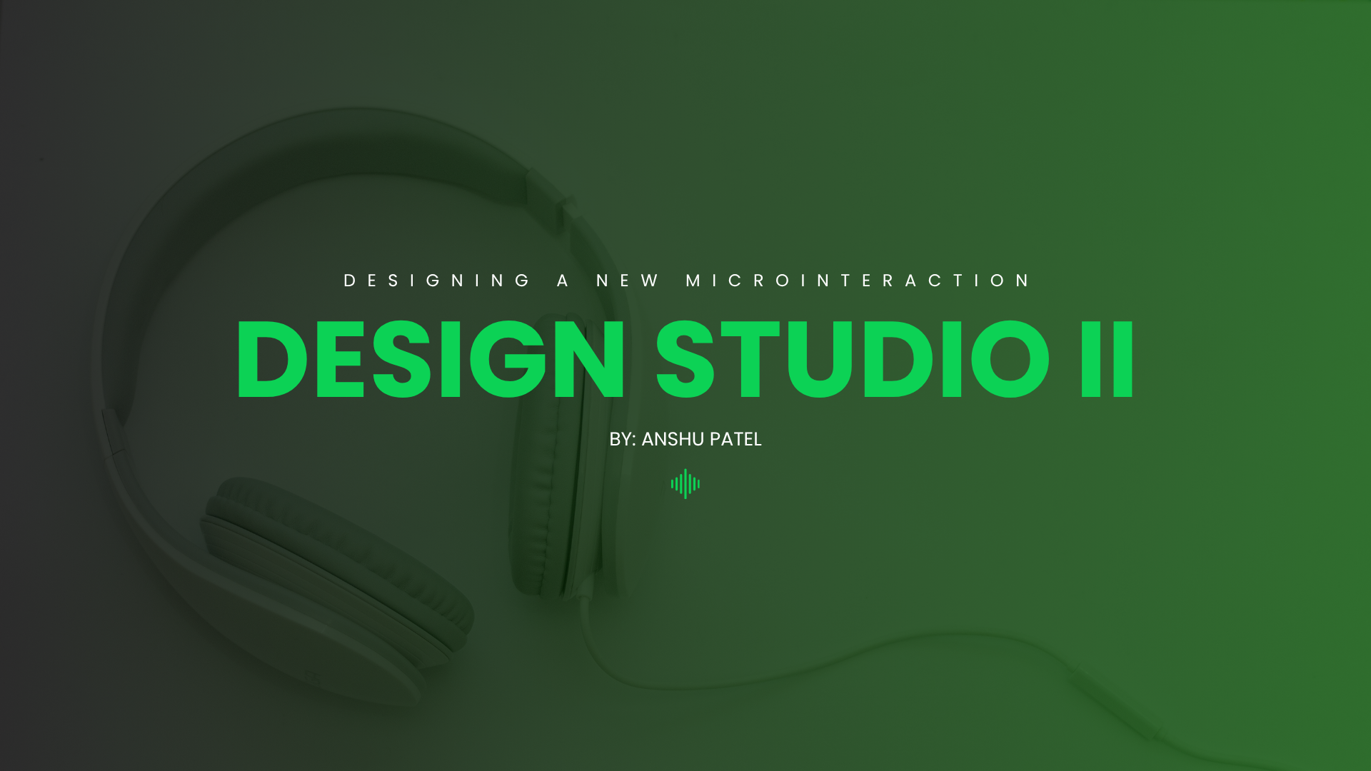

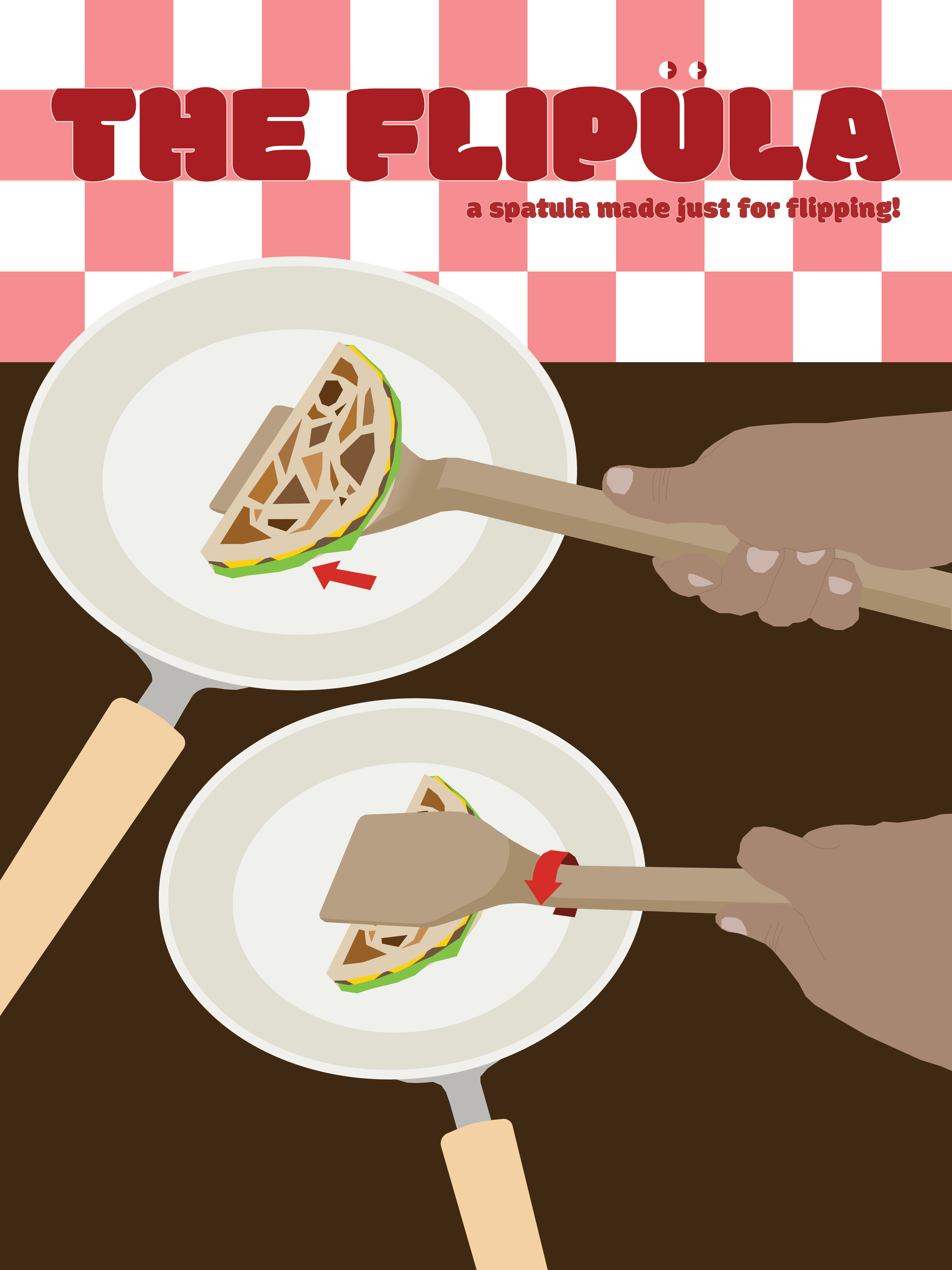
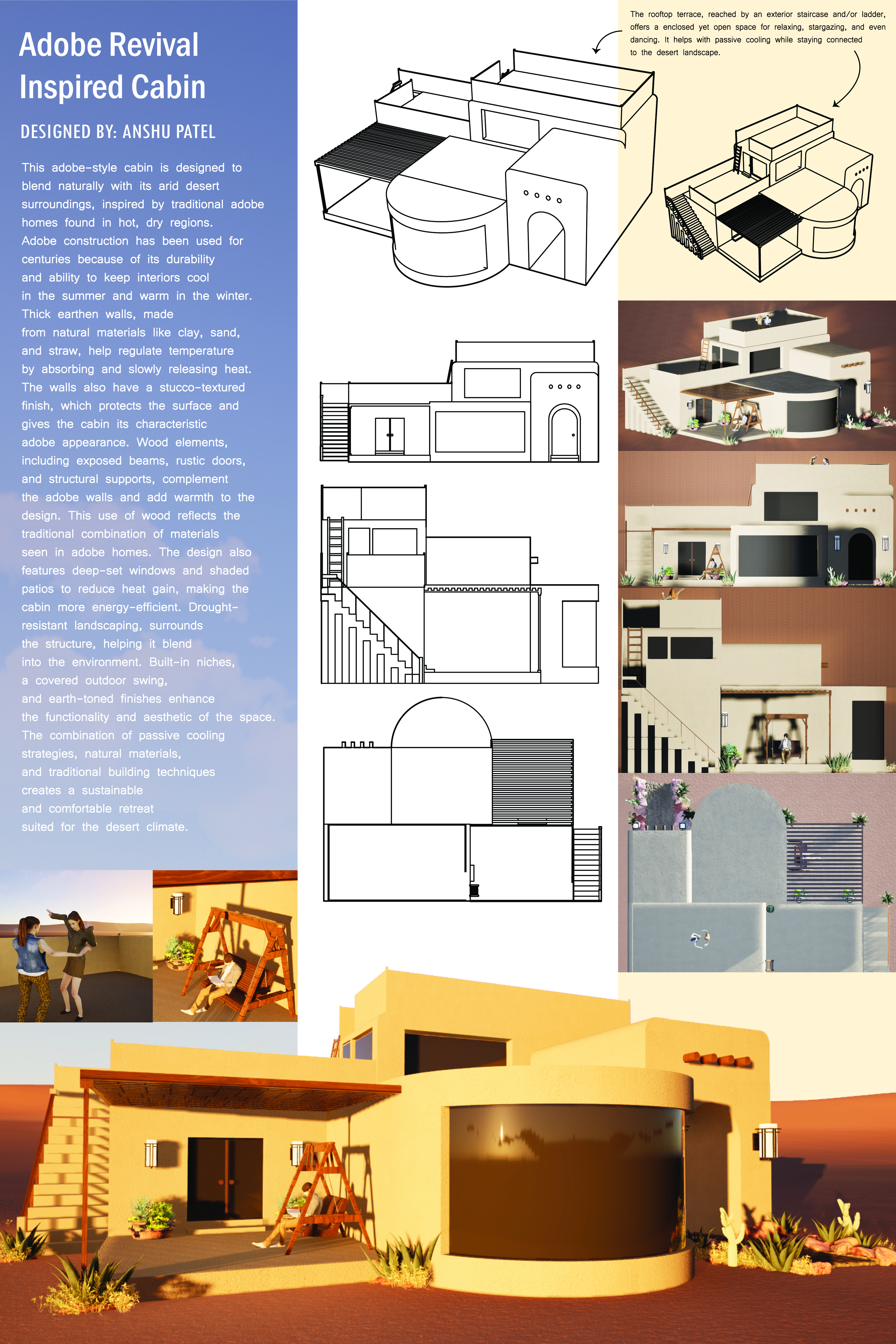

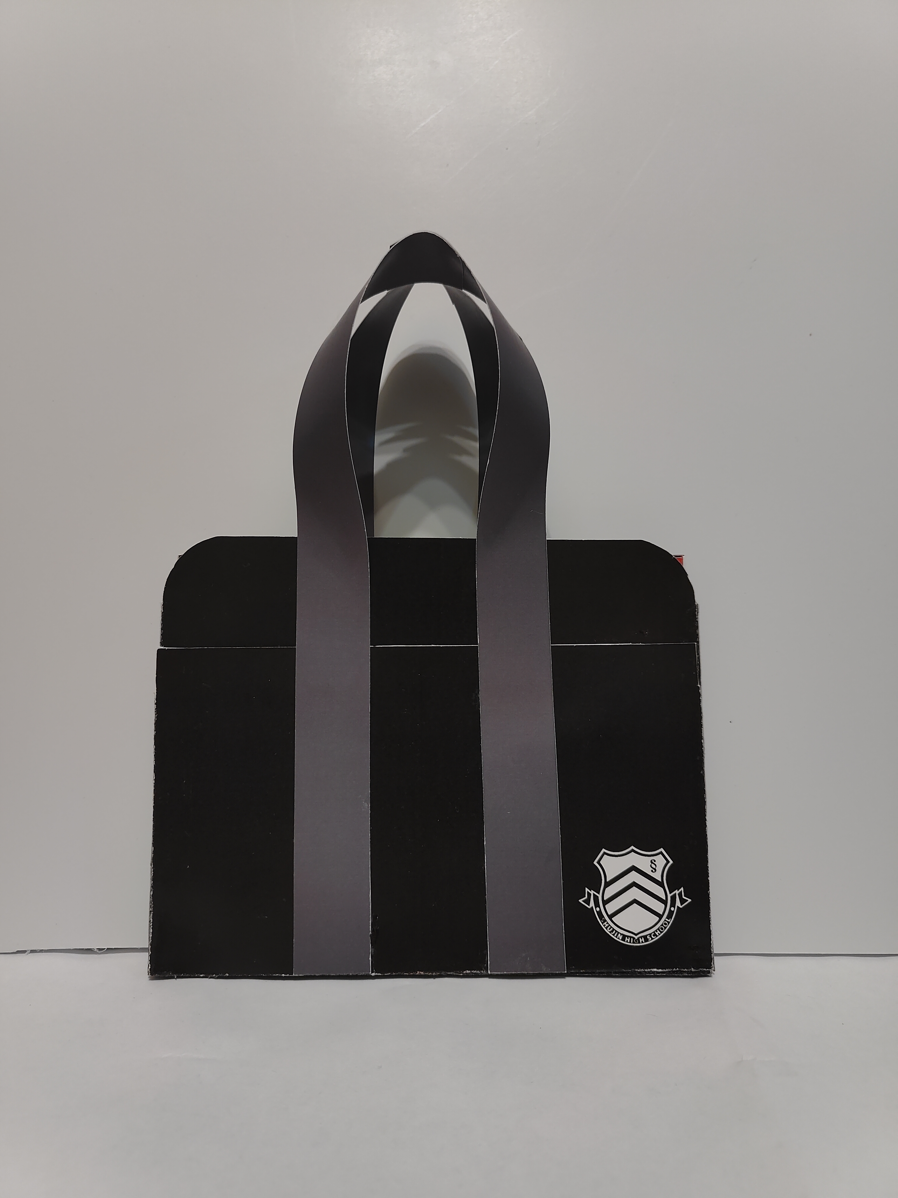
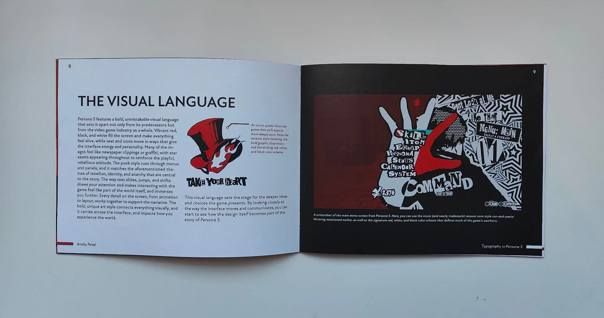
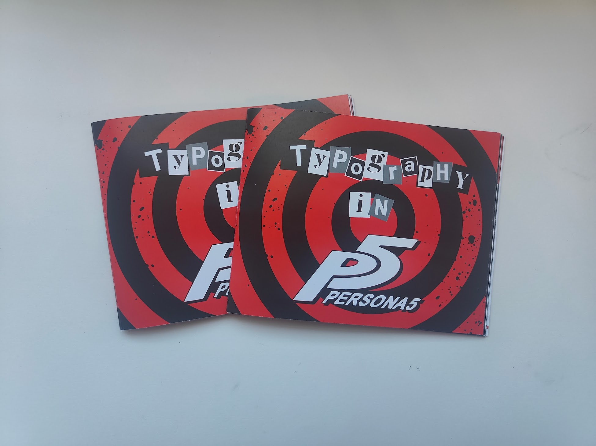
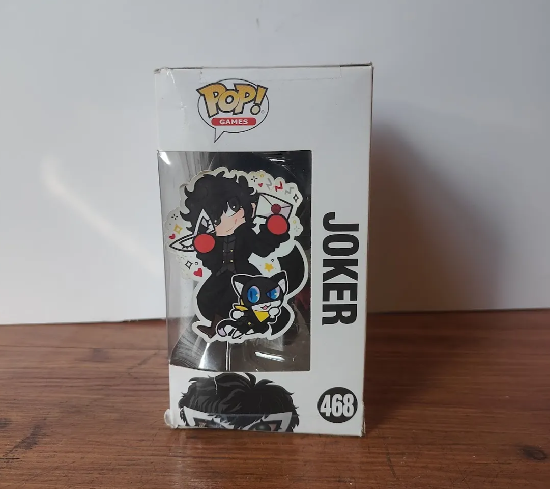
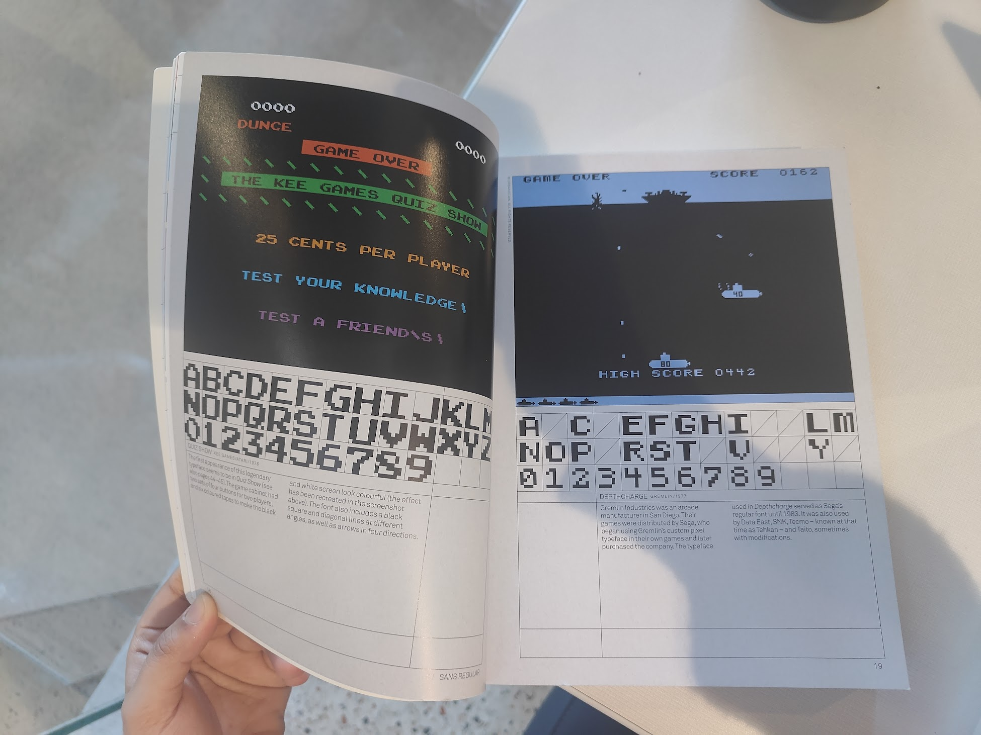
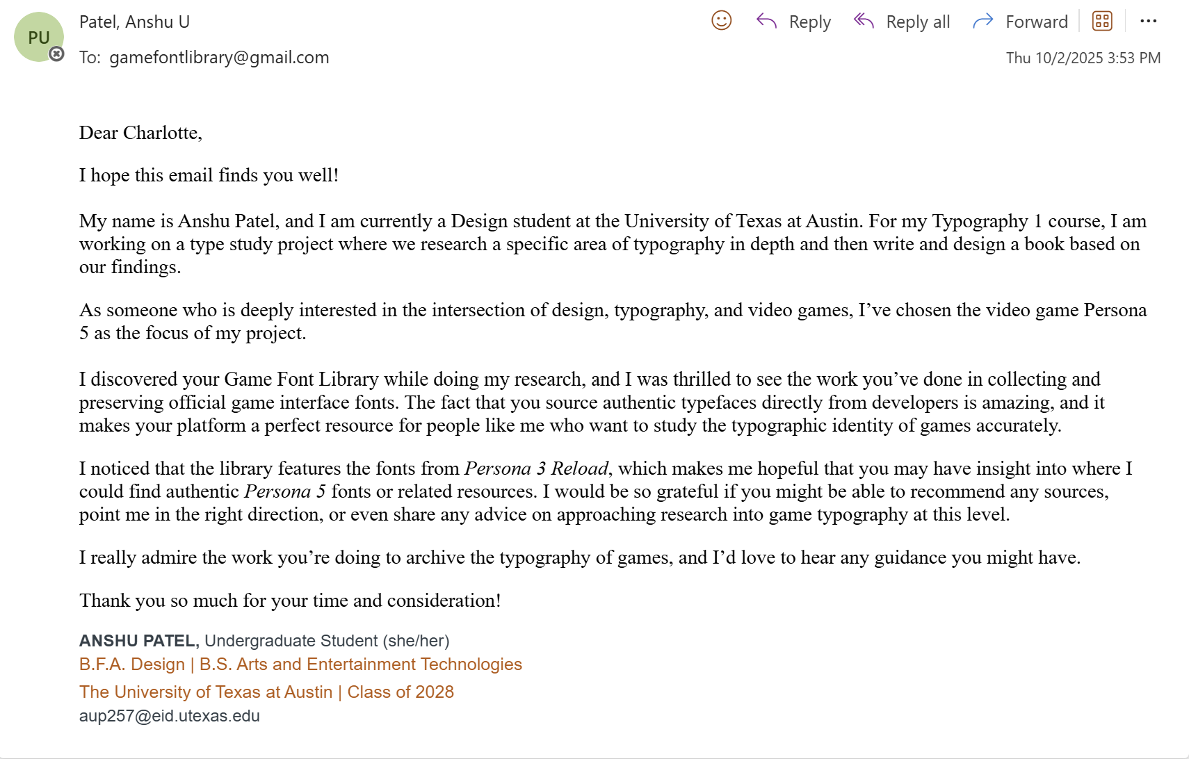
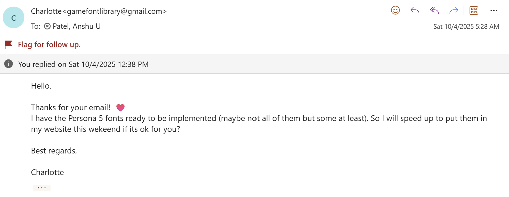
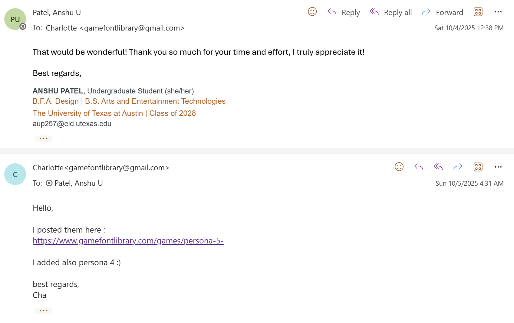
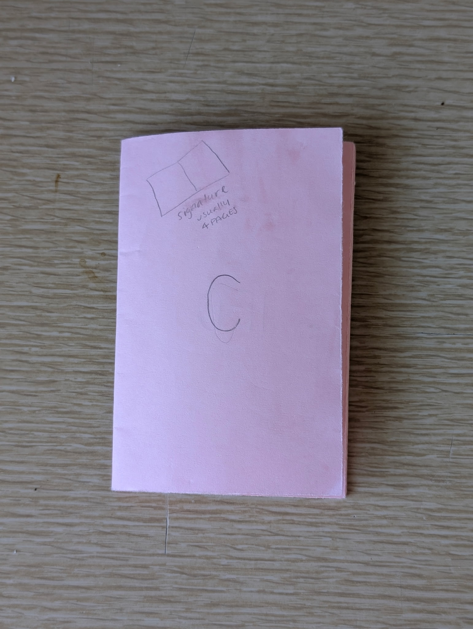
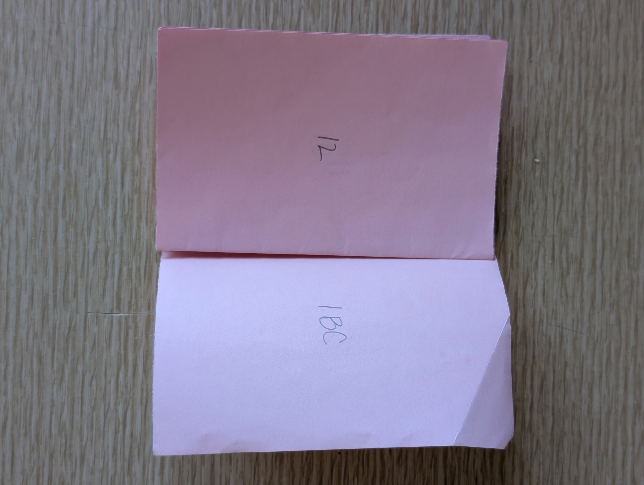
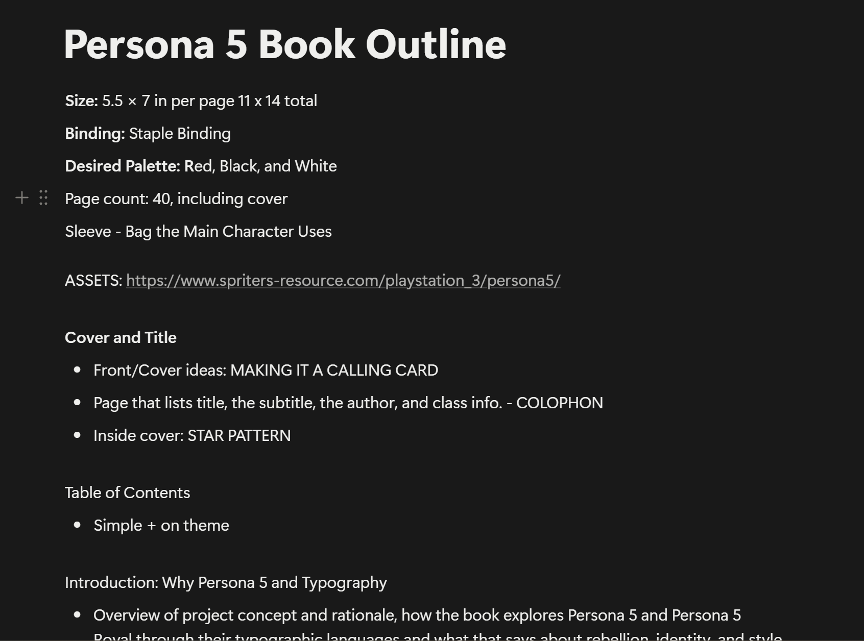
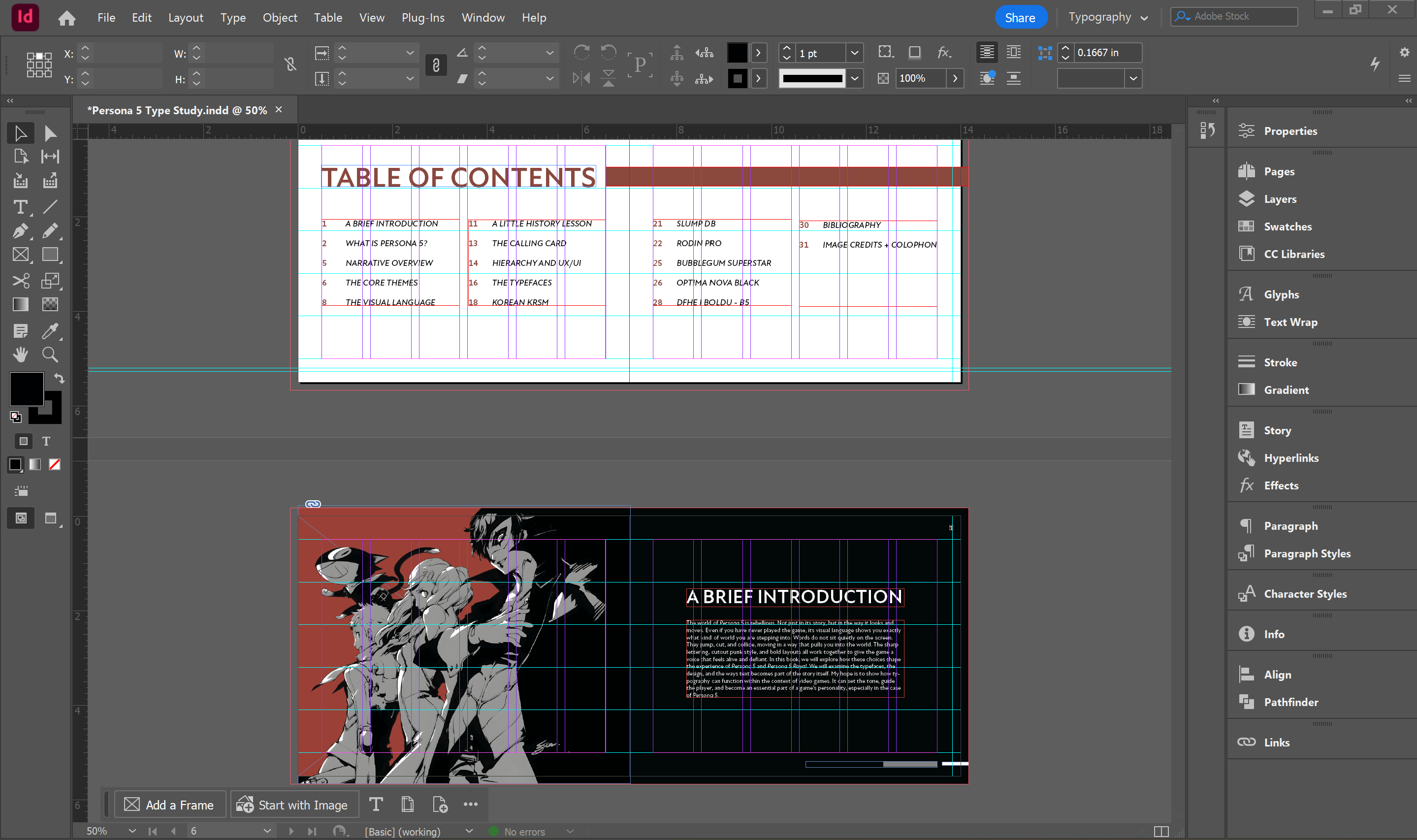
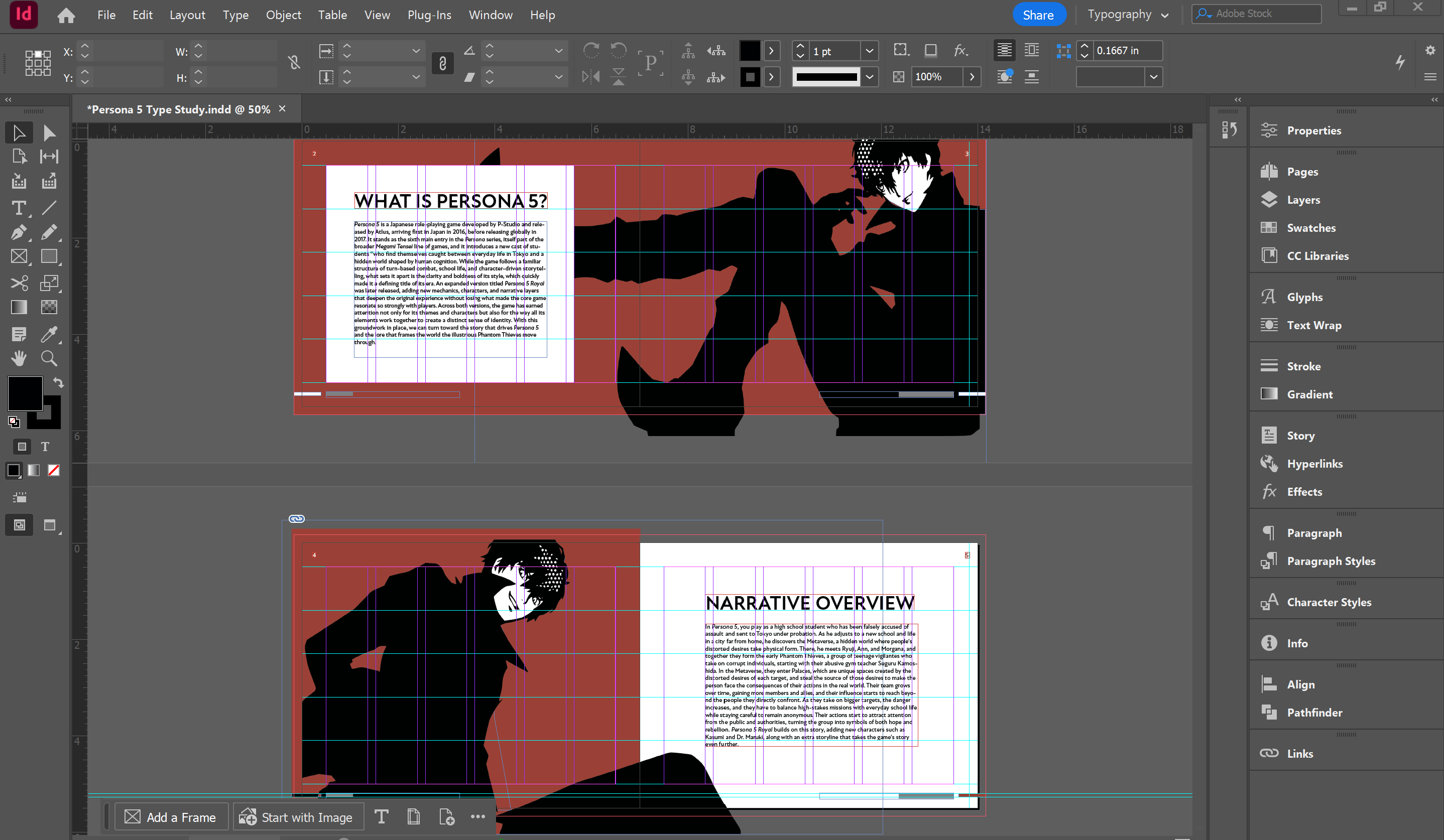
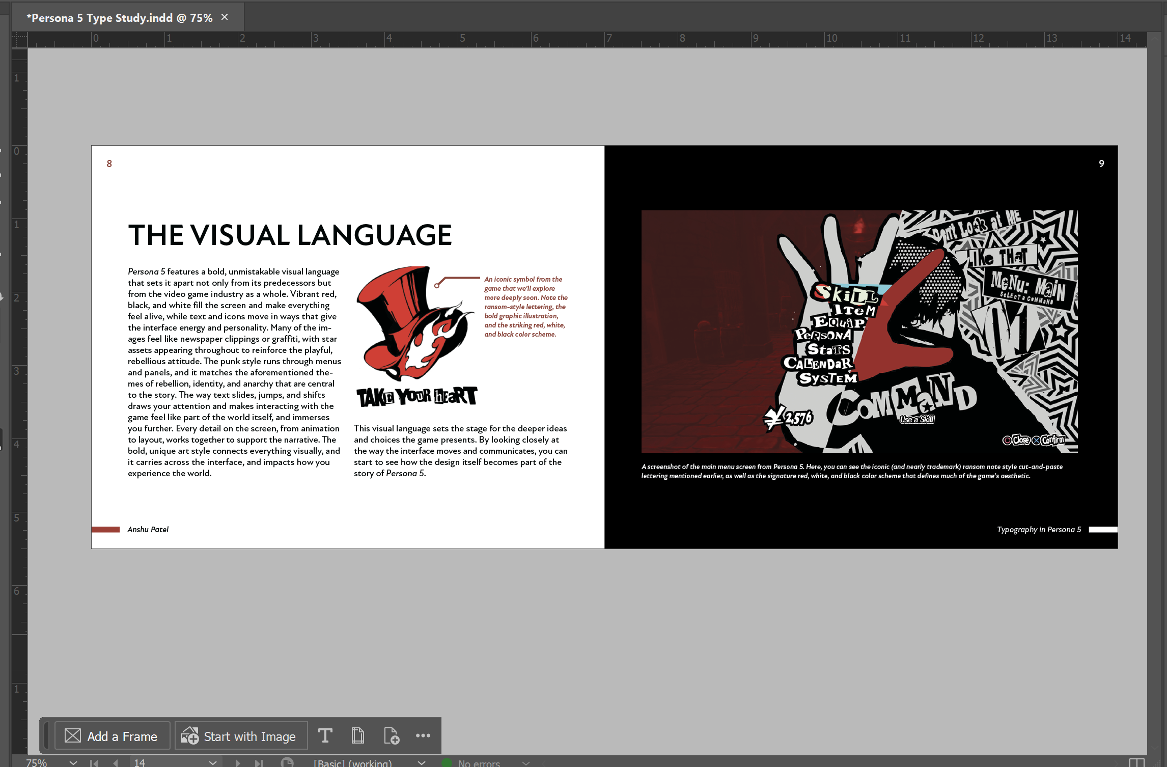
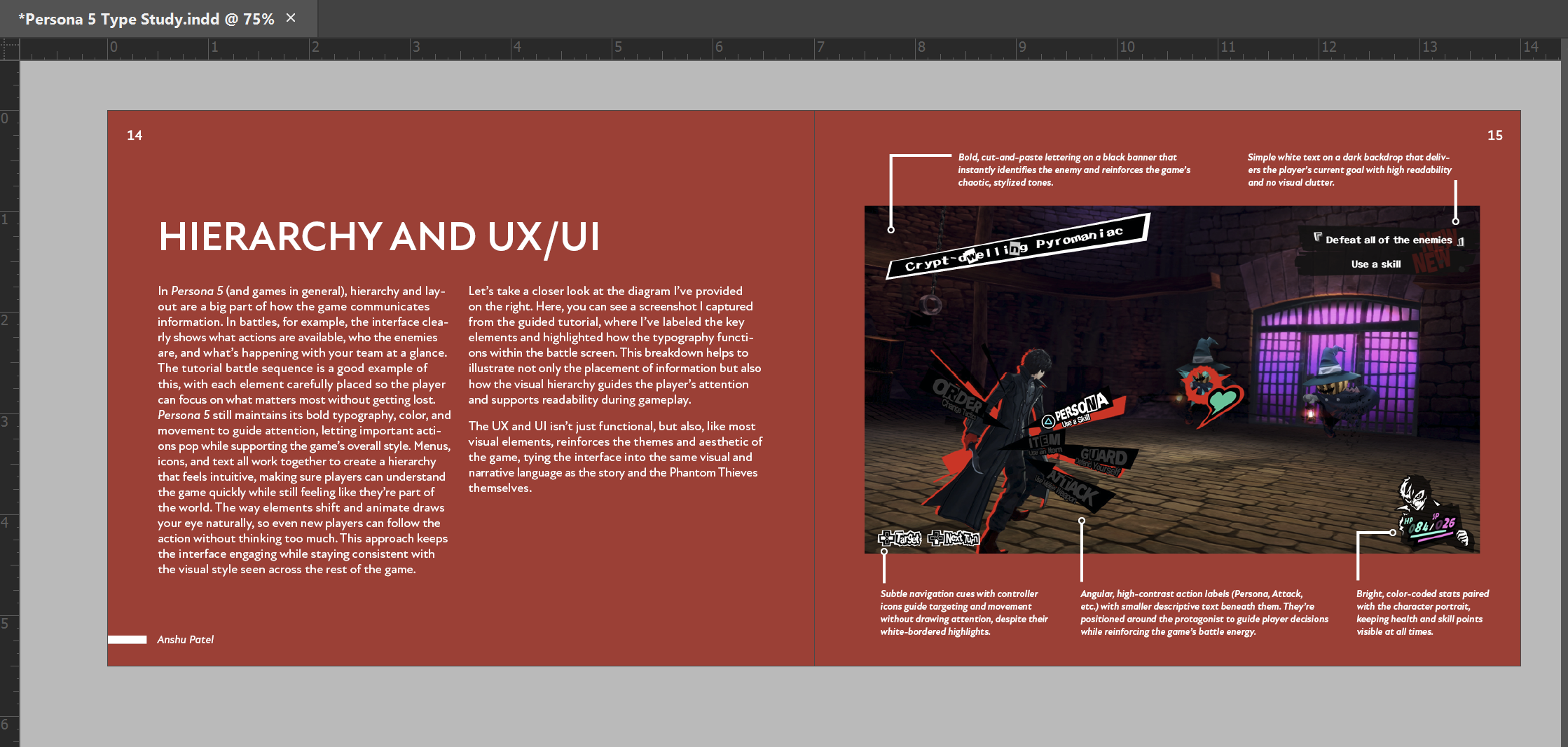
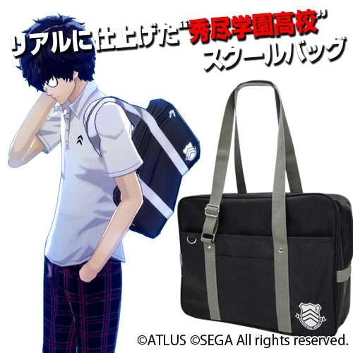
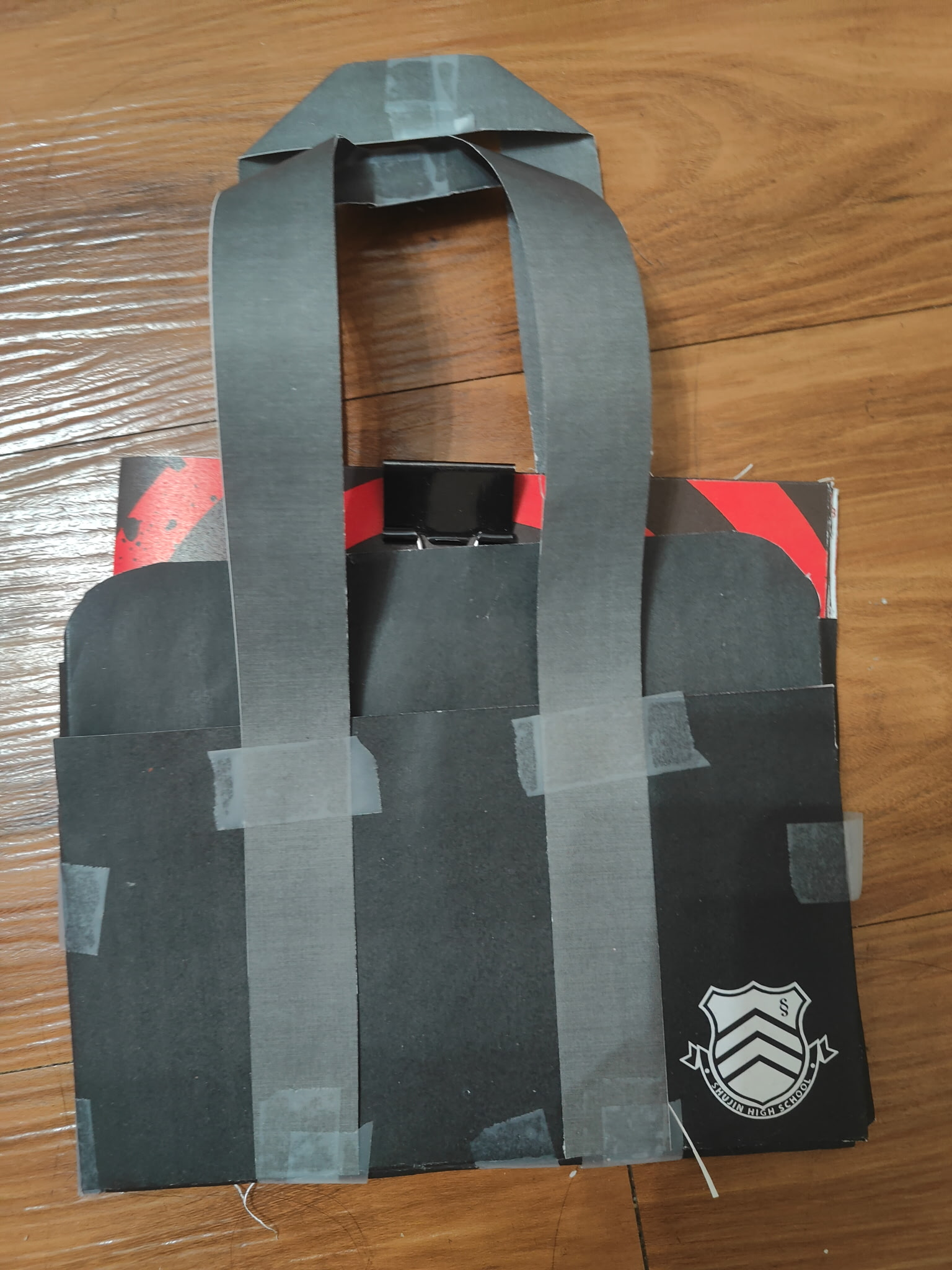
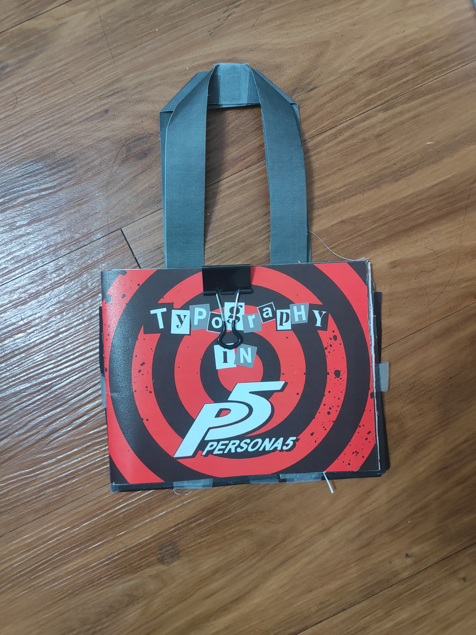
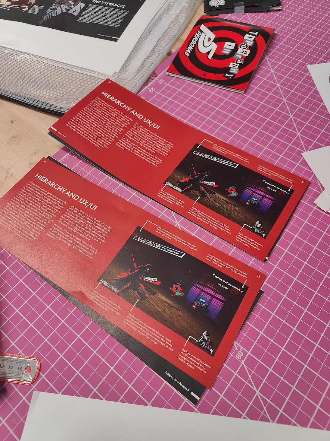
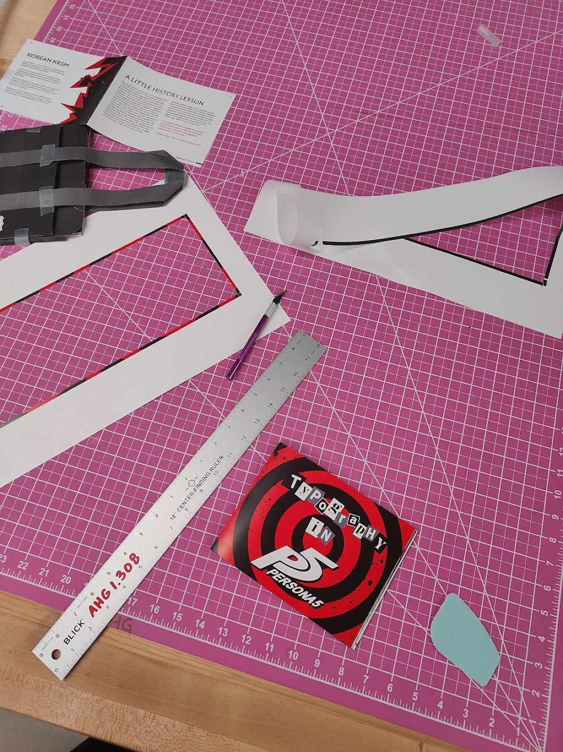
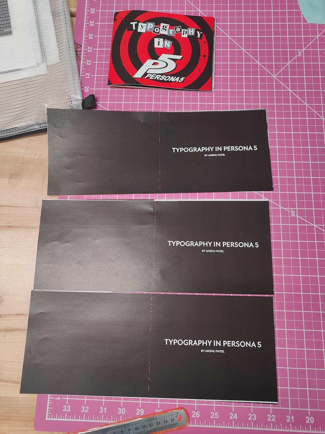
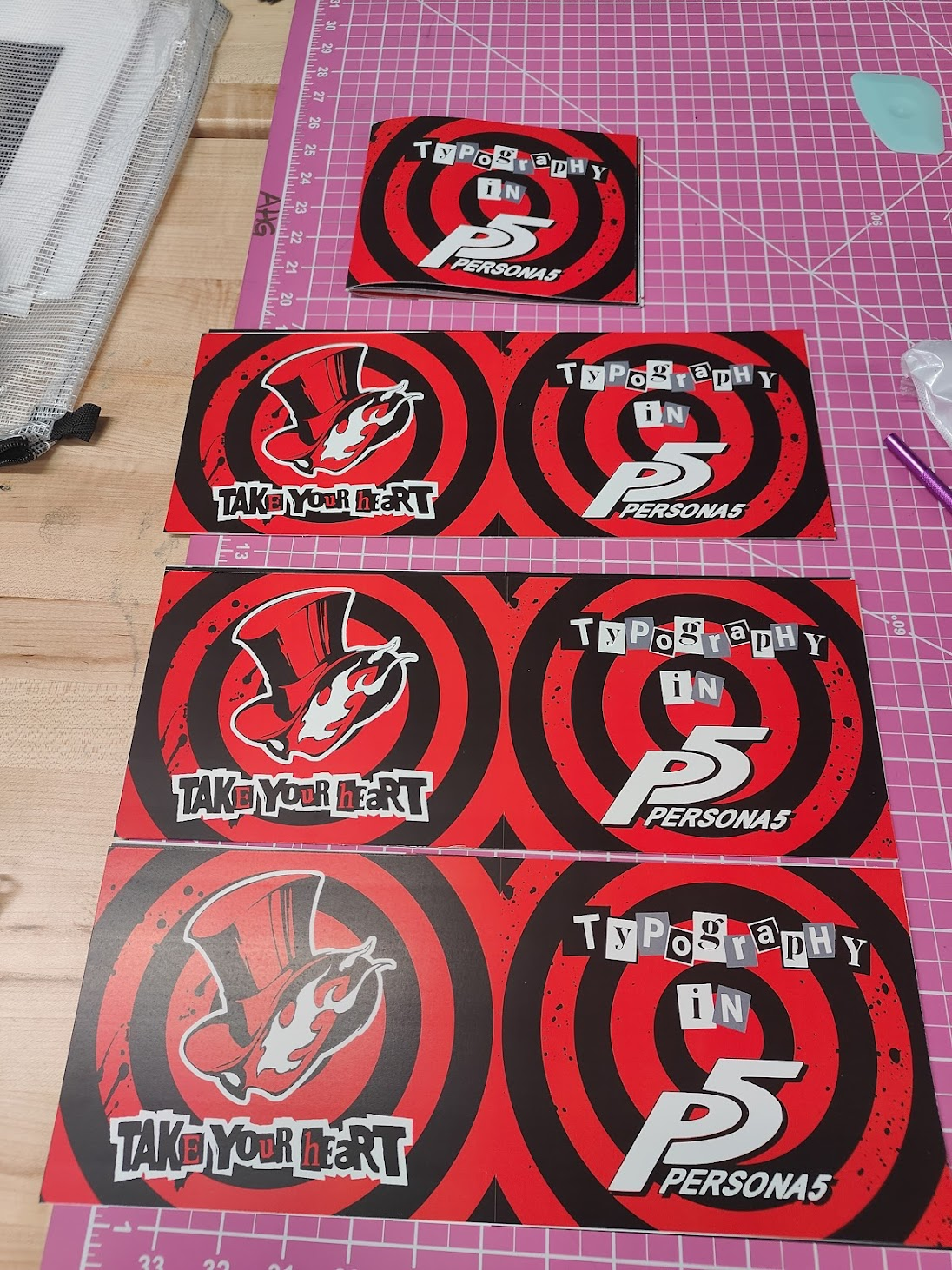
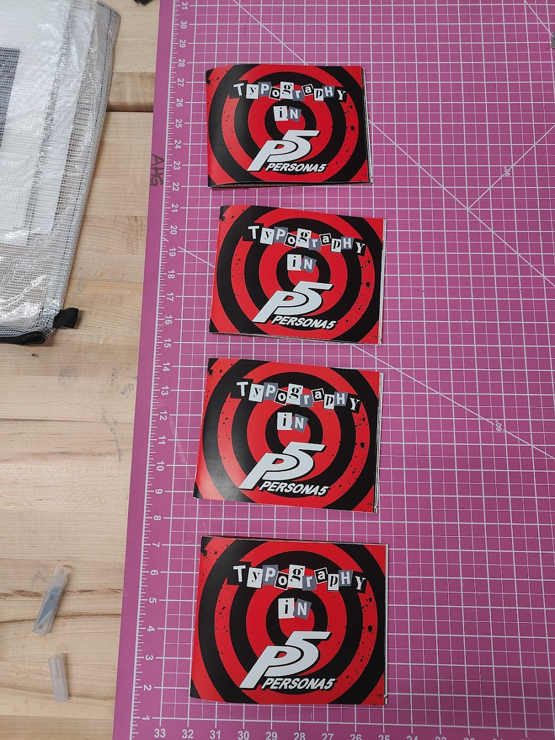
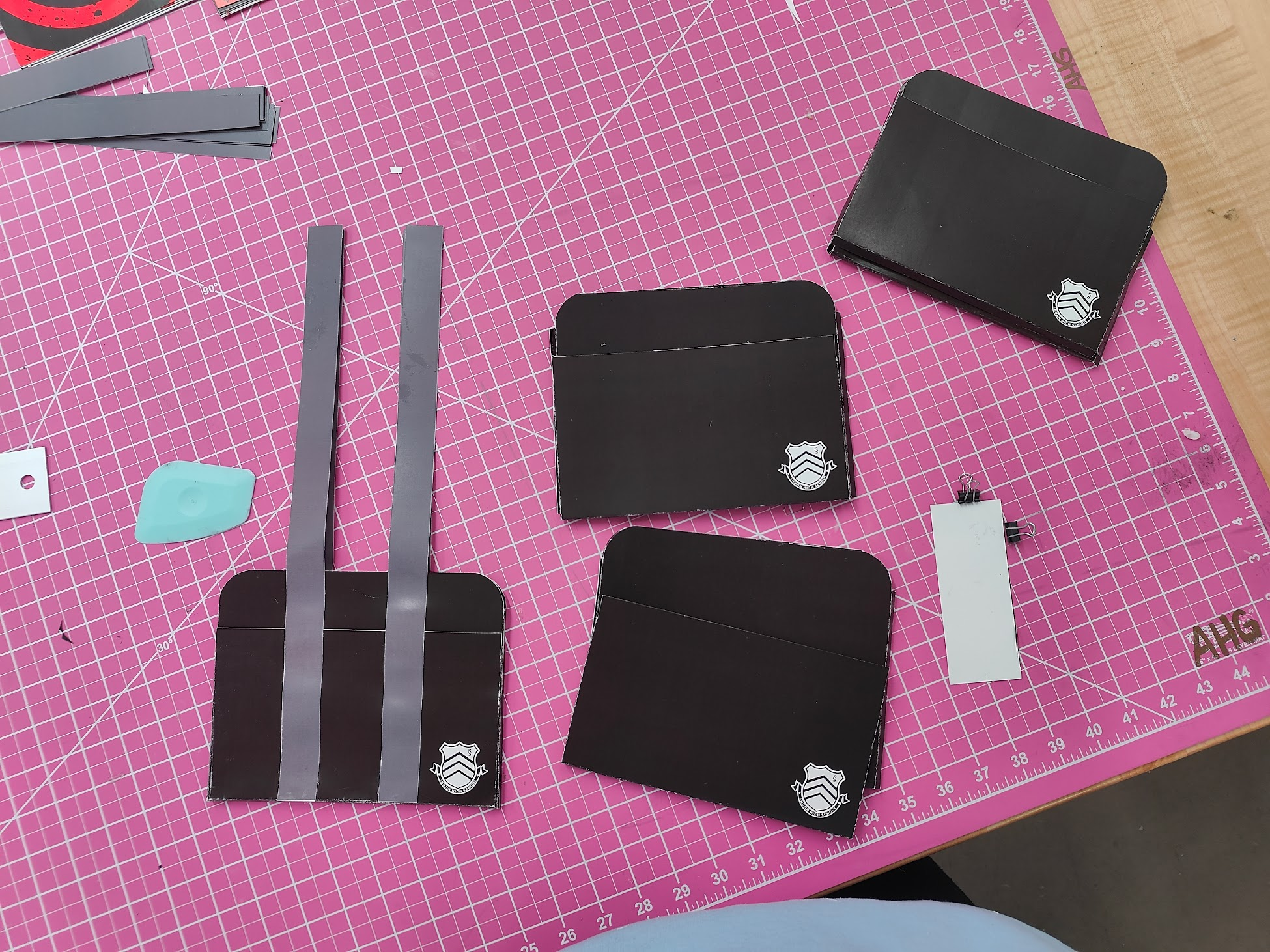
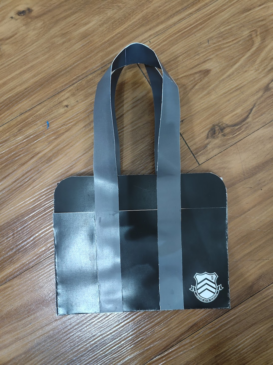
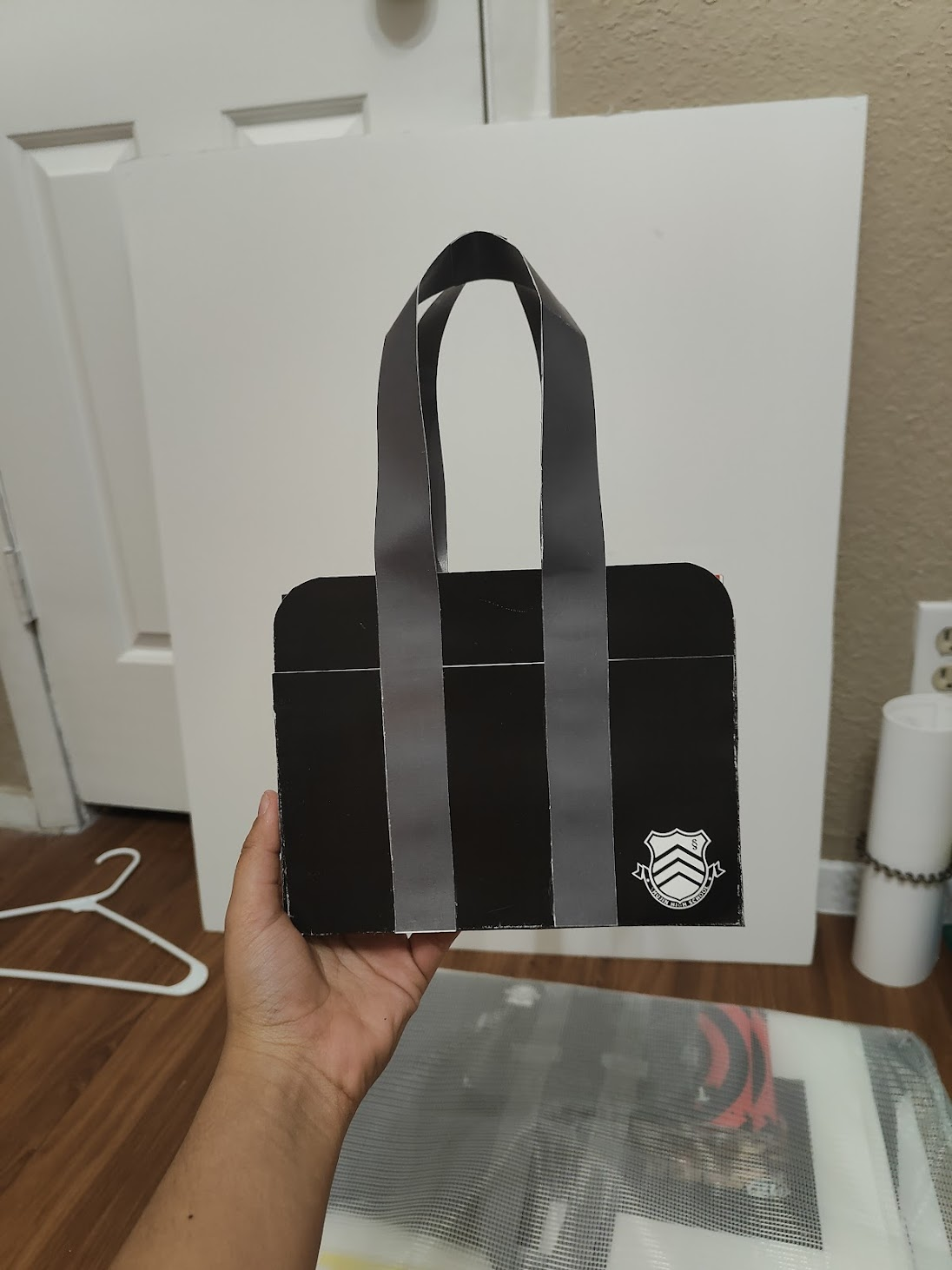
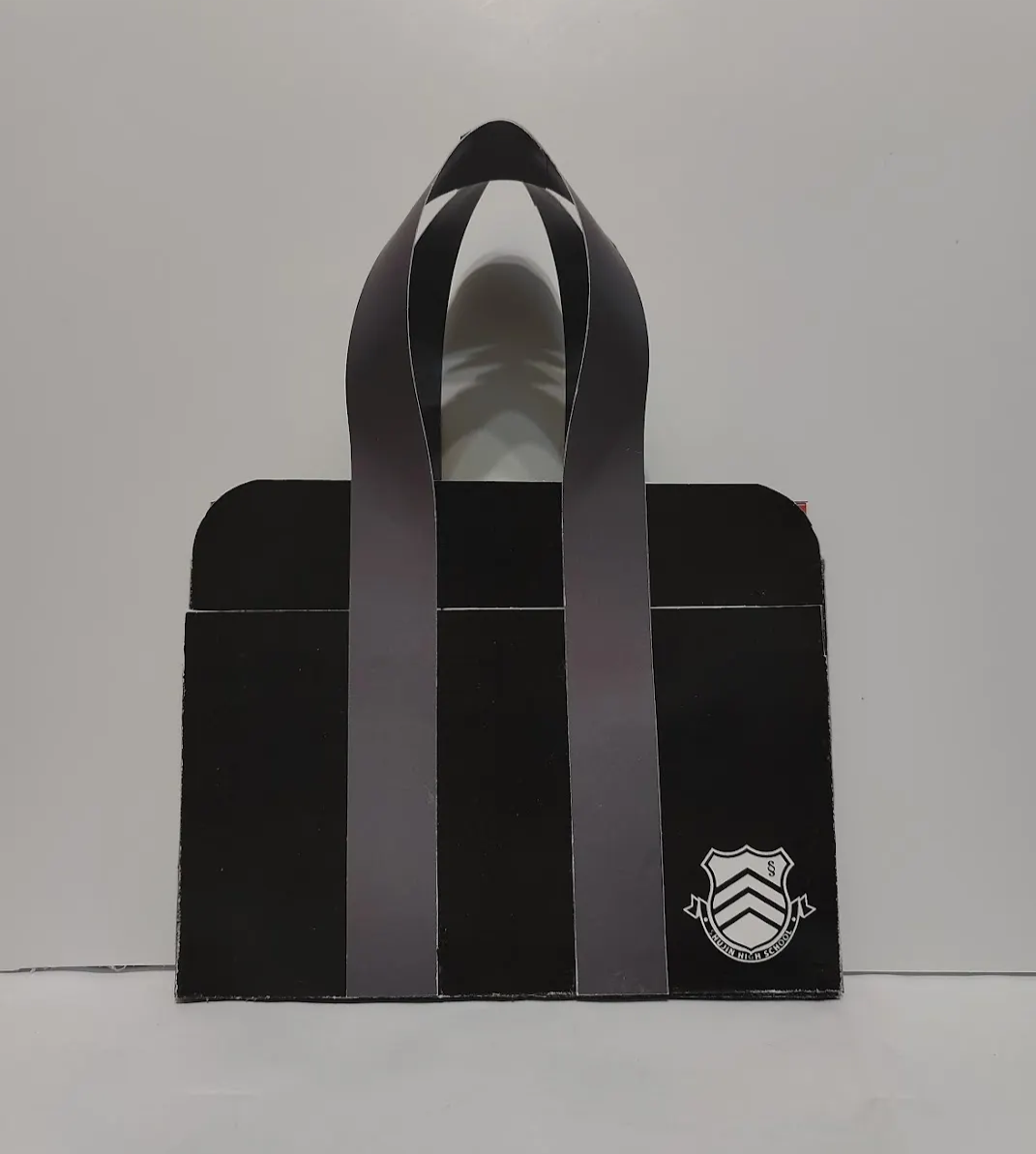
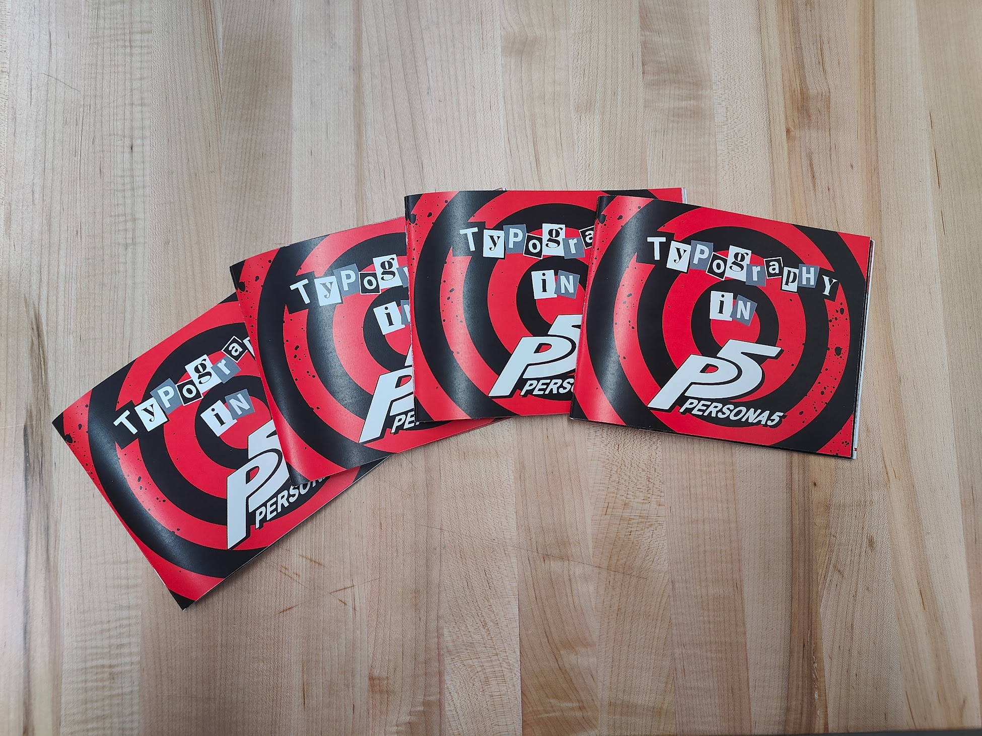
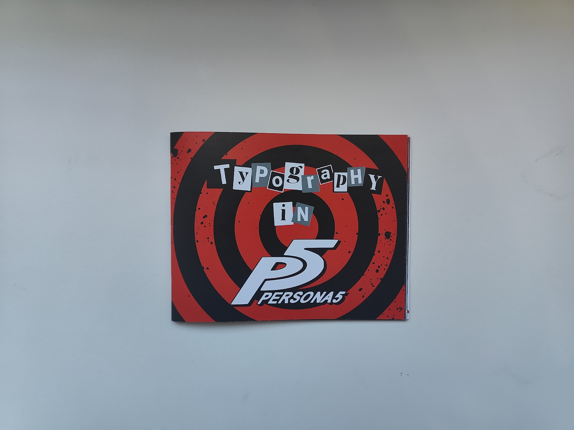
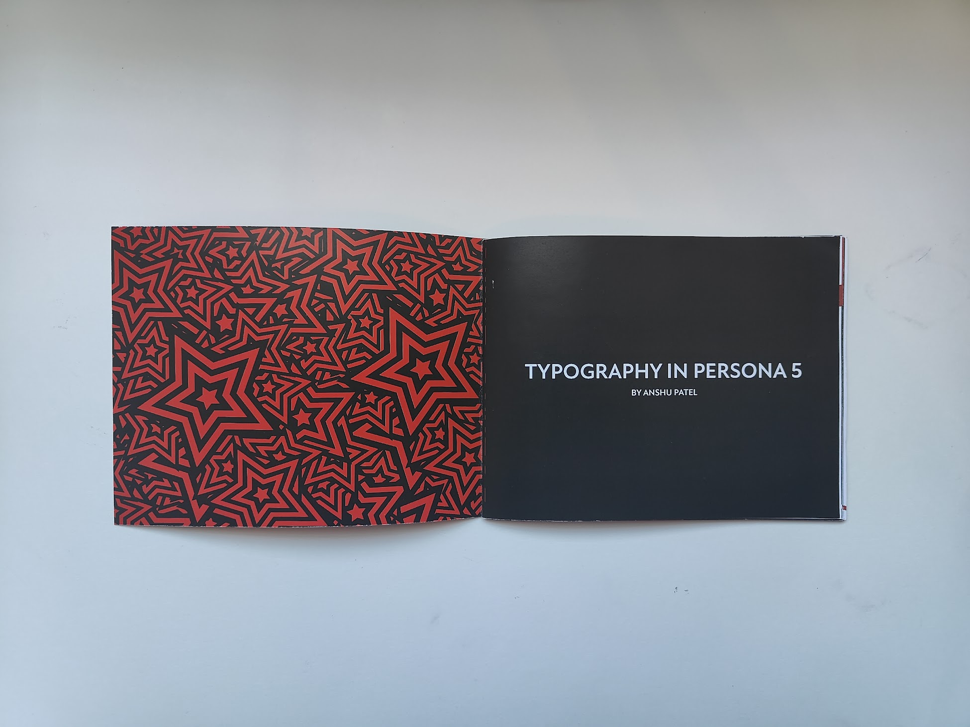
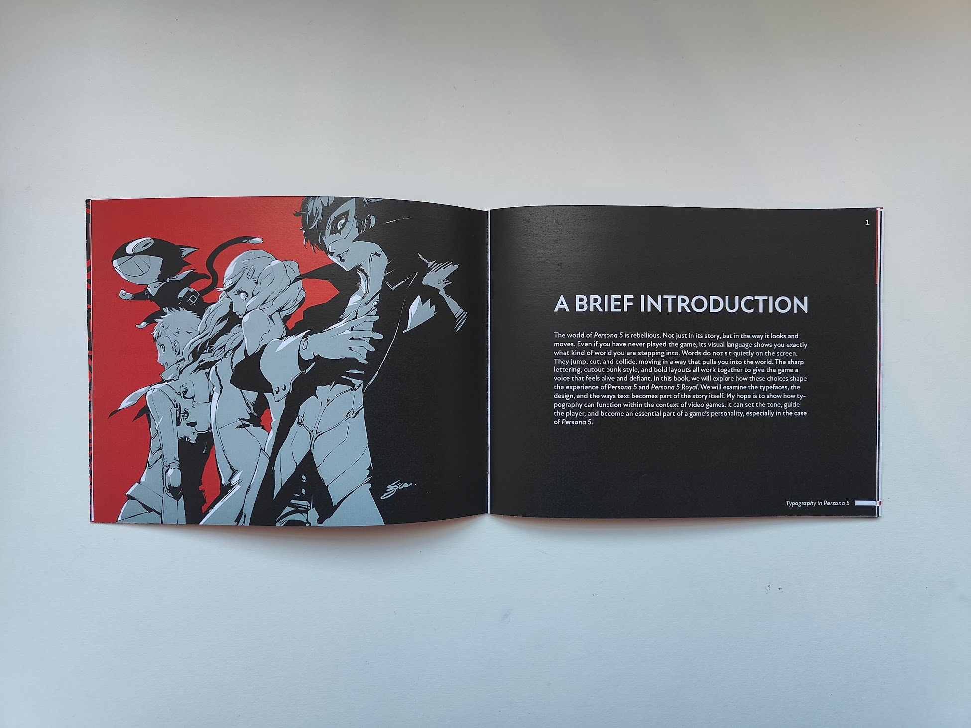
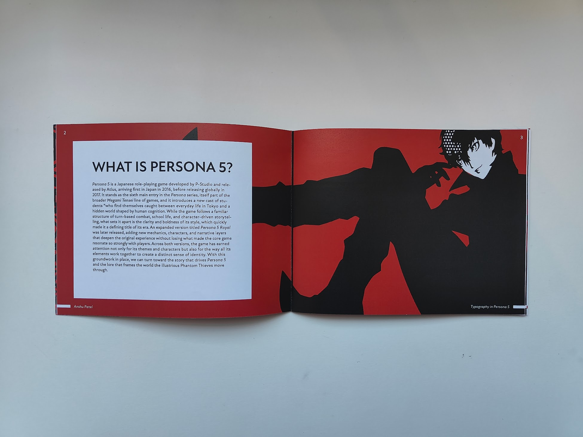
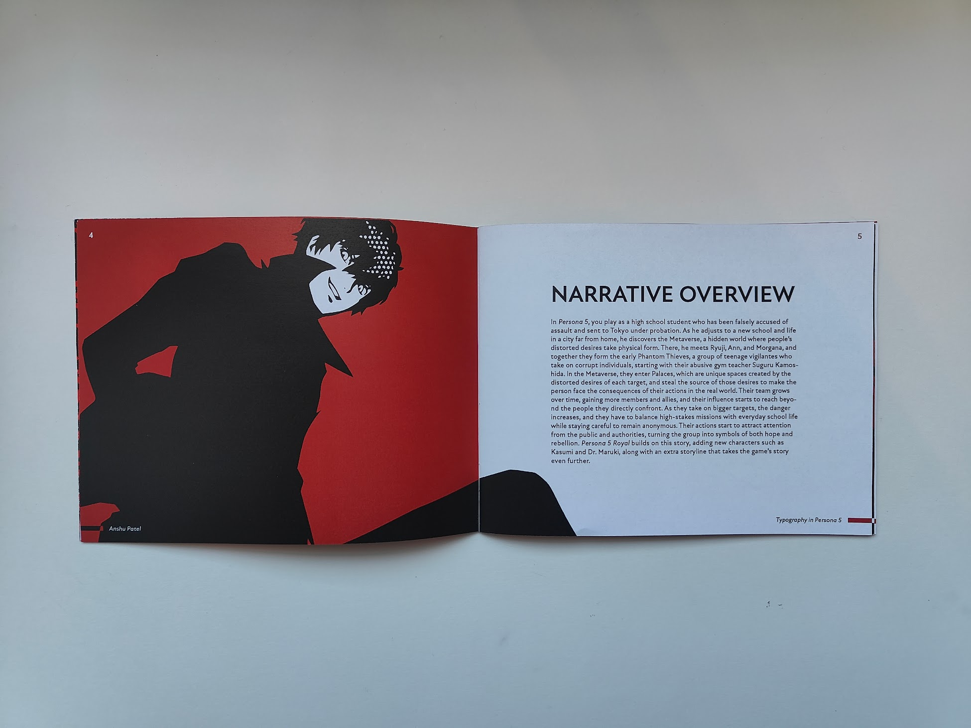
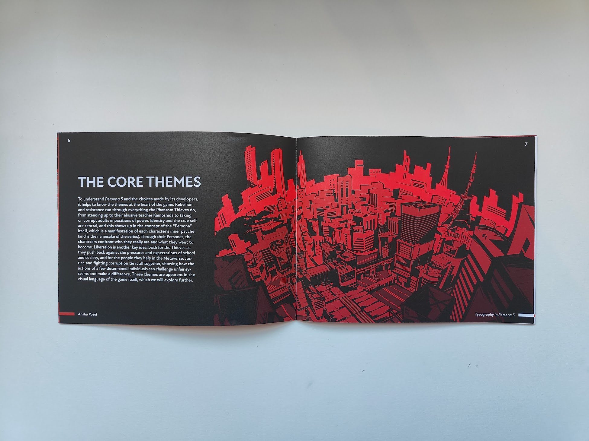
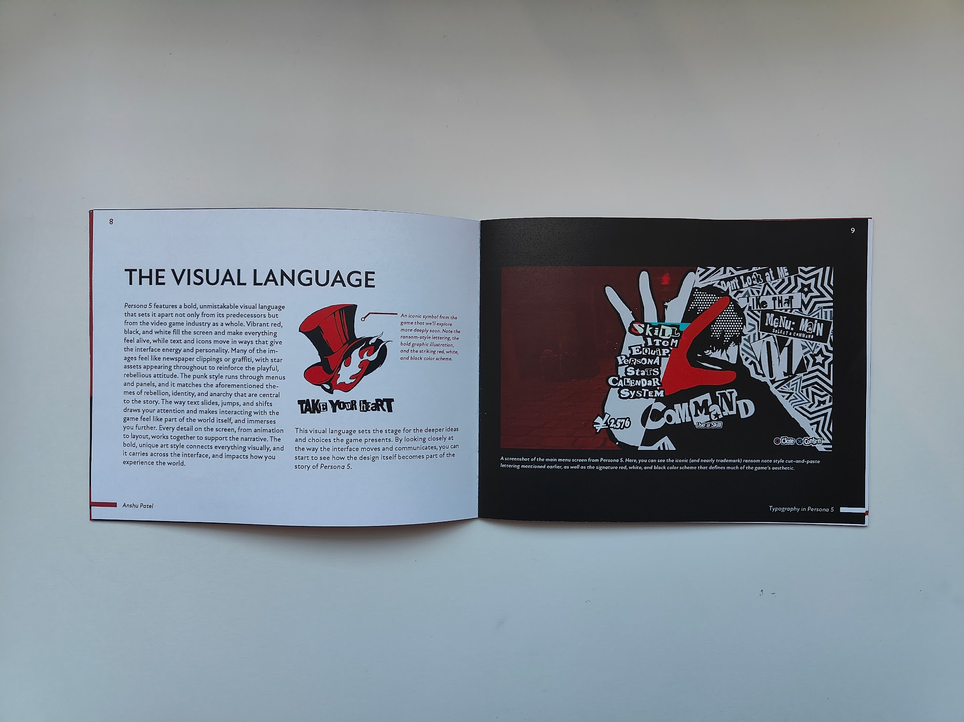
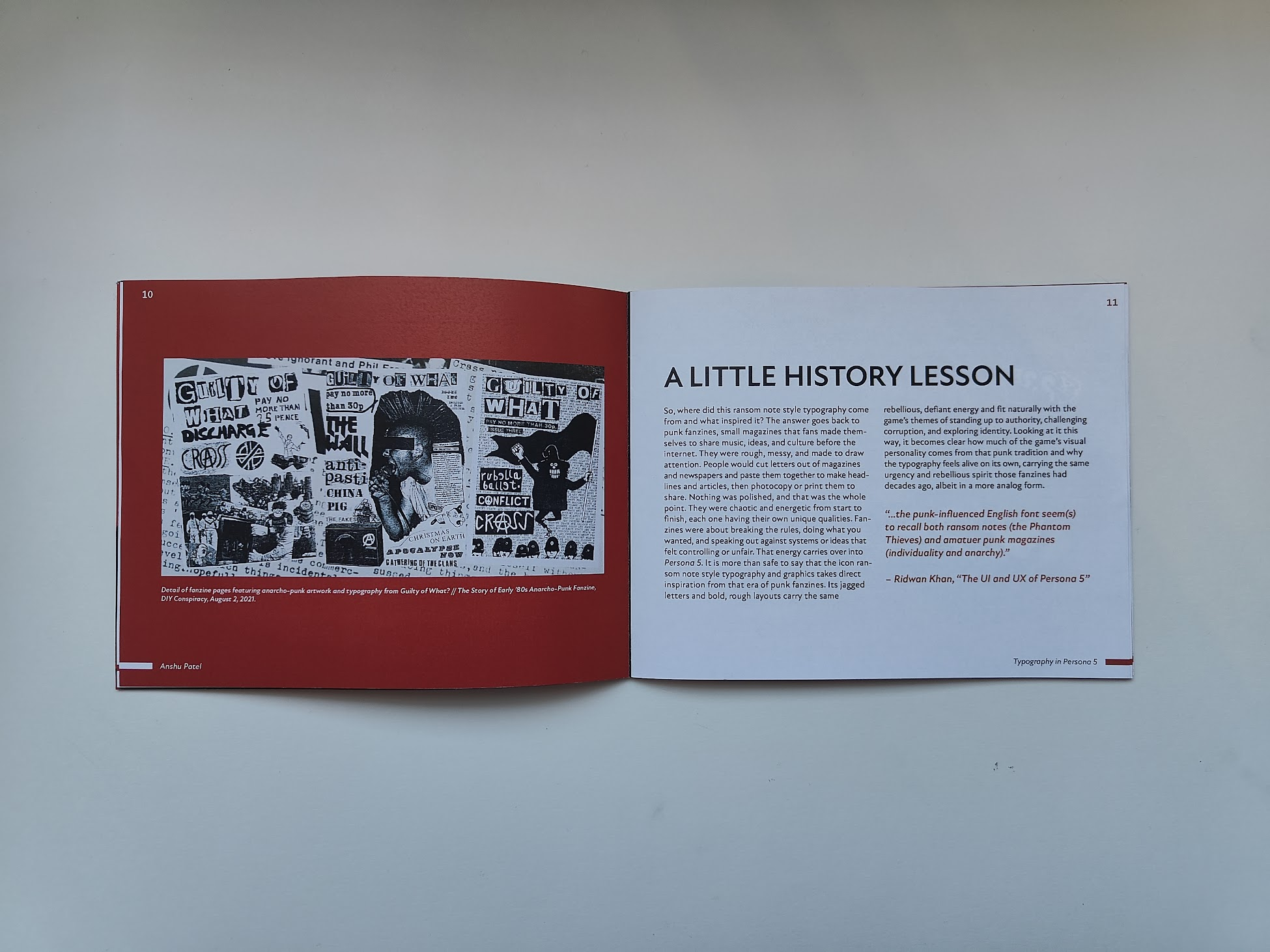
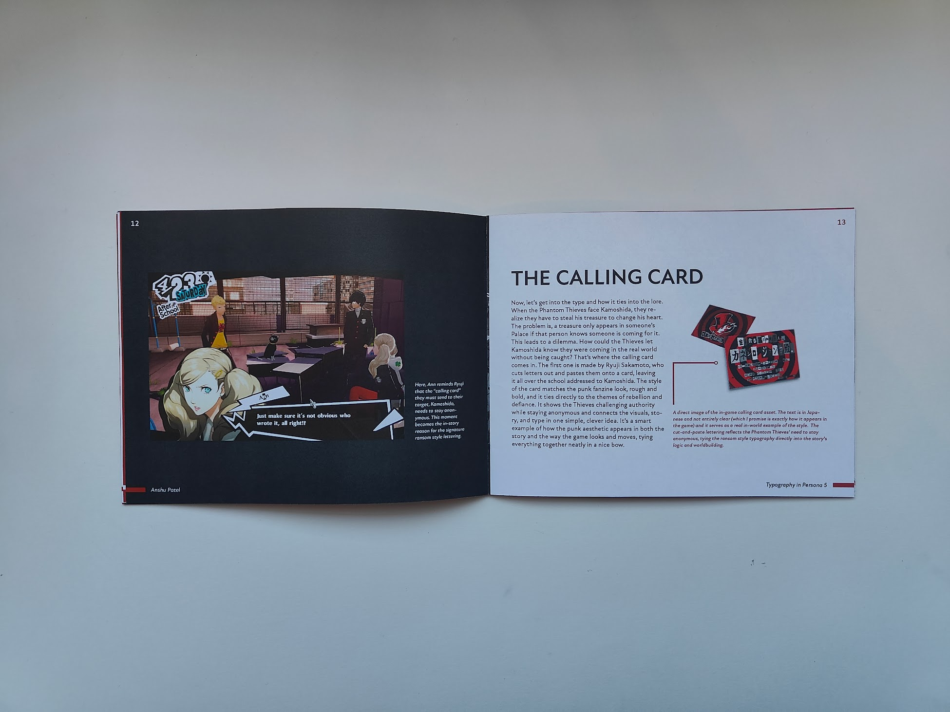
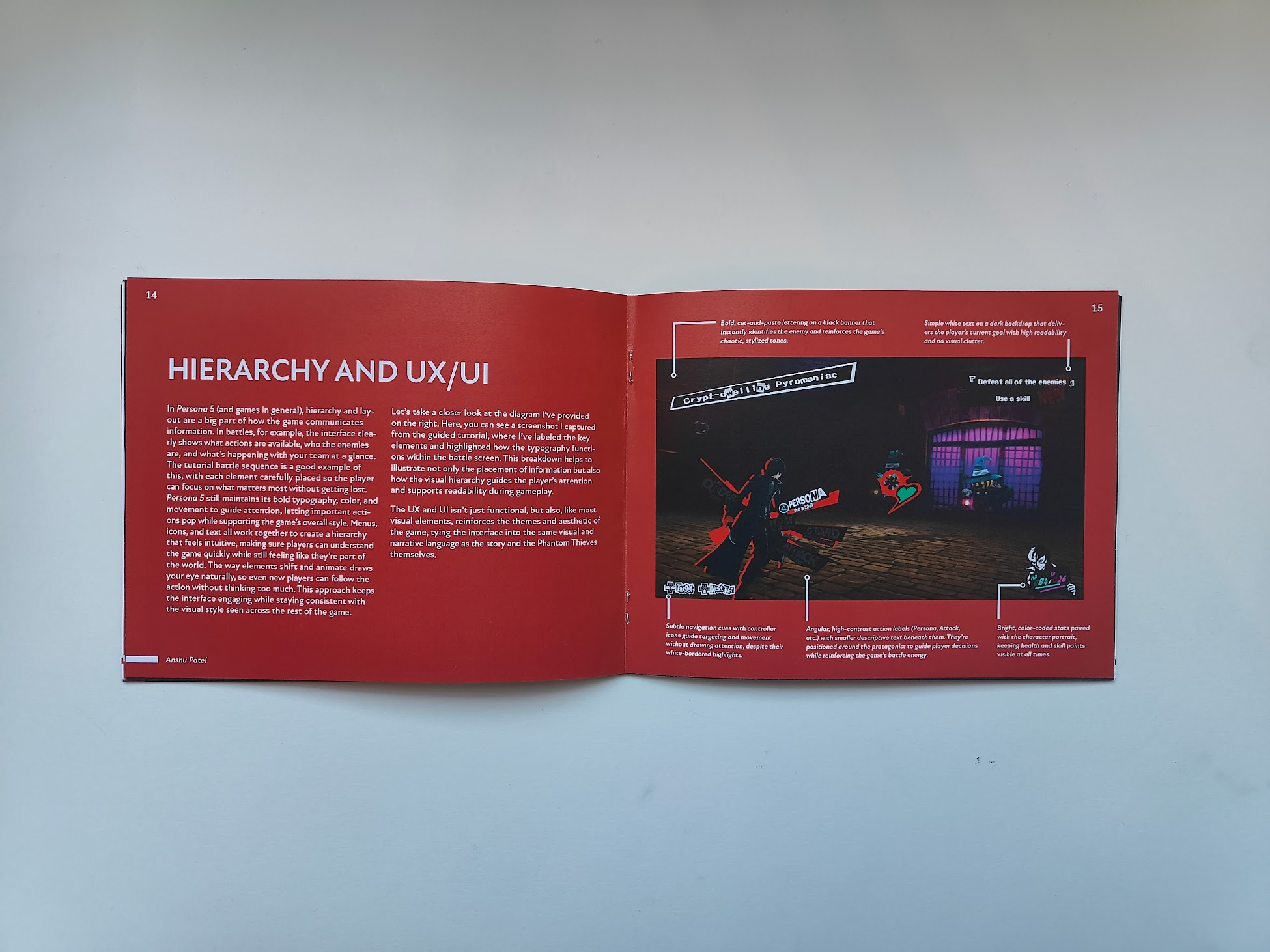
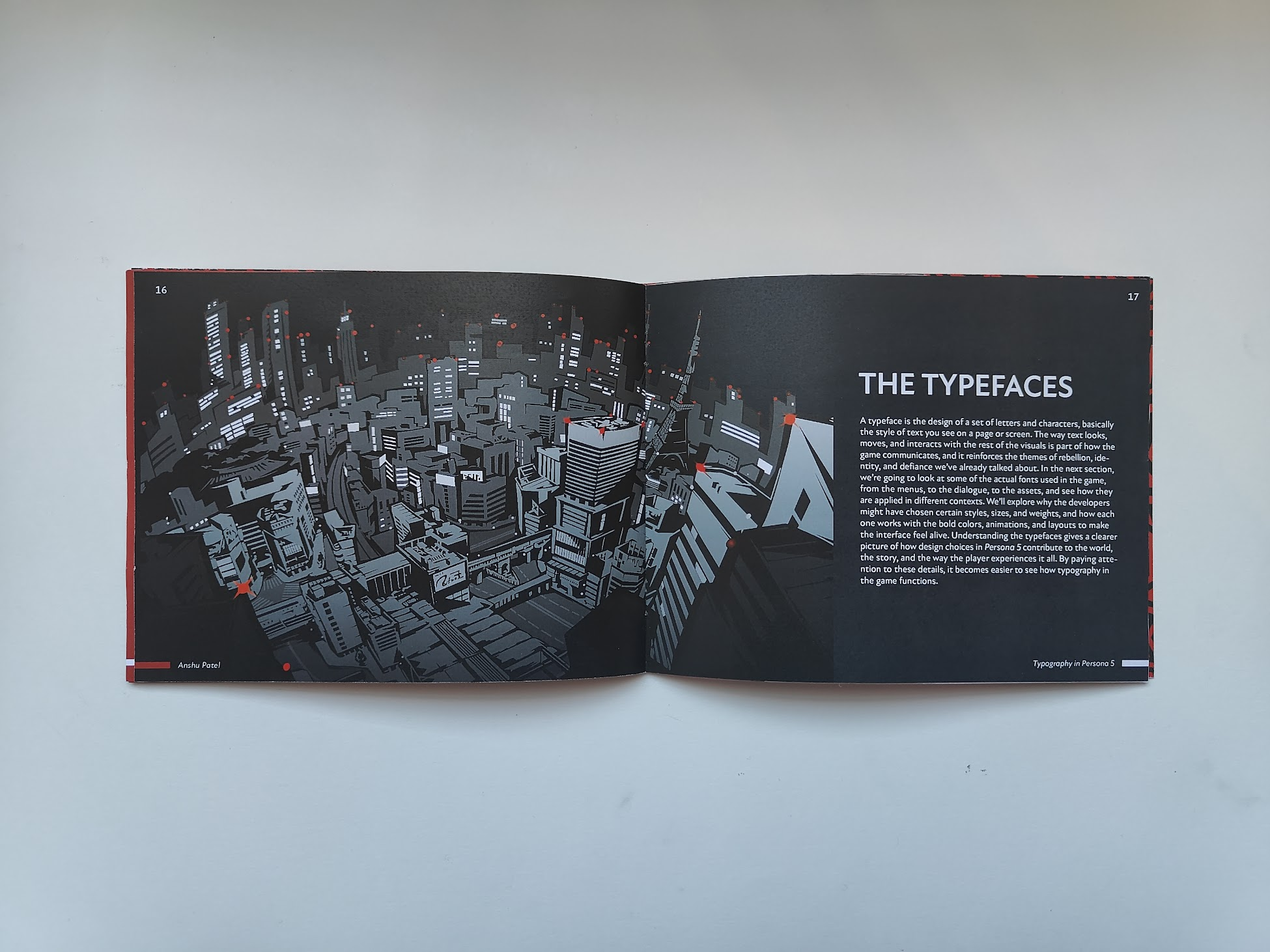
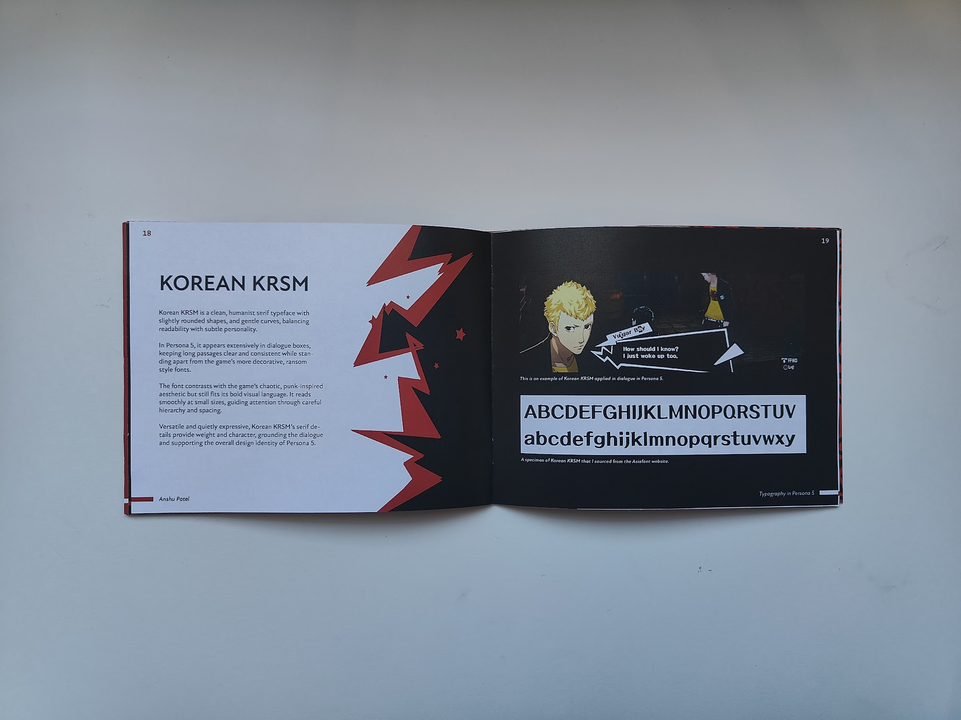
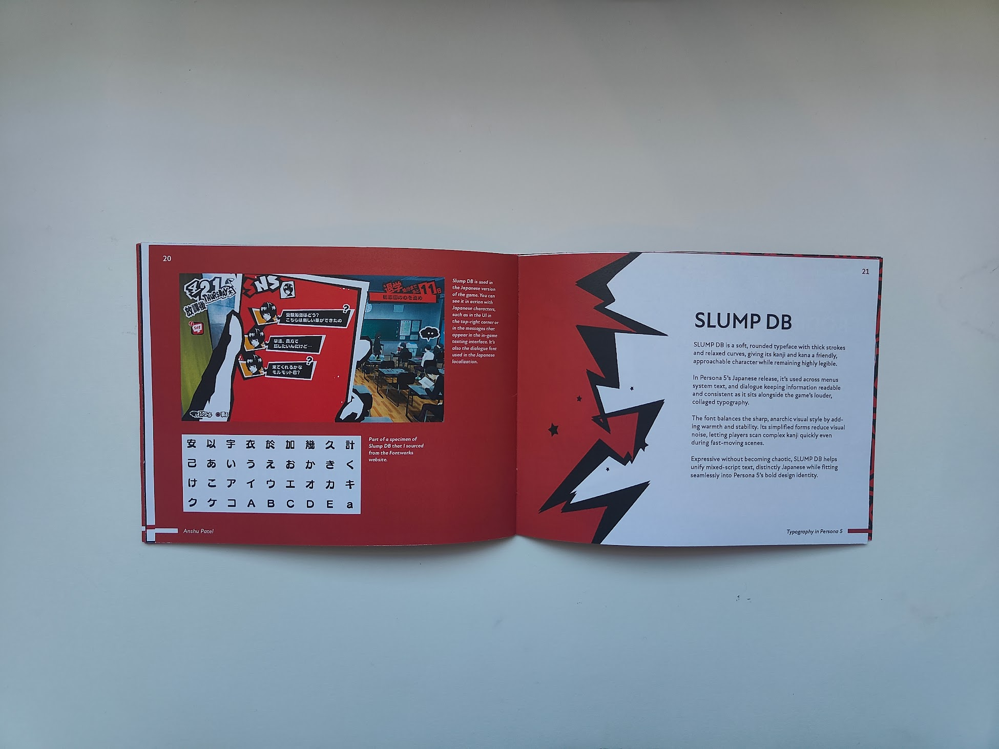
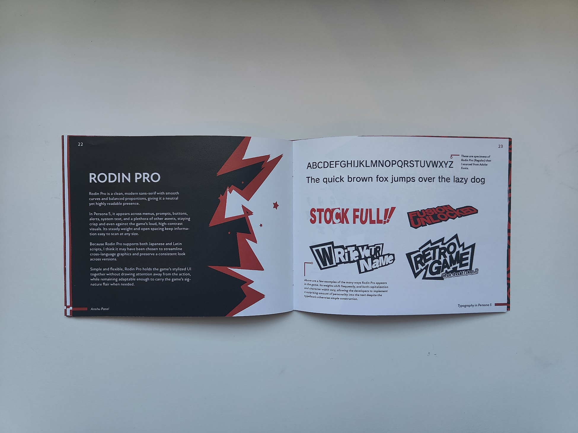
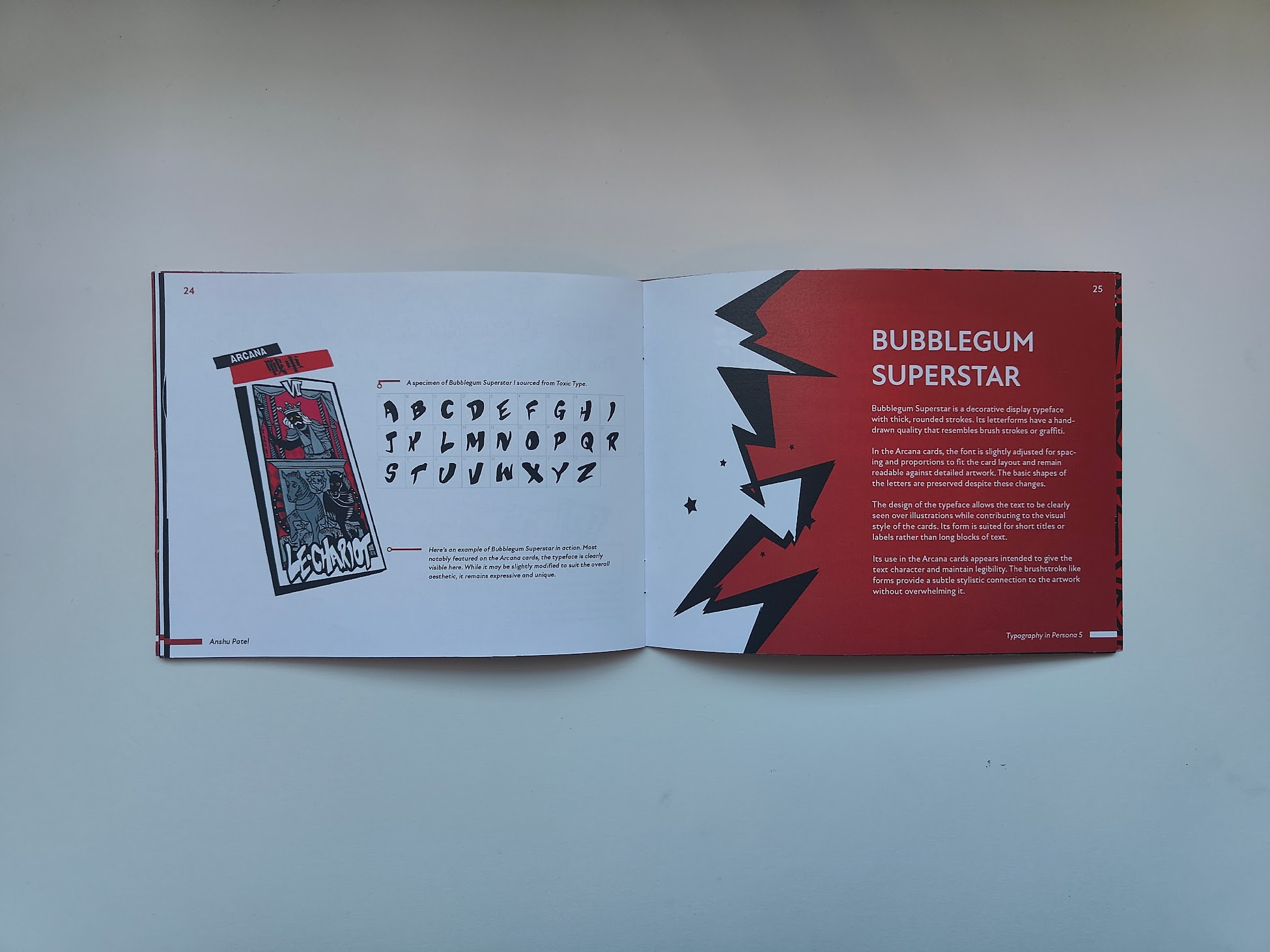
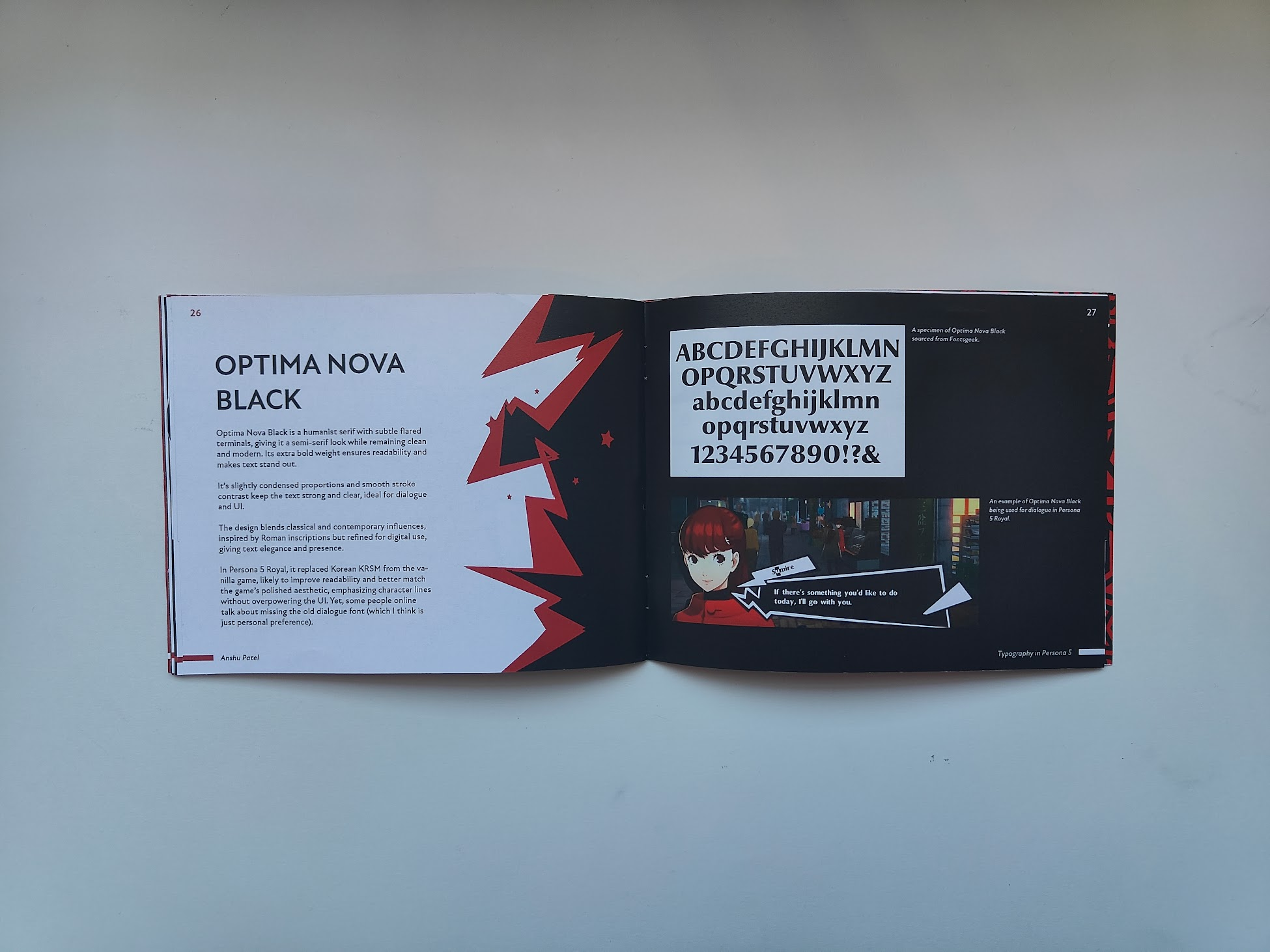
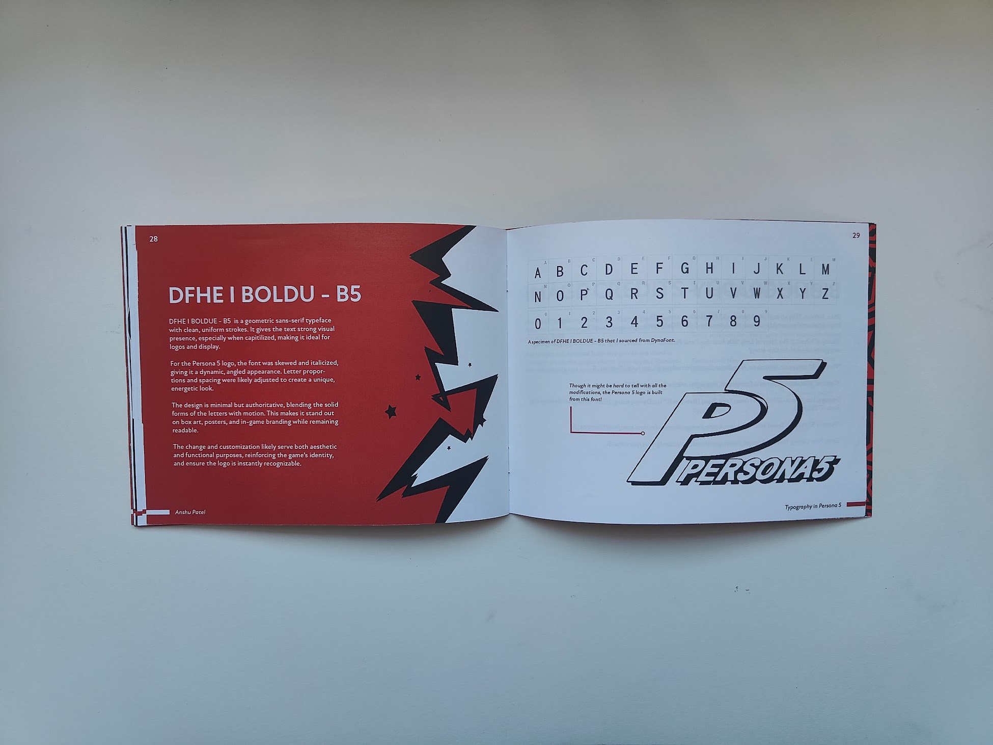
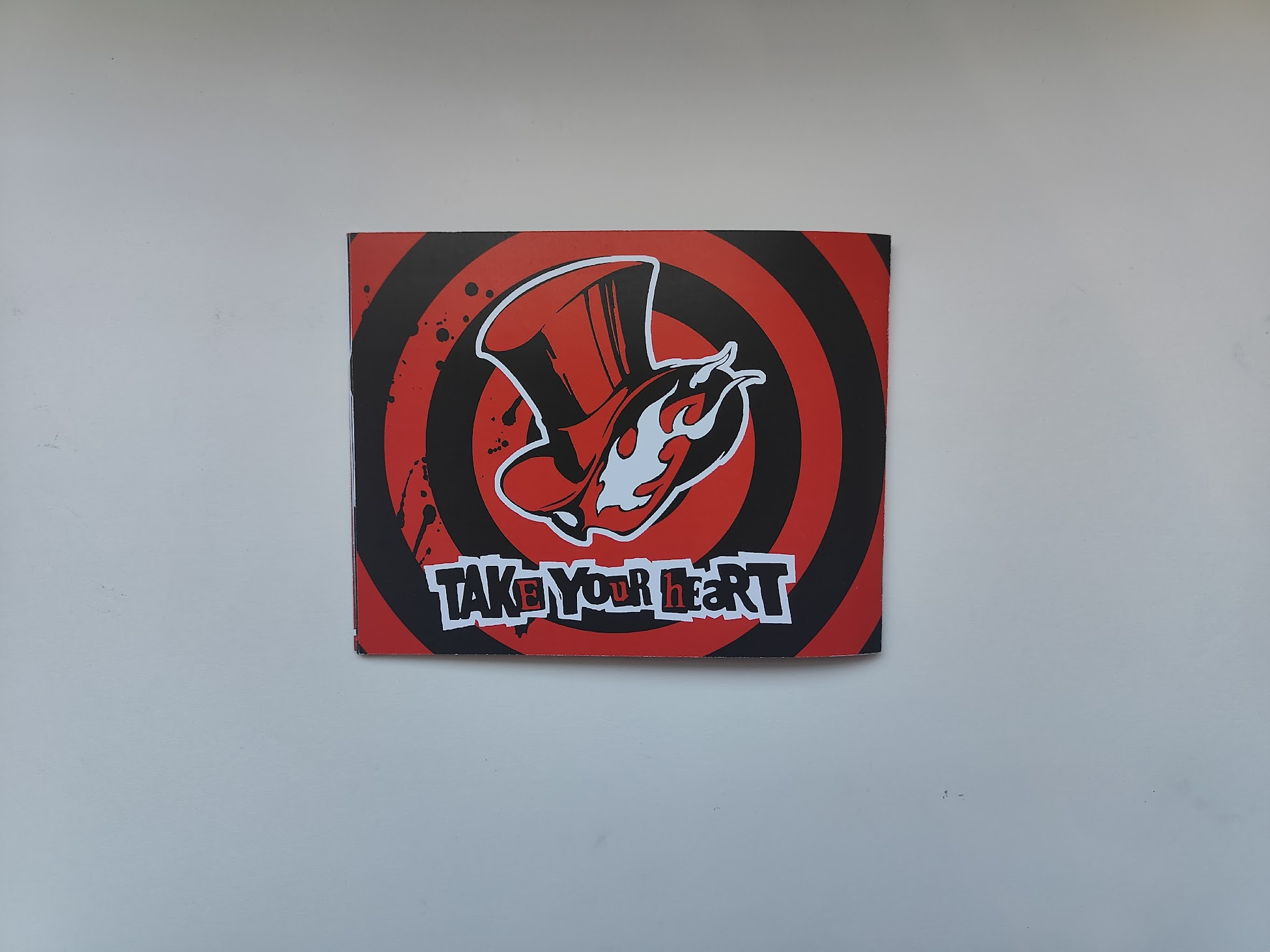
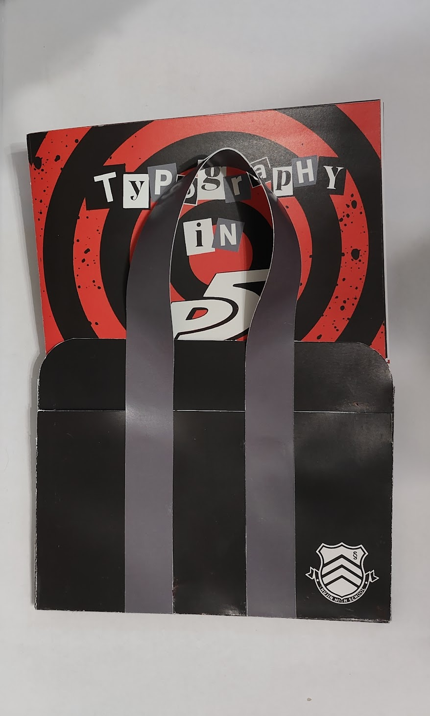
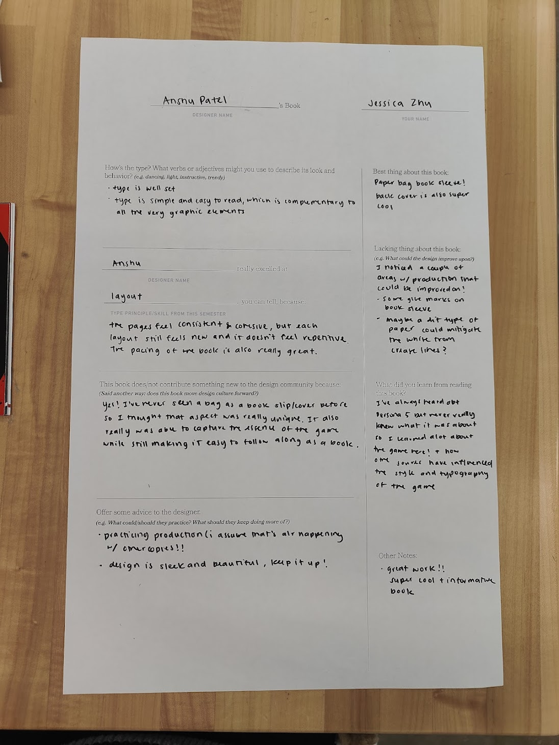
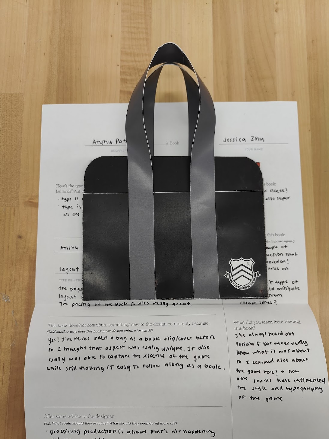
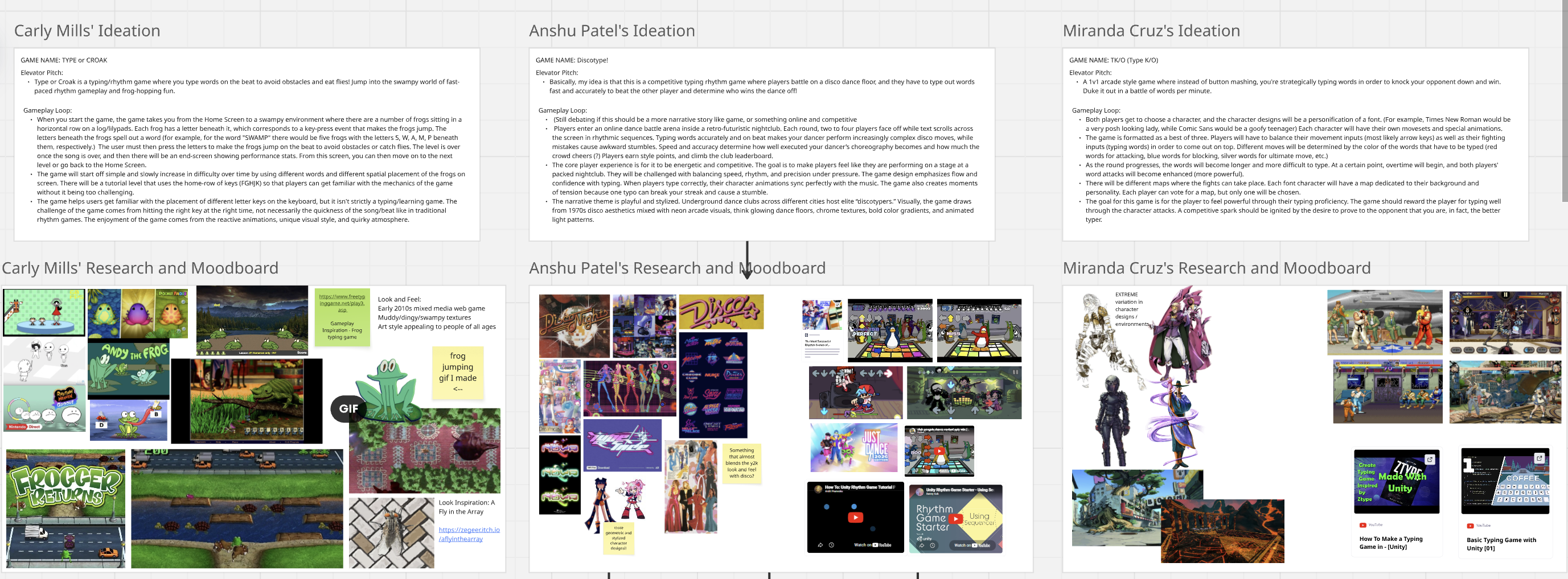
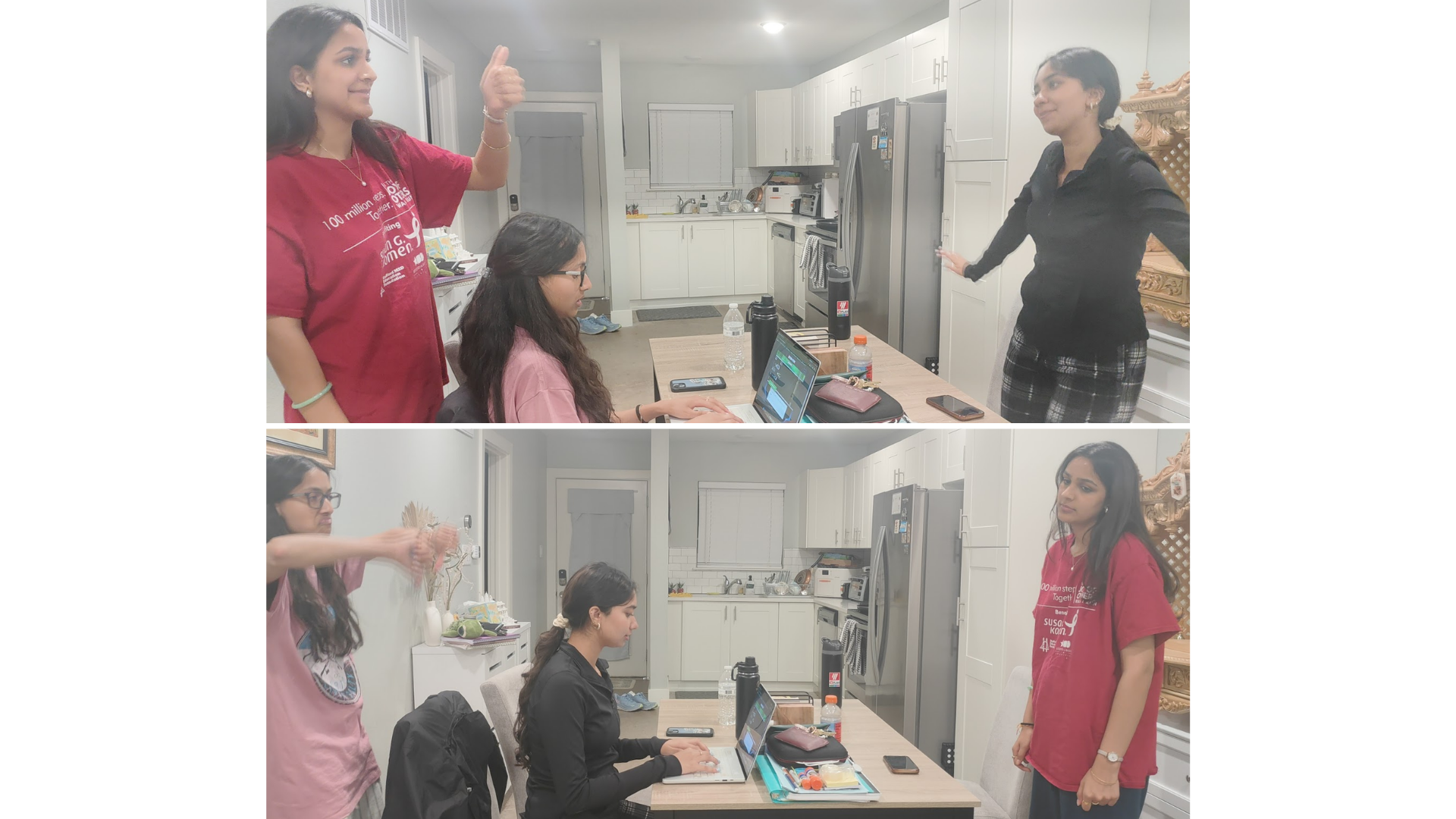
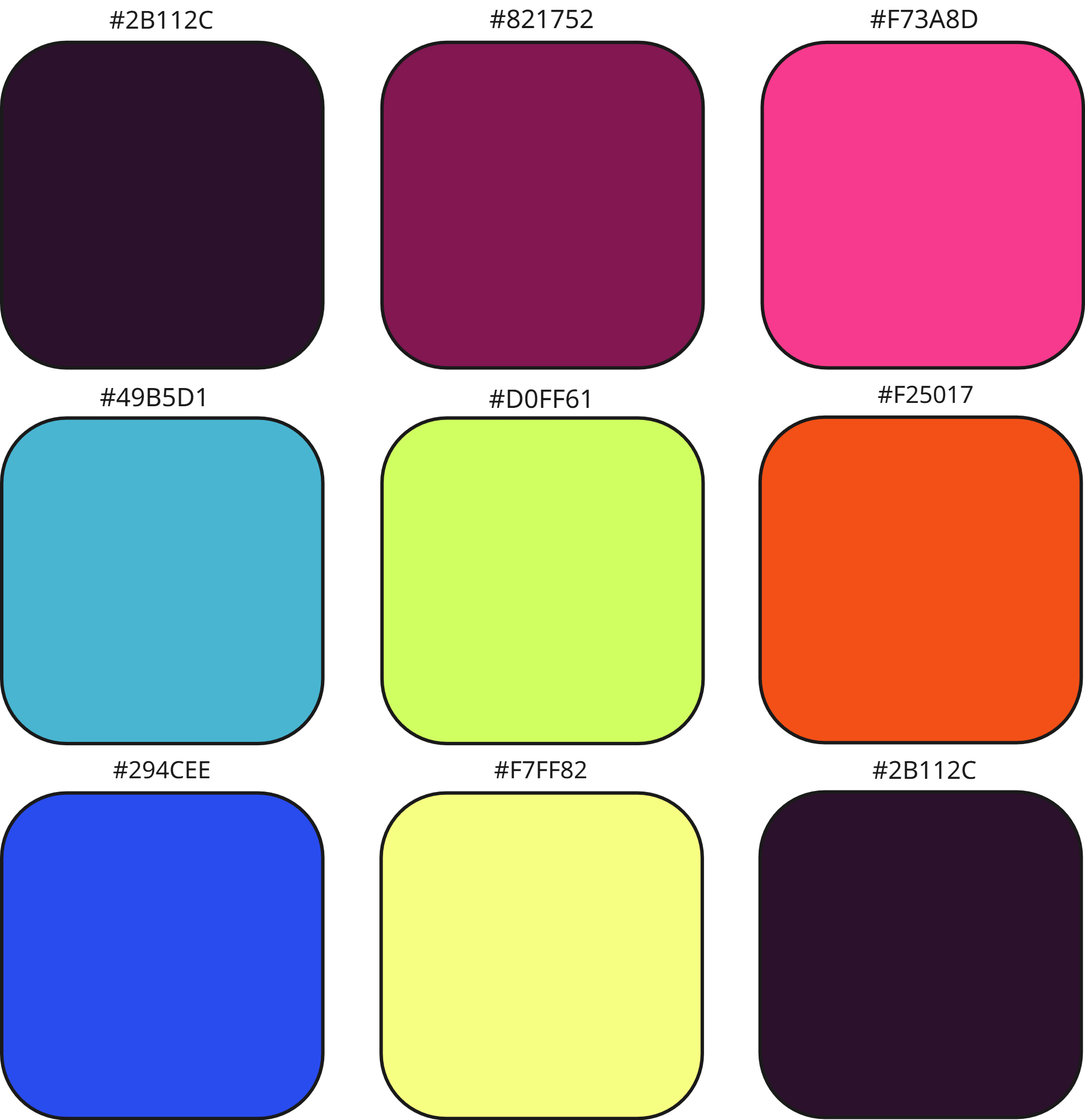
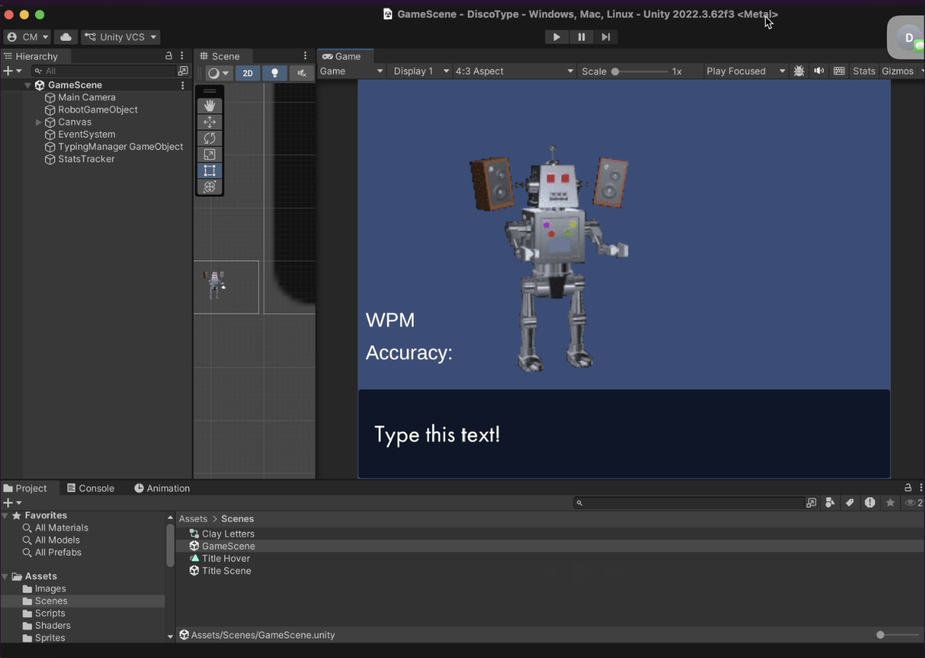
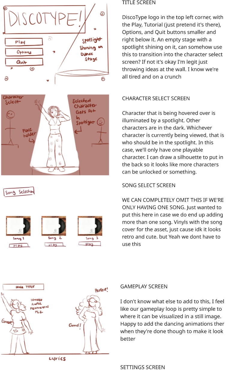
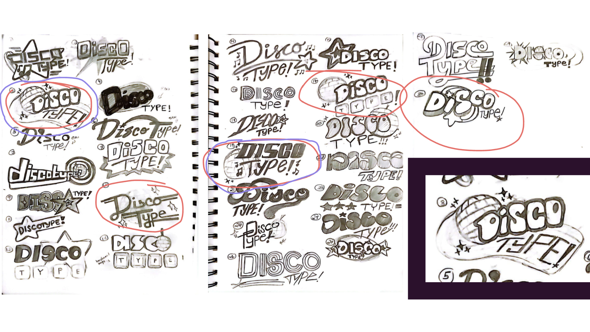
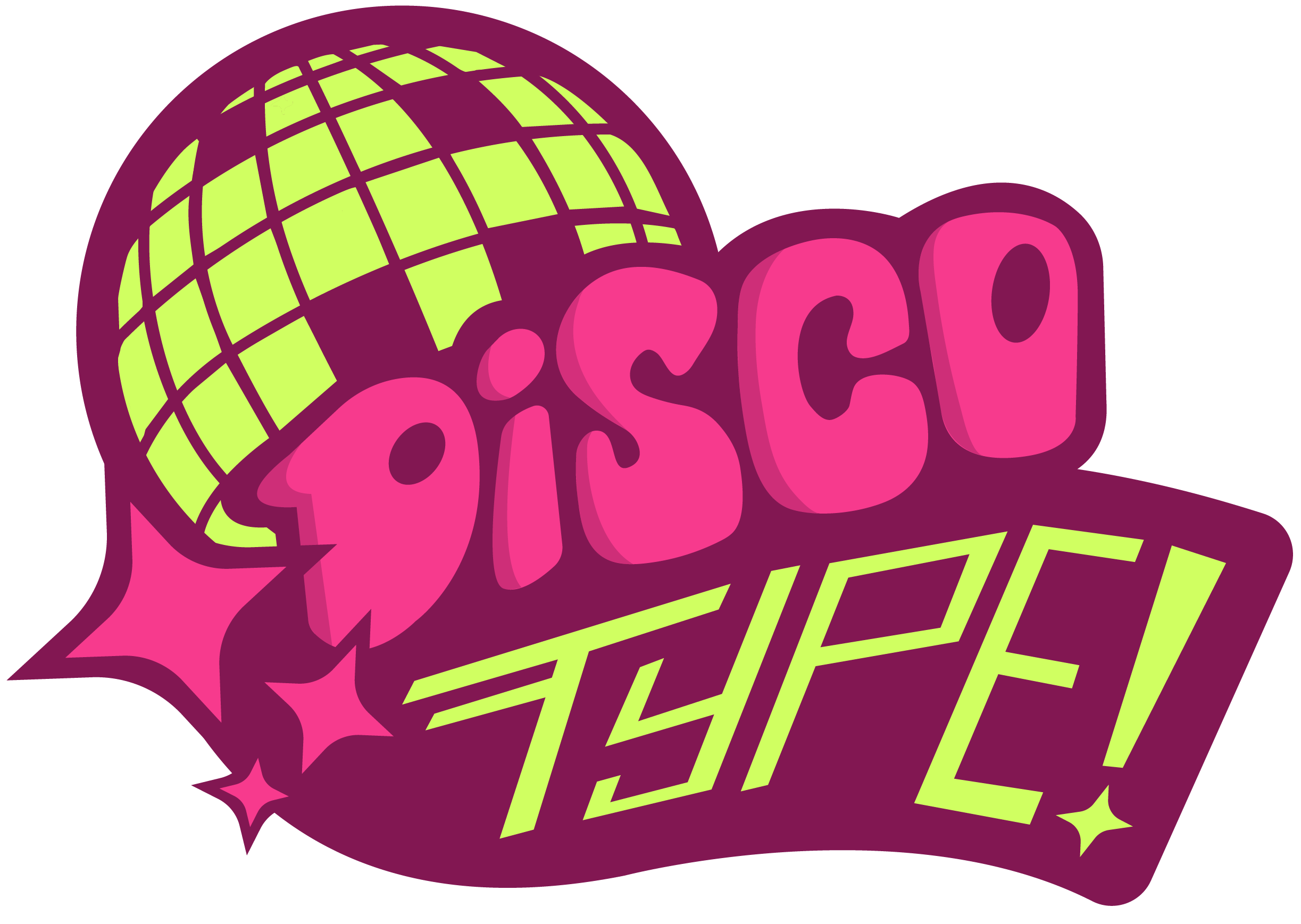
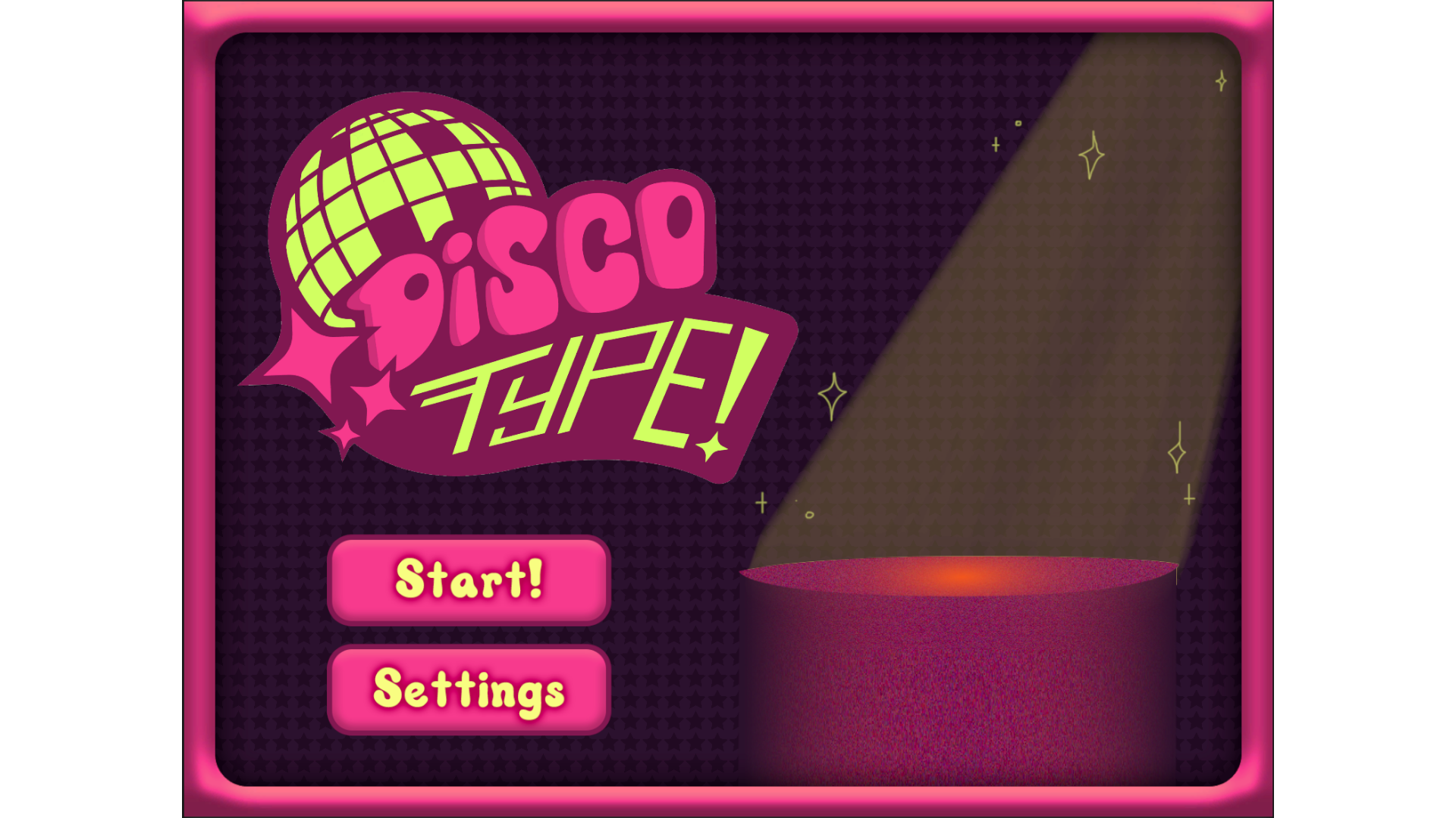
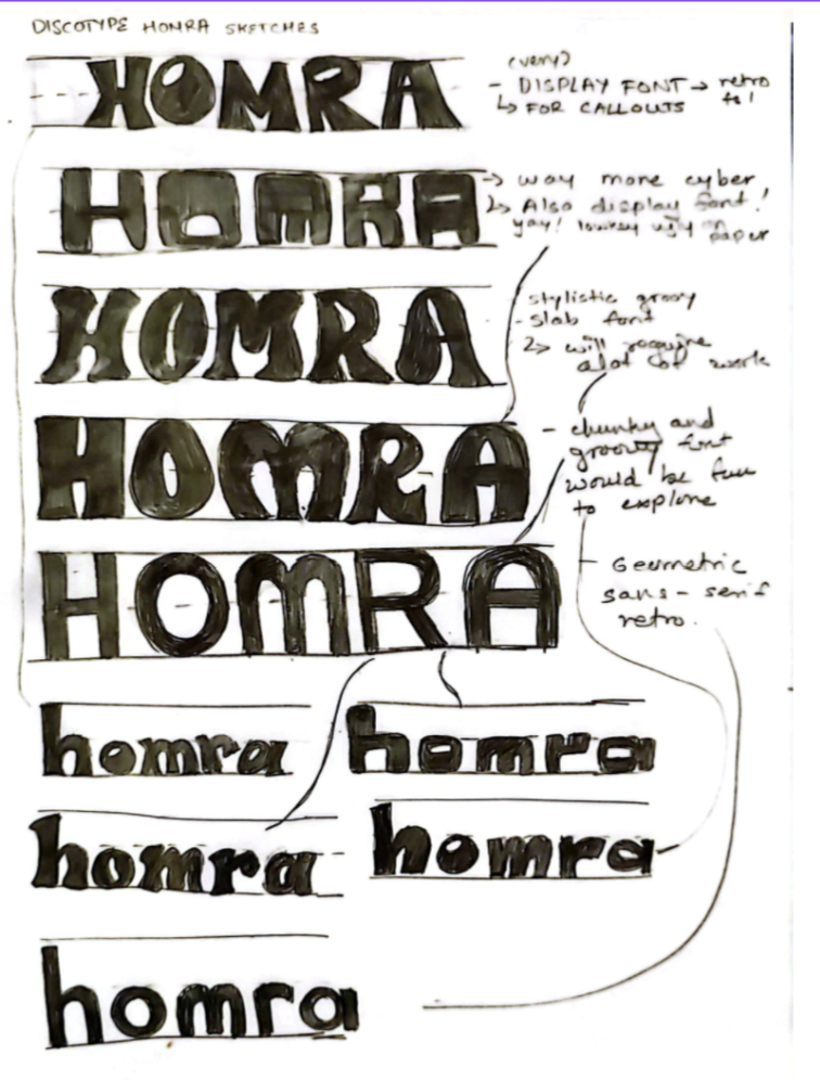
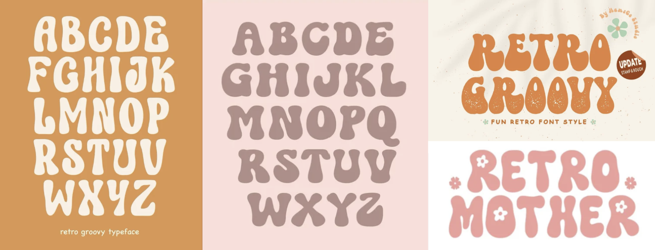
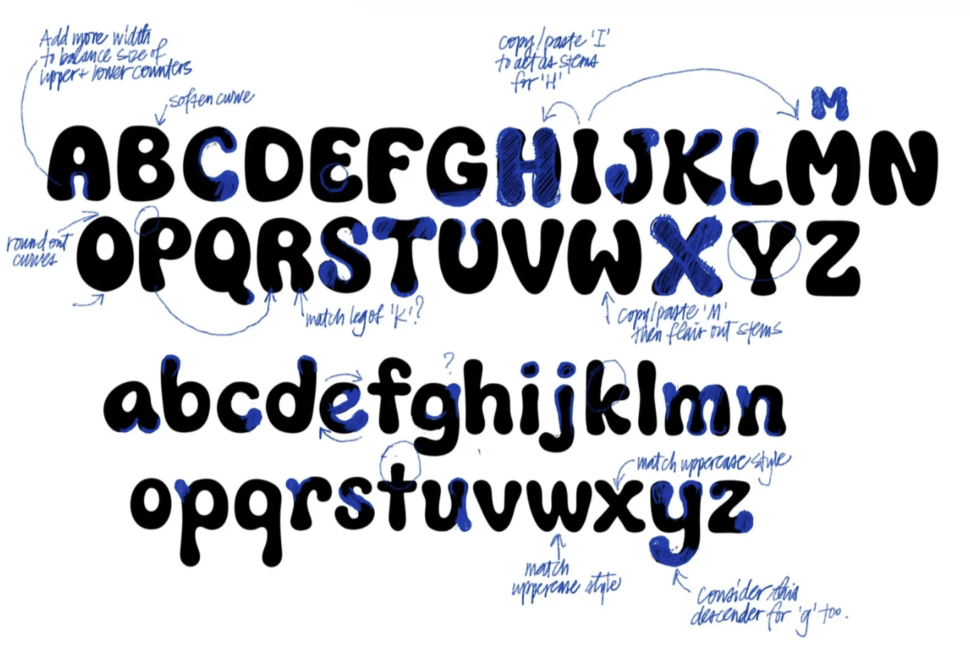
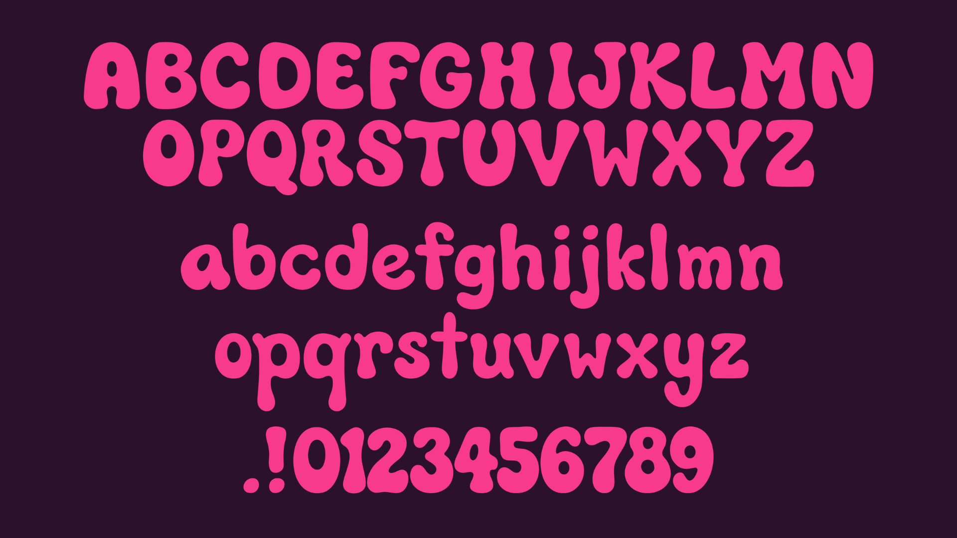
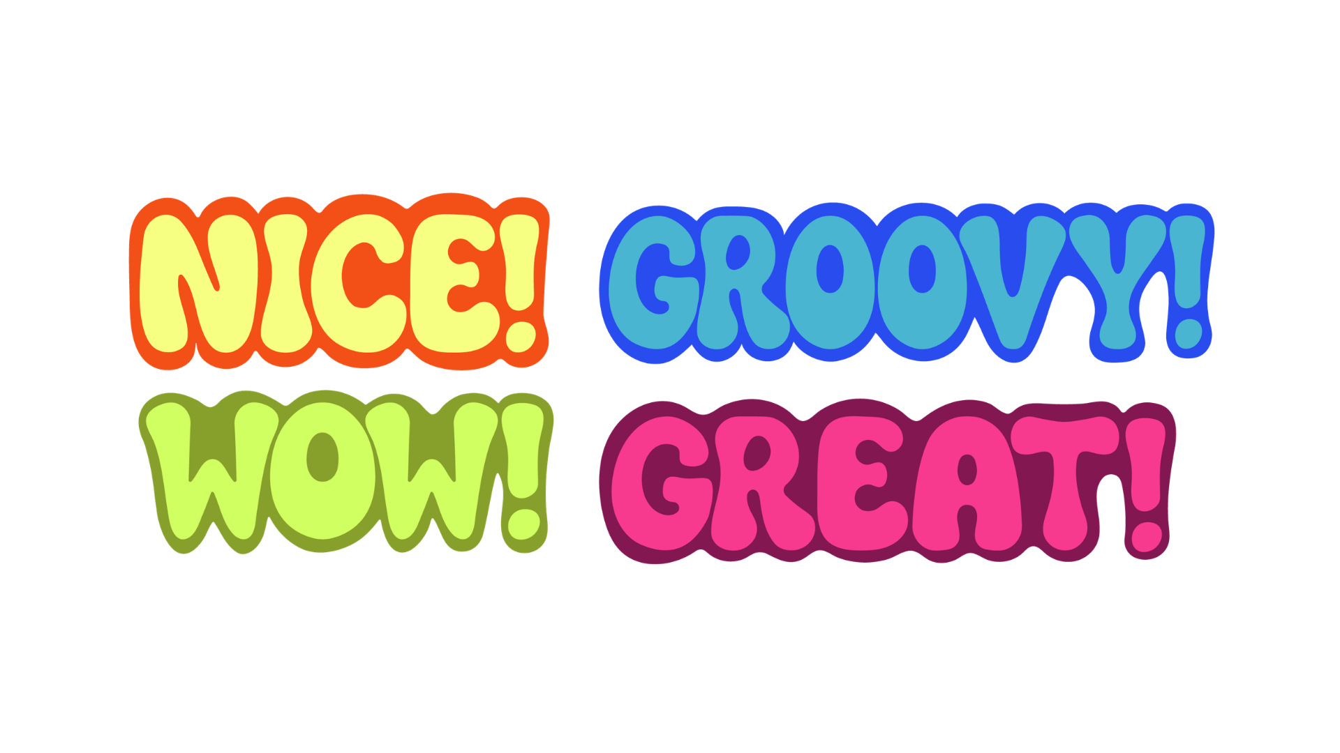
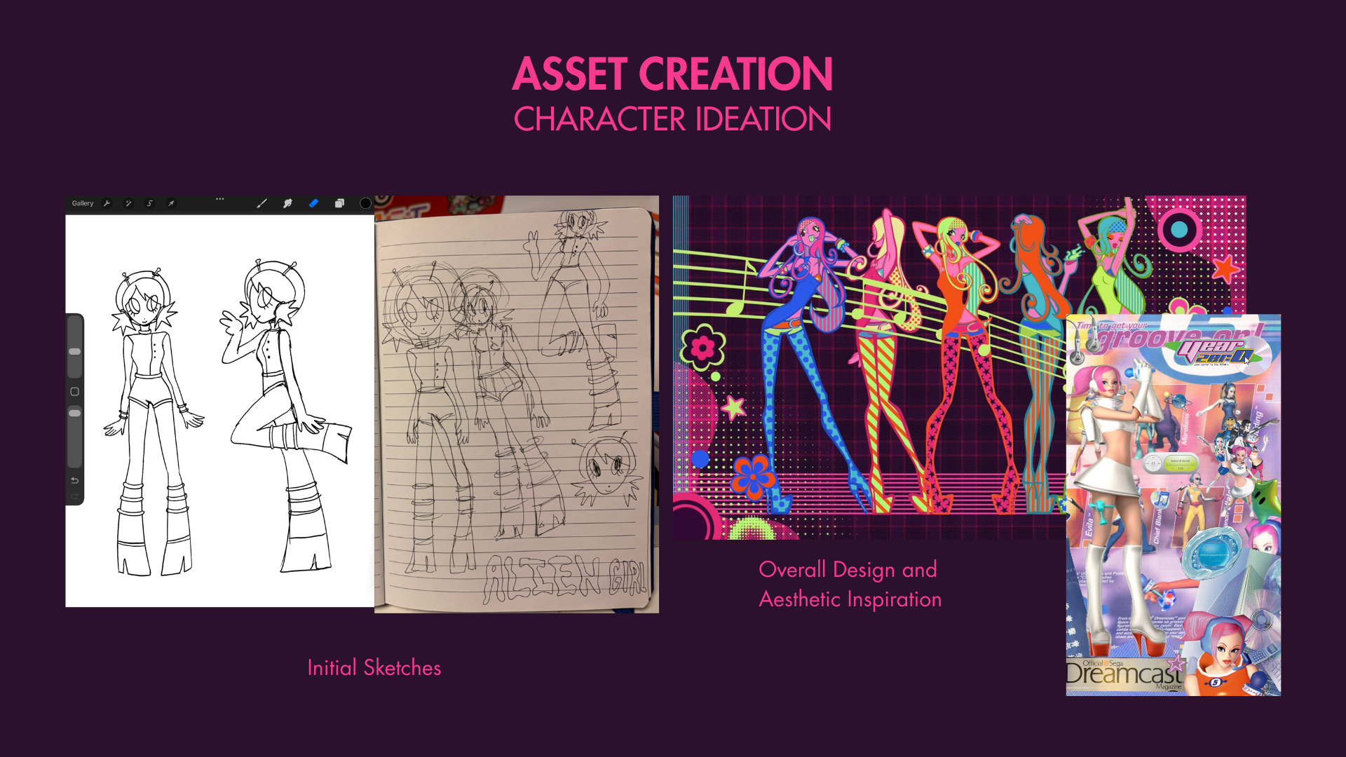
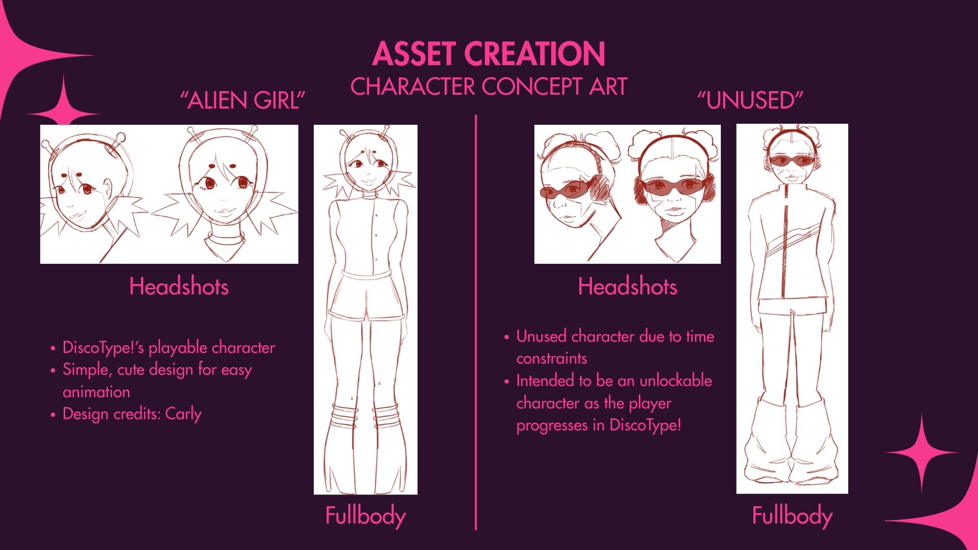
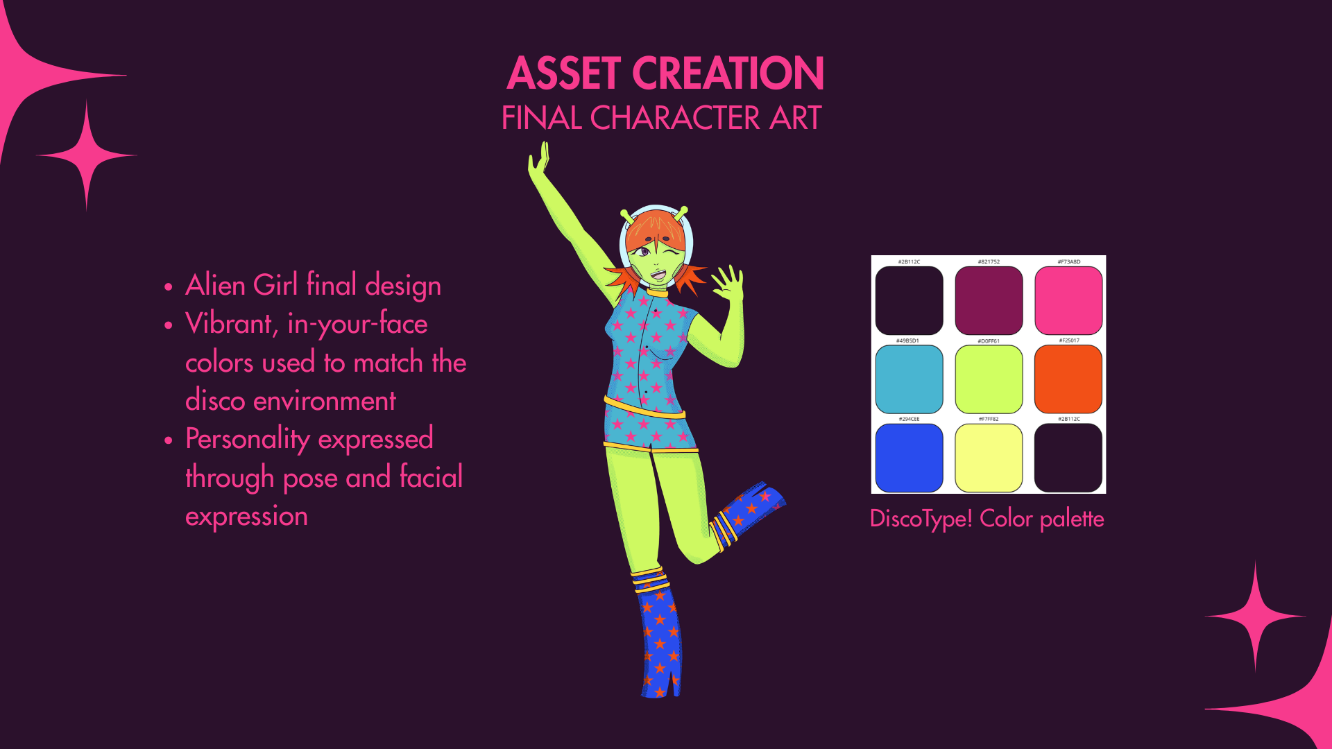
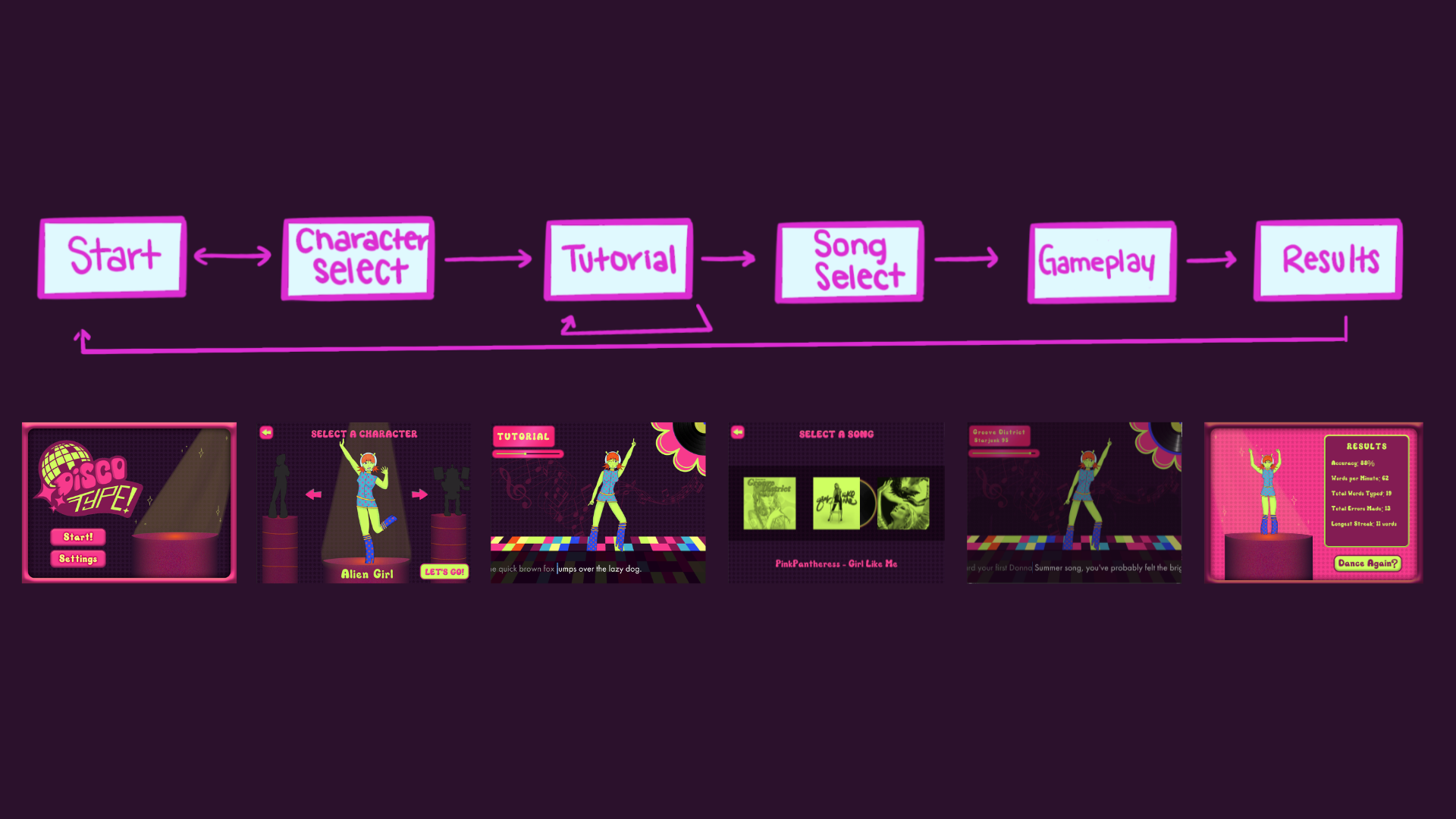
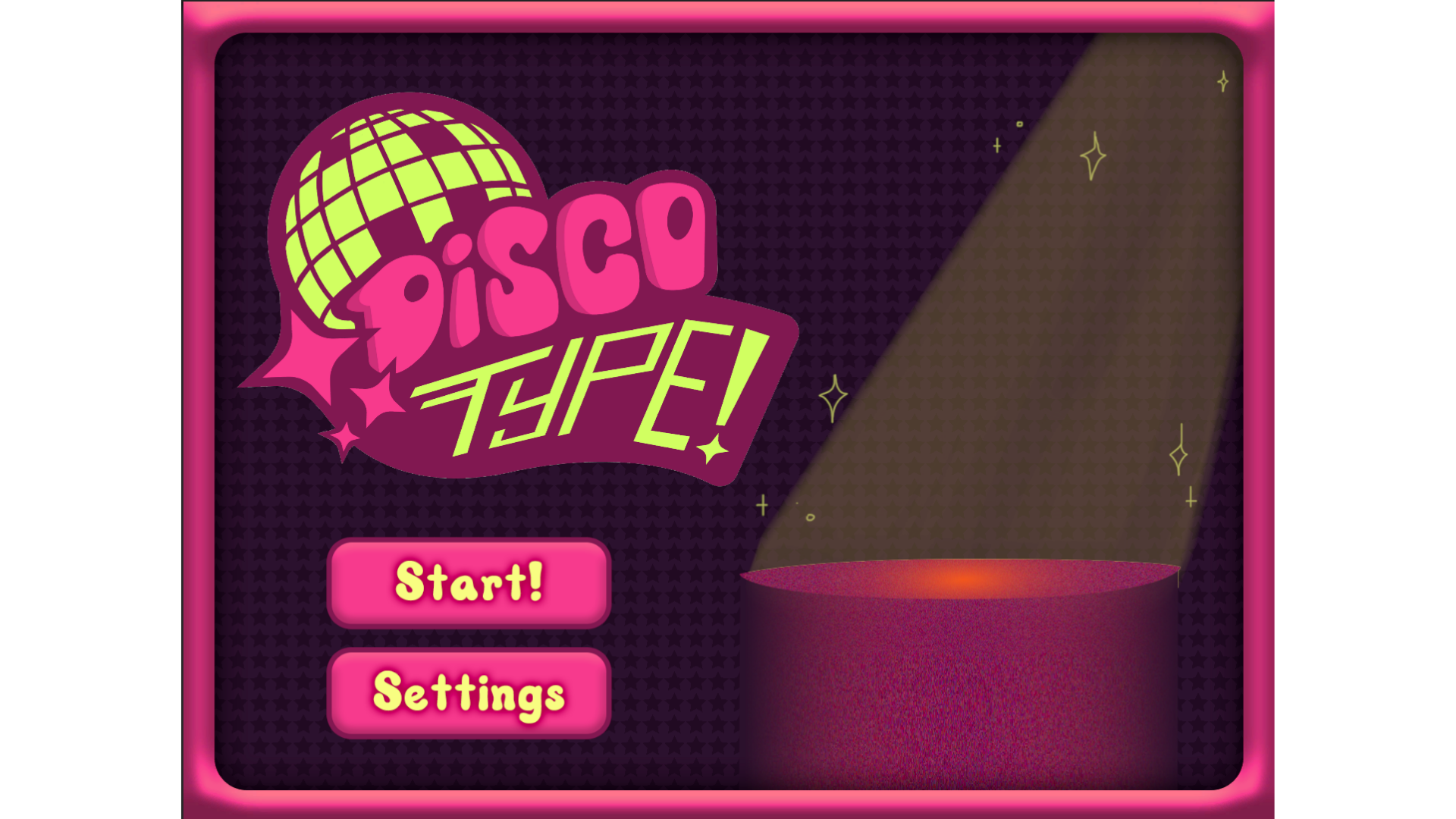
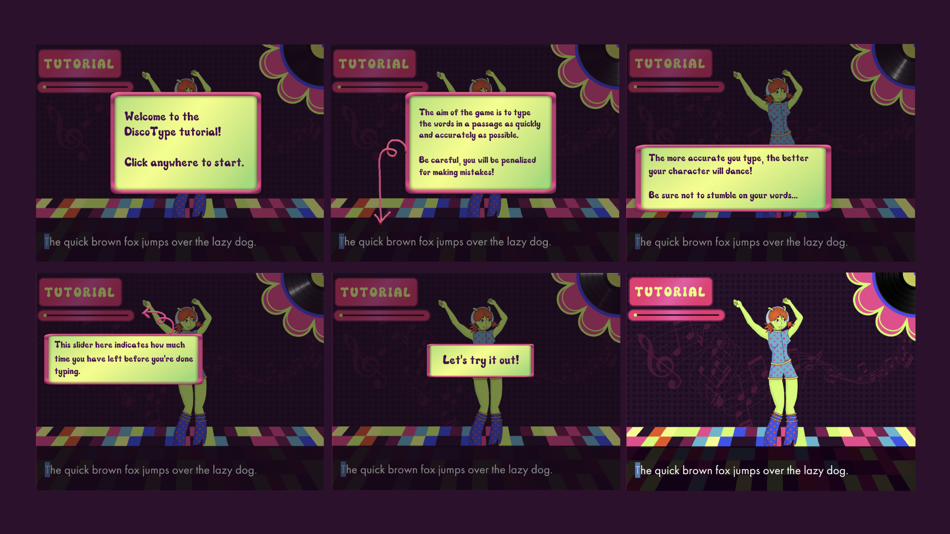
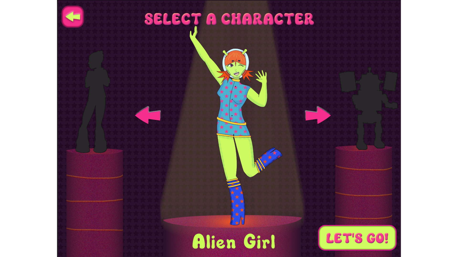
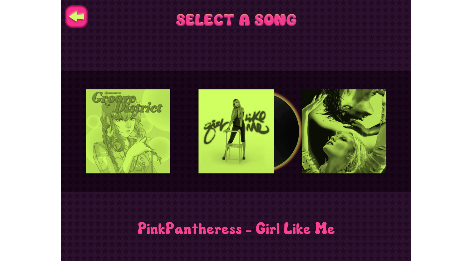
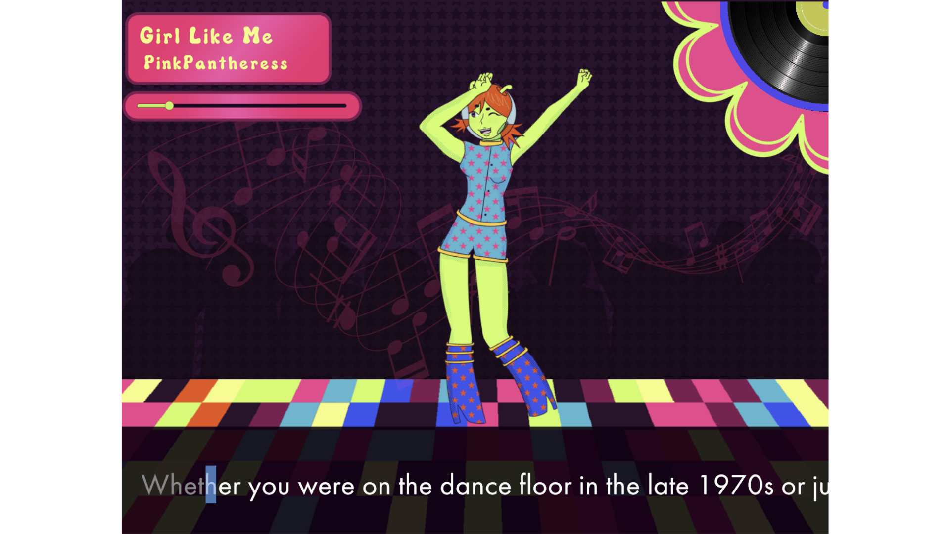
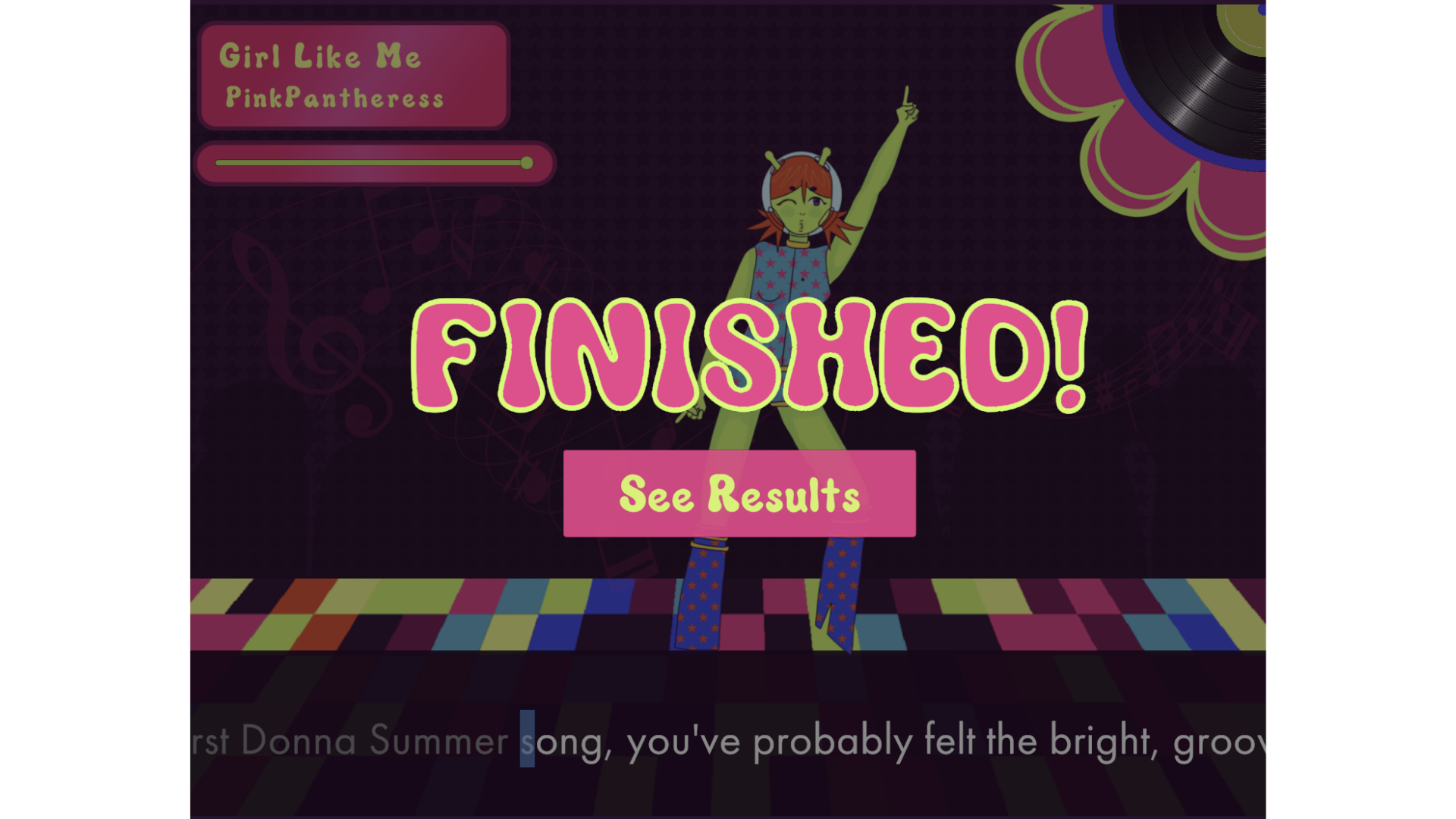
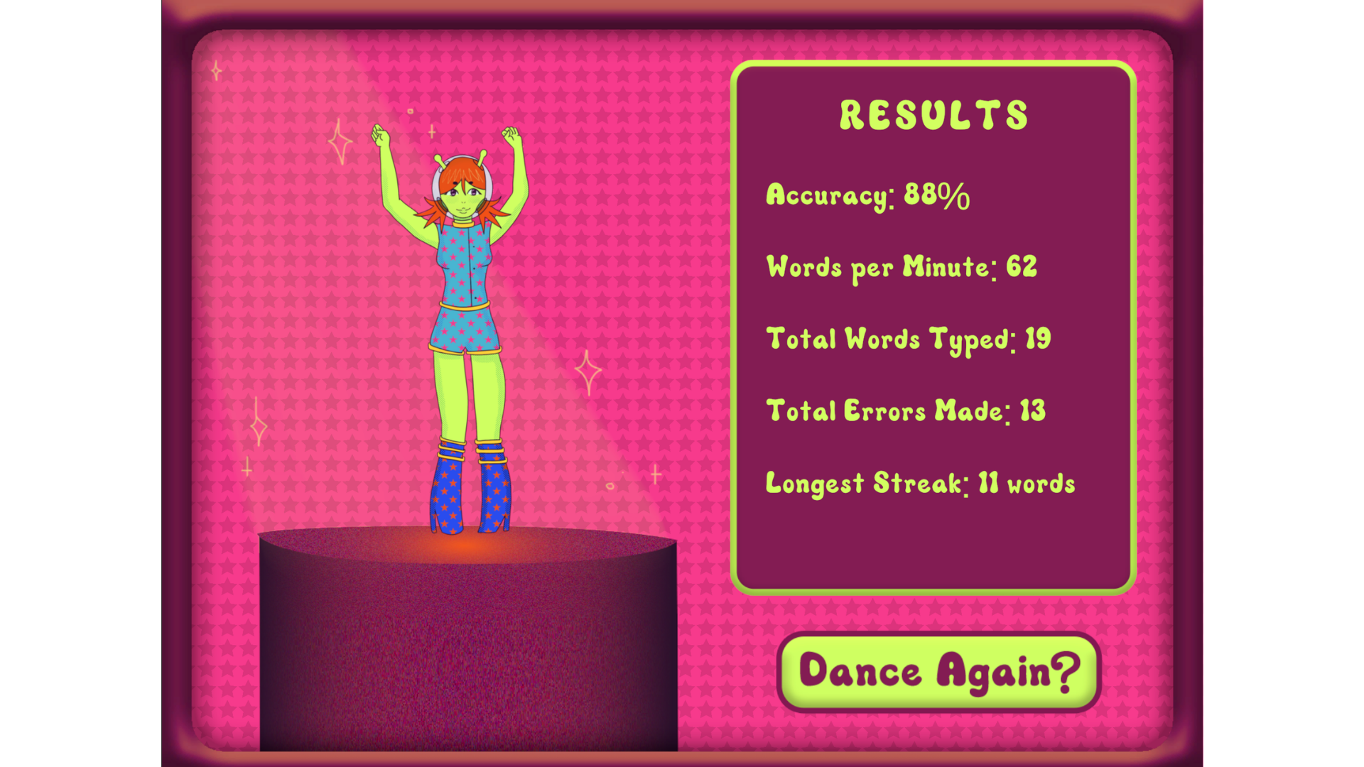
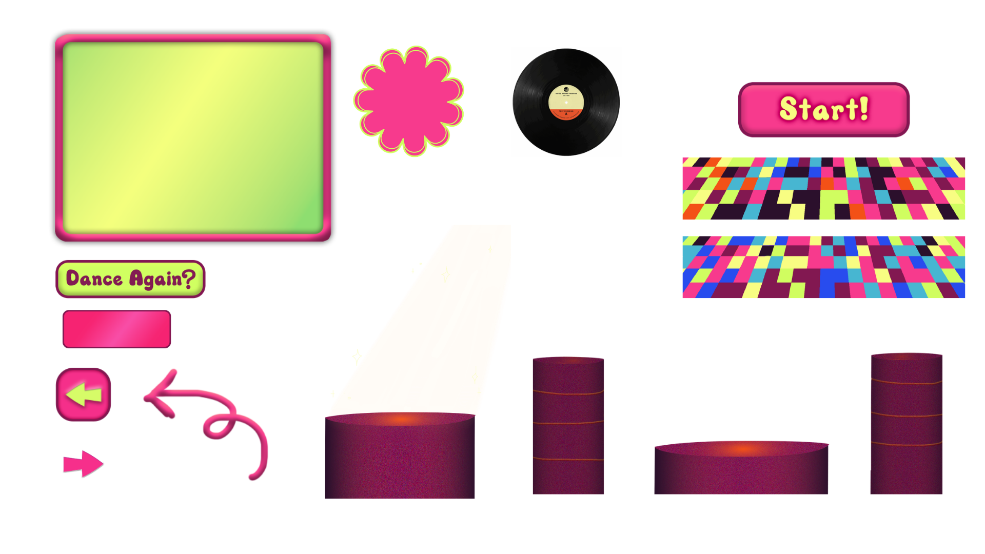
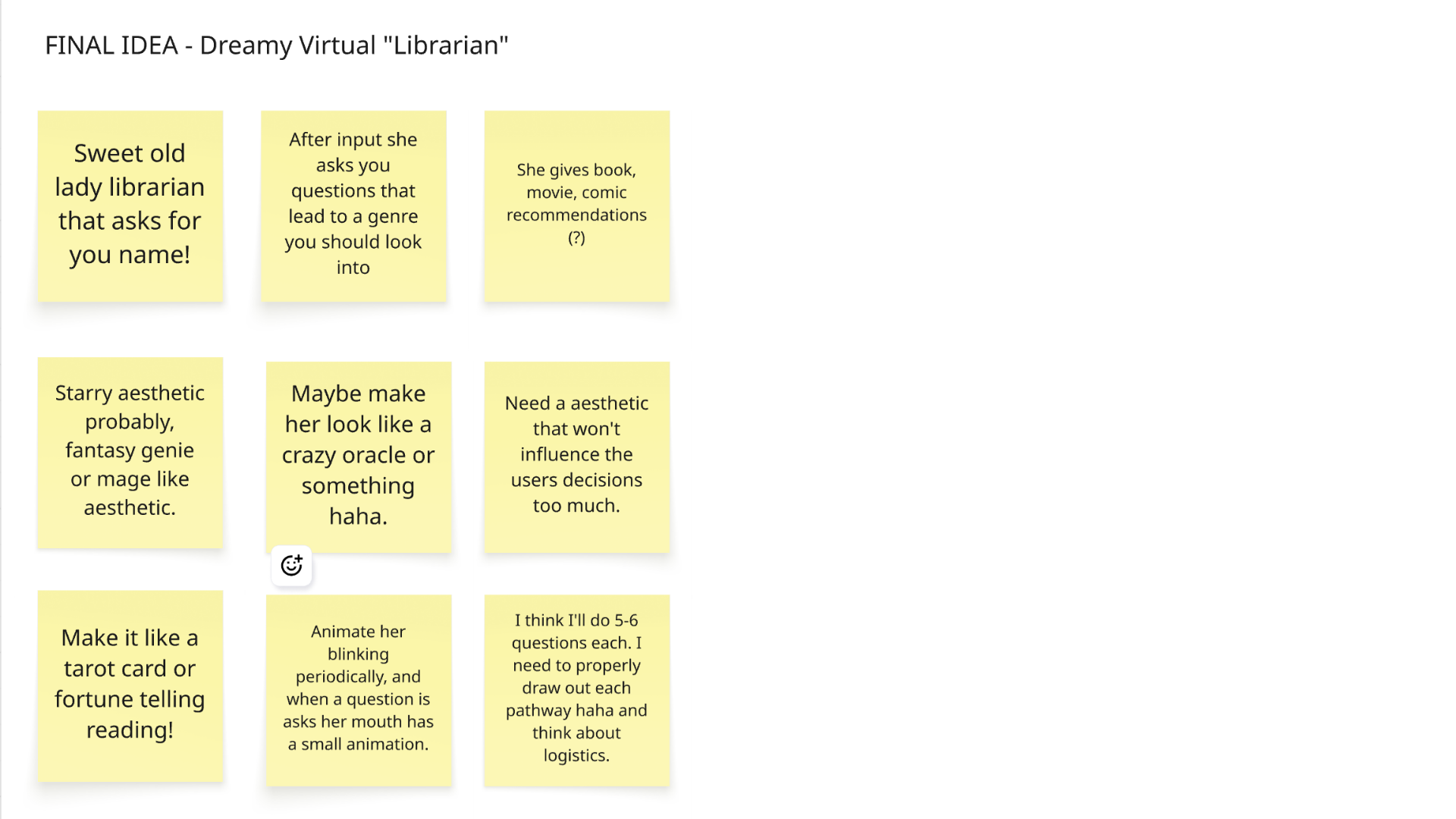
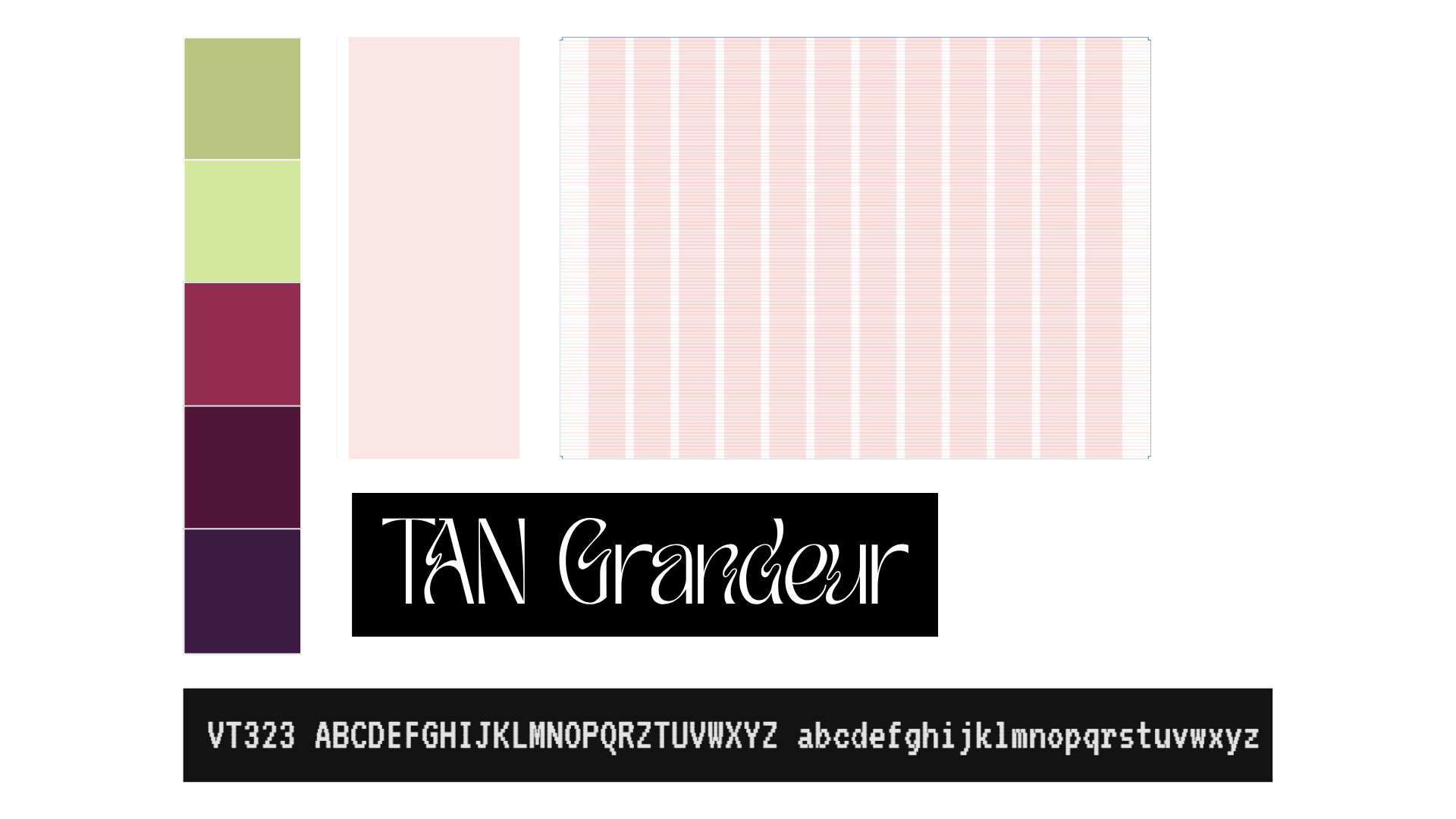
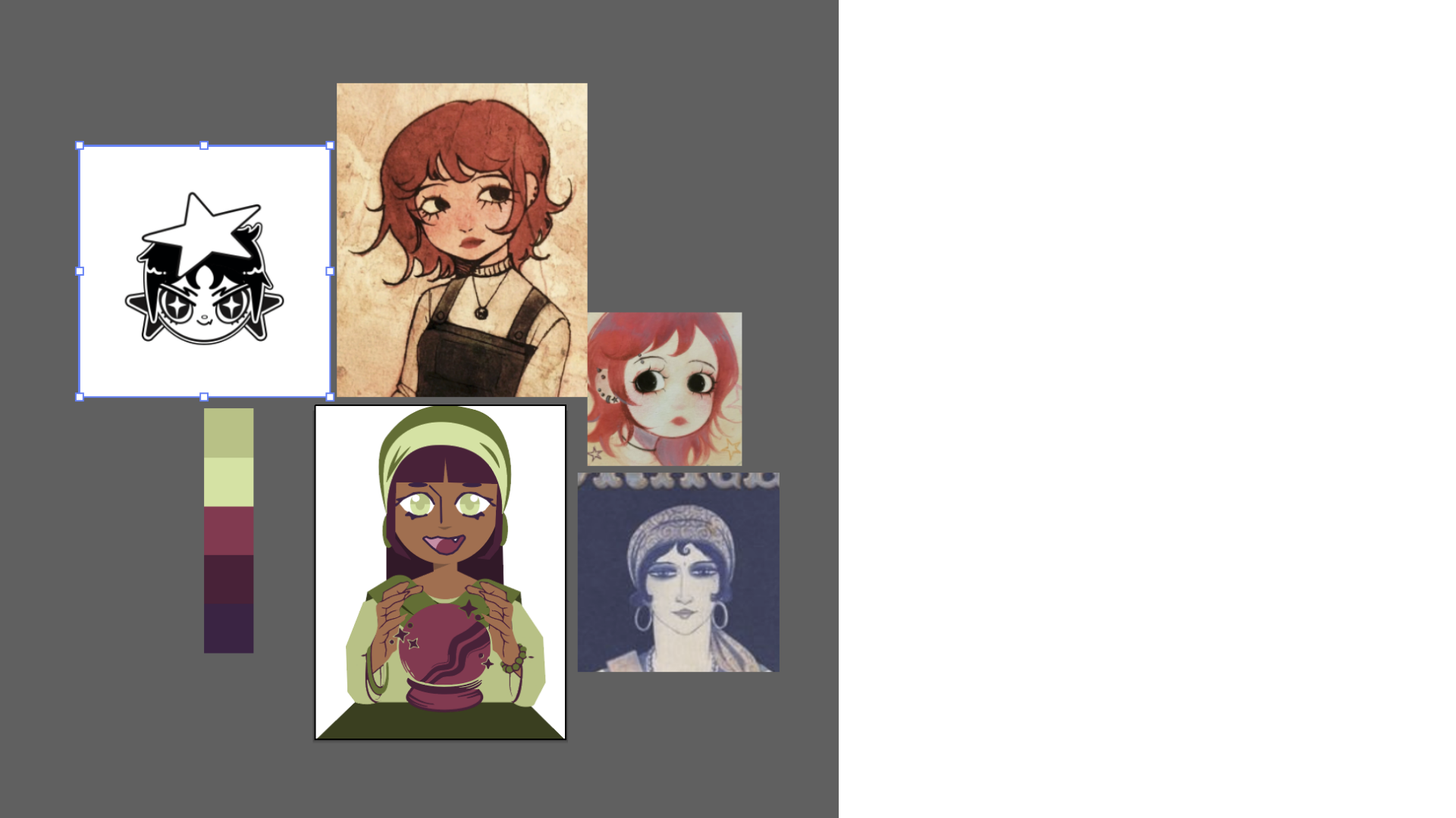
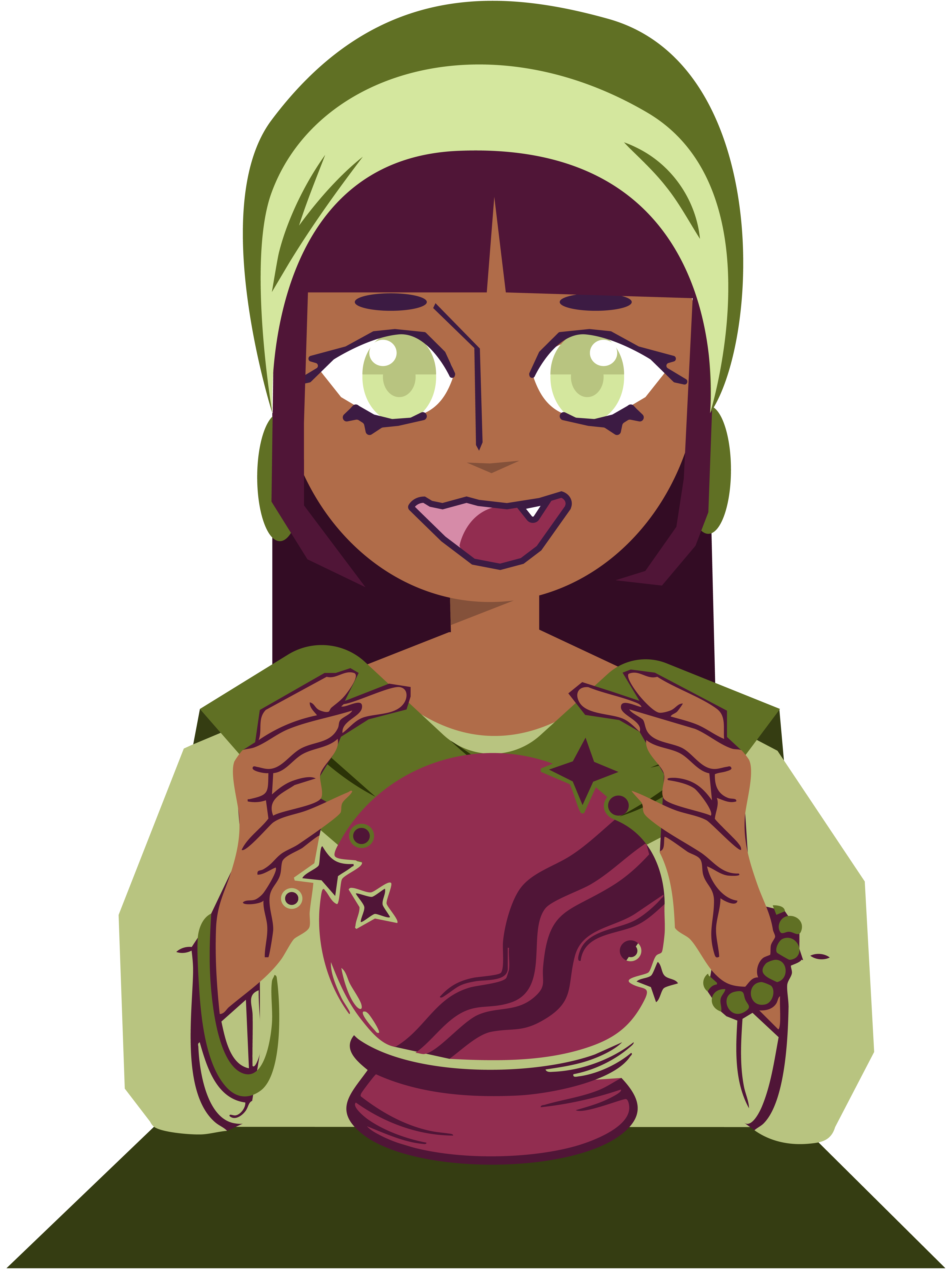
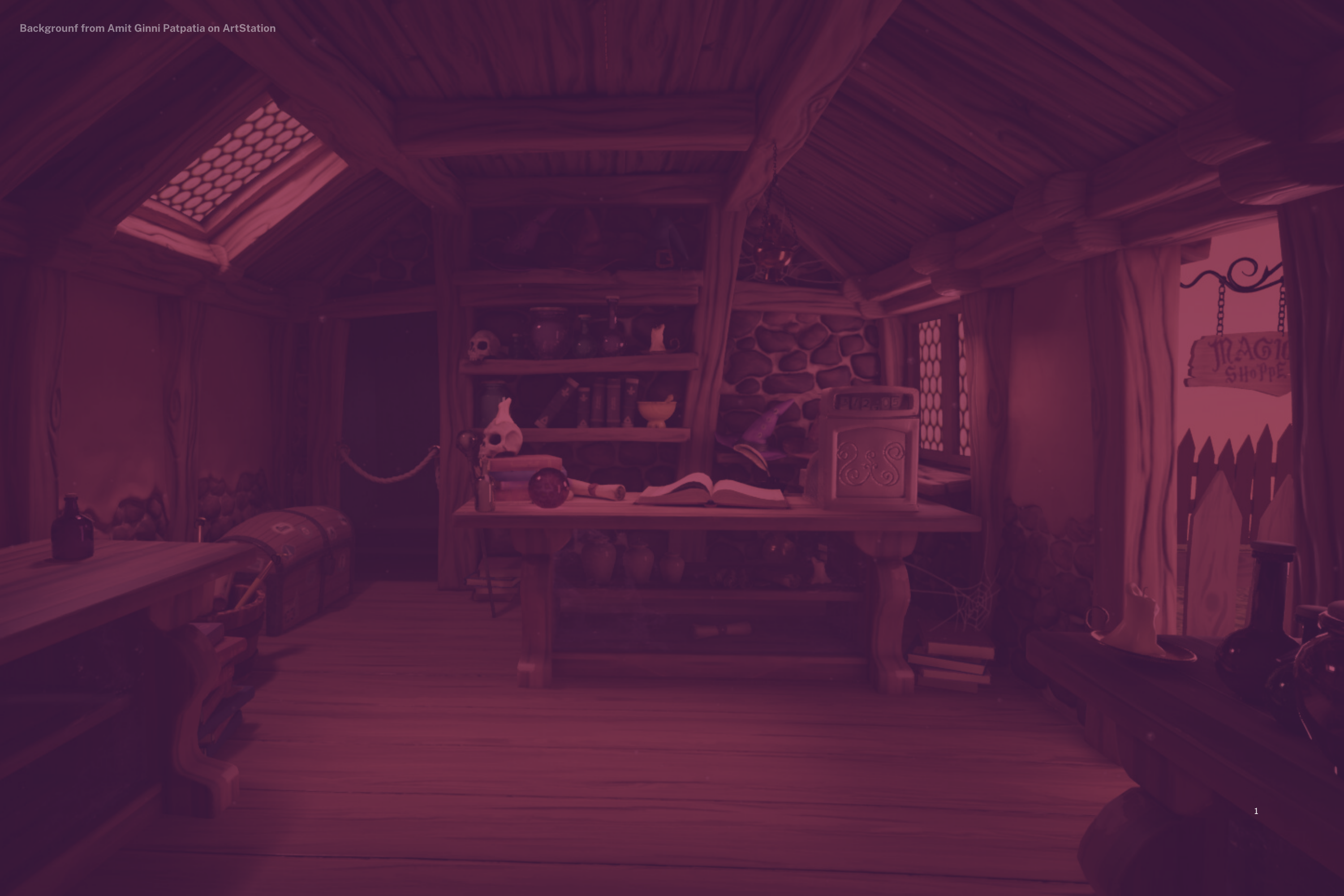
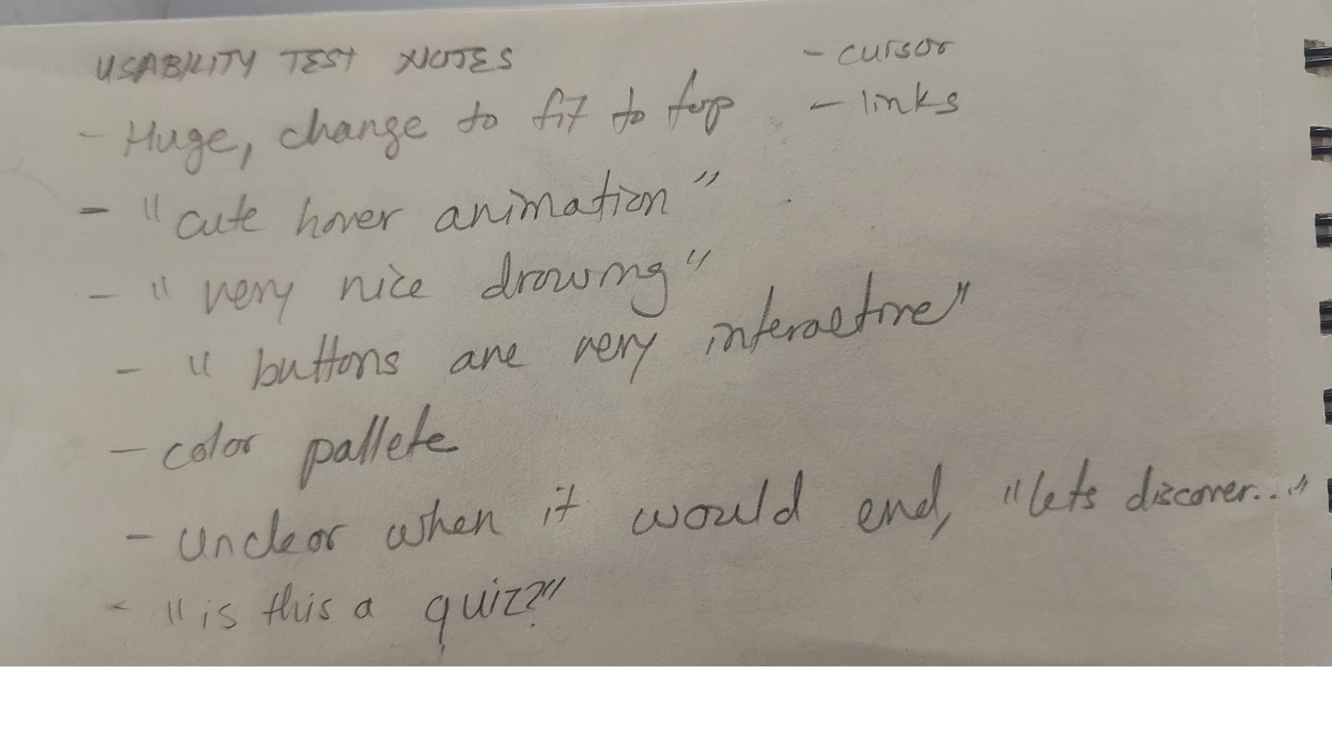
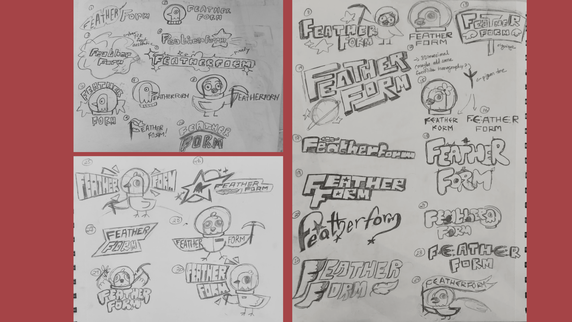
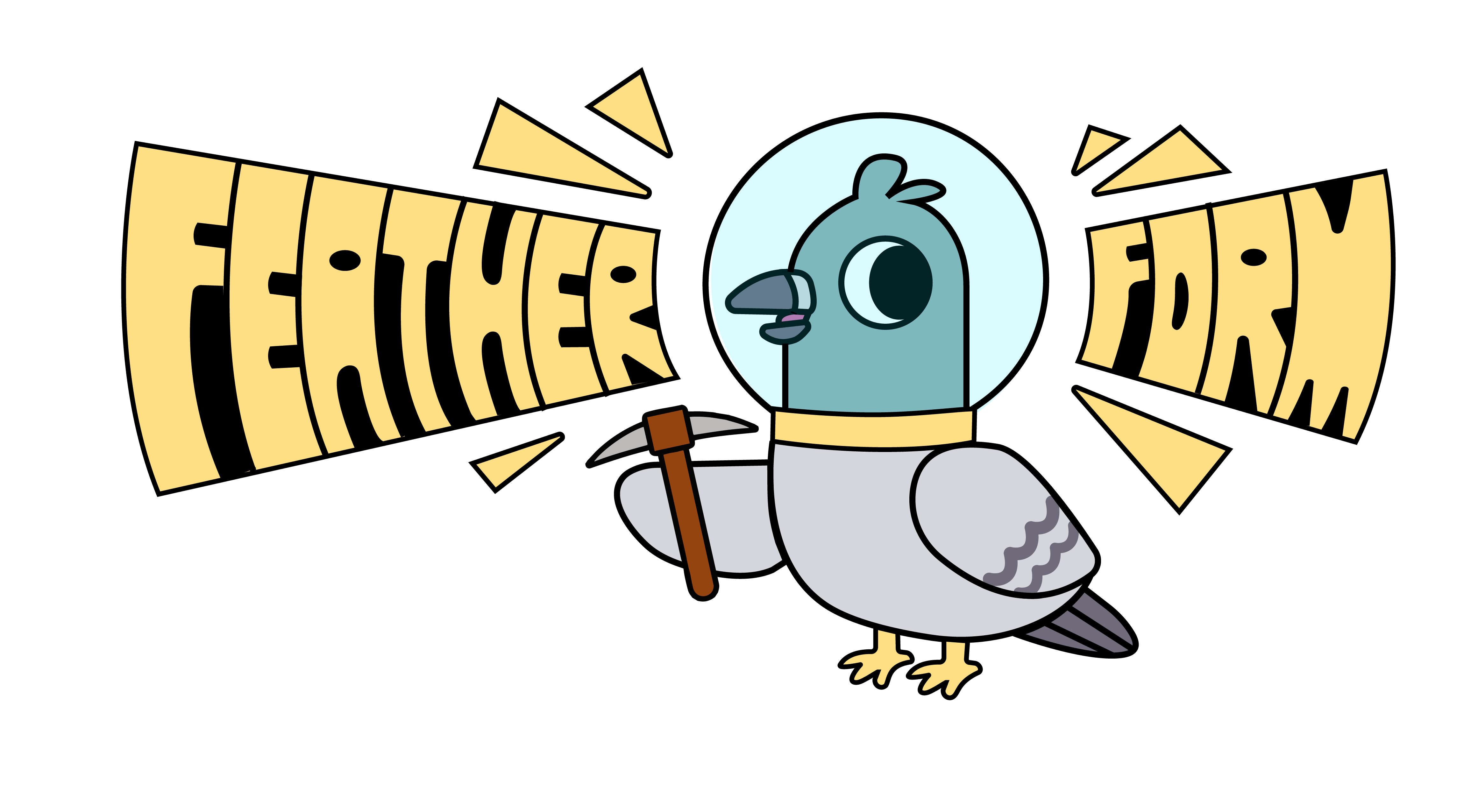
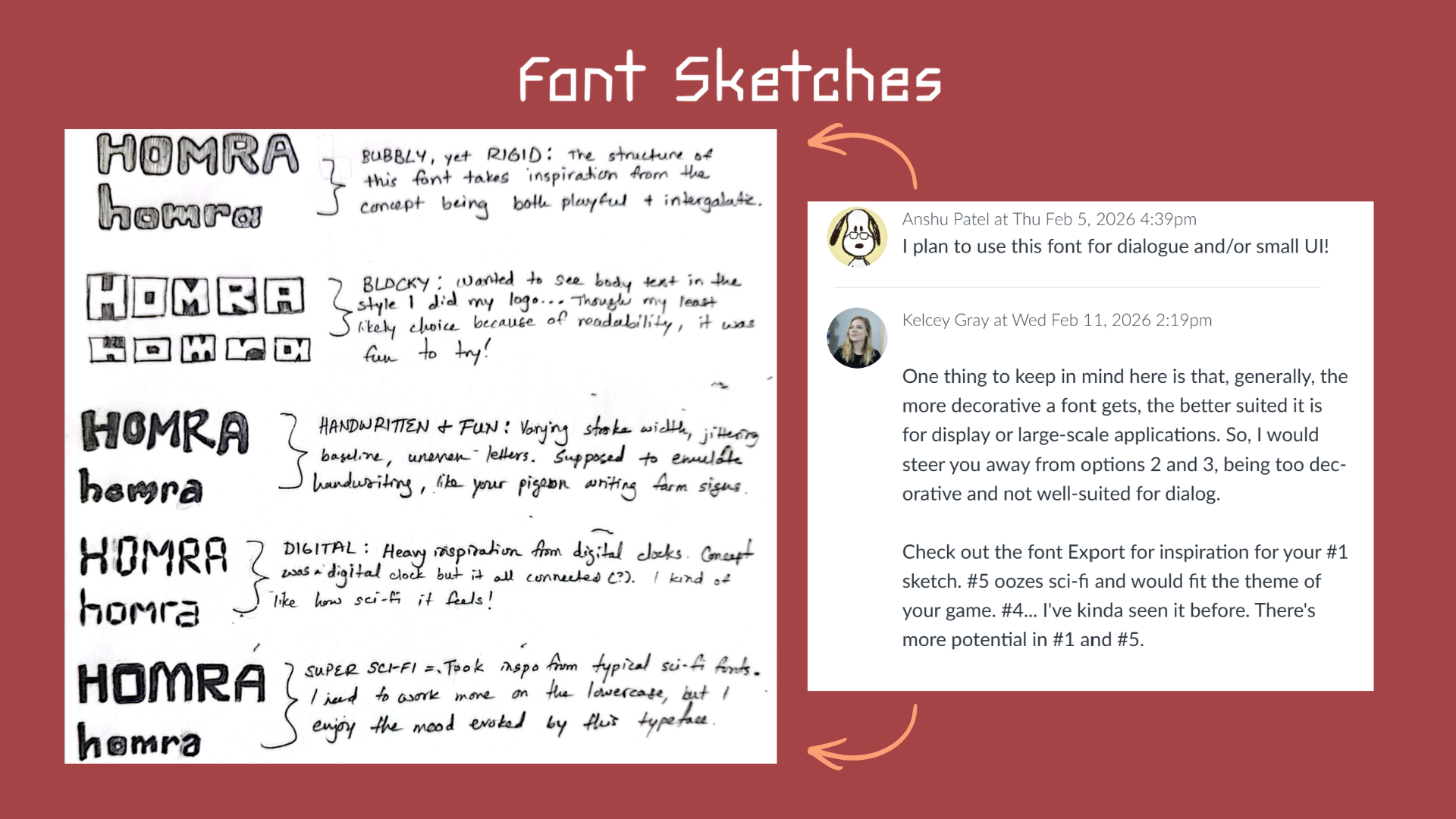
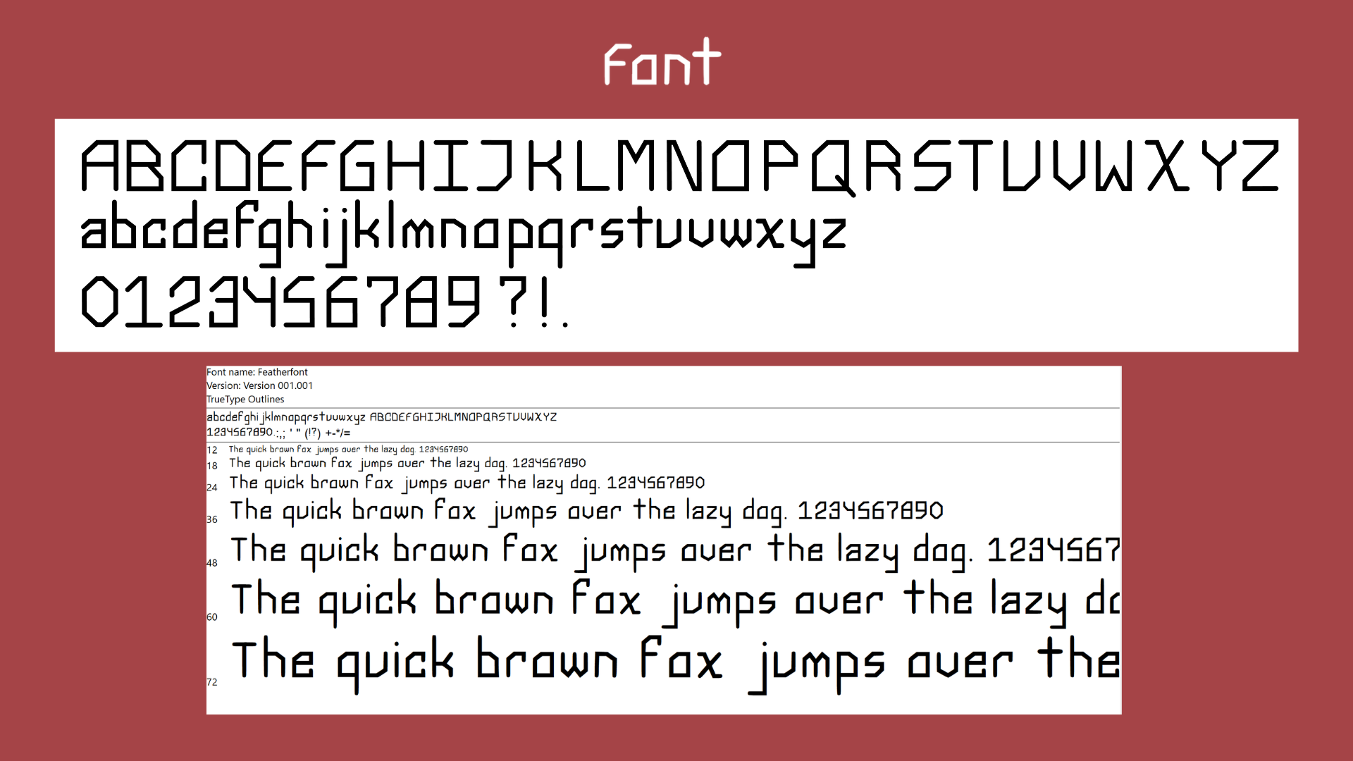
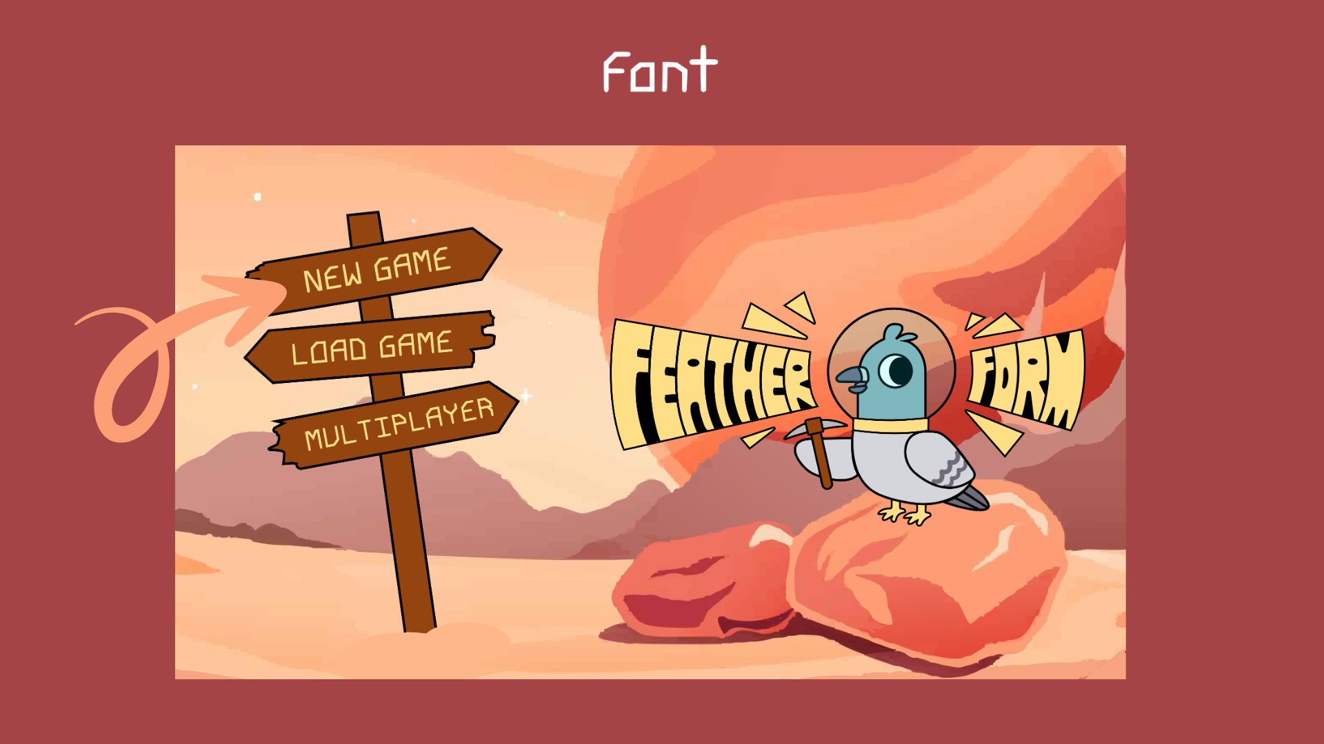

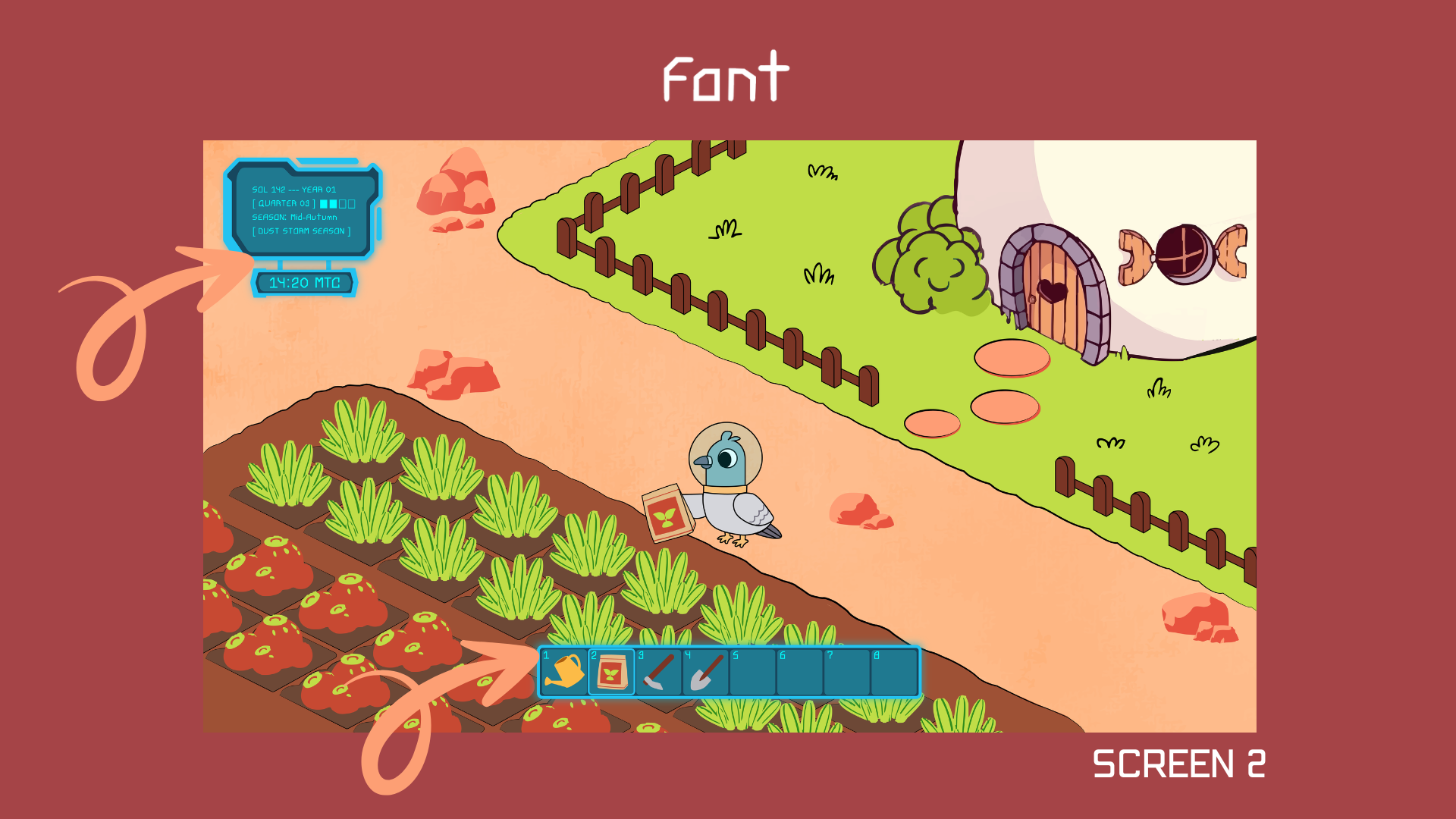

.jpeg)
.jpeg)
.jpeg)
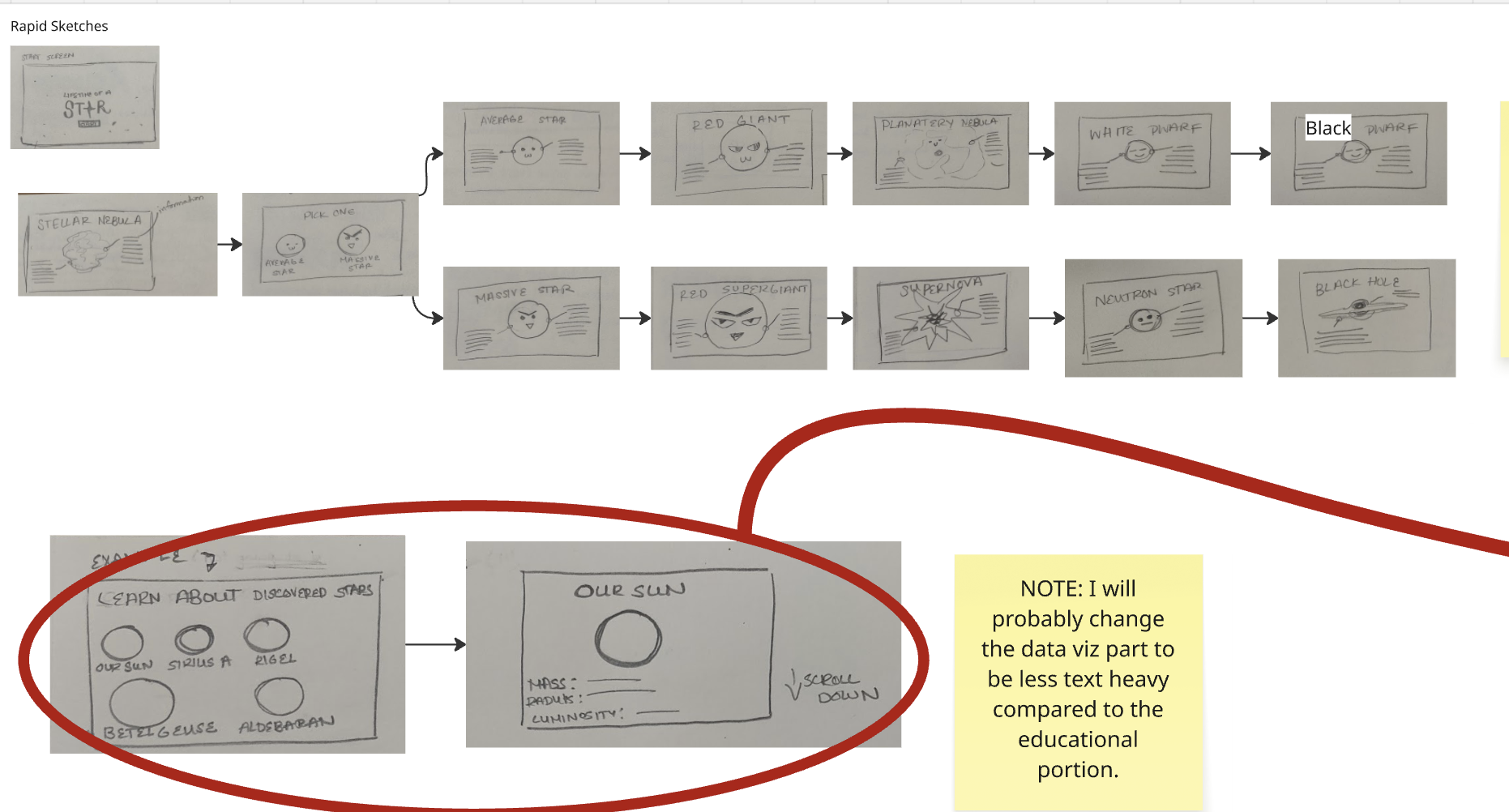
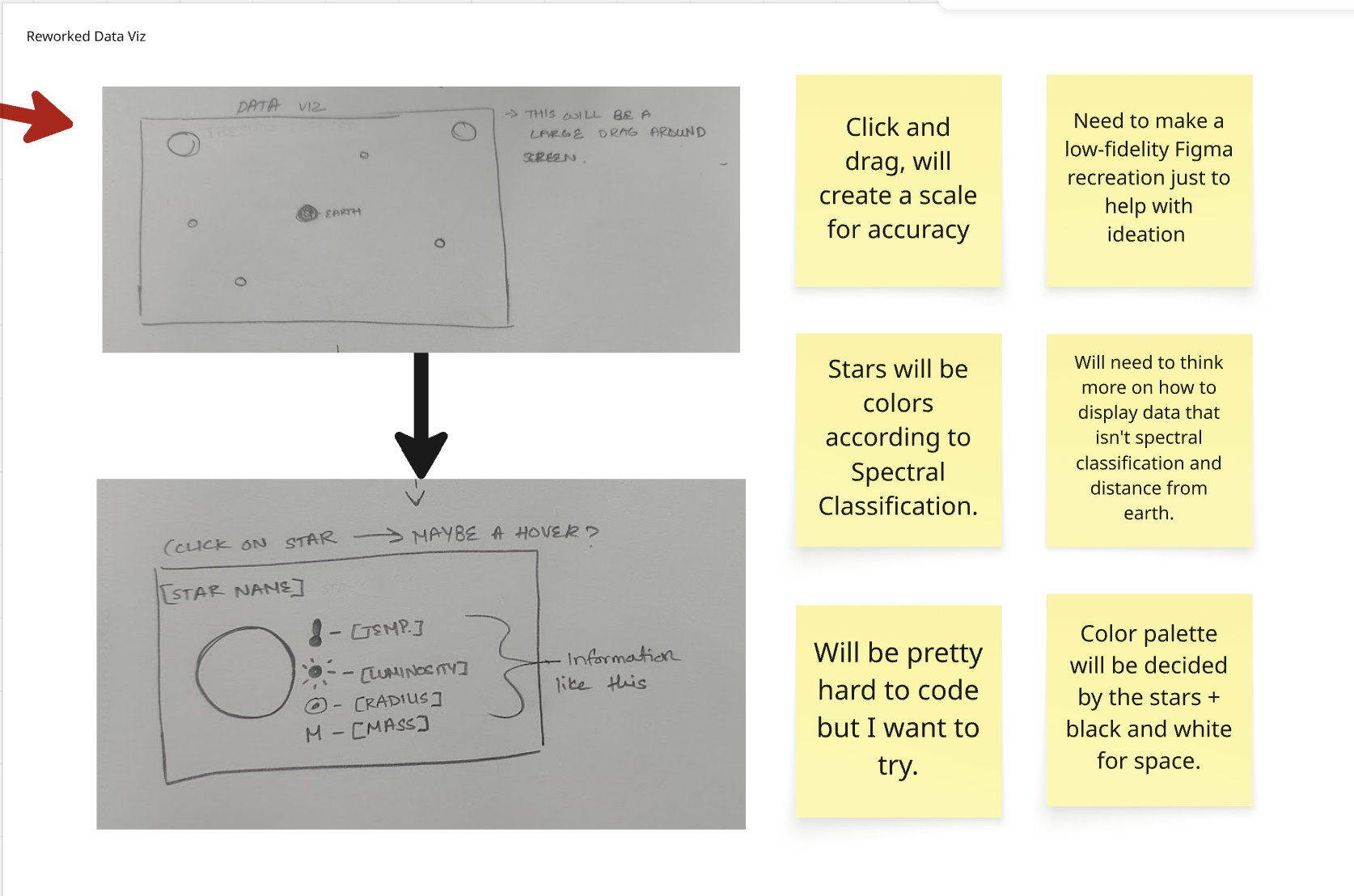
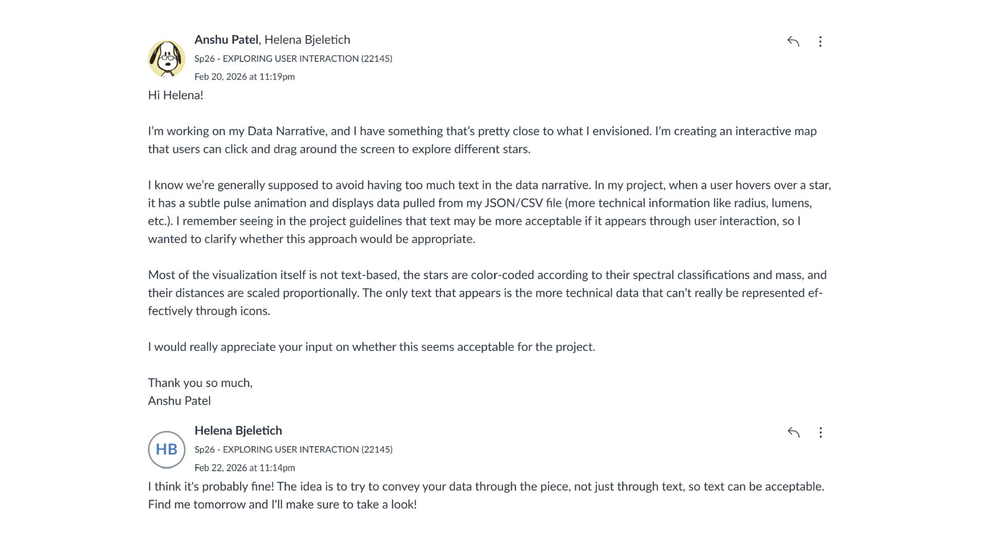
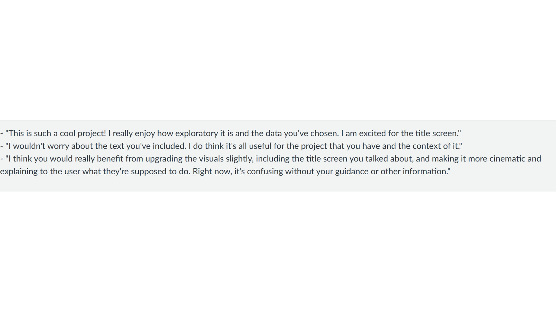
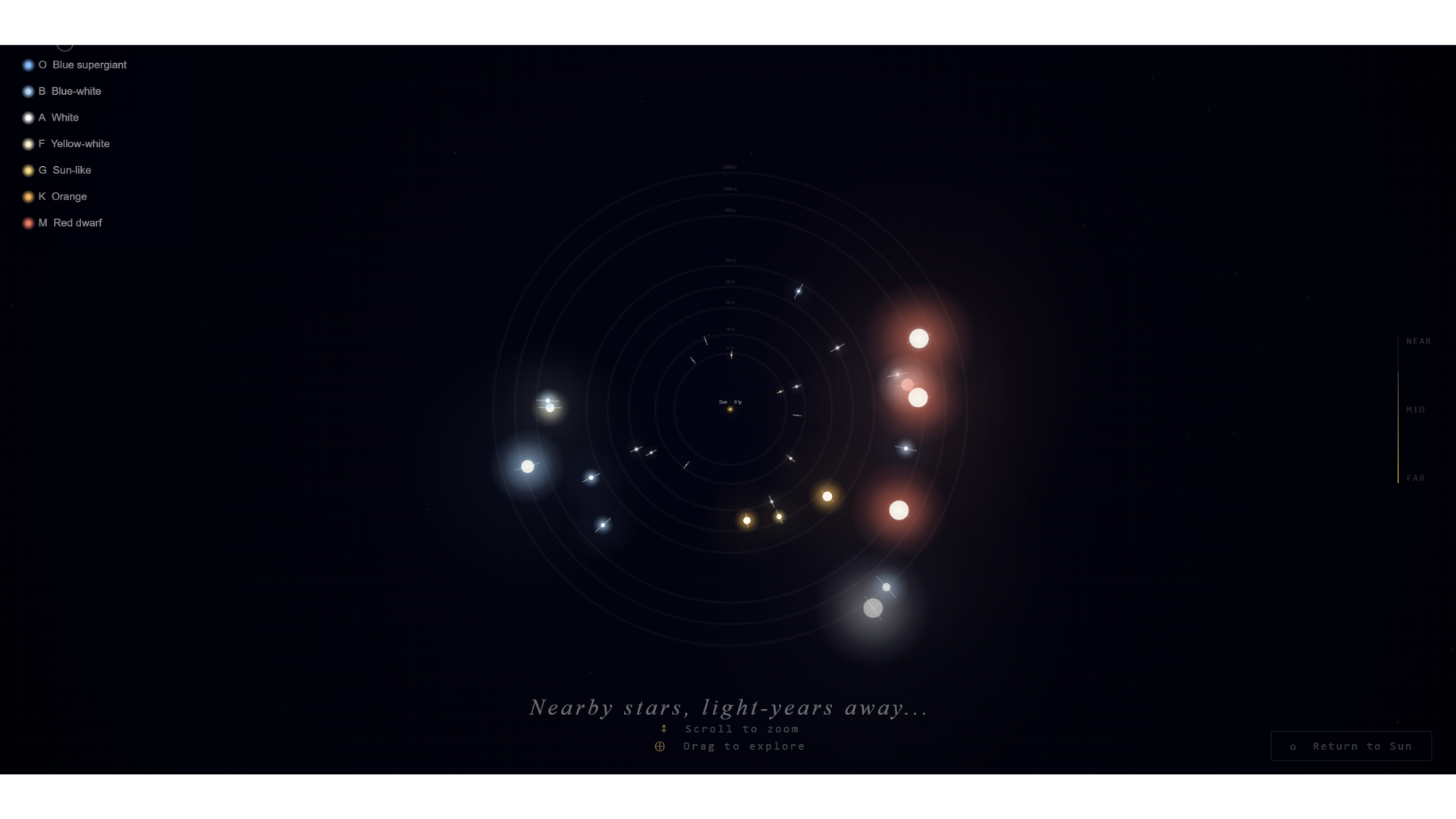
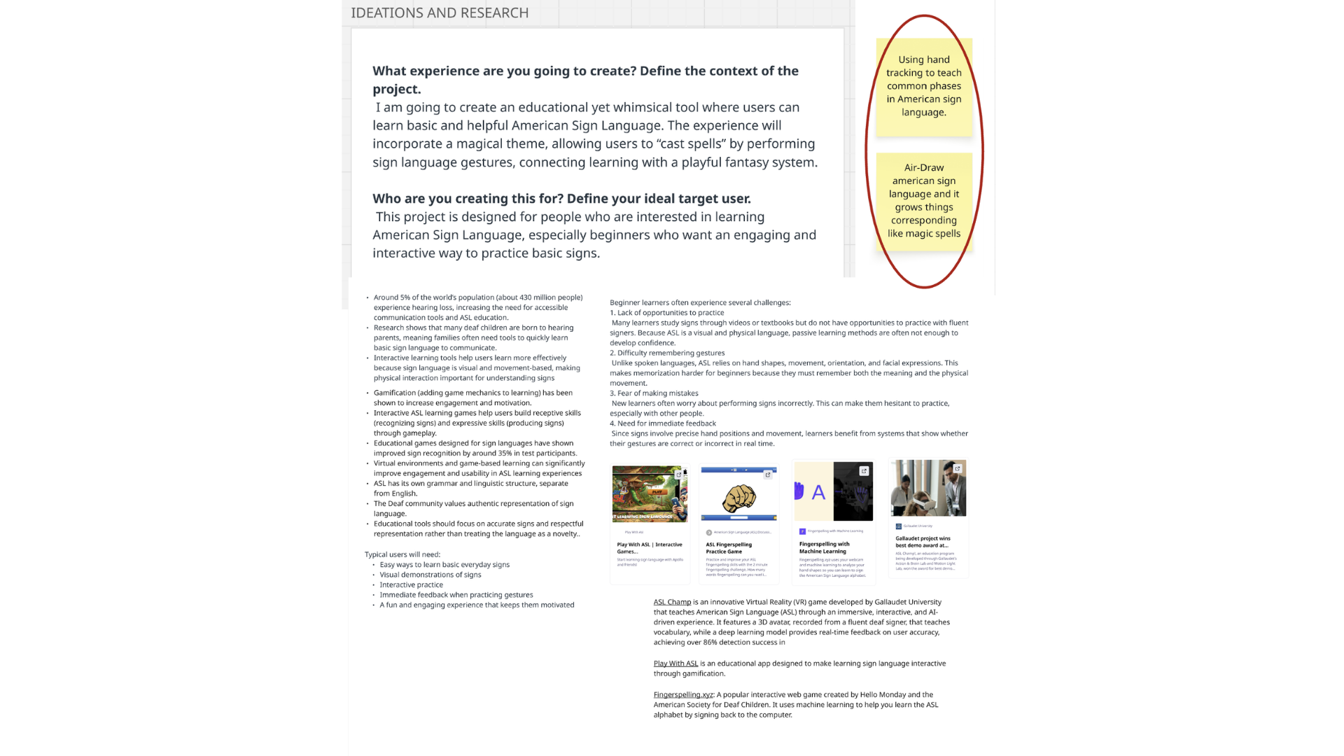
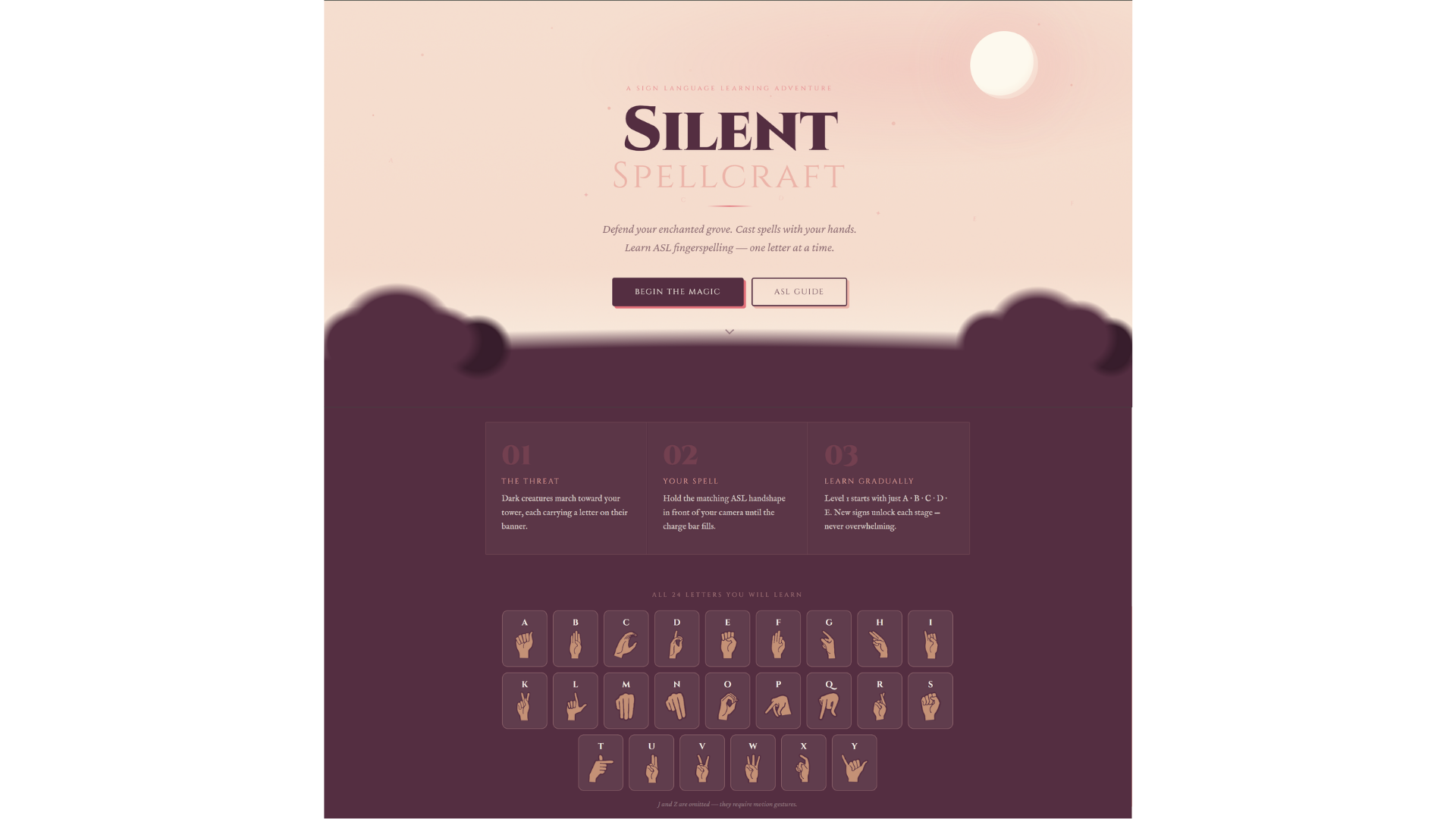
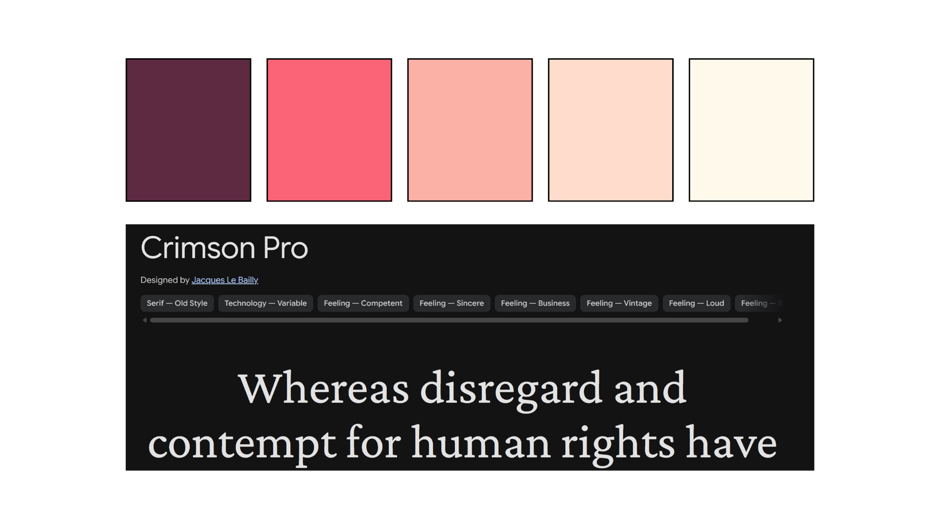
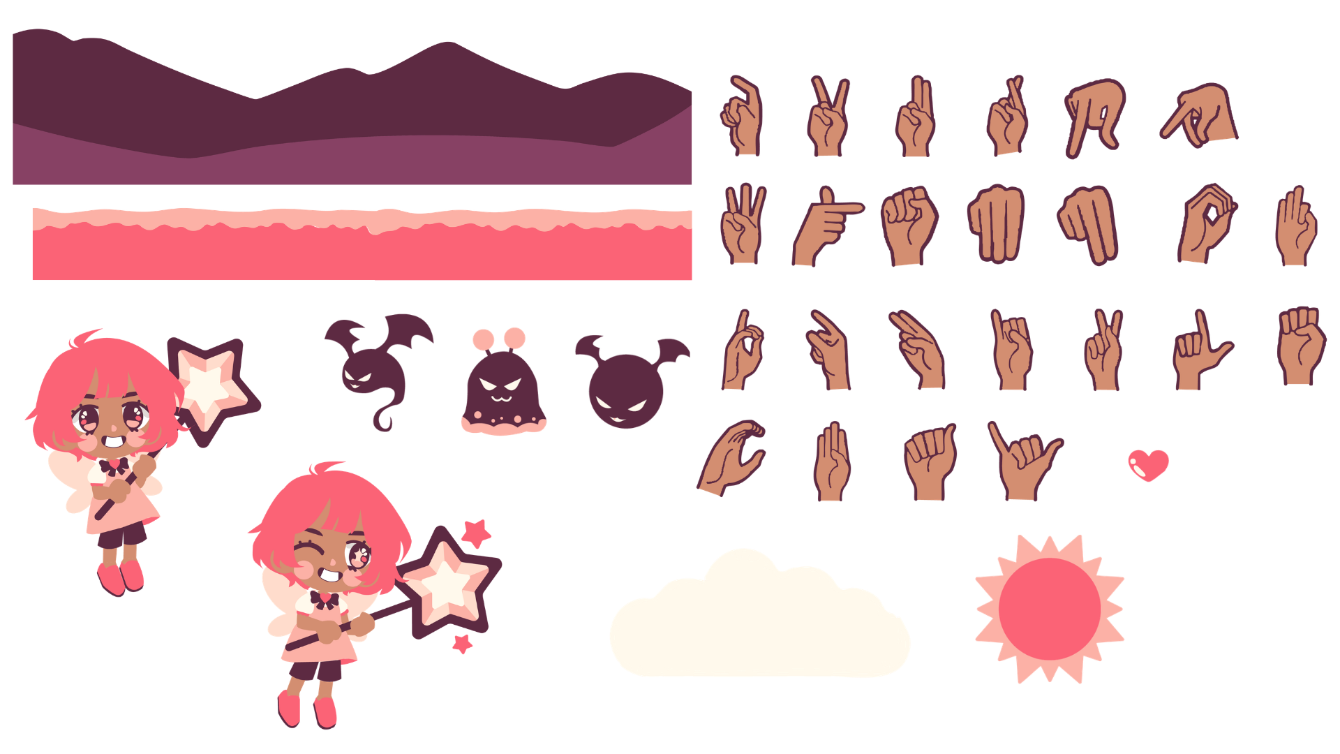
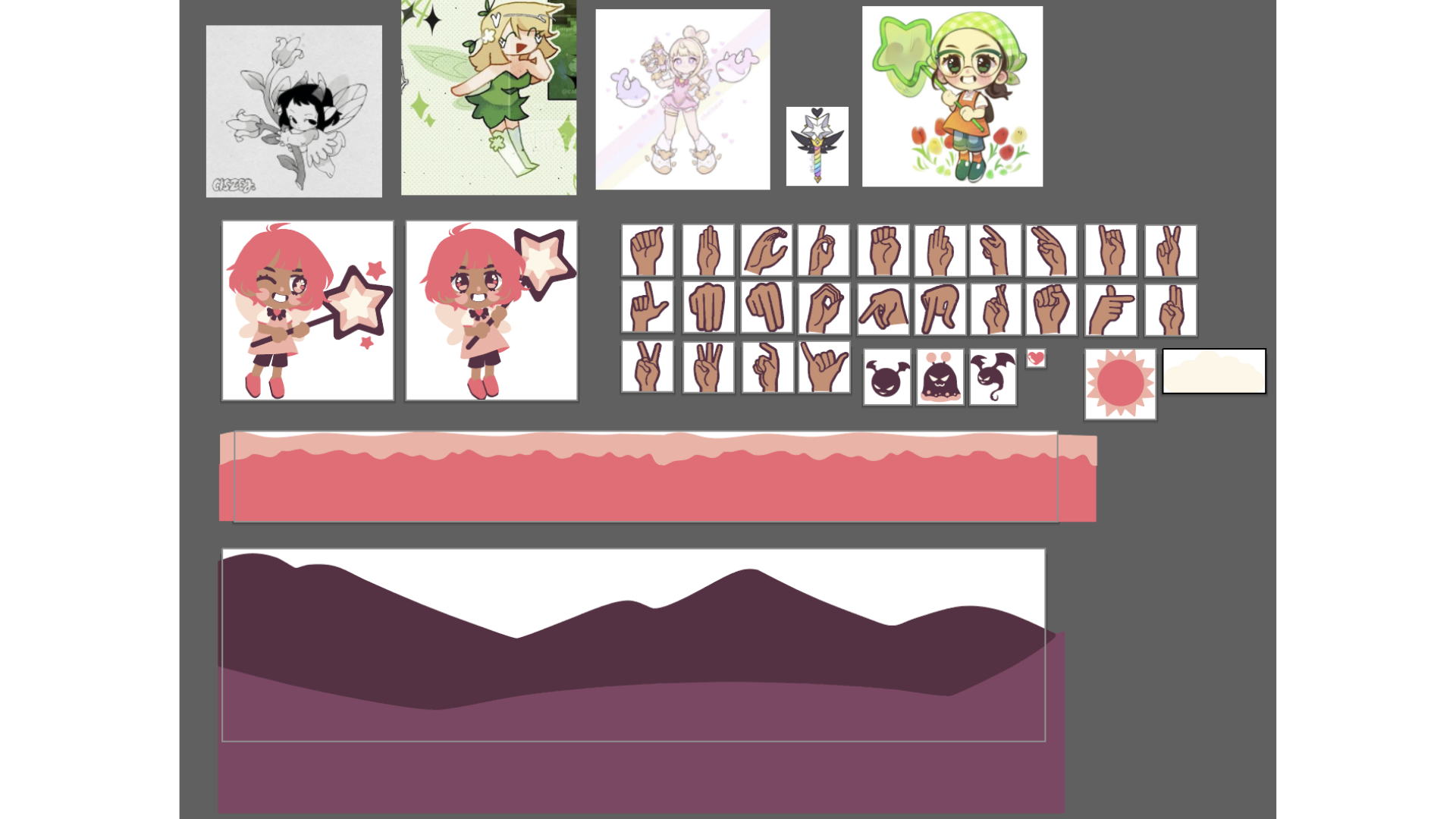
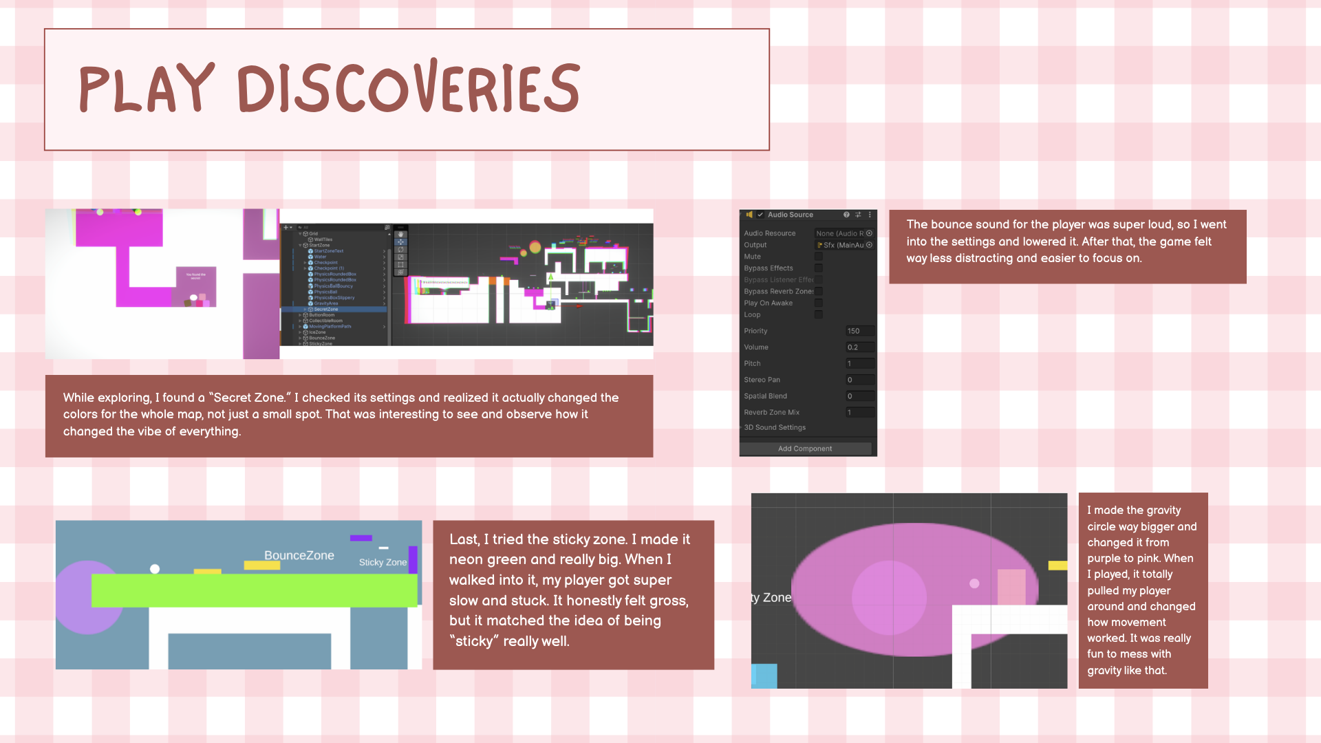
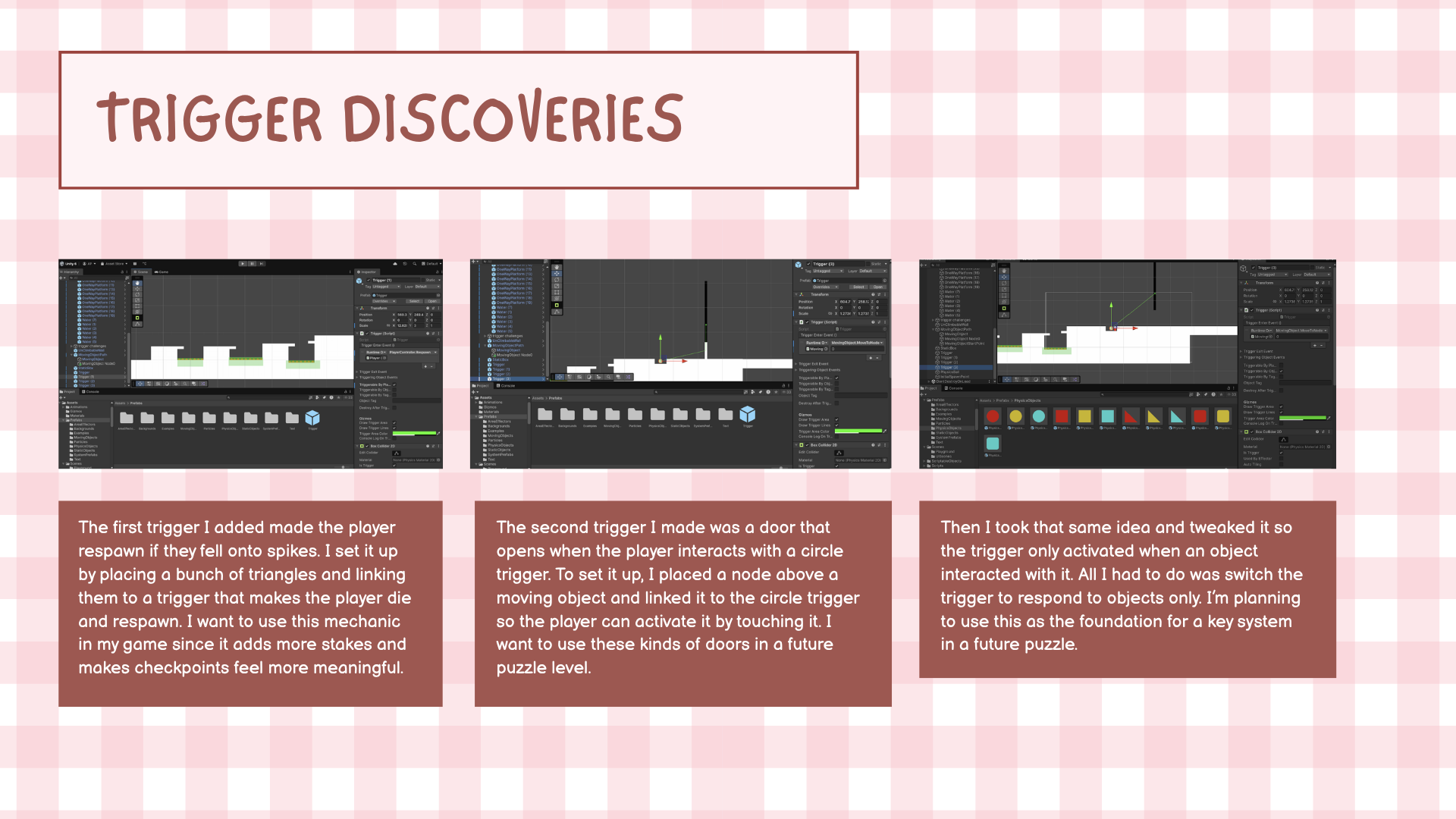
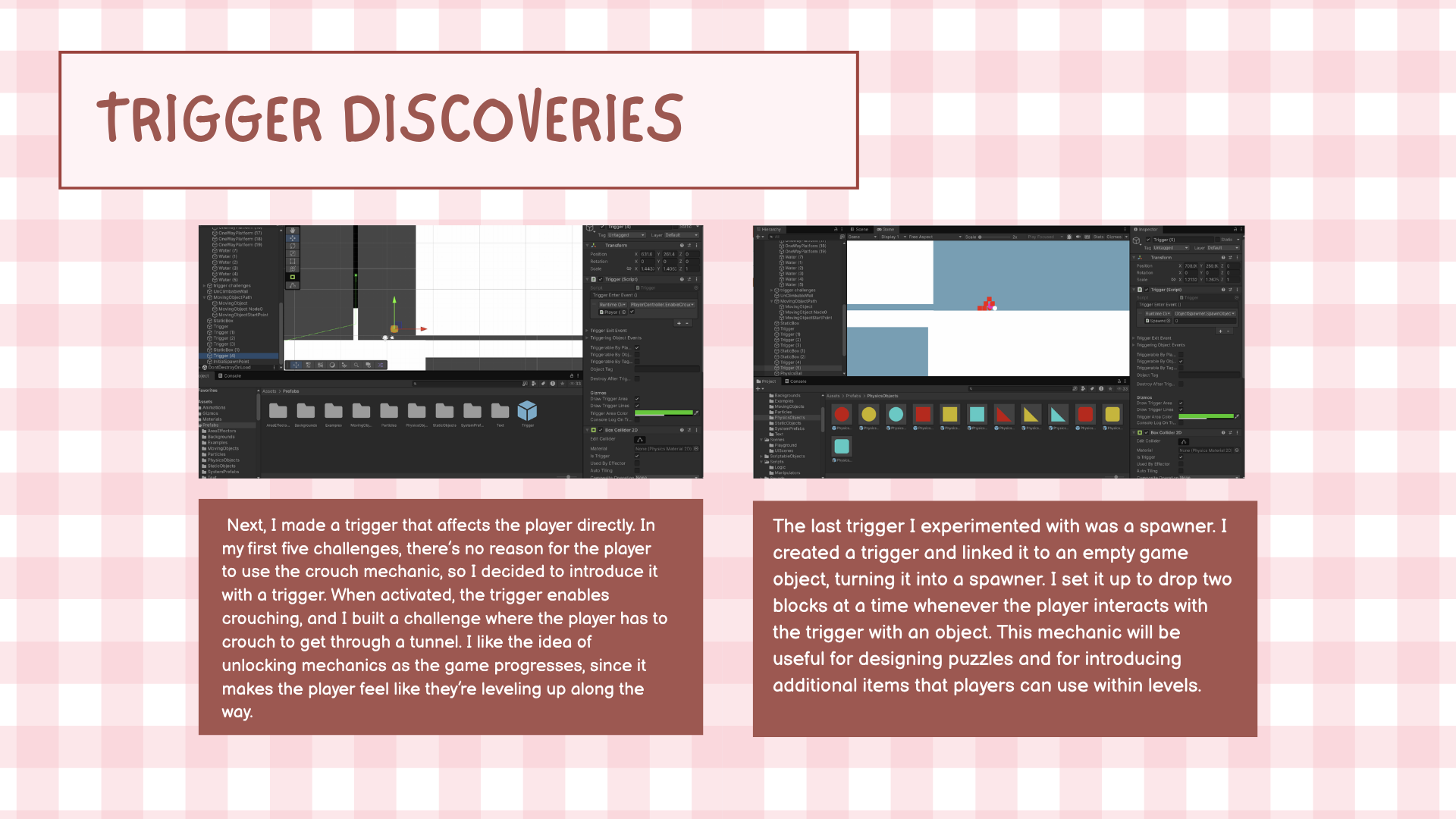
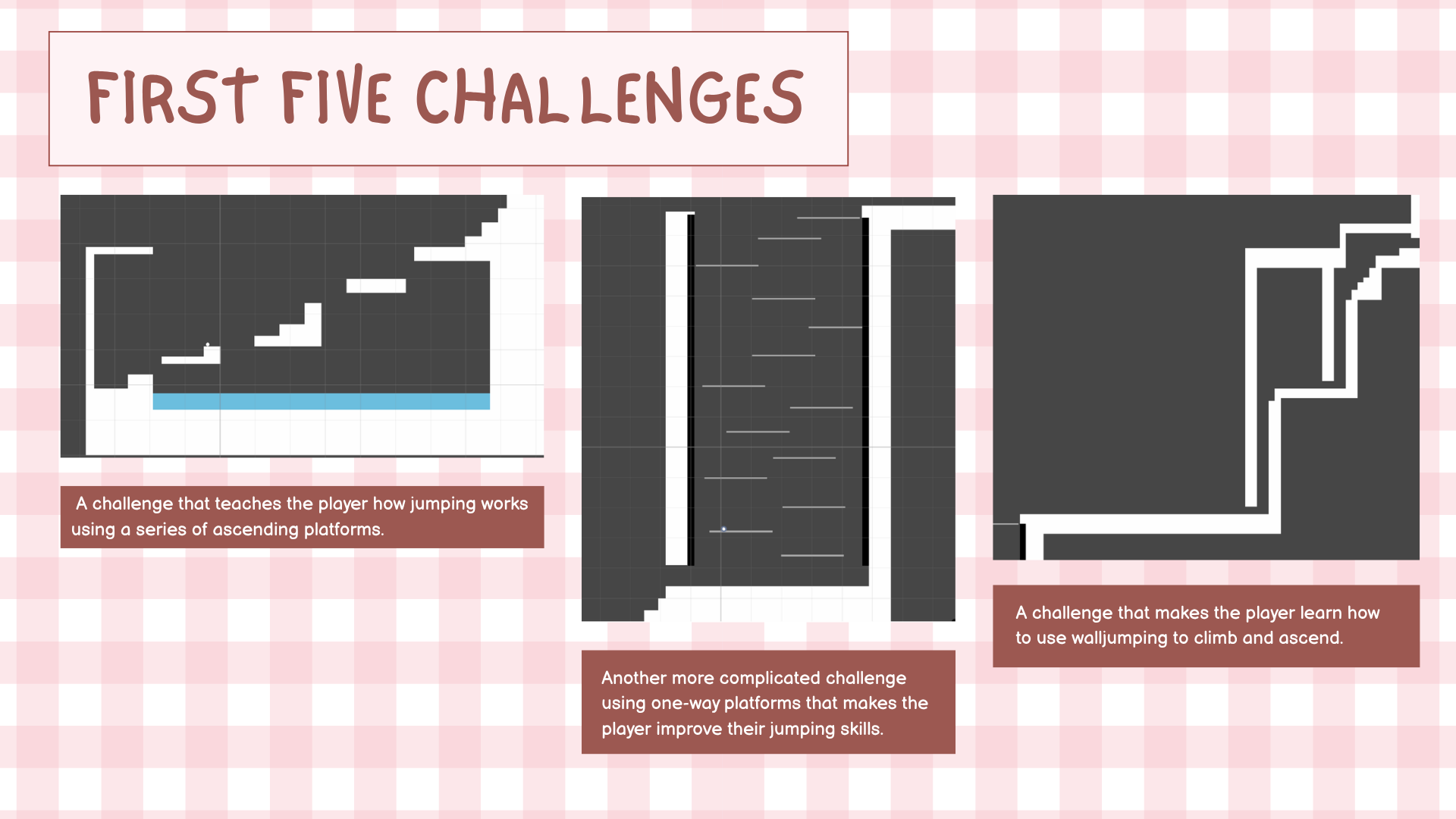
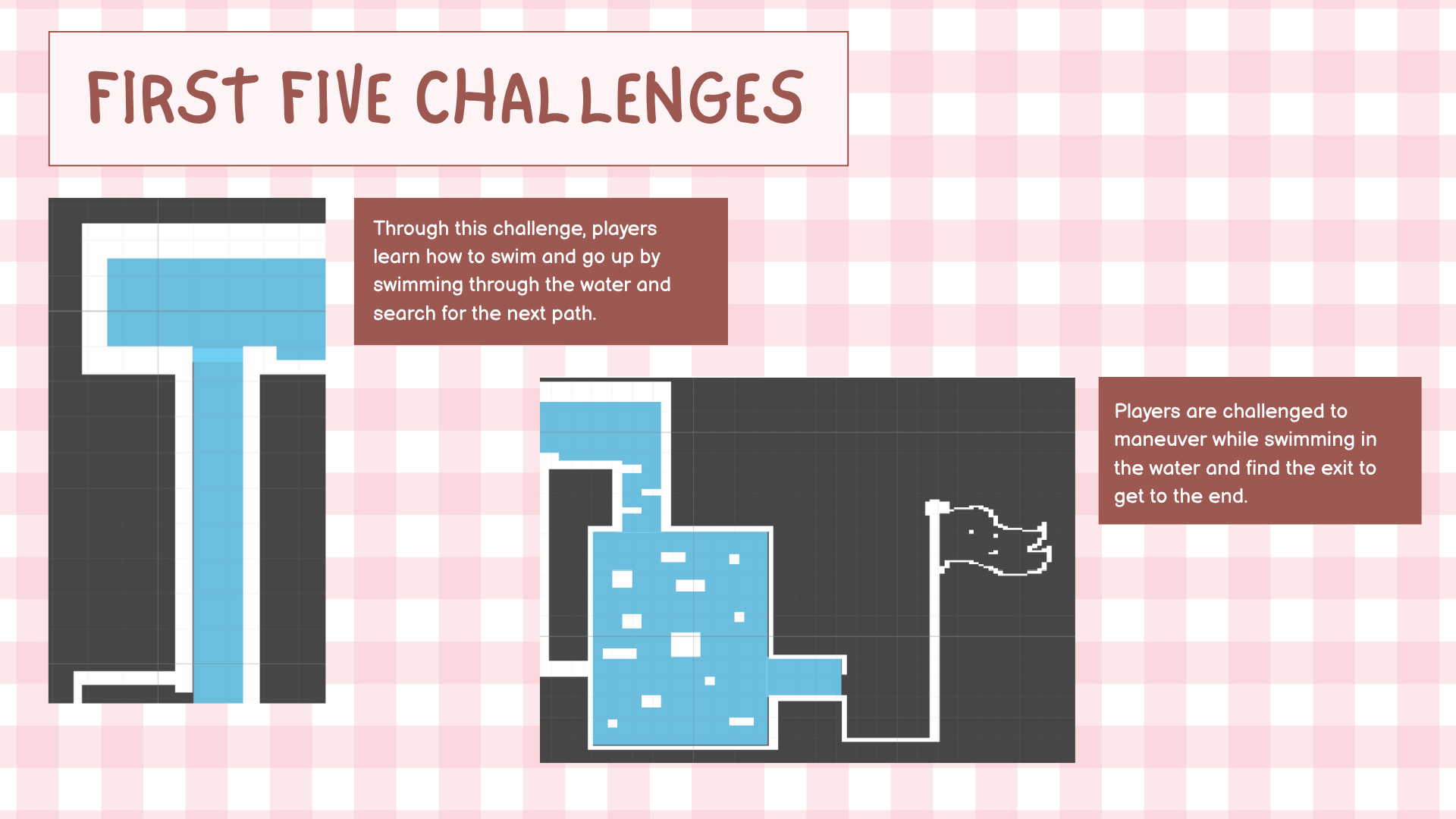
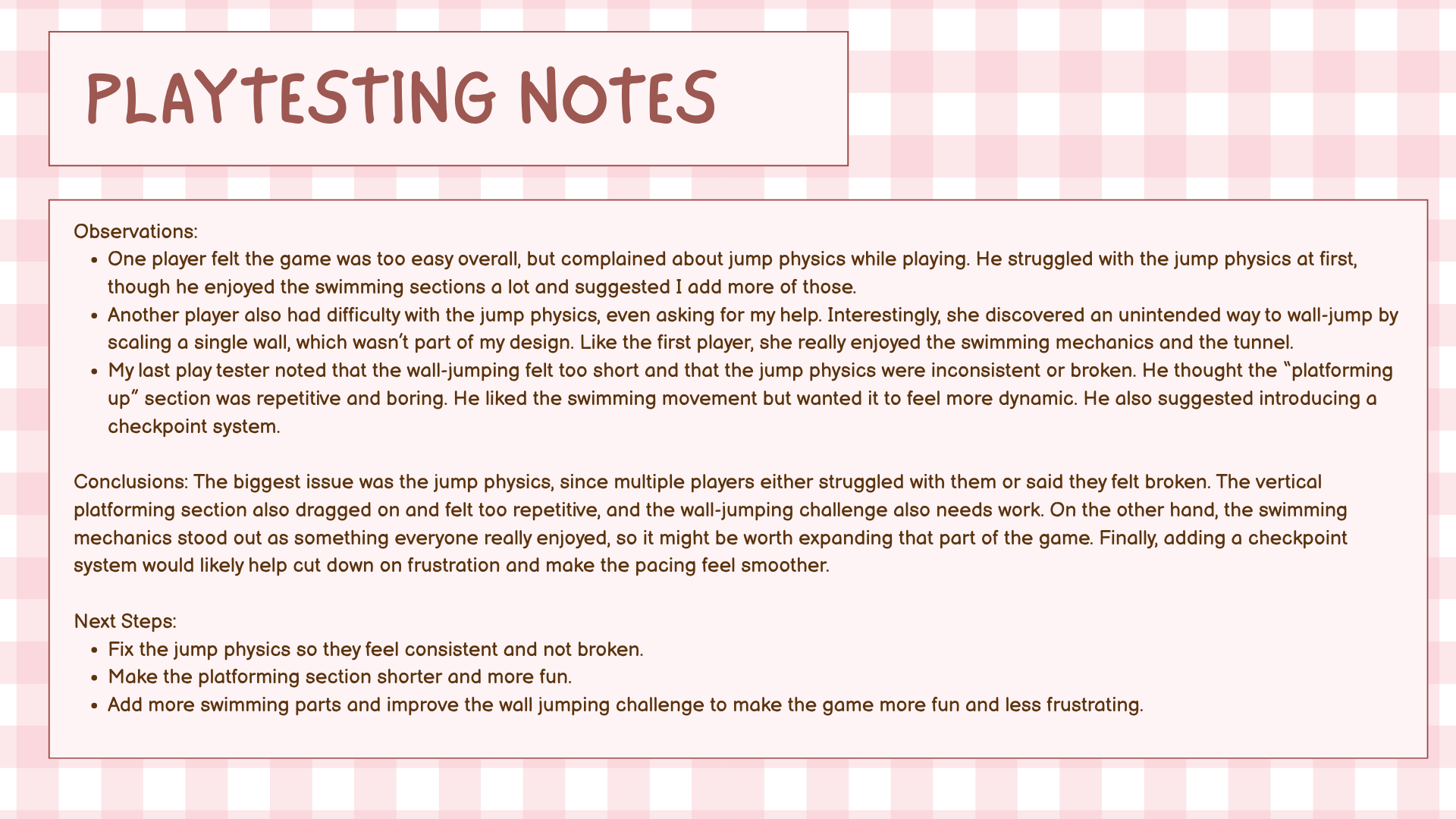
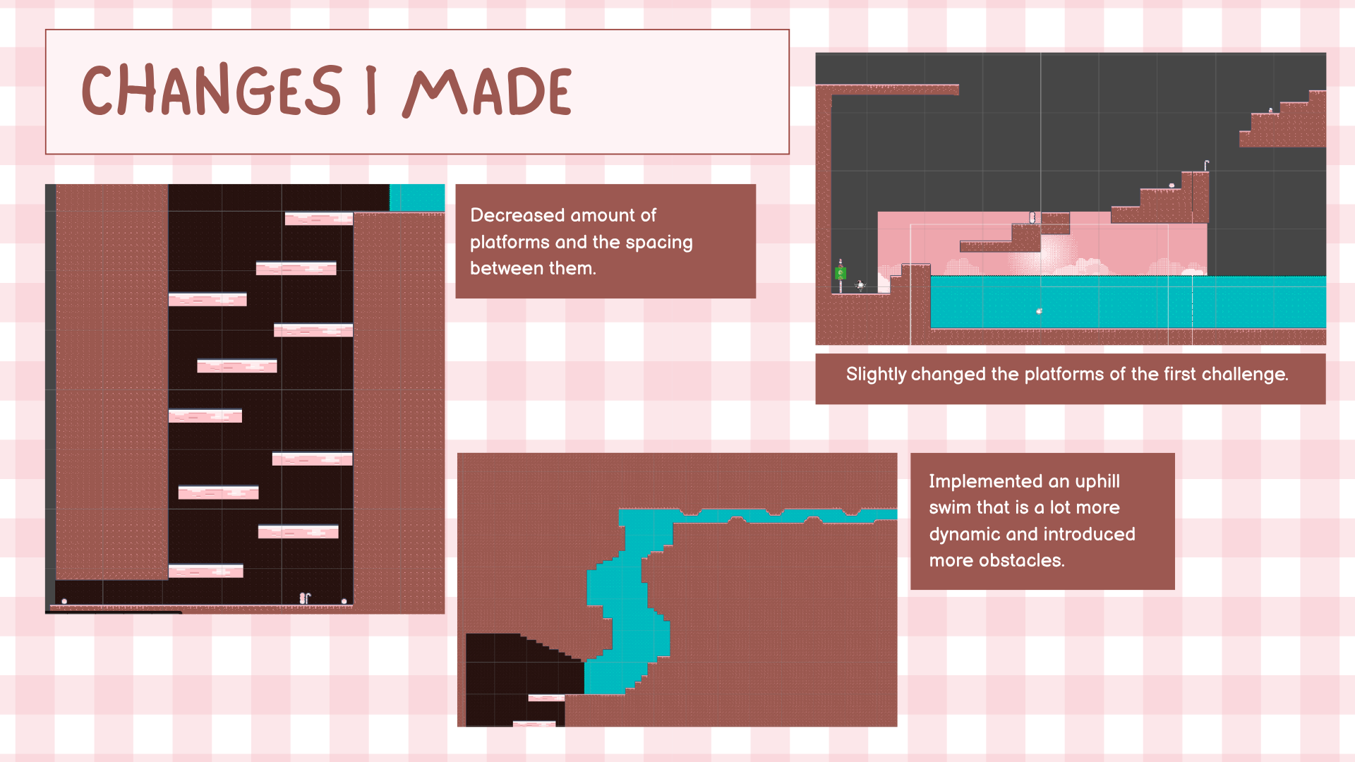
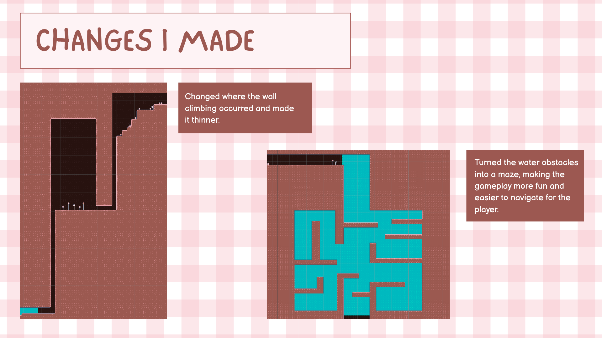
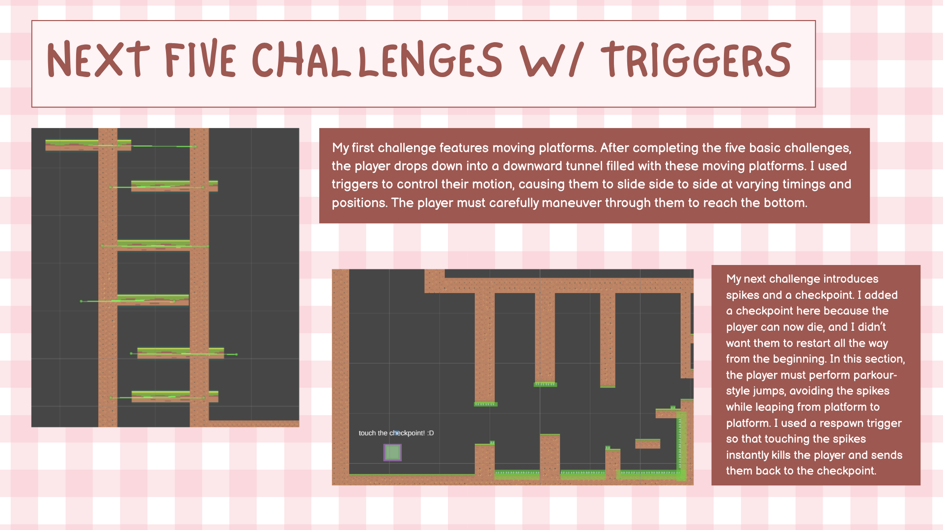
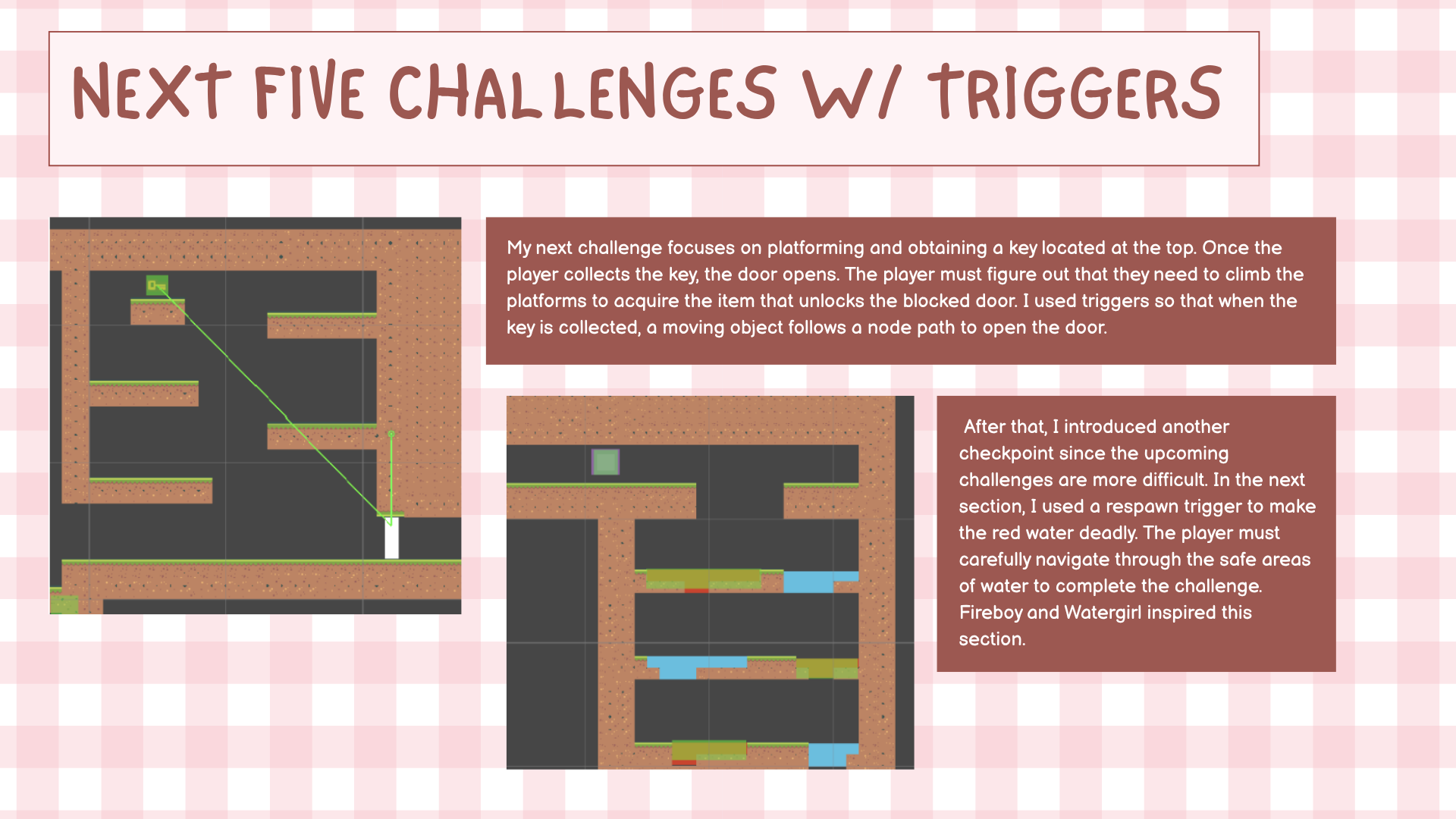
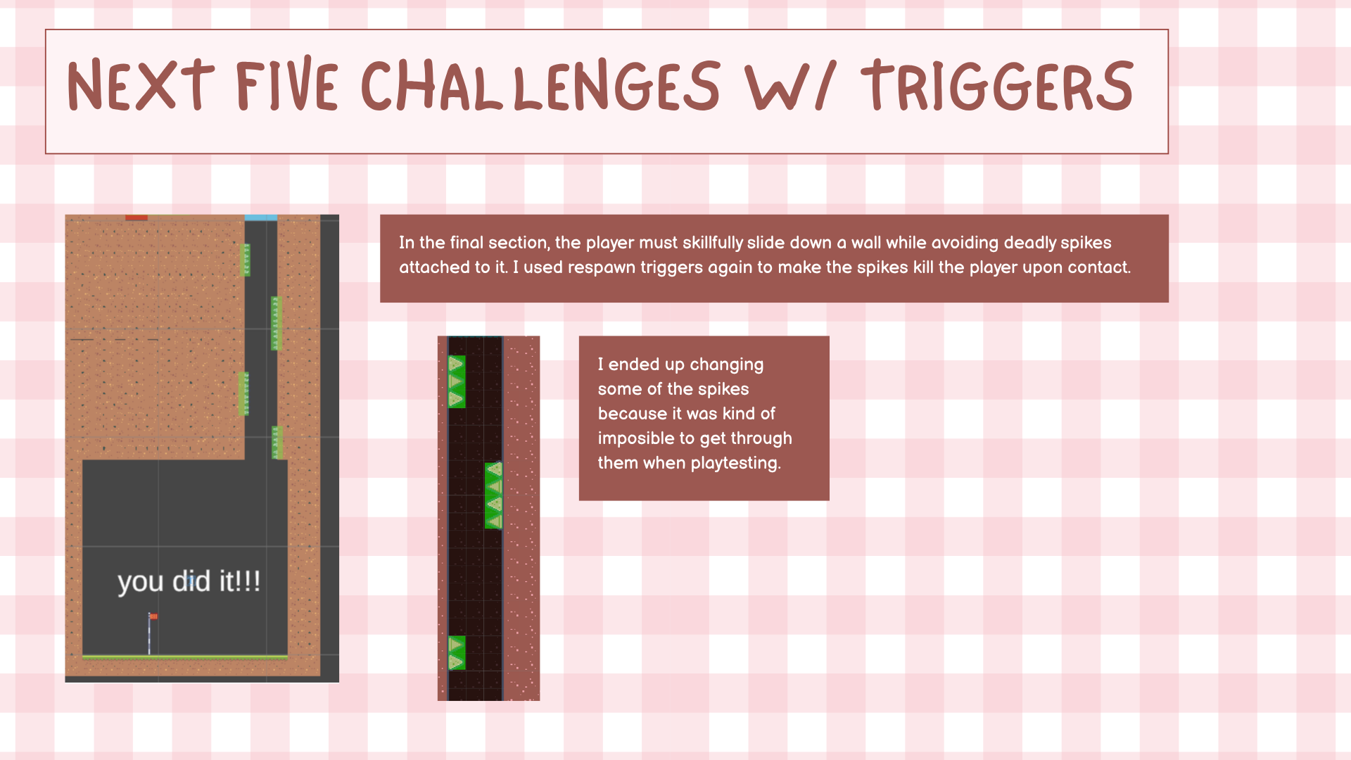
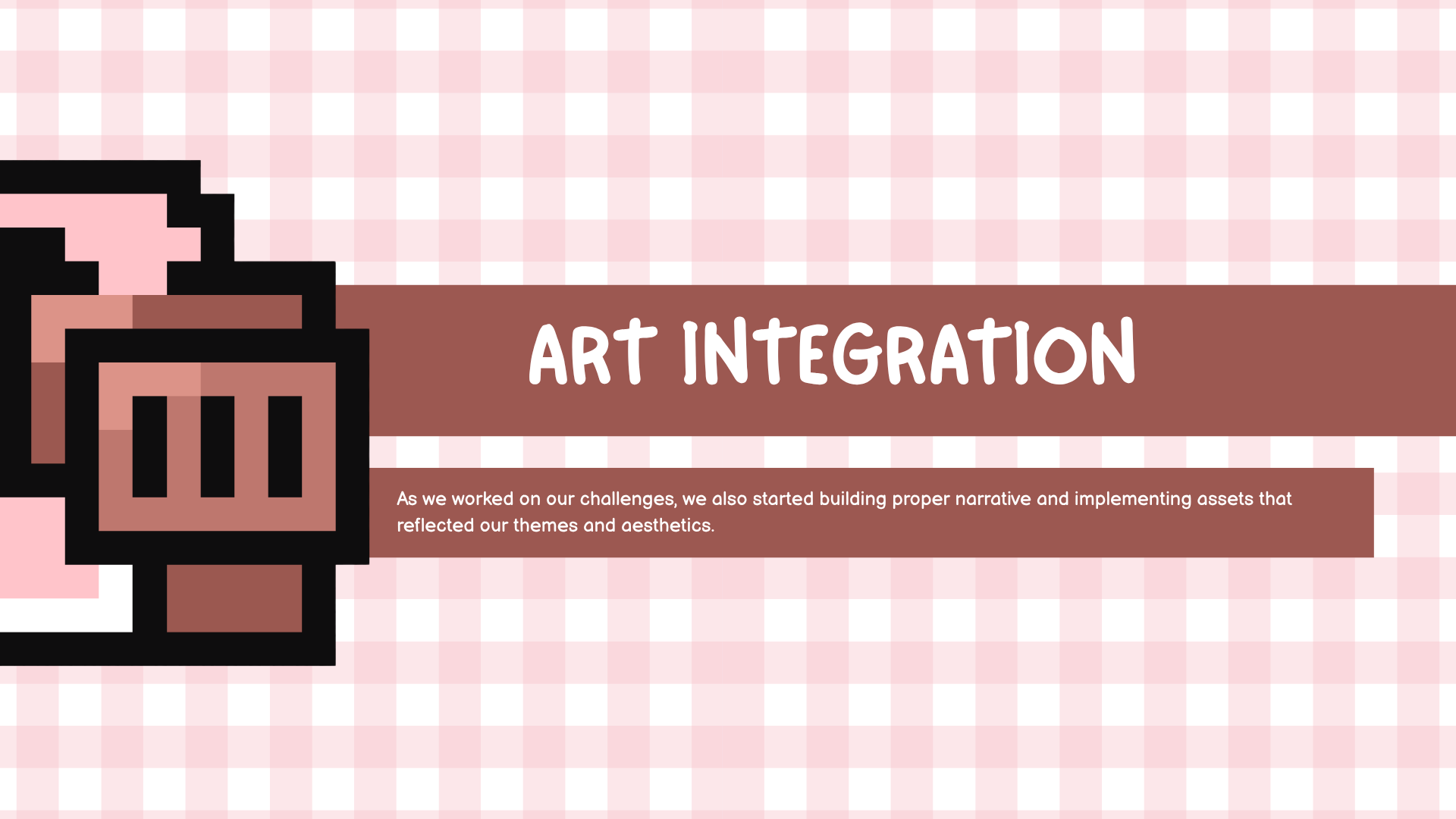
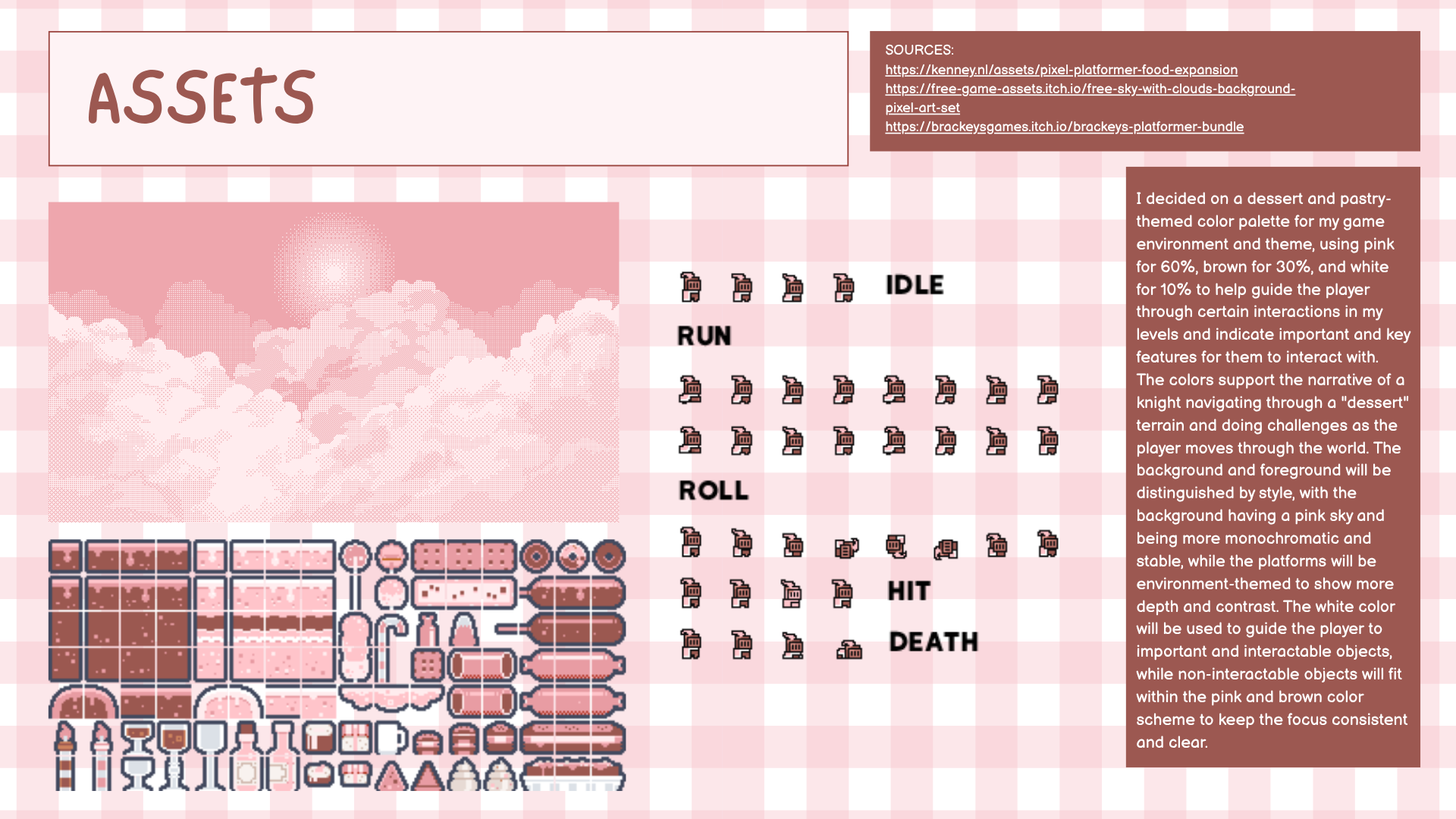
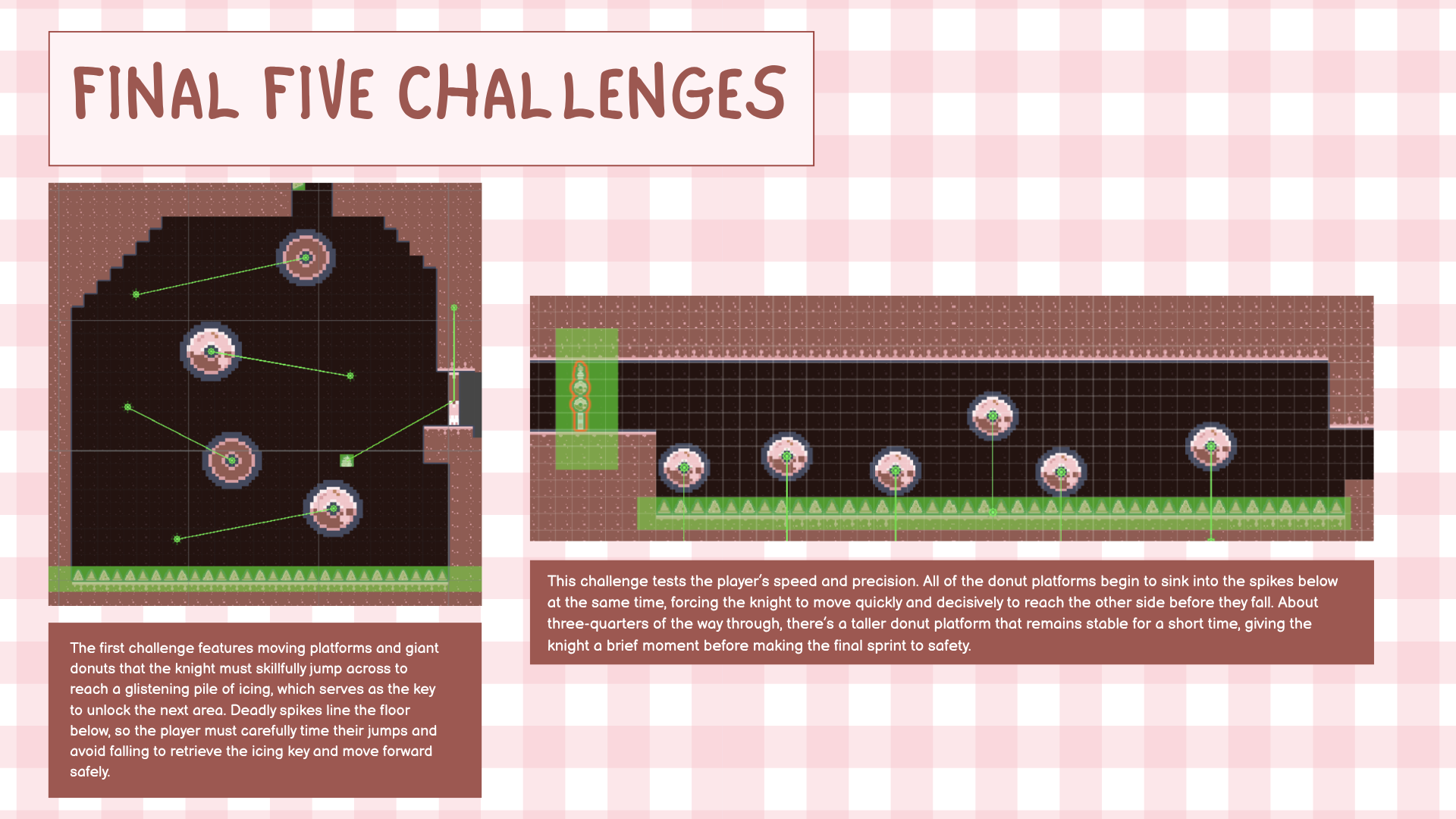
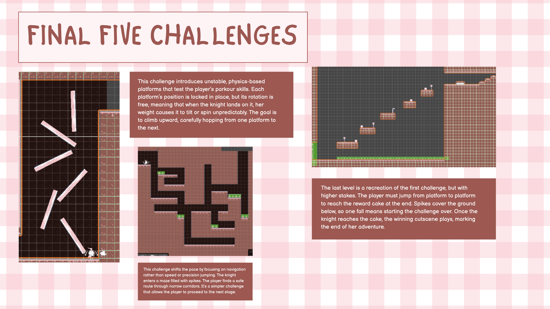
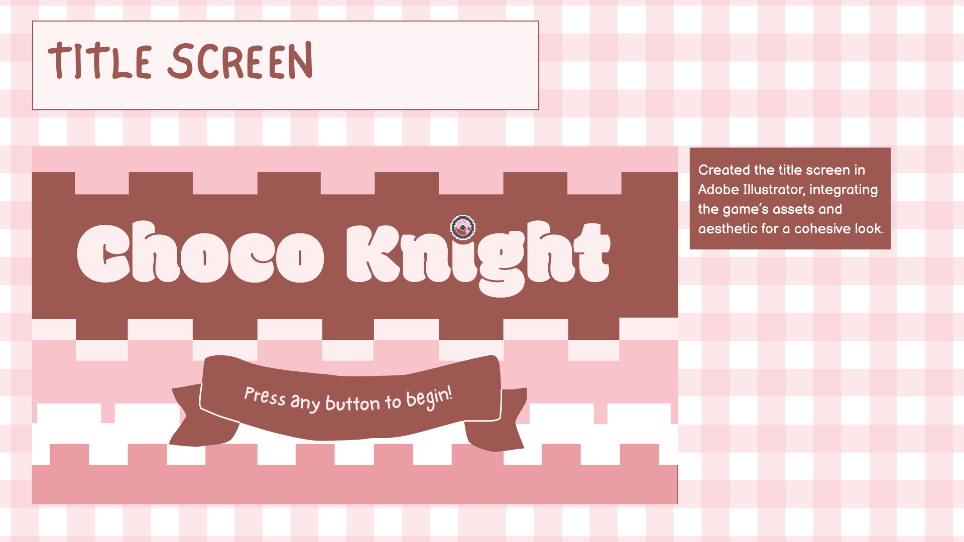
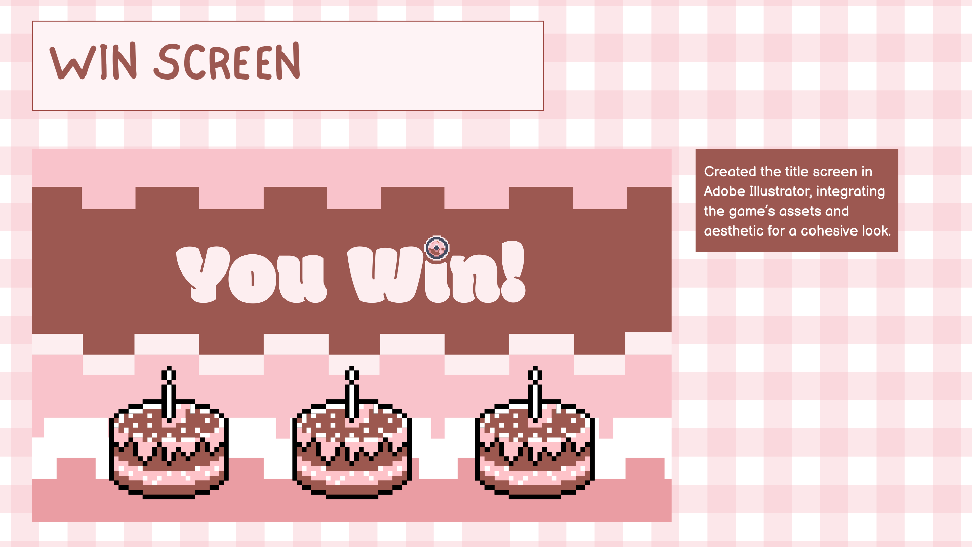
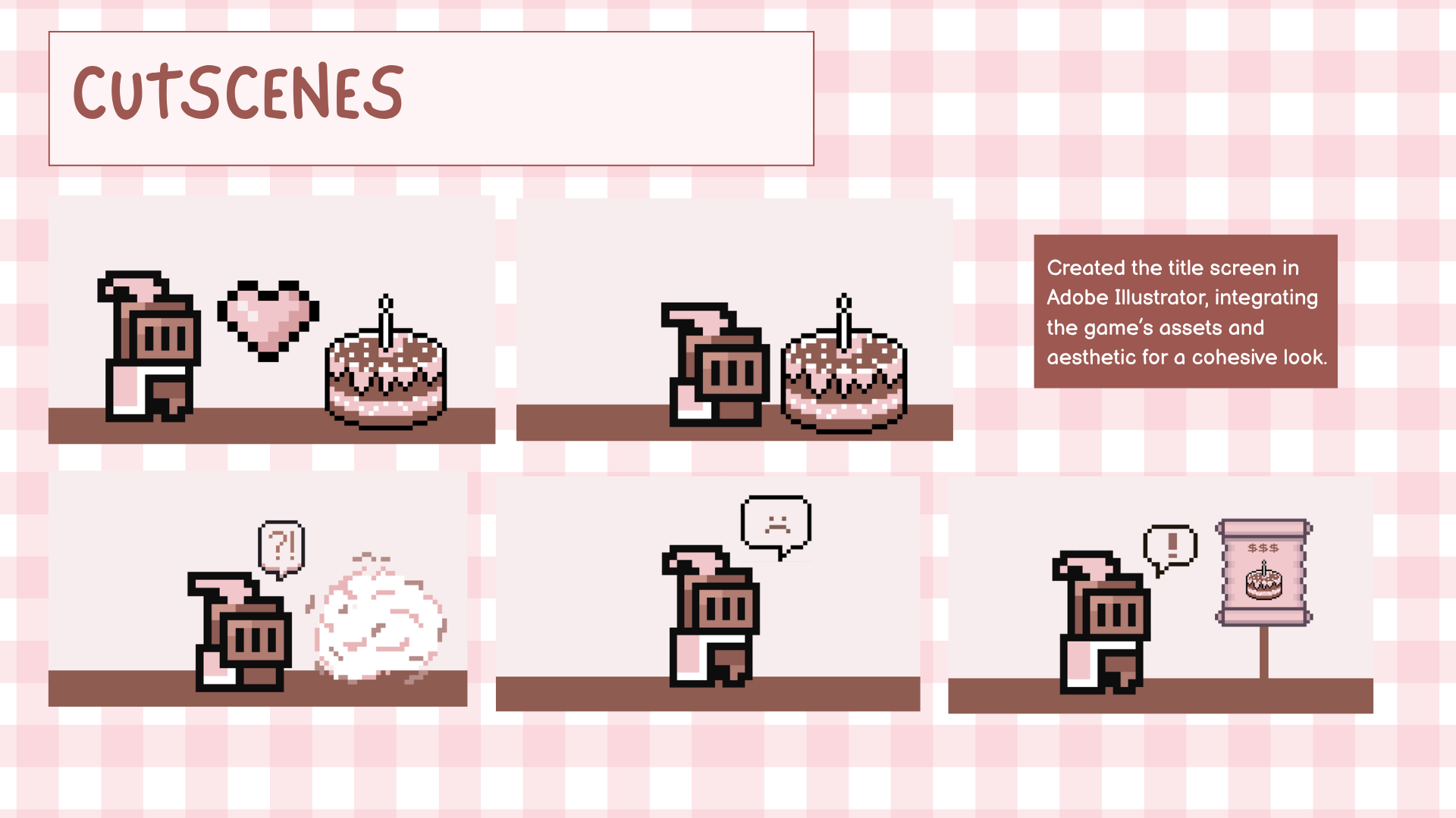
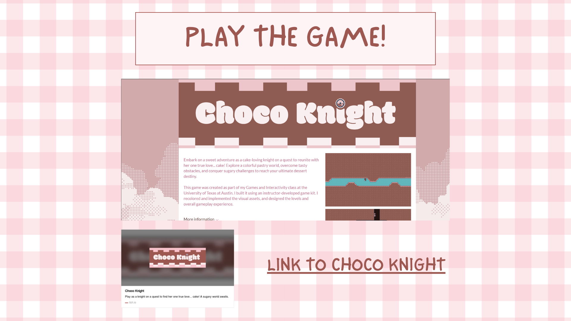
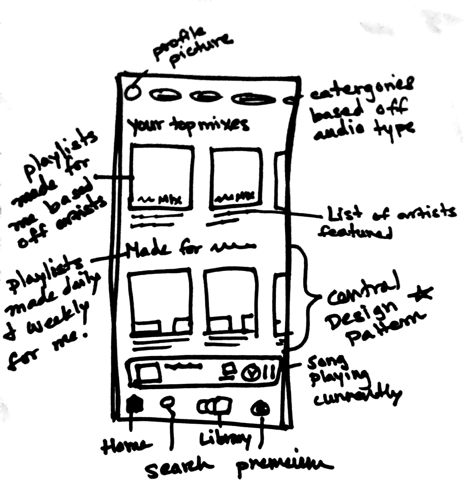
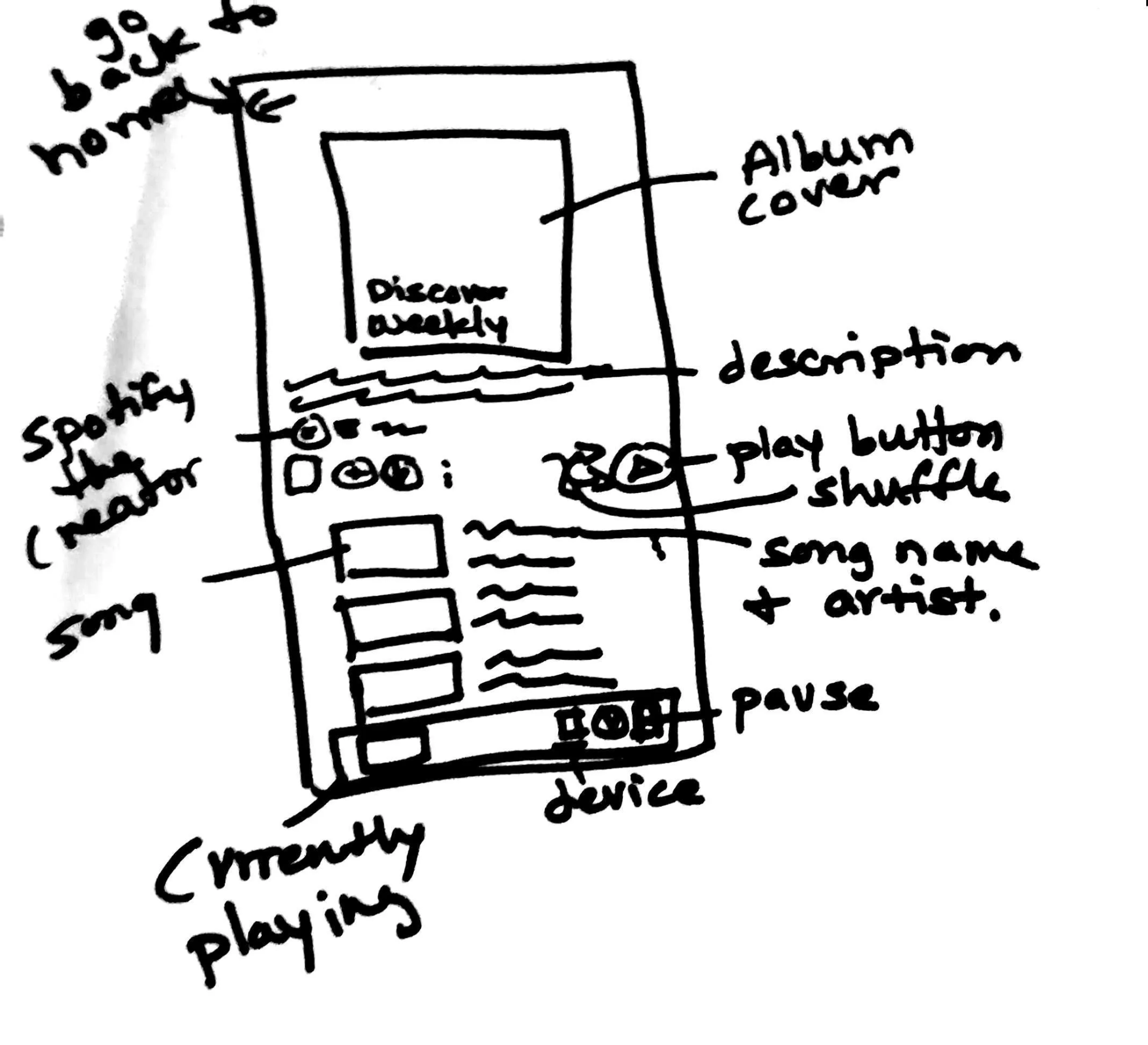
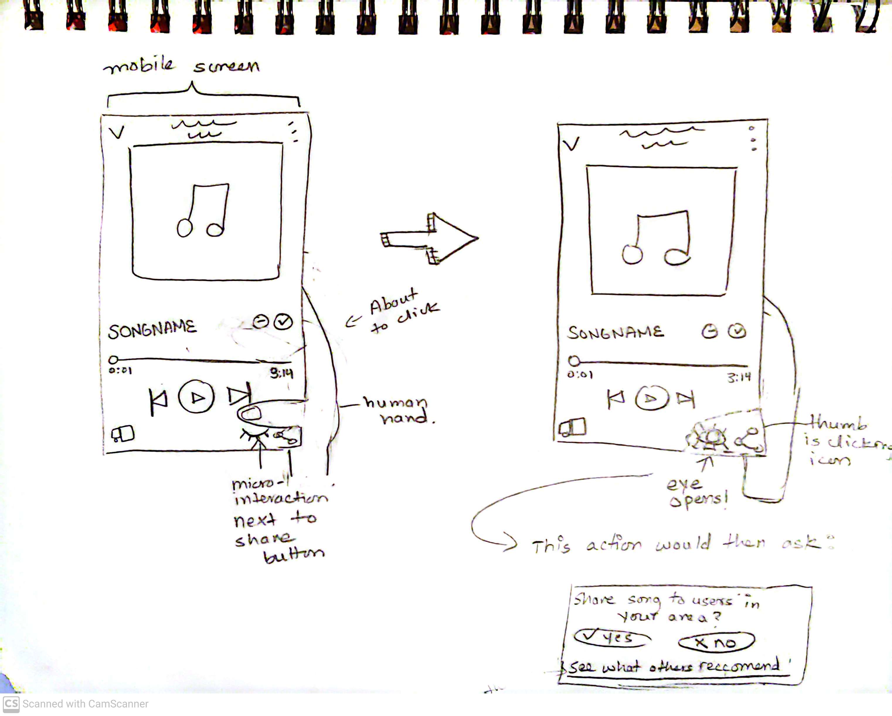
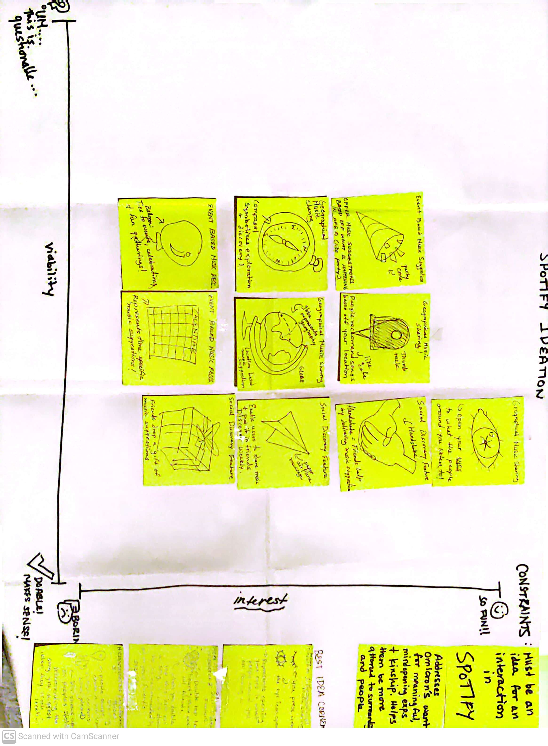
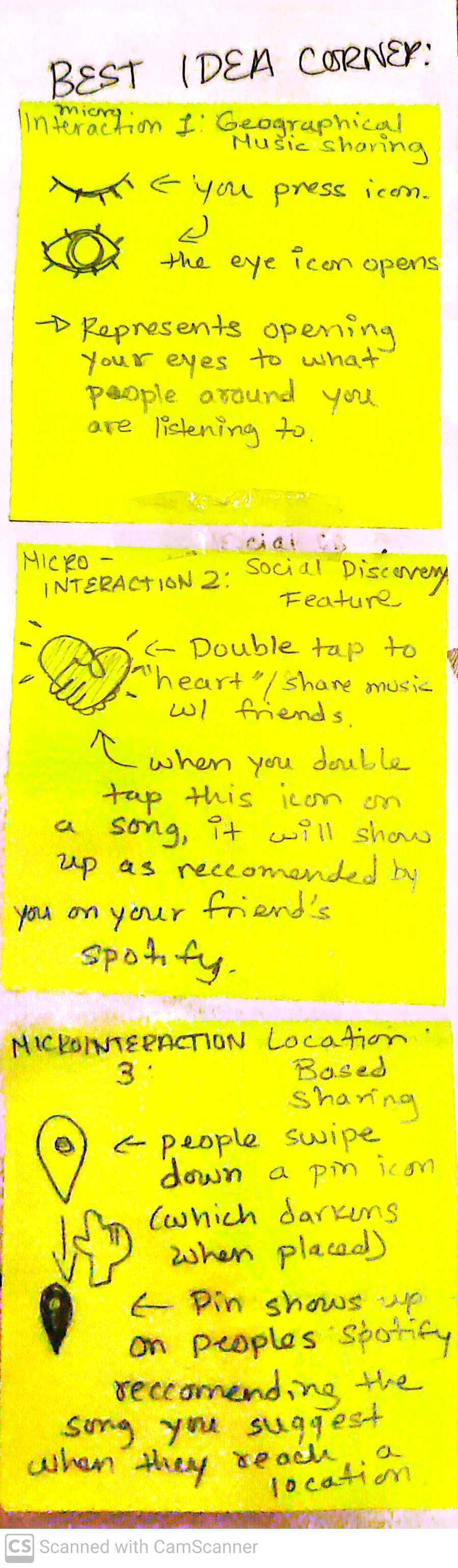
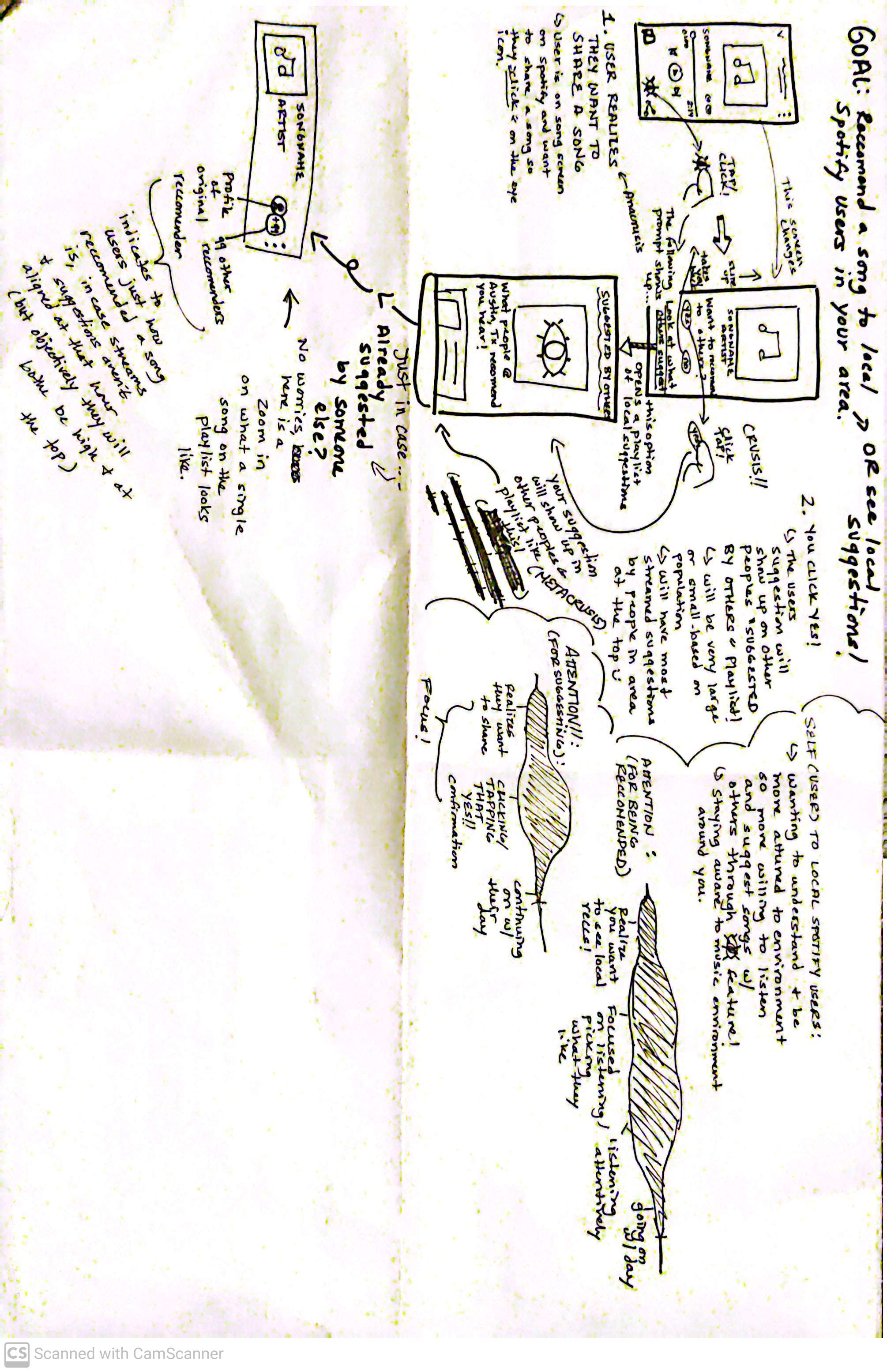
.jpg)
.jpg)
.jpg)
.jpg)
.jpg)
.jpg)
.jpg)
.jpg)
.jpg)
.jpg)
.png)
.png)
.png)
.png)
.png)
.png)
.png)
.png)
.png)
.png)
.png)
.png)

.png)
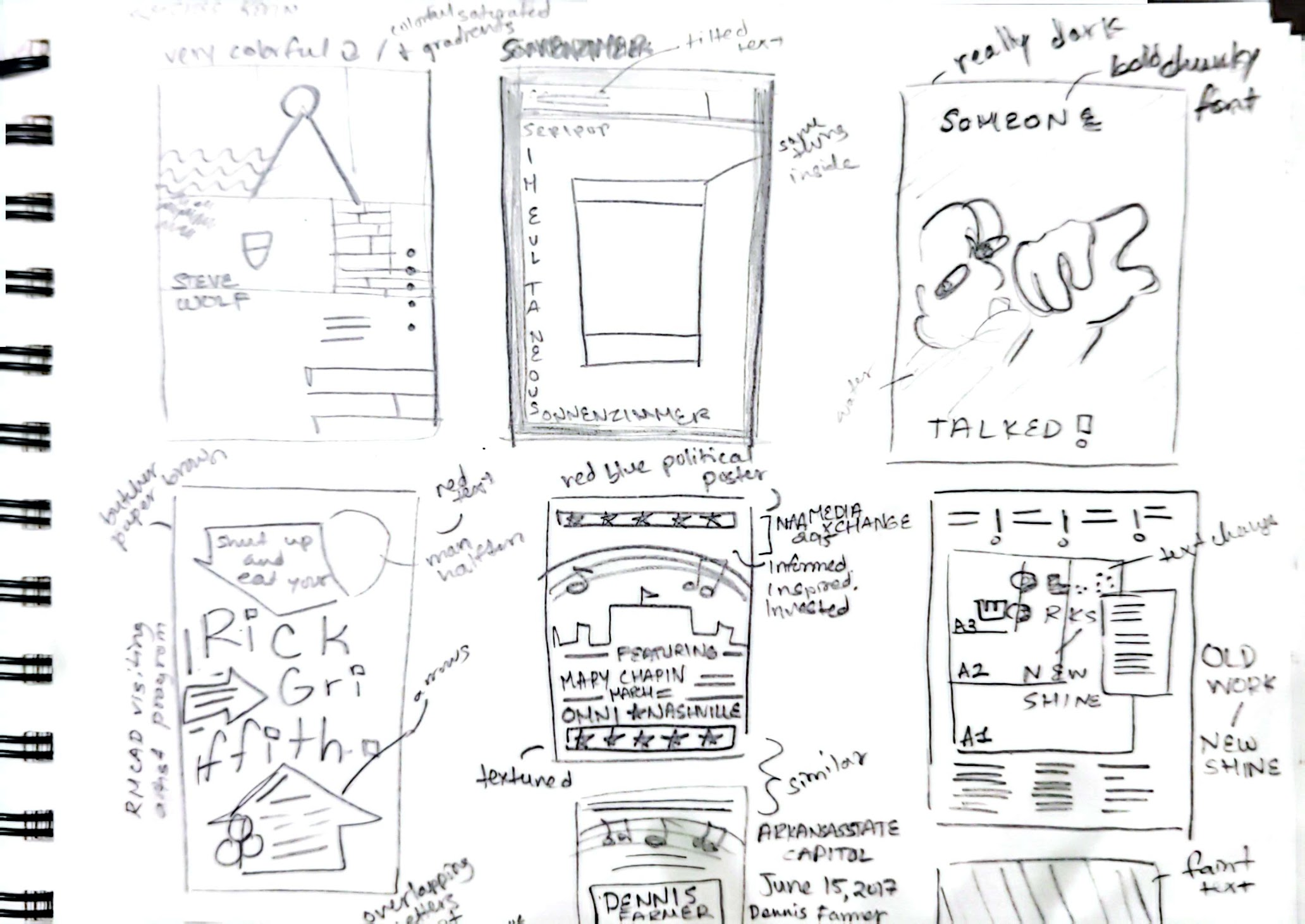
.png)
.png)
.png)
.png)
.png)
.png)

.png)
.png)
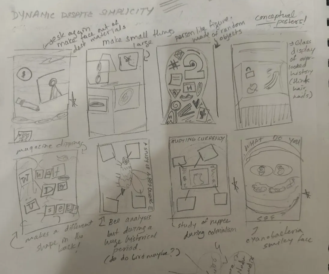
.png)
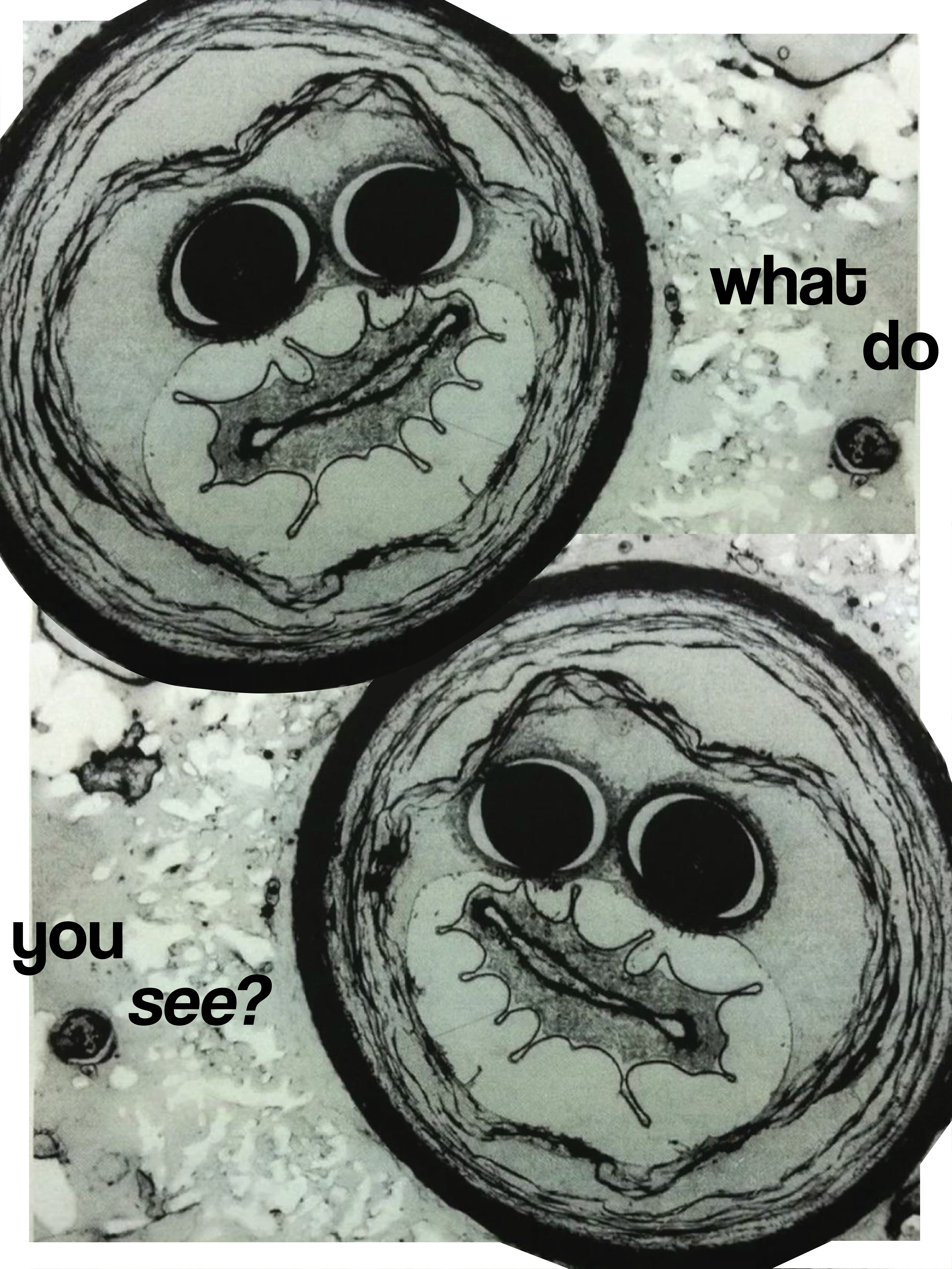
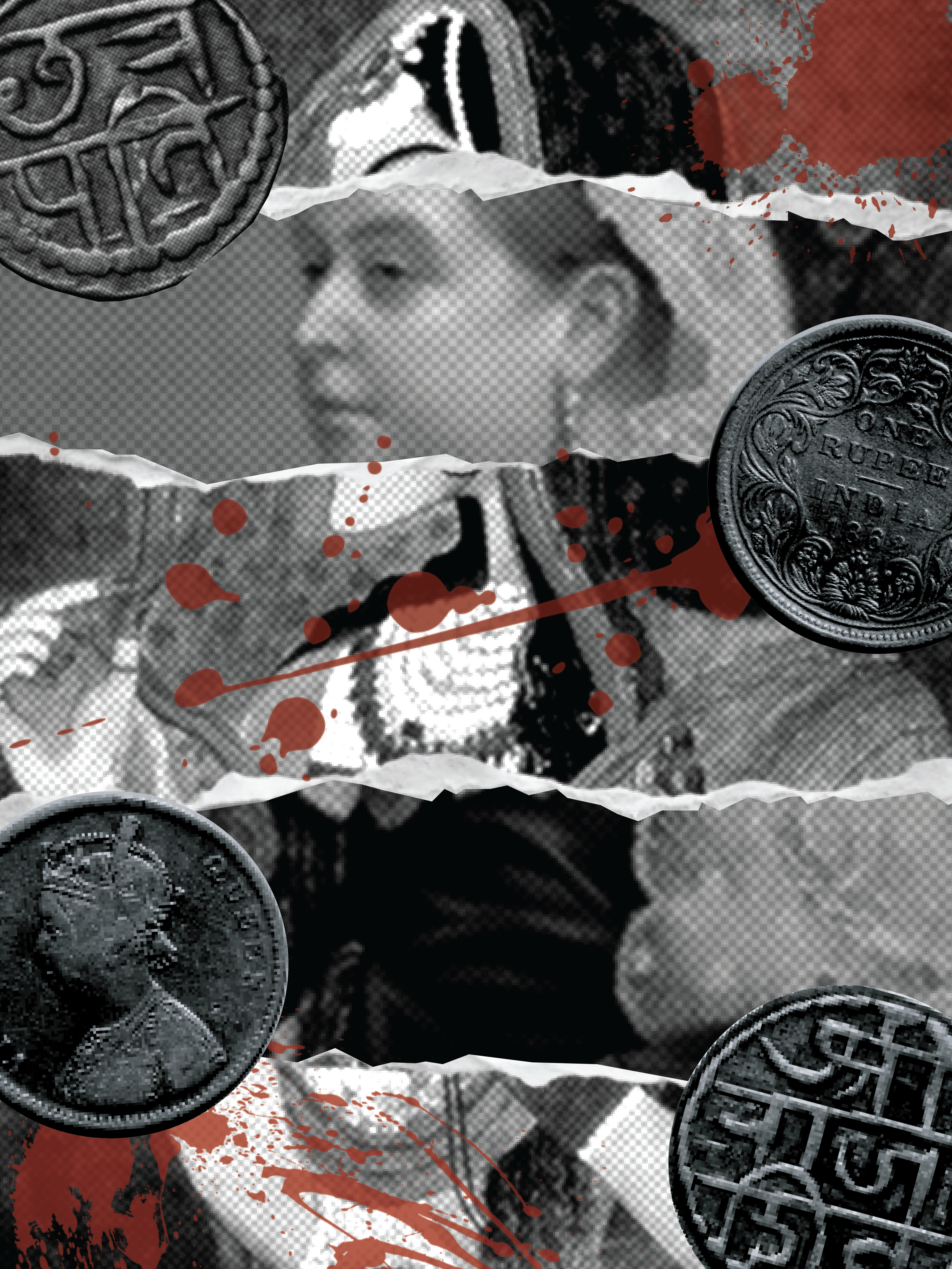
.png)